Eye CloseupIn pretty much every way, good web design is subjective. Trends come and go, and limitations are removed which open up entirely new options for how a site can look and act. While user experience can be quantified through testing, there is nothing scientific about what people want either. There are objective ways to look at the current desires of the public, and some things, like easily understandable navigation methods, will never go out of style, but in a decade, the rules for “good web design” will be barely recognizable from the standards we have today.

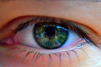
However, the way people read is likely to stay the same for the foreseeable future, even on the web. Eye tracking has allowed up to study just how people tend to look at text on the web and paying attention to how users read and look at websites, designers can make informed decisions on how to design their site around their visitors’ patterns.

Eye tracking has been around since the late 1800’s, though it only became commonly used for studying design and marketing in the 1980’s and 90’s. The first big study on web page viewing happened in 2006 by Jakob Nielson, which shows that visitors read web pages in a steady pattern; people’s eye make horizontal swipes across the page, then move down vertically. There have been numerous other studies since, and they all show that internet users continuously scan websites in the same pattern.

The pattern is usually referred to as an F-shape pattern because of how eyes start at the top left corner, moving to the right in a straight pattern, then back to the left hand side where they scan about a third of the way down the page, then back out to the right in a straight line.

If you want to know how you can harness eye movement patterns to inform your web design decisions, Carrie Cousins from Designmodo explores all of the possible implications of eye tracking studies. She breaks down every pattern seen in the studies and even gives examples of websites that are already designed around viewing patterns.

Apple Logo1One of the most crucial design decisions for a new company is the logo. Great logos are instantly recognizable and evoke the brand image with just one image. When anyone discusses McDonald’s, Apple, Nike, or NBC, it is hard not to imagine the Golden Arches, iconic apple, or swoosh because they are so deeply ingrained in their corporate image.

Creating a logo that perfect is deceptively difficult to do however. The business world is awash with bad logos that no one will ever remember. There is no magic recipe for a great logo, but there are some rules to follow that will help a logo stick out. I’ve given some tips on logos before, but Sarah Clare from Vandelay Design had some suggestions designers should keep in mind.

One of the most common mistakes is just over-doing the logo. Clean lines and simple contrast are striking and easily able to be replicated in any format, neon sign to stationary. Text can be included but only when necessary, and limit it to the brand name. Even if you’ve been in business for 200 years and you’re doing a logo redesign, your icon isn’t the place to tell people that.

It is hard to understate how important it is that your logo is able to be reproduced anywhere. Something may look good on a computer screen, but logos are sometimes printed on endless materials like pens, paper, mugs, and even mints, and stress balls. You want people to be able to recognize the logo whether it is 1″ x 1″ on a memo, or plastered on a billboard.

While a logo has to be simple, it also has to convey the tone and personality of your business. A high tech company with a childish logo may have trouble convincing potential customers of their abilities, especially because everyone in tech hates comic sans. Usually bright colors are reserved for companies more associated with children as well, but Google’s logo shows why that isn’t a hard rule.

As a business owner, you will see your logo more than you actually see your brand name, or at least it will feel like it. If you want your brand to be successful in the marketplace, you need a logo people will instantly be able to identify and connect with. It seems like a small task, but being lazy on the logo can torpedo a new brand.

Visual Link ExplorerSometimes it helps to step back and get a more visual idea of your link profile, but until now the only way to do this was to export all of your links to Excel and create a bunch of charts. CognitiveSEO has released the Visual Link Explorer to make the whole process easier and let you see your link profile all at once in a visually comprehensive way. It can also be used to help easily explain a profile to clients or even help figure out why you were penalized by Google. You can view competitors backlinks to analyze them and stay ahead of your closest competition.

One of the things this visual tool is best at is showing the importance of deep links and homepage links. It is always hard to explain to clients why it is a bad idea to direct all links to the homepage, and the way the Visual Link Explorer depicts your links is perfectly suited for showing how building a deep link profile as well boosts you site’s overall authority.

Judging overall link quality is also made incredibly easy and quick. In this tool, the lowest-quality links are placed closer to the center of the clusters of dots while the best link are portrayed with larger dots further away from the center.

There are a ton of other ways you can use the Visual Link Explorer to analyze your link profile, and any SEO worth their salt understands the importance of a your profile. Kristi Hines has more ideas for how the tool can be used at Search Engine Journal, but needless to say, I think it is a must have.

Web design relies on the resources of others. Without them, we could still make good looking pages, but it would take exponentially more time. Of course there are textures, fonts, images, and any other visual aspect you want to incorporate for free or cheap use, but we also use time savers behind the scenes.

This isn’t to say we rip off people. It is always best to notify the owner of any resource when you use it, and it is better to use as much original content as possible. Using boring standardized icons won’t ever have the same effect as specialized icons that fit the page they are made for.

Frameworks are what we use behind the scenes, and they are packages made of a structure of files and folders of standardized code used to build websites. They help get you started without making you spend hours typing in code that is normally extremely similar to others such as gridding systems. All websites have a similar structure, and these frameworks allow you to use a “standard” version of that structure and modify it as you need to.

Awwwards has an article explaining the different types of frameworks you might use on a new site, and a collection of great packages to get started.

A recent Google Webmaster Hangout seems to have implied that Google is pushing out Penguin Updates without announcing them. Penguin has only been officially updated twice after its initial release, and the last update was in October 2012. In the video, John Meuller from Google makes it appear that Google has been updating Penguin on a regular basis but has not announced them all. The comments come at around the four minute mark in the video below.

When asked for clarification by Search Engine Land, Meuller says that he was referring to general “link analysis” refreshes, but does not include the Penguin algorithm. They also confirmed the last update was the one announced in October.

One of the reasons some questioned if Penguin was being refreshed is Panda, the update always mentioned in association with Penguin, has been updated on roughly a monthly basis. Google didn’t confirm another update is coming, but the updates have been coming steadily, and there are signs a new one should arrive in the next few days.

The simple goal for your AdWords campaign should be to get the most conversions possible while spending the least money possible. If you have a good ratio here, you’re likely doing everything right. However, there are plenty of potential pitfalls to avoid in order to lose out on conversions or spend way too much in getting them.

Check out Patrick McDaniel’s tips at Business2Community and find out if you could be saving money somewhere or getting more out of your campaigns.

Responsive design is definitely the most talked about web design method right now, especially when discussing designing for mobile. It isn’t the only option though. There are three real options currently and each has its own pros and cons to them. Choosing the way you interact with mobile customers should reflect the type of business you are running and what you hope to accomplish.

Source: Flickr

Responsive Design – Though it is well covered, responsive websites are those that adapt to different sized screens across all platforms, from mobile to tablet to desktop. The idea is that you only build one website for everyone rather than different sites for all different devices. That time you would have spent designing sites for different platforms will have to be spent testing your one site on all of the devices. It also removes some of the ability to customize sites for certain devices.

Mobile Sites – A mobile site is optimized for that specific section of on-the-go customers. The sites are usually minimal, with large, finger-friendly buttons, and they load faster than responsive sites. This allows more direct control of how sites appear on different devices, but more importantly, the content selected to appear is tailored for the mobile demographic accessing it.

Native Mobile Apps – If you own a smartphone, you know what an app is. They are specific to their platforms so they have the benefit of being able to curate mobile content like websites do while further focusing on the differing needs of different platform users.

All three have their merits. Responsive websites create a sense of consistency and deliver the full experience of a desktop website in an accessible form for a specific device. Some hail it as a time saver, which isn’t quite true, but it does allow you to spend equal time on a site for all devices. Mobile sites and apps load faster and cater to specific audiences, while allowing them to act immediately.

Diksha Arora compares the three against each other at Vandelay Design. If you don’t know what is best for your business, she can help you identify your needs.

It is impossible to understate just how quickly SEO changes and how important it is to keep up. Strategies change, and search engines update countless times. Google’s Penguin and Panda updates are clearly the most talked about, but Google has had plenty of other updates with less catchy names throughout the last year, like the Knowledge Graph (okay, that one has a catchy name too).

Penguin and Panda changed the landscape of searching completely and strategies have had to adapt to them quickly, though SEOs not taking advantage of gray area SEO tactics like link buying were mostly unaffected. That doesn’t mean that they don’t have to follow the new guidelines as well.

Most of these guidelines are more broad however, but Don Pathak, writer for Search Engine Journal, tried to simplify and explain them, and in doing so came out with a few specific points.

Many writers, usually with vested interests, have argued that SEO success can’t be done with just great content, and it is true to an extent that the internet is competitive to the point where great content doesn’t quite get you to the top search result. However, Google has also made it very clear that it wants to favor the quality of content over SEO tactics. Keeping a site fresh and relevant will give you as much of a boost as any behind the scenes tweak can.

The new Google also favors locality, so if your business has a local presence in a marketplace, optimizing for that location will help customers find your service. You can get started by simply establishing a local profile on Google Places for Business, and encourage customers to give you reviews on the site.

SEO will likely always concern itself with the technical dealings behind the curtain of a website, but Google wants to give preference to those who operate valuable and well made websites, not those manipulating every loophole to get the market advantage. As with anything run mostly through algorithms, there will always be “hacks” or weaknesses, but rather than exploiting them as they open, it is better to just create a website with real value.

For users, the biggest factor in whether they will stay on a page is the usability and user experience of the page. They want it to look pretty, obviously, but even the nicest looking pages don’t keep their visitors unless the page functions the way they want.

There are hundreds of thousands of books about web design and user experience (UX), and even textbooks preaching specific ways to guide users throughout a site. So why does a site that breaks every rule of design continuously draw scores of news seekers and win design awards all over the place?

Mail Online is a British tabloid-type of news source with celebrity gossip, indignant moral opinion pieces, and of course “coverage” of breaking news. The recent Oscar Pistorious case held the same pagespace as a headline about Amanda Bynes. The site is also heavily addicting, even for those like me who try to be picky about their news sources. It outperforms almost every major news website including The New York Times and Britain’s The Guardian.

Mail Online’s disregard for traditional web design rules is apparent from their scrolltastic front page, which would be close to four foot long if printed out and laid end to end. They draw reader’s immediately by removing all advertising on the front page and doubling the rate of ads everywhere else.

The news source’s site is like a maze that you can’t ever be totally lost in. Sidebars have over 50 stories, each with images, and a visitor can end up pages deep before they realize they haven’t been to the front page, but they don’t feel lost. The feeling is similar to Wikipedia’s site structure where visitors follow links down the rabbit hole, but are still connected with almost every navigational tool the front page offers.

Kelsey Campbell-Dollaghan explored Mail Online’s rule-breaking design innovation more at Co.Design. I’m unsure whether this type of rule breaking is actually good for web design, but I have always been attached to overly designed styles which emphasize aesthetics. Mail Online suggests that aesthetics may actually be holding back design.

Any time Google’s Penguin or Panda updates are mentioned, site owners and bloggers alike work themselves into a mini frenzy about the possibility that their totally legitimate website might have been penalized. It’s warranted, in a way, because a few innocent bystanders have been affected, but largely Google is policing those breaking the rules.

Meanwhile, bloggers have tended to downplay just how much rule breaking there is. Black hat SEO is treated as a fringe issue when in reality it is a huge issue. Writers tend to focus on a small aspect of black hat SEO in which competitors use shady links and other SEO tactics to bring your site down, and that is incredibly rare. Google considers all explicit spam to be black hat, and with that definition, black hat SEO is the most pervasive type of SEO around.

It is also the type of spam Google spends most of their time fighting. Matt Cutts, Google’s webspam team leader, took to YouTube recently to answer a question about how many notifications Google sends out to website owners, and 90% of Google’s manual penalties are still spent on blatant spam pages.

Google sends out hundreds of thousands of notifications each month, but the chances of your common SEO or website owner seeing one are rare. There is a chance though. The other 10% of notifications focus on problems that SEOs who have fallen out of the loop or novices may have gotten sucked up into such as link buying, link selling, or even hacking notifications.