Don’t say Google doesn’t at least try to listen to webmasters. Though many webmasters have some pretty big (and often legitimate) grudges against the biggest search engine, it can’t be said they don’t at least try to reach out for opinions. One example of Google trying to receive feedback from site owners appeared last night, as Matt Cutts, Google’s head of webspam, tweeted out a call for webmasters and SEOs to fill out a survey.
Specifically, Cutts called for owners of small but high-quality websites who believe they should be doing better than they are in the rankings. It won’t end up affecting your rankings immediately, but it may give Google some information that will help them keep the playing field vaguely even for small businesses and big companies alike. The form reads:
Google would like to hear feedback about small but high-quality websites that could do better in our search results. To be clear, we’re just collecting feedback at this point; for example, don’t expect this survey to affect any site’s ranking.
The survey only asks two short questions. First, it calls for the name and URL of the small site you believe should be ranking well. Secondly, Google would obviously like to hear your opinion about why the site should rank higher. It is extremely straightforward, and shouldn’t take all that long for most webmasters to complete.
https://www.tulsamarketingonline.com/wp-content/uploads/2018/07/TMO-Logo.png00TMOhttps://www.tulsamarketingonline.com/wp-content/uploads/2018/07/TMO-Logo.pngTMO2013-08-29 11:56:062013-08-29 11:56:06Matt Cutts Asks For Feedback From Small Sites That Aren’t Ranking Well
SEO has more than its fair share of myths, legends, and misconceptions. The search engines are in no hurry to give away the deep details of how they rank websites, as more than a few people would immediately try to take advantage of their methods, and there are countless “experts” weighing in and giving their opinion on every little event.
To combat all of these wild misunderstandings throughout the SEO field, Ranjana Jha fro SEO Best Practices attempted to refute the most common myths you’ll run into.
Brands don’t need SEO – Many believe big brands don’t need optimization because they are going to automatically rank well, but those people misunderstand SEO. Optimization is a process that influences every aspect of a webpage from design, to content, and site construction. Not only that, but SEO plays a role in many off-site factors that increase visibility such as social media and creating a natural high-quality link profile. Even the biggest brands wouldn’t be doing as well online without all of these practices.
Content generation is your ace – Content generation is the new trend in SEO as links are being more downplayed, but far too many people are missing the point. Google has been turning to content and site quality because they want to offer sites with real value to their users. Putting up new content all the time just for the sake of posting something doesn’t benefit anyone. Content can be a great tool, but if you aren’t offering something valuable, you’re wasting everyone’s time and you won’t maintain your rankings.
Links are Golden – This myth is slowly fading out as Google gets more and more strict about their linking policies, but there are still some who believe links are the best way to get high in the rankings. Similar to content, links only matter if they have real value. Google can spot cheap or low-quality links from a mile away. If you aren’t fighting to earn real high quality links, you’re more likely hurting yourself.
Keyword stuffing still works – This is an old practice which Google is well-versed in fighting. Filling any available space with excessive keyword usage or key phrases only makes you look desperate or fake, and Google isn’t going to do you any favors.
Commenting on blogs with key anchor texts – This is another one that is fading out, but there are many who are still trying to exploit this strategy using random anchor texts and linking to unrelated content. However, most webmasters are using the “no follow” tag, so those links aren’t getting any benefits.
Paid anchor links on popular sites will give you a boost – This one didn’t actually use to be a myth. But, Google has caught on and now buying link space for the singular purpose of inflating your page rank doesn’t accomplish anything (aside from wasting money).
SEO means Meta tags, keywords, and content – Trying to break SEO down into just a couple of factors is a fools game. Many will list those aspects as the basic SEO elements, but optimization extends much further beyond those simple steps.
https://www.tulsamarketingonline.com/wp-content/uploads/2018/07/TMO-Logo.png00TMOhttps://www.tulsamarketingonline.com/wp-content/uploads/2018/07/TMO-Logo.pngTMO2013-08-28 10:42:032013-08-28 10:42:03Refuting The Most Popular SEO Myths
In his attempt to fix some confusing wording Google has been using, Matt Cutts, Google’s head of webspam, used his latest Webmaster Help video to clarify that page load speed is not any more important for rankings on mobile than it is for desktop searches.
This comes after Google has been publicly emphasizing the need for sites to load quickly, noting that mobile users are highly likely to leave a page if it doesn’t load fast enough. While Google isn’t backing off of that stance, Cutts wanted to make it clear that there isn’t a difference in how this speed is ranked from mobile to desktop.
If all things are equal, meaning all other aspects of two sites are ranked evenly, the site that loads faster will almost certainly be given the higher ranking in search results by Google, but that is true on smartphones and desktop computers alike. It is also just a sensible part of the algorithm, as slow pages will likely lose a large number of visitors just during the loading time, making it a lower-value site.
But, as internet speeds across devices and across the globe vary, Cutts said Google doesn’t have plans to give an exact amount of seconds your site should load in, but if it becomes obvious to Google that mobile users are getting more frustrated by slow sites than their desktop counterparts, they may consider weighting loading speed more for mobile searches. It just isn’t the case yet, and there are no plans currently to make it so.
https://www.tulsamarketingonline.com/wp-content/uploads/2018/07/TMO-Logo.png00TMOhttps://www.tulsamarketingonline.com/wp-content/uploads/2018/07/TMO-Logo.pngTMO2013-08-27 14:25:362013-08-27 14:25:36Is Loading Speed More Important For Mobile? Matt Cutts Says No
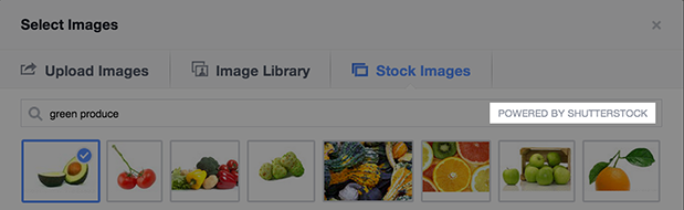
Facebook advertisers won’t have to rely on expensive stock photo subscriptions of licenses soon, as Facebook has announced they have formed a deal with Shutterstock to allow advertisers to access millions of stock photos for all Facebook ad formats, provided at no extra cost. They will be fully searchable and accessible directly through the ad creation tool, making it much easier to add quality images to your ads.
The announcement from Facebook said, “High-quality, engaging photos often increase the performance of ads, particularly in News Feed. And now, through our collaboration with Shutterstock, it will be easier for businesses to integrate beautiful photography into their Facebook ads.”
With the addition of this new feature, Facebook advertisers will also be able to create multiple ads at a time with several images. The image uploader has been improved to allow users to select from a range of photos from your Page, as well as previous ads and the Shutterstock library. This also opens up the possibility of creating multiple ads for a single campaign and testing images to increase performance.
While Google may own a huge share of the search market, Bing is no slouch. They have undertaken a serious campaign to raise their profile and earn a larger amount of the searches happening every day. Part of this campaign is very straightforward; Bing wants to educate you about why they are a better search engine than Google.
To do this, Bing has undergone some high profile marketing (the “Bing it On” Challenge), but they’ve also upped their transparency and have been reaching out to interested consumers through the Bing Blog. Last week, Senior Program Manager Meenaz Merchant did just that, attempting to explain why Bing is the superior search engine for image searches.
Entity Understanding – Bing claims to be able to determine whether a search is for a person, place, or thing. By being able to distinguish the object of searches, they are able to deliver more accurate results to the user.
Big Data – According to Bing, Google doesn’t incorporate any image click data from the web or social signals into their search engine. Bing, on the other hand, includes user interaction data based on visual and text features to better match results for your interests.
Computer Vision Technologies – Bing uses deep learning to interpret dimensional data from the world to understand images more accurately than Google. They claim they are able to process images similar to the way the human brain does, allowing for more thorough cataloging and delivery of image results.
Thematic Intent Focus – Supposedly, Google treats image searches almost exactly how they handle text or web searches. Bing however says they are able to differentiate between the intent of users’ searches using specific methods for image searches.
Exact and Near Duplicate Images – Unlike Google, Bing is able to recognize and flag exact duplicates or near duplicate images from their searches, allowing for them to be filtered out of search results.
Aesthetics and Easy Viewing – Bing makes it easier to see multiple images in a single glance by more consistently sizing the results across the page. Google’s results tend to directly reflect their image size, creating a slightly jumbled view, while Bing’s is more cohesive, so that you can see all the images at once.
High Quality Images – Bing favors image quality above all, and they make it easy to see a full-size, high quality image after the first click. On other search engines, you often have to click through a page or two to actually see the full image.
00TMOhttps://www.tulsamarketingonline.com/wp-content/uploads/2018/07/TMO-Logo.pngTMO2013-08-26 10:16:222013-08-26 10:16:22Bing Tells You Why They Are Better At Image Search
Chances are no matter what medium you work in, you consider yourself a designer. Not a web designer, or a print designer, but simply a designer. It is increasingly rare to find a designer that restricts themselves to a specific medium. Why should they when they have almost limitless possibilities for matching their design to the best medium?
The biggest distinction that still lies between digital and print design is the language. Every medium has its own technical jargon, and as a designer it is important for you to understand and be able to speak the language. Even if you think you don’t, Carrie Cousins points out there is a good probability that at some point a client will ask for print components to go with the website. Eventually a client will want to be able to put part of the design onto posters, or business cards, or pamphlets.
You don’t want to be caught off guard and look amateurish in that scenario, and getting informed isn’t difficult. All you need to do is add some new words to your vocabulary. Design Shack put together a list of the ten most important terms. I’ve explained some of them below, but there are always more terms you could learn to be a more rounded designer.
1) DPI
Dots per inch is a literal measure of printing quality. Many traditional printing methods still being used today work by creating tiny dots to create an image. The more dots used per square inch, the higher quality and accuracy of the detail. Most print jobs use 300 or 600 DPI, but lighter papers require lower DPI to prevent color bleed and over saturation.
Many programs include settings to increase or decrease DPI, but the settings only refer to print design. Increasing the DPI will increase a file size, but it means absolutely nothing to digital projects because screen resolution is measured using pixels, not DPI. DPI can improve the quality of printing, but it doesn’t intrinsically affect the quality or size of an image.
2) CMYK
Digital designers are familiar with the RGB color profile, but printing uses a CMYK color model. The CMYK model refers ro a four-color (or plate) process of printing where each letter refers to a color used in the process: Cyan, Magenta, Yellow, and Black (K equals black).
This means any design you create on a computer for a print design needs to be created with CMYK profiles so that the color is accurately reproduced. Many printers will even require that a job be converted before being submitted. Above all it creates consistency across all print jobs.
3) Large Format
Large format refers to any project that needs to be printed on a specialty printer, usually larger than 16 by 20 inches. Usually these types of print jobs are for banners, posters, and sometimes billboards. These types of projects are also made to be viewed from afar, and are usually rather low quality or pixelated up close. From a distance however, they look great. It does require a high quality image to print these projects, but they also tend to be printed at lower DPI.
4) Pantone Color
Pantone is the worldwide standard for color. The company has been around since 1963, and they have established a universal system for understanding and matching colors created by mixing a set of standard colors in precise combinations. This way, they can be precisely printed across different presses and substrates.
The colors are identified by number, but what sets the system apart is the detail they take into consideration. They include information on how to account for different types of paper based on a lettering system.
5) Overprint
Overprint is exactly what it sounds like; it is the process of printing on top of other things. Specifically overprint is when inks are printed directly on top of each other. The effect ca be used to create special effects, but it can also create issues during the printing process if not taken account for. The most common issue is the use of pure black, which can become richer when overprinted, and tends to overwhelm images. Instead, it is suggested to use rich black created with all four color plates to prevent overprinting.
00TMOhttps://www.tulsamarketingonline.com/wp-content/uploads/2018/07/TMO-Logo.pngTMO2013-08-22 14:10:242013-08-22 14:10:24The Most Important Printing Terms for Web Designers
We’ve all seen the cycle of Google updates. Every time there is a change to the algorithms, the blogs all light up with announcements, a fair sized group panics while the rest ride out the storm, and then the “how to recover” posts start rolling in. Eventually the excitement tapers off, and then it is time for a new update.
Probably the most shocking thing about all the commotion is how many people freak out in the first place. While some of Google’s changes are pretty significant, it isn’t like they don’t warn webmasters ahead of time with what direction they are headed for ranking websites. They won’t give the specifics, but they normally denounce a practice well before they start penalizing for it.
That is all my long-winded way of saying we don’t all have to be afraid of the next Penguin or Panda update. By simply following the best practice guidelines and keeping some solid tips in mind, you’ll find you have no reason to worry. Erin Everhart recently shared some great tactics you can use to keep your website in Google’s good graces.
1) Focus on Branding, Not on Ranking
It is no secret that Google isn’t actually a fan of a lot of what constitutes search engine optimization, mostly because of the way many try to take advantage of every loophole to get rankings. The common idea of SEO focuses solely on improving rankings, while Google wants to rank sites based on value to their consumers.
To start thinking like Google, you need to get your mind off of ranking and focus more on building your brand. If you search for any type of product like a flat screen TV, the results will be almost entirely brand names. Google views brand names as trustworthy and valuable parts of their community, and that goes for small businesses as well as large companies. Simply sponsoring events in the community and interacting with users in positive ways go a long way with search engines.
Of course, it would be naive to say the big brands don’t have advantages, but it isn’t the reason you think. Google evaluates them the same way they evaluate everyone else, but these brands are large enough that they never resort to the keyword stuffing, anchor text over-optimizing stuff that so many SEO professionals try to use.
2) Create a Good User Experience
Along the lines of taking your focus off of rankings, Google has been pleading with the SEO community to take their attention to actually delivering quality experiences for users. The search engine wants to deliver great sites that users will enjoy being on, not low quality pages with the most optimization. To achieve this, the engine made site quality more important than link profiles and has been refining their guidelines to push for faster sites with better content.
For marketers and optimizers, this can be a little confusing. Who exactly defines a “high quality site” and what are the criteria? Well we know the faster your site is, the better off it will fare. But, there are many more amorphous factors to deal with. The only real way to find out exactly what your users will like and how to make the highest quality site for them is testing. Run every type of test you can. Do user testing. Do split testing. Research your market.
3) Preserve Your URLs
It is a little bit of an outdated practice at this point, but it remains true that old URLs still rank the best. The only reason you should resort to changing your URLs is to fix an absolute mess of site architecture or absolutely have no choice. But, if there is any way you can avoid it, do. Canonicals and 301s reduce equity that you’ve built up, and new pages have to start all over again.
Instead, bigger companies like Apple use the same page for every new product launch, unless they release an entirely new product like the rumored upcoming smartwatch. They simply update the existing page to reflect the new product, while the old iPhone gets pushed to a new page. This way, you can take advantage of the equity you already have.
Conclusion
Focusing your SEO efforts on rankings isn’t sustainable any longer. You may shoot up the rankings more quickly than those creating a high quality campaign, but you’ll live in fear of every algorithm update, and eventually you will get hit. Chances are, you probably already have been penalized once, unless you’re walking the straight and narrow.
00TMOhttps://www.tulsamarketingonline.com/wp-content/uploads/2018/07/TMO-Logo.pngTMO2013-08-22 11:16:072013-08-22 11:16:073 Tips for a Successful Long Term SEO Campaign
Negative SEO has been a topic of debate for a while now, especially since links became dramatically more risky with the introduction of Google Penguin. It is entirely possible competitors could simply point hundreds or thousands of low-quality or negative backlinks towards your site with the intention of causing your site to be penalized or possibly even completely removed from Google’s index. Buying links went from being a tool for cheating to algorithms to a weapon for destroying, or at least handicapping, competitors.
Google acknowledged this issue with the introduction of the Disavow Links tool, by giving webmasters a way to protect their site. The problem is, everyone seems to be using it wrong. According to Marcela De Vivo from Search Engine Watch, the Disavow Links tool isn’t best used after a site has been penalized. Instead, it should be used in combination with a link audit before you ever run into trouble.
It makes sense, the entire point of a backlink audit is to check the quality and status of all of the links in your profile. If you’re auditing properly and regularly, you won’t ever have to worry about algorithm updates or manual actions. You could catch every low quality link and disavow before search engines identify them.
Auditing isn’t difficult either. All you have to do is download your backlinks from your Google Webmaster account or any other backlink tool, and look for any links pointing back to your site that you either don’t recognize or look questionable. Usually fishy or spammy links are easy to pick out. Then, you can take action by emailing the owner of those sites and asking for the link to be removed. If that fails, all you have to do is turn to the disavow tool.
Running these types of audits is like exercising for your website. When done regularly, audits keep your site healthy, removes any unhealthy links from the profile, and makes it easier to fight off outside attacks. If you’re regularly auditing your links, you’ll quickly spot any negative or blackhat SEO attempts. Everyone living in fear of Penguin updates is spending too much time being reactive. If you proactively manage your backlink profile, penalties will seem far less menacing.
https://www.tulsamarketingonline.com/wp-content/uploads/2018/07/TMO-Logo.png00TMOhttps://www.tulsamarketingonline.com/wp-content/uploads/2018/07/TMO-Logo.pngTMO2013-08-21 13:26:382013-08-21 13:26:38Why You Aren’t Using the Disavow Links Tool Right
Despite constant detractors proclaiming the death of Facebook, advertising on the social media platform continues to show strong results for marketers according to the Q2 review of Facebook advertising by Kenshoo Social. Their statistics show significant increases for all metrics, from analysis of more than 75 billion Facebook ad impressions from advertisers using the Kenshoo Social platform.
Throughout Q2, the company saw click through rates rise 18.5 percent, with total clicks increasing by 16.5 percent compared to Q1 of this year. Engagement rates beyond the click also saw substantial increases as conversions rose 56.9 percent and revenue increased by 28.3 percent.
Todd Herrold, senior director of product marketing for Kenshoo Social says the gains are the result of advertisers continuing to refine their techniques and becoming more savy about the social media platform, as well as improvements made by Facebook itself. He told Marketing Land:
“Facebook has been steadily optimizing its ad units and launching new ad targeting products designed specifically for direct response, including Custom and Lookalike Audiences, Partner Categories and the Facebook Exchange (FBX).”
00TMOhttps://www.tulsamarketingonline.com/wp-content/uploads/2018/07/TMO-Logo.pngTMO2013-08-21 11:31:082013-08-21 11:31:08Facebook Q2 Review Shows Large Gains in Click Through Rates, Conversions
Web design has a love of all things retro. You can’t scan the web for long before you come across a site with faux wood textures or faded and breezy images influenced by the aesthetics of another time. These old styles are even large parts of current design trends such as flat design and the new found focus on typography. Designers are constantly taking the old and turning it new again.
Some choose to lean more heavily into the retro styles than others. While many flat designs owe debts of gratitude to minimalist styles of the 50’s and 60’s, you usually wouldn’t confuse the two. Others however do their best to emulate the styles of earlier times as closely as they can, but translated into a digital medium.
Going retro is a popular style for many brands and artists, and it isn’t any more difficult to achieve than most other current design aesthetics. Designrfix recently shared tips to really get the look and feel of older times, if you want to try it out for yourself.
Think Retro – The first step is getting inspiration. It can be difficult to detach yourself from your contemporary ideas of good style, and the best way to do that is go directly to the source. Search out old magazines and newspapers, any sort of graphic media from the time you can find. There is a huge amount of it online, and you’ll be able to get inspired within just a couple searches.
Focus on Simple Shapes – Vintage and retro styles are characterized by simplicity. Designs of the past relied on impact to grab attention, and this was usually achieved by using very simple shapes like circles which demand attention. Consider a circle surrounded by decoration, or blocky and heavy arrangements.
Limit Your Use of Color – Modern designers have it easy. We can use any assortment of colors we want on the web, even down to slight shading choices. Designers of the past were limited by the expense of full color printing, so they often relied on two-toned coloring to come up with colorful designs without breaking the bank. Using black-white, orange-yellow, or cream-brown color combinations will immediately make viewers think of older printing styles.
Retro Typefaces and Fonts – As previously mentioned, big typography in retro styles is an absolute necessity of a vintage site. The style has grown some legs on its own, but it still is a defining trait of older styles. You need to choose a font reflective of the era you want to reflect. Using the wrong typeface can seem anachronistic or lazy, so take your time and get it right. Check what designers were using in the era you’re emulating and find something similar online. It shouldn’t be hard to do so.
Borders – Borders have always been a big part of design, and ornamental borders were definitely a big part of making older designs attention grabbing. Frame your images and content in borders and simple shapes and you’re site will already look pretty retro.
Badges – Interestingly, if you look at websites with retro designs, you tend to see lots of badges as buttons, even though badges weren’t actually a big part of designs in the past. Still, these badges remind users of county-fair days and older times, while also standing out on the page and drawing attention. It is a simple addition that works better than it should.
Using the Right Texture – Well used textures can make a boring page feel stoic and formal. They can entirely define how a page feels, and can certainly make a page feel more retro. The trick is subtlety and integrating the texture into the layout, not simply laying it over things.
00TMOhttps://www.tulsamarketingonline.com/wp-content/uploads/2018/07/TMO-Logo.pngTMO2013-08-20 13:02:372013-08-20 13:02:37How to Make Your Website Look Retro