If you read many blogs, it is easy to notice how rampant content scraping is. For the lucky few out there who haven’t run into it yet, content scraping is stealing content from a site to display it on someone else’s blog, usually with Adsense ads to make money off of your hard work.
Thankfully for all the bloggers out there, experienced coders have been fighting off these content scrapers for years and they are happy to share their latest tricks to keep their content from appearing on other sites. Given, this battle is similar to the ongoing battles against copyright infringers and hackers, in that while these solutions may work for the moment, scammers and scrapers are already at work to find a way around the defenses.
None-the-less, it is better to put up a fight rather than giving up when it comes to these content bandits. Jean-Baptiste Jung, co-founder of Cats Who Code, has offered snippets you can use in WordPress to help fend off exactly these types of content thieves, each with their own unique solution.
One common way scrapers steal content is by displaying your blog within a frame on their page, with the ads in another frame so that they will always be shown, and thus earn the scrapers money. Jung’s first snippet breaks out of these frames so that your blog covers the entire window, effectively blocking the scraper site from being seen.
The single most frequent content scraper method is to simply use your RSS feed, and display it on their site so that they also get to take advantage of your original (or paid for) images, as well as not using their own bandwidth. To solve this problem, Jung disabled hotlinking to images so that every time someone tries to use your pictures on their site, they instead see an image informing viewers the content is stolen from your website. It is pretty entertaining to see the results he shared from one such website.
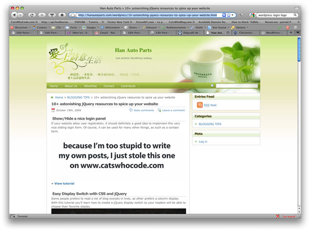
Source: Cats Who Code
Obviously, most content scrapers are using tools that do all the work for them, and these tools normally steal the title as well as the content of your post. The solution here is a simple snippet that adds a link automatically to your post titles that directs back to your original post.
To get the snippets, you’ll have to head over to Jung’s article, which also offers a couple more solutions to content thiefs. If you haven’t been bothered by scrapers yet, you are either very lucky, or not paying enough attention. The bandits may eventually figure out how to thwart these defenses, but at least your content will be safe for a while.


