CSS lets us do wonderful things as designers, but it can sometimes be a hassle. If you are super experienced, you may have learned to avoid the problems, but the majority of us are way to accustomed to beginning with a very simple CSS file, and watching it spiral out of control as you continue development.
As you create your site, your CSS gradually becomes a mess. It looks disorganized, borderline unreadable, and there are inevitably quite a few mistakes spread throughout. It doesn’t mean you’re a bad designer. In fact, this could happen to anyone.
Usually there are two ways to deal with this, you can either regularly stop your site development and clean up the CSS, or you can wait until the end and dive into fixing everything all at once. Either way, it takes forever.
Recently, a third (much faster) way has come up. Why not just use a tool to keep your CSS sorted and formatted? No tool is going to keep your CSS looking perfect, but they can at least keep it organized enough to be readable when it becomes time to edit, and you won’t have to do near as much editing as you did in the past.
Speckyboy Design Magazine collected a whole bunch of different options for keeping CSS code looking clean while you work. While none of them will recognize your unique way of writing the code, but you should be able to find something that fits you well enough to make your life much easier.
00TMOhttps://www.tulsamarketingonline.com/wp-content/uploads/2018/07/TMO-Logo.pngTMO2013-05-30 14:40:302013-05-30 14:40:30Tools For Keeping Your CSS Looking Clean While You Work
Web design has more in common with print design than we like to admit. While the web offers endless opportunities and unique design possibilities, print design has been evolving for over 500 years and much of how we approach content of all kinds comes from our longstanding use of print and paper.
Design is really all about connecting with the public and sharing information in an attractive form, whether it be in books, images, or videos. Noupe offered some print design rules that apply in every medium you want to use.
Less is More
Print has always been very aware of size constraints. If you go over the size limit, it means adding more space, which meant using more paper, which means higher costs. The web has the opposite problem. We are given endless space and some designers take that space and try to use as much of it as possible to bombard viewers with everything they have to offer.
When you throw too much at the audience all at once however, you face clutter problems as well as just overwhelming and putting off your audience. Consider a memo or press release, and how corporate designers aim to immediately grab the viewer’s attention with economic design. You can put out information with a strong central theme or message without attacking your audience all at once.
Make Scanning Easy
Very few people read every word on anything. We are skimmers, who jump to and from text littered all throughout or life, and we expect the things we read to make this easy for us. People don’t want to have to search extensively for what they’re looking for. They want the content to be broken up in a way where sections and different types of information are immediately obvious.
Following a typographical hierarchy is one of the best ways to keep your content organized for scanners to find what they are looking for. Headlines and sub-headings guide the eyes and announce the main topic of content sections, while bold and italics draw attention to important areas.
Functionality is More Important Than Style
Managing print functionality doesn’t seem like that much of a task, but part of that comes from our long history of streamlining text into its most legible forms from the birth of the print press. Consider every aspect of print design that keeps text legible; text color, layout, font choice, and even text alignment all have to be considered in order to keep the print “functional” or able to convey the information you’re trying to share.
In web design, functionality is much more of an overt issue, yet the rule remains the same. Some designers try to hard to create lavish sights rich with animation and high quality images, but they sacrifice usability, sped, and practicality in favor of style. Any site that doesn’t work for users isn’t a successful site because people won’t care about fancy design if they can’t use it.
https://www.tulsamarketingonline.com/wp-content/uploads/2018/07/TMO-Logo.png75142TMOhttps://www.tulsamarketingonline.com/wp-content/uploads/2018/07/TMO-Logo.pngTMO2013-05-28 13:18:172013-05-28 13:18:173 Things We’ve Learned From Print Design
It’s easy to take text for granted as a designer. However for most users, text is the most common component across the web. Designers can lose focus or patience on text when we want to get to the more fun aspects of design, but you can’t communicate effectively in any way without good typography, and good type is built upon a few basic principles.
Web Designer Depot set down a list of rules that designers can follow for excellent typography, or at least prevent the most basic mistakes. While some of these considerations may seem unimportant or odd when you begin trying to work them into your page compositions, before long they will be second nature to you.
Establish a Typographic Hierarchy – Text is all about conveying information, and readers on the internet want to obtain that information quickly. They scan and look for the most interesting or important parts, which they can’t easily do without an organized typographic hierarchy. Even for readers who don’t skim, the hierarchy keeps information organized and accessible.
Keep Text Large Enough To Read – While 12pt. fonts may have been acceptable on the web a few years ago, no one wants to be squinting at a computer screen anymore. Make your text large enough for people to easily read. I’d suggest 16pt. fonts, but certainly no smaller than 14pt.
Choose Appropriate Fonts For Body Texts – Conveying information is also all about legibility. Choosing a flowery, superfluous, or otherwise hard to read font for body copy is off-putting to visitors and will keep them from sticking around the page for long. There is a time and a place for extravagant fonts, but that isn’t in the body paragraphs.
Don’t Use Too Many Fonts On One Page – The web ran on only a handful of fonts years ago, but now we have the abilities to work with a practically endless number of fonts in our designs. That doesn’t mean every one of those fonts should go into a single design. Using too many fonts in a single design can be clashy, distracting, and just plain ugly. The old rule is too stick to two or three fonts. I don’t suggest using more.
Give Your Text Some Room To Breathe – Just like on school essays, having extra space between each line of text makes everything much easier to read than trying to make sense of jumbled cluttered letters. The problem is evenly solved too, all by increasing line-heights. Be careful not to overdo it though, too much space can be bad.
Web Designer Depot has a few other rules on their page, but these basic rules will be enough to protect you from the biggest typographic sins. Remember, text is the best way to convey information to your visitors, so make the text easy to read above all else.
00TMOhttps://www.tulsamarketingonline.com/wp-content/uploads/2018/07/TMO-Logo.pngTMO2013-05-24 15:40:552013-05-24 15:40:55The Guide To Great Typography
Like most designers and web design bloggers, I try to keep up to date with the latest tools and resources available, and I try to pass them along when I get the chance. One of the best places to find the latest and greatest tools, extensions, apps, and kits is Web Designer Depot’s monthly compilation for designers and developers. Most of them are free, and almost all of them can be of use in your workflow.
This month’s wrap up has everything from web apps, jQuery plygins and JavaScript resources to wireframing kits and coding resources. As always, there are also some awesome fonts, most of which you can get on a budget.
One of my favorite resources, though one of the least directly usable on this list, is a free ebook calledThe Productivity Manifesto, which is filled with tips on upping your productivity. All you have to do to get the ebook is sign up for the free newsletter.
If you’re looking for more practical tools, you’ll like WireKit, a set of Photoshop shape layers for iPhone apps, or the interactive usability checklist Userium that comes with categories for user experience, homepage, accessibility, navigation, and every other facet of site usability.
Those couple tools are just scratching the surface of what is offered at Web Designer Depot this month, and I highly advise you check out everything else they are showcasing this month. You’re bound to find at least one tool you like.
00TMOhttps://www.tulsamarketingonline.com/wp-content/uploads/2018/07/TMO-Logo.pngTMO2013-05-23 13:31:382013-05-23 13:31:38Free Resources: The Best Tools For Designers This Month
What does it mean to be Pantone’s Color of the Year? It seems like an arbitrary designation to many, but if you watch the design trends close enough, it is easy to see how emerald was chosen as this year’s favorite color.
Emerald works great as a base color or as an accent, and it is an easy choice in a year when colors have gone slightly more natural and pastel. It is a favorite of many, and has always been a staple in fashion, beauty, and design. It was really only a matter of time until emerald had its moment in the sun.
Pantone’s emerald chosen as the color of the year is very specific, and very in line with the design trend of subdued light colors that still pack a lot of punch. Emerald 17-5641 is the lush blue-green that works wonders as a background and is a friendly complement to many colors without clashing.
“The most abundant hue in nature, the human eye sees more green than any other color in the spectrum,” said Leatrice Eiseman, executive director of the Pantone Color Institute, following the announcement of the color of the year. “Symbolically, Emerald brings a sense of clarity, renewal and rejuvenation, which is so important in today’s complex world. This powerful and universally-appealing tone translates easily to both fashion and home interiors.”
Green has always been a popular color because it lacks many negative connotations. Greens are common and associated with health, and is a the second most common favorite color, following only blue. We are used to greens and they don’t have the aggressive or overly feminine associations harsh reds or soft yellows do.
Emerald specifically has many positive emotional associations such as soothing, relaxation, and harmony and there are almost no negative color meanings. The only bad connection that can be drawn is greed or death, which are normally more thought of with more sickly or saturated greens, not the comforting blue-green you’ll find in this type of emerald.
If you want to get inspired or hear some tips on how to use the color of the year, Designshack has created an entire page devoted to uses of the color in design and pop culture, as well as exploring the color’s meaning a little deeper.
00TMOhttps://www.tulsamarketingonline.com/wp-content/uploads/2018/07/TMO-Logo.pngTMO2013-05-16 15:20:322013-05-16 15:20:32Understanding Pantone’s Color of the Year: Emerald
Want to know if your company understands branding? Just ask if you have a brand bible. If you don’t, your business probably has some large flaws in their branding and their marketing.
Every brand, from the smallest startups to the giants you see on your drive to work, should have their “bible” establishing the guidelines and rules of maintaining their corporate image.
What is a Brand Bible?
A brand bible is a document shared throughout the company that lays out how the company achieves its personality and public voice across many individuals and different departments. It is, as Designshack explains, “the basis for all interactions on behalf of the company.”
These documents, which range from a few pages to a couple hundred depending on the size and needs of the company, cover every sort of public interaction. Brand bibles or books distinguish what types of marketing should be pursued or taken off the table, letterhead, logo usage, and even the specific colors that can be used for corporate design. This book is how every Facebook employee knows exactly what color blue is Facebook Blue.
Creating a Brand Bible
See, above all, a brand bible is about cohesion and consistency. From the first design or memo you send out, creating a brand bible is as easy as keeping notes on what fonts you use, how you lay out public documents, and how letterhead is arranged. Over time, if you keep good notes, putting together your brand bible will be as easy as arranging these notes into a document to share with your employees.
If you’ve waited to create these guidelines, it isn’t much more difficult. Start keeping notes. Set a standard. It may take longer to get established across the company, but it will speed up marketing and design. If you need more specific ideas on how to establish a brand book, Designshack has a few suggestions in their article.
00TMOhttps://www.tulsamarketingonline.com/wp-content/uploads/2018/07/TMO-Logo.pngTMO2013-05-15 14:22:002013-05-15 14:22:00Building a United Brand Image With a Brand Bible
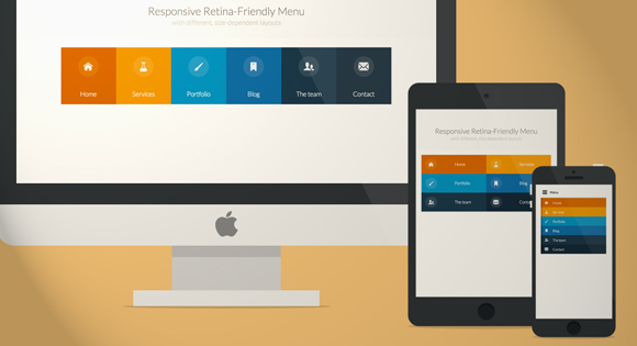
Responsive websites are all the rage right now, but there are still a lot of common problems with implementation that need to be taken care of. One of the biggest problems is navigation.
Many websites have problems figuring out how to handle shrinking extensive navigation systems so that they can fit onto a smaller device’s screen, but the truth is, if you can’t minimize your navigation tools into few enough buttons to make easily usable on a smartphone screen, you already need to redo your navigation.
It’s true, some web sites need more menus and navigational options than others, but if you have more than two layers of drop down menus or more than seven or eight main navigational categories, you are statistically more likely to be suffering from bad website organization rather than running a sprawling media empire.
Codrops created a tutorial to help solve both problems, and it teaches you how to make an icon font at the same time, just for the sake of it! The tutorial teaches you how to make a more simplified, classy looking responsive menu that is retina-ready, making it perfectly up-to-date with all the current design trends. If you want a quick way to learn all the modern tricks, their tutorial has got it all covered.
00TMOhttps://www.tulsamarketingonline.com/wp-content/uploads/2018/07/TMO-Logo.pngTMO2013-05-14 14:55:392013-05-14 14:55:39How To Make A Responsive Menu That Looks Great On A Retina Screen
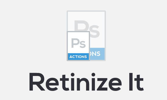
Making “retina-ready” images isn’t exactly difficult, but it is definitely tiresome and far from fun. No one likes looking back on all of their website’s images and having to painstakingly go through and rescale and resave individual images all day. That’s exactly why web design tools are so popular. Designers aren’t quite lazy, but boy do we hate doing tedious tasks.
Artiom Dashinsky from Tel-Aviv was the designer who decided this issue needed a free tool to speed up creating high definition images for high density “retina” screens. His creation, “Retinize It” is an automated set of two Photoshop actions.
As Noupe explains, the first action slices a selected layer or group into a single image, then opens the dialog for saving the image for the web. The second one does the same, scaled the sliced area up 200-percent, and reopens “Save for Web” so that you end up with two differently scaled versions of the same image almost automatically.
Before you use Retinize It, you should always make sure your image relies on shapes or has been turned into a smart object. Traditional pictures will just be pixelated by the simple upscaling.
Dashinsky’s tool is far from revolutionary, and won’t accomplish much that any competent designer wouldn’t be able to do for themselves, but it cuts down on wasted time spent manually reworking individual images.
00TMOhttps://www.tulsamarketingonline.com/wp-content/uploads/2018/07/TMO-Logo.pngTMO2013-05-10 13:22:522013-05-10 13:22:52‘Retinize It’ Saves You Time and Tedium
Just like every aspect of design, color is subject to trends and fads, though they aren’t always obvious. Look around a city and you’re hit by a wave of color so various it is hard to make heads or tails of what color palettes are popular at the moment. Start to hone in on the individual elements however, and soon you’ll see patterns in the different billboards and store fronts that litter the landscape.
The same goes for web design. If you are looking at the entire web as a case study, it is hard to tell what is popular right now. If you pay attention to the trendsetters and heavy hitters though, the trends are pretty clear. Luke Clum from Web Design Ledger selected four color trends he has seen coming up this year, and they are indicative of many other fads going on right now.
1) Grayscale with Colorful Accents – Designers have long understood the use of bright colors on muted backgrounds to provide points of interest and direct the eye along the page. Lately, this has been refined to an art. Grayscale palettes give sites an air of sophistication while the brighter spots of color help differentiate between different aspects of the page and important content.
2) Muted Pastels – For sites going with the grayscale with accents palette, muted pastels are often the hues of choice for those accents. A desaturated robins-egg blue or grayed out purple still jump off largely black, gray, and white pages, without throwing off the balance with overly saturated brights. These muted colors also work well with creating formal web presences, or more vintage artisanal brand images when accompanied with retro typography.
3) Neons and Brights – On the other hand, while a large group is going muted and reserved, other designers in fashion and visual mediums have been moving towards loud neon colors that scream 80’s throwback. Bright pinks and electric blues are showing up more and more places, giving businesses a perceived image as modern, energetic, and engaging.
4) Color Blocking – This is the trend that unites all of these palette fads, as well as giving a view as to what is going on in web design as a whole. Breaking sites into distinct, but aesthetically pleasing grids is one of the most irrefutable trends going on right this moment, and it all leads back to flat design. These crisp blocks of color help create an organization across the page, without separating every element with white space. It is reminiscent of illustration, minimalism design, and even the trend towards vector graphics. Plus, it can be combined with an other color trend for great results.
Conclusion
While the trends will always be changing, and some of these may not even still be en vogue by the end of the year, keeping up with what is happening across design is essential to the job, and following the latest color trends allows you to keep your site looking modern while experimenting with palettes and layouts outside of your normal wheelhouse. Sometimes, following trends will help get you away from your boring design routine.
00TMOhttps://www.tulsamarketingonline.com/wp-content/uploads/2018/07/TMO-Logo.pngTMO2013-05-06 13:50:332013-05-06 13:50:33The Coolest Color Trends For Web Design in 2013
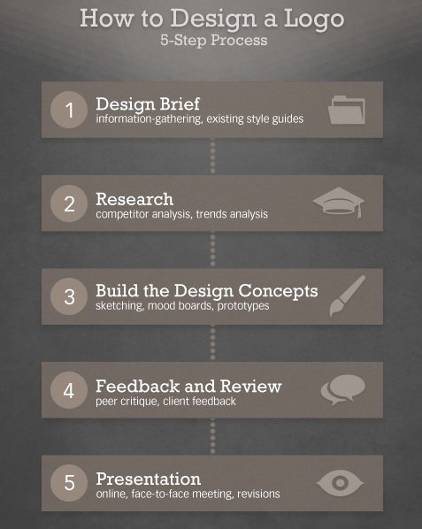
What if I told you there was a simple five step process you can use to create great quality logos? Seems to good to be true? It kind of is. There are no shortcuts to great logos, because you always have to put the work in during every step, but if your problems stem from not knowing where to get started rather than simply skimping on the effort, Martin Christie’s five step process may be just what you need.
Every designer might have their own work flow, but if you don’t have one in place you are sacrificing efficiency and most likely quality. Christie’s process starts where every good design should, with a design brief, and walks you through every step all the way up to the presentation. He simplifies it into the image below, but to get the full idea of the process, you should see it in his own words over at Design Instruct.
00TMOhttps://www.tulsamarketingonline.com/wp-content/uploads/2018/07/TMO-Logo.pngTMO2013-04-30 12:42:042013-04-30 12:42:04The Five Step Process To Great Logos
 CSS lets us do wonderful things as designers, but it can sometimes be a hassle. If you are super experienced, you may have learned to avoid the problems, but the majority of us are way to accustomed to beginning with a very simple CSS file, and watching it spiral out of control as you continue development.


