cssCSS has so many measurement units that it can be difficult to keep everything straight. Each measurement system has its own benefits, and it is easy to find yourself wondering which one is correct. Many designers just decide to use a single unit for everything, but you are limiting yourself by not putting some thought into the units you decide to use in CSS. Thankfully, demosthenes.info put together a great list of guidelines to help you pick the best measurement unit for the task.

Pixels (px)

Pixels are best used for hairline borders and general elements when creating fixed-width designs. It is also a good choice for CSS shadow displacement. But, when using pixels as your unit you need to avoid @media breakpoints, because they break pages when zooming – use rem or em instead.
Don’t use for: typography, except when setting a base font-size in a CSS reset.

Percentage (%)

This is great for making responsive images and containers, as well as setting height on the body in certain situations.
Don’t use for: typography, except in a font-size CSS reset.

em, ex

Use em or ex or typography and elements related to it, such as margins. However, as the guidelines point out, em and ex have subtle “gotchas” when used in complex layout. In this case, rem should be substituted.

Points and picas

These are only good for print stylesheets. Seriously, don’t use them for anything else.

rem

This is a more capable and predictable replacement for em and ex, that is best used for the same purposes, as well as @media query breakpoints.

Viewport units (vh & vw)

These are best for responsive typography and so-called “perfect” responsive containers.

Character (ch)

Use this for sizing and adjusting monospaced fonts, though browsers do have some issues with this unit.

A few weeks ago, select Firefox users noticed a new “card” layout in the About page for local listings. Beginning Tuesday, it appears the layout has begun to roll out world wide. Mike Blumenthal explained the new layout, saying:

The big difference is that the page now can be displayed in either a single, two or three column layouts depending on browser window width as opposed to the current fixed two column display. Reviews will now follow the same columnar structure as the rest of the page and will not be limited to a current one column display. While this view is not yet visible in mobile, one assumes that if the view were to become universal it would likely push to mobile as well.

The page adds three iconic based calls to action near the top; review, directions & photos. The review summary has been moved up the page and photos have been moved down the page. Geo information including street address, category, hours, description and map are now consolidated into a single card near the top titled “Contact Information. “Similar Places” from around the web no longer show and “reviews from around the web” have been moved up the page to be nearer the top.

But, with the change has come an issue with reviews, at least temporarily. As of Tuesday, the number of reviews listed in the information for local businesses has dropped or begun to show wildly inaccurate review counts. It is unclear whether the actual reviews have disappeared or whether the counts are the only aspect to be affected, but users are reporting as much as a 30 review count drop. It is safe to assume the issue will be resolved quickly as the new layout is ironed out.

You can see the new layout below:

New Local Layout

Source: Mike Blumenthal


Bing Featured VideoOn Monday, Bing rolled out a brand new music video search results page. The new feature allows you to search for a music video by song title, artist, or album, and users will see a box at the top of the results that highlights the most popular music videos related to the search, and a list of “Top Songs” for the query.

Bing’s result page collects videos from “leading sites including YouTube, Vimeo, MTV, Artist Direct, and more.” The videos listed beneath the featured video are ranked based on relevancy to the search, so an artist’s name will only mostly show their videos, while a search for a specific song returns more covers and amateur music videos.

Bing Videos Screenshot

Users are able to preview song’s without clicking by simply mousing over.

You will also notice a sidebar to the music video search results page which includes a related artist or related albums list so you can more easily find music in the same vein as you enjoy.

One nice little feature is that Bing has collected certain videos as they were originally ordered on an album. Search Engine Land reports a search for Pink Floyd’s Dark Side of the Moon results in Bing listing the songs in the original order along with the featured video.

Bing-music-video-Dark-side-of-the-moon-600x192

Google AdSenseIt seems something odd is happening over at Google AdSense. While there is always a pretty much constant stream of complaints coming in about drops in CTRs (click through rates), they are usually isolated cases. Most often, an individual is simply experiencing a problem and their issues are easily resolved.

But, over the past week there has been an unusually large number of people complaining at both the Google AdSense Help and WebmasterWorld forums that their CTR have declined significantly in the past weeks. As Barry Schwartz noticed, not only is the number of threads enough to raise an eye, but there are some who are saying this is having a big impact on their earnings. Clearly something is afoot.

Some quotes from commenters include:

My blog traffic still increasing but adsense earnings dropped from three days. I have a message from adsense help as “Your earnings were 76% below our forecast”.

and

At the risk of getting screamed at for asking this question (yet again). My ctr went down the last 3 days (Sunday,Monday, Today) a whopping 75%!

Not everyone is experiencing the drop in CTR (Schwartz himself has seen an increase), but this appears to be a widespread enough issue to cause some alarm. The world isn’t ending, but you should probably check out your own CTR to make sure everything is alright.

Google-Webmaster-Tools-LogoThere’s a new manual action showing up in Google Webmaster Tools, according to Jessica Lee from Search Engine Watch. Webmaster Tools was updated over the summer so that site owners could be notified when a specific type of manual action had been taken against the site, and since then the waters have been fairly quiet. This new type of manual action, referred to as “image mismatch” is the first change we’ve seen since then.

Google says:

If you see this message on the Manual Actions page, it means that some of your site’s images may be displaying differently on Google’s search results pages than they are when viewed on your site.

As a result, Google has applied a manual action to the affected portions of your site, which will affect how your site’s images are displayed in Google. Actions that affect your whole site are listed under Site-wide matches. Actions that affect only part of your site are listed under Partial matches.

If you end up receiving that message, it is up to you to ensure that your site is showing the same images to users both on your site and within Google image search results. It is possible “anti-hotlinking” tools can cause the issue, so you may have to look through your site’s code on the server.

As with all manual penalties, once the problem is fixed you have to submit your site for reconsideration and wait. And wait. And wait. Eventually, after you’ve waited for what seems like forever, you’ll get a message in your Webmaster Tools account informing whether the manual action will be revoked after review.

Manual actions are penalties at real, living Google employees have placed against your site after determining that you are violating Google’s guidelines. The majority of manual penalties have related to outright spammy practices such as user-generated spam, hidden text, and unnatural links.

rip-offersAfter an underwhelming debut in February, it appears AdWords Offer Extensions is being sent to the grave in favor of Google Offers. Ginny Marvin explains that AdWords Offer Extensions was intended to allow advertisers to dedicate extra real estate in their search ads to promoting in-store coupons and discounts. There was little excitement surrounding the announcement, and a new alert informs users that Offer Extensions was sent to the chopping block on November 1st.

The alert was posted on the support page for Offer Extensions. It reads:

Starting on November 1, 2013, we will no longer support offer extensions in AdWords. On that date, offer extensions will stop showing in your ads and offer extensions reporting will stop showing in your account. No action is required.

We recommend reviewing your campaigns to ensure your messaging continues to fit your goals. To retain offer extensions reporting for your records, remember to download campaign reports before November 1. Consider using sitelinks or Google offers to promote your deals and offers in the future.

On the other hand, on October 24, Google announced an updated self-service tool that allowed US businesses to create Google Offers. This way, consumers can use their smartphones to redeem and save coupons and promotions. These offers are distributed through Google Maps, Google+, Google Wallet, and the Google Offers app and website. It appears Google is putting their investments into turning Google Offers into a success, rather than trying to force AdWords Offer Extensions to catch on.

It is hard to ignore how quickly mobile traffic has grown to become an essential part of how people access the internet, but there are still a fair amount of brands burying their heads in the sand and pretending nothing has really changed. It is almost astounding to see how many are stuck in the past and refuse to invest in going mobile. With some brands estimating that half of their traffic comes from mobile devices, it is clear that brands who refuse to step-up are going to begin suffering very soon.

We know how popular smartphones and tablets are now, but we don’t actually know how much of all online traffic comes from these devices. Some analysts estimate as low as 15 percent of all traffic is coming from mobile devices, while others have said that as much as a third is coming from non-desktop devices. With such a large range, it has difficult to discern what the exact amount of mobile traffic is, but these studies do give us insight into the direction things are going.

Mobile Traffic Report

For example, Greg Sterling reports that public relations firm Walker Sands released their latest quarterly index of mobile traffic to their clients’ websites, and they estimate 28 percent of their clients’ traffic is coming from smartphones and tablets. The problem is their sample is too small for their estimate to be very relevant when dealing with the big picture. However, because of how regularly they compile and release this data, we can use their report to see the direction the market is going, and the market is largely going mobile.

Walker Sands actually found a small drop from 29 percent of traffic coming from mobile devices to 28 percent, but those numbers are a big leap from 17.5 percent at this time last year, and a one percent drop in mobile traffic isn’t large enough to draw any conclusions that mobile traffic is faltering.

It becomes even more apparent that mobile is becoming a hugely important consideration for online marketing when you consider that Facebook currently estimates that a third of their users access the site strictly from mobile devices and Yelp says that 59 percent of their searches are now coming from mobile.

The big takeaway, as Sterling points out, is that marketers are doing themselves a massive disservice by ignoring mobile traffic or even by just treating mobile traffic as secondary. Every marketer should be taking mobile traffic seriously, and not treating it as secondary. For some markets, it may even be best to put mobile ahead of desktop in their priorities.

Android

Source: Google

Smartphones have revolutionized how we browse the web, but most browsing still happens within the same web browsers we have all grown accustomed to. For the most part, we do our searches and actual browsing from Chrome, Safari, or Firefox, while we limit our apps to games, reading the news, or taking care of business. But, that all could change in the near future.

Google announced late last week that they would begin allowing Android app developers to have their app content indexed. That content will then be able to be opened directly through apps on Android devices. It is a large step towards a more seamless user experience on smartphones and tablets, rather than the disjointed experience we currently enjoy.

Googlebot has been improved to be able to index the content of apps, either through a sitemap file or through Google’s Webmaster Tools, though the feature is currently only in the testing phase. This means the indexing is only currently available to a small selection of developers, and signed-in users won’t begin to see the app content in their result for a few weeks.

The update means that searches will be able to return information from app content, which will then open directly in the intended app. For websites which tend to offer the same content on both their website and their app, such as news sites, it means users will be able to pick their desired experience, whether it be from within the browser or within the app.

Jennifer Slegg reports that app developers can sign up to let Google know they are interested in having their apps indexed by filling out an application of interest. Before you do though, you should know that your app must have deep linking enabled, and you will have to provide Google with information about alternate URLs either within their sitemap or in a link element within the pages of their site.

Indexing is only available for Android apps currently, and Google has yet to comment on when or if they will extend the capability to iPhone or Windows apps.

Creating a website that works well on the huge range of devices is no easy task. In fact, creating a website with a solid user experience on every device being used to access your site may actually be impossible. You have to account for a variety of screen sizes, creating a site that loads quickly enough to keep a user from losing interest, and the fact that no everyone has the newest devices for browsing the web. In fact, many are using devices that are quite outdated, which can be an issue for modern designers.

Responsive design is the popular solution for these problems, but it isn’t a magic fix. Responsive design methods certainly make it easier to account for the huge range of devices connecting users to information, but without relentless testing and tweaking there will invariably be a few devices which run into problems accessing your website.

However, responsive design is still the best current solution for these issues. Your only real alternative solution is creating different websites for mobile and desktop users, but this still requires massive amounts of testing to make these sites usable for every device. It makes more sense to do all that work towards a single site, rather than two.

As Marianna Gallano explained, the most common approach to responsive design is to split pages into multiple elements, such as the header, image galleries, and product descriptions. Each element stands on its own in terms of functionality, but seamlessly transfer their look and user experience to various devices and screen sizes. This way, images are able to automatically scale and resize, while text always stays legible, even on the relatively small screen of a smartphone.

WhoIsHostingThis, a site covering news for webmasters and webhosting, created an infographic to break down what responsive design really is, why it is so important, and how each element of a site functions within the whole while responding to a variety of screen sizes.

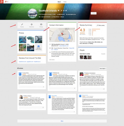
No matter how bad of shape your website is in, Google will crawl it. Google crawls and indexes seemingly the entire internet. Though we know they may not look as deep into low-quality websites, that doesn’t mean they haven’t at least crawled and indexed the landing page. It takes something truly special to keep Google from crawling and indexing a page, but there are two common mistakes that can actually manage to keep Google away.

Technical SEO is one of the most difficult aspects of optimization to grasp, but if you are making these two simple mistakes, it can keep search engines, especially Google, from correctly indexing your websites. If your site isn’t getting correctly indexed, you have absolutely no chance of ranking well. Until you fix the problem your site is going to be severely crippled, so it is imperative you aren’t ignoring these issues.

1. The 301 Redirects on Your Website are Broken

It is a commonly accepted practice to use 301 redirects after a website redesign. As Free-SEO-News mentioned in their latest newsletter, using these redirects properly allows you to retain the ranking equity you’ve built with your website, rather than having to start again from the bottom.

The problem is when these 301 redirects aren’t implemented properly. Even worse, sometimes properly working redirects can suddenly falter, so you can’t place your faith in the redirects working correctly forever. Code changes, new plugins, or broken databases can cause your working 301’s to begin linking to non-existing pages.

Broken links are an automatic wrecking ball to all your efforts building a solid link portfolio. The best way to ensure that all your links are working is to download a website audit tool, such as SEOprofiler, which automatically checks all of your links and redirects. If your links or redirects suddenly stop working, you will be warned before you start getting punished by the search engines.

2. Rel=canonical Attributes Are Causing Problems

Just as with 301 redirects, the rel=canonical attribute serves a legitimate purpose when used correctly. The attribute can help you avoid problems with duplicate content, but those using the tag without knowing what they are doing can find themselves with some major issues.

Two of the biggest faux pas that we see regularly committed by site owners are to add a rel=canonical attribute which points to the index page to all web pages or to other pages that use the ‘noindex’ attribute. In both scenarios, Google won’t index the web pages at all.

The best advise is to simply stay away from the rel=canonical attribute unless you are absolutely sure what you’re doing. The only proper time to use the attribute is on duplicate pages, and anywhere else will result in significant problems. The problems that can come from using the attribute incorrectly are much worse than those you might see by failing to use the tag on duplicate pages.