The simple goal for your AdWords campaign should be to get the most conversions possible while spending the least money possible. If you have a good ratio here, you’re likely doing everything right. However, there are plenty of potential pitfalls to avoid in order to lose out on conversions or spend way too much in getting them.

Check out Patrick McDaniel’s tips at Business2Community and find out if you could be saving money somewhere or getting more out of your campaigns.

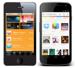
Responsive design is definitely the most talked about web design method right now, especially when discussing designing for mobile. It isn’t the only option though. There are three real options currently and each has its own pros and cons to them. Choosing the way you interact with mobile customers should reflect the type of business you are running and what you hope to accomplish.

Source: Flickr

Responsive Design – Though it is well covered, responsive websites are those that adapt to different sized screens across all platforms, from mobile to tablet to desktop. The idea is that you only build one website for everyone rather than different sites for all different devices. That time you would have spent designing sites for different platforms will have to be spent testing your one site on all of the devices. It also removes some of the ability to customize sites for certain devices.

Mobile Sites – A mobile site is optimized for that specific section of on-the-go customers. The sites are usually minimal, with large, finger-friendly buttons, and they load faster than responsive sites. This allows more direct control of how sites appear on different devices, but more importantly, the content selected to appear is tailored for the mobile demographic accessing it.

Native Mobile Apps – If you own a smartphone, you know what an app is. They are specific to their platforms so they have the benefit of being able to curate mobile content like websites do while further focusing on the differing needs of different platform users.

All three have their merits. Responsive websites create a sense of consistency and deliver the full experience of a desktop website in an accessible form for a specific device. Some hail it as a time saver, which isn’t quite true, but it does allow you to spend equal time on a site for all devices. Mobile sites and apps load faster and cater to specific audiences, while allowing them to act immediately.

Diksha Arora compares the three against each other at Vandelay Design. If you don’t know what is best for your business, she can help you identify your needs.

It is impossible to understate just how quickly SEO changes and how important it is to keep up. Strategies change, and search engines update countless times. Google’s Penguin and Panda updates are clearly the most talked about, but Google has had plenty of other updates with less catchy names throughout the last year, like the Knowledge Graph (okay, that one has a catchy name too).

Penguin and Panda changed the landscape of searching completely and strategies have had to adapt to them quickly, though SEOs not taking advantage of gray area SEO tactics like link buying were mostly unaffected. That doesn’t mean that they don’t have to follow the new guidelines as well.

Most of these guidelines are more broad however, but Don Pathak, writer for Search Engine Journal, tried to simplify and explain them, and in doing so came out with a few specific points.

Many writers, usually with vested interests, have argued that SEO success can’t be done with just great content, and it is true to an extent that the internet is competitive to the point where great content doesn’t quite get you to the top search result. However, Google has also made it very clear that it wants to favor the quality of content over SEO tactics. Keeping a site fresh and relevant will give you as much of a boost as any behind the scenes tweak can.

The new Google also favors locality, so if your business has a local presence in a marketplace, optimizing for that location will help customers find your service. You can get started by simply establishing a local profile on Google Places for Business, and encourage customers to give you reviews on the site.

SEO will likely always concern itself with the technical dealings behind the curtain of a website, but Google wants to give preference to those who operate valuable and well made websites, not those manipulating every loophole to get the market advantage. As with anything run mostly through algorithms, there will always be “hacks” or weaknesses, but rather than exploiting them as they open, it is better to just create a website with real value.

For users, the biggest factor in whether they will stay on a page is the usability and user experience of the page. They want it to look pretty, obviously, but even the nicest looking pages don’t keep their visitors unless the page functions the way they want.

There are hundreds of thousands of books about web design and user experience (UX), and even textbooks preaching specific ways to guide users throughout a site. So why does a site that breaks every rule of design continuously draw scores of news seekers and win design awards all over the place?

Mail Online is a British tabloid-type of news source with celebrity gossip, indignant moral opinion pieces, and of course “coverage” of breaking news. The recent Oscar Pistorious case held the same pagespace as a headline about Amanda Bynes. The site is also heavily addicting, even for those like me who try to be picky about their news sources. It outperforms almost every major news website including The New York Times and Britain’s The Guardian.

Mail Online’s disregard for traditional web design rules is apparent from their scrolltastic front page, which would be close to four foot long if printed out and laid end to end. They draw reader’s immediately by removing all advertising on the front page and doubling the rate of ads everywhere else.

The news source’s site is like a maze that you can’t ever be totally lost in. Sidebars have over 50 stories, each with images, and a visitor can end up pages deep before they realize they haven’t been to the front page, but they don’t feel lost. The feeling is similar to Wikipedia’s site structure where visitors follow links down the rabbit hole, but are still connected with almost every navigational tool the front page offers.

Kelsey Campbell-Dollaghan explored Mail Online’s rule-breaking design innovation more at Co.Design. I’m unsure whether this type of rule breaking is actually good for web design, but I have always been attached to overly designed styles which emphasize aesthetics. Mail Online suggests that aesthetics may actually be holding back design.

Any time Google’s Penguin or Panda updates are mentioned, site owners and bloggers alike work themselves into a mini frenzy about the possibility that their totally legitimate website might have been penalized. It’s warranted, in a way, because a few innocent bystanders have been affected, but largely Google is policing those breaking the rules.

Meanwhile, bloggers have tended to downplay just how much rule breaking there is. Black hat SEO is treated as a fringe issue when in reality it is a huge issue. Writers tend to focus on a small aspect of black hat SEO in which competitors use shady links and other SEO tactics to bring your site down, and that is incredibly rare. Google considers all explicit spam to be black hat, and with that definition, black hat SEO is the most pervasive type of SEO around.

It is also the type of spam Google spends most of their time fighting. Matt Cutts, Google’s webspam team leader, took to YouTube recently to answer a question about how many notifications Google sends out to website owners, and 90% of Google’s manual penalties are still spent on blatant spam pages.

Google sends out hundreds of thousands of notifications each month, but the chances of your common SEO or website owner seeing one are rare. There is a chance though. The other 10% of notifications focus on problems that SEOs who have fallen out of the loop or novices may have gotten sucked up into such as link buying, link selling, or even hacking notifications.

When marketing your business through social media, it can be easy to hit a proverbial wall and decide that everything worth doing has already been done. When you find yourself stuck in this rut, it can be extremely helpful to read about the innovative ways other companies are using social media. This will hopefully inspire you to put your own spin on a particularly interesting or engaging campaign, rather than solidify your thought that everything has already been thought of.

David Moth has a fantastic list of excellence in social media at Econsultancy. Some even come with a disclaimer that they’re no longer possible since they bent the rules of a specific social media platform, but that should encourage you to bend your own rules.

The debate between skeuomorphism and flat design has been covered thoroughly, but when I talked about it I found it hard to think of many examples of flat design. Possibly because I largely use Apple products or because flat design is a new-ish trend, I find myself interacting with skeuomorphic design interfaces much more often than flat design schemes.

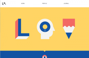
That doesn’t mean there aren’t plenty of sites out there using the ideas behind flat design to create striking pages. For those unfamiliar, flat design is a style that drops all forms of imitation of depth or “realism” in favor of designing based on the flat screens we actually use. A great deal of new sites are using the style to create clean, minimal pages that emphasize simplicity and interaction, and Chris Spooner compiled a list of sites that have sprung up using flat design, complete with images for each website.

The actual debate between the two design methods is of course overblown. Some writers act as if the schism will decide the future look of the internet in the same way VHS and Laserdisk competed for how we watched movies at home. Unlike that type of competitive market, neither is “better” for the internet, though one may be more suited for your current project. These pages definitely make it clear that flat design can inspire creative and user-friendly interfaces just like skeuomorphism can.

New business have a lot to manage in a short period of time if they hope to be sustainable, and one of the most important marketing tools they can use is SEO. Establishing your company online is a huge step towards establishing your business in your community, and the only way to get popular online is to have a website showing up in the search rankings.

In the past, creating a respectable website with good content would have been enough to get your page on the search results page, but the internet is now an incredibly competitive arena. To get your website on the front page, you have to create great content while also managing a number of ranking signals that Google and Bing use to rank websites.

These signals are read by “bots” or “spiders” that index web pages and all of their internal information, which are sorted by algorithms that decide what pages get ranked where. There are seemingly countless signals, and it can be overwhelming when you are just getting started.

Startups trying to understand SEO often feel completely confused by the barrage of technical information out there, but there are some basic steps you can take to get started. Sujan Patel has five rules you can apply to running your website which will help any fledgling business firmly ground their online presence.

Source: RBertelg/Flickr.com

Source: RBertelg/Flickr.com

Website owners and SEOs have to budget their time wisely. There are a billion different ways you can try to gather traffic, but some are more effective than others. Of course, anyone that preaches that they have a quick way to get visitors is probably pushing questionable or outright terrible practices that won’t actually work, but there are also methods out there that under perform because they have become outdated or just fail to understand the field.

Sujan Patel put together a list of seven of these SEO tasks that waste precious time at Search Engine Journal. Some of these tasks are harmless, but don’t have any actual value. Checking your site traffic every day can be tempting, especially to new site owners. There is a legitimate thrill to seeing people begin to trickle onto your content, and the number of visitors is a helpful metric to keep note of, but checking traffic every day focuses too much on individual visitors and not the overall trends in traffic. Trends in traffic numbers give you much more useful information than seeing every single visitor arriving on your page.

Some of the other tactics Patel points out are downright frowned upon by the SEO community, and the Search Engines are trying to put a stop to them. Buying backlink packages was nothing more than a scheme to get sites to the top of rankings without having any actual value. It was a loophole that many took advantage of, but it has absolutely no real worth, and Google’s algorithm updates have made it very clear that the practice isn’t tolerated anymore.

Monitoring keyword density, unlike the past two, used to actually be fairly useful, but it has absolutely no function in the current SEO climate. Keyword density was never quite as important as some made it seem, but for a period Google’s system did favor sites with a reasonable amount of keywords within the content. That is pretty much completely gone now, and the more advanced search engines favor natural sounding content rather than overstuffed robotic sounding paragraphs.

Patel has even more tasks that are draining your time without giving anything back. It is easy to be tempted by easy paths to high rankings or to fall out of touch with the constantly changing SEO world if you let it happen. The best way to know where to focus your energy is to keep up to date with everything happening in SEO regularly, and to look for practices which offer long-term, sustainable growth for your site.

Source: Flickr

Typography lagged behind a lot of innovation online for years because of constrictions on font use. Text on the internet relied on a few fonts that would be on almost every visitor’s computer, and even then you were doubly limited by text legibility. Web-safe fonts opened the doors a little for designers, but they also created their own set of unique problems.

It hasn’t been until just recently that creative typography became easily achievable and widespread online thanks to a few technological jumps. Higher display resolutions, more control over text, and the wonderful @font-face implementation has made typography not just a creative flourish, but a necessary concern when trying to make a gorgeous site.

Whether or not this is related to the burst in popularity for typography in design as a whole is hard to tell, but it is hard to deny that while the internet has been making typography easier, more traditional designers have also been enjoying a renaissance for calligraphy and innovative use of text.

Paula Borowska is as big of a typography lover as I am, and she agrees that 2013 is going to be huge for online typography. She predicted the typography trends for this year over at Designmodo, and it is interesting to see how many of her predictions are parallel with the wider trends for web design at the moment. The first trend she mentions, an increased utilization of white or negative space, has been on every web design list for this year, and it is hard to deny that eye-popping use of text has helped push minimalistic design to new heights recently.