Choosing the right font has always been one of those tasks that sounds deceptively easy, but can slowly drive you crazy. It has become easier thanks to new websites with better searchability, but if anything we are now dealing with the problem of too many options. While we used to have to scavenge for the best fit from the low quality fonts available for graphic design ten or fifteen years ago, now we have to choose the exact best fit from countless options.
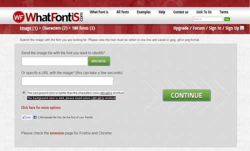
Thankfully, as with all design quandaries, there is a new tool to help us out. WhatFontIs allows you to find the exact font you are looking for by uploading an image containing the font or directing the tool towards a URL with the font present on the page.
All in all, the whole thing only takes around 10 seconds. You upload the image or enter a URL, then you confirm the letters the website recognized. From there, you’ll be given a list of font options that you can easily download. It is as easy as it sounds, and if for some reason, you can’t find the exact font you’re looking for, you will almost definitely be given an option that will get the job done well. They currently have a database cataloguing around 280,000 fonts, so you’ll always have options.
00TMOhttps://www.tulsamarketingonline.com/wp-content/uploads/2018/07/TMO-Logo.pngTMO2013-08-27 12:58:462013-08-27 12:58:46A New Tool Finds The Right Font For You
Chances are no matter what medium you work in, you consider yourself a designer. Not a web designer, or a print designer, but simply a designer. It is increasingly rare to find a designer that restricts themselves to a specific medium. Why should they when they have almost limitless possibilities for matching their design to the best medium?
The biggest distinction that still lies between digital and print design is the language. Every medium has its own technical jargon, and as a designer it is important for you to understand and be able to speak the language. Even if you think you don’t, Carrie Cousins points out there is a good probability that at some point a client will ask for print components to go with the website. Eventually a client will want to be able to put part of the design onto posters, or business cards, or pamphlets.
You don’t want to be caught off guard and look amateurish in that scenario, and getting informed isn’t difficult. All you need to do is add some new words to your vocabulary. Design Shack put together a list of the ten most important terms. I’ve explained some of them below, but there are always more terms you could learn to be a more rounded designer.
1) DPI
Dots per inch is a literal measure of printing quality. Many traditional printing methods still being used today work by creating tiny dots to create an image. The more dots used per square inch, the higher quality and accuracy of the detail. Most print jobs use 300 or 600 DPI, but lighter papers require lower DPI to prevent color bleed and over saturation.
Many programs include settings to increase or decrease DPI, but the settings only refer to print design. Increasing the DPI will increase a file size, but it means absolutely nothing to digital projects because screen resolution is measured using pixels, not DPI. DPI can improve the quality of printing, but it doesn’t intrinsically affect the quality or size of an image.
2) CMYK
Digital designers are familiar with the RGB color profile, but printing uses a CMYK color model. The CMYK model refers ro a four-color (or plate) process of printing where each letter refers to a color used in the process: Cyan, Magenta, Yellow, and Black (K equals black).
This means any design you create on a computer for a print design needs to be created with CMYK profiles so that the color is accurately reproduced. Many printers will even require that a job be converted before being submitted. Above all it creates consistency across all print jobs.
3) Large Format
Large format refers to any project that needs to be printed on a specialty printer, usually larger than 16 by 20 inches. Usually these types of print jobs are for banners, posters, and sometimes billboards. These types of projects are also made to be viewed from afar, and are usually rather low quality or pixelated up close. From a distance however, they look great. It does require a high quality image to print these projects, but they also tend to be printed at lower DPI.
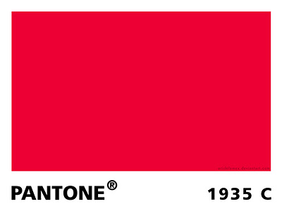
4) Pantone Color
Pantone is the worldwide standard for color. The company has been around since 1963, and they have established a universal system for understanding and matching colors created by mixing a set of standard colors in precise combinations. This way, they can be precisely printed across different presses and substrates.
The colors are identified by number, but what sets the system apart is the detail they take into consideration. They include information on how to account for different types of paper based on a lettering system.
5) Overprint
Overprint is exactly what it sounds like; it is the process of printing on top of other things. Specifically overprint is when inks are printed directly on top of each other. The effect ca be used to create special effects, but it can also create issues during the printing process if not taken account for. The most common issue is the use of pure black, which can become richer when overprinted, and tends to overwhelm images. Instead, it is suggested to use rich black created with all four color plates to prevent overprinting.
00TMOhttps://www.tulsamarketingonline.com/wp-content/uploads/2018/07/TMO-Logo.pngTMO2013-08-22 14:10:242013-08-22 14:10:24The Most Important Printing Terms for Web Designers
Web design has a love of all things retro. You can’t scan the web for long before you come across a site with faux wood textures or faded and breezy images influenced by the aesthetics of another time. These old styles are even large parts of current design trends such as flat design and the new found focus on typography. Designers are constantly taking the old and turning it new again.
Some choose to lean more heavily into the retro styles than others. While many flat designs owe debts of gratitude to minimalist styles of the 50’s and 60’s, you usually wouldn’t confuse the two. Others however do their best to emulate the styles of earlier times as closely as they can, but translated into a digital medium.
Going retro is a popular style for many brands and artists, and it isn’t any more difficult to achieve than most other current design aesthetics. Designrfix recently shared tips to really get the look and feel of older times, if you want to try it out for yourself.
Think Retro – The first step is getting inspiration. It can be difficult to detach yourself from your contemporary ideas of good style, and the best way to do that is go directly to the source. Search out old magazines and newspapers, any sort of graphic media from the time you can find. There is a huge amount of it online, and you’ll be able to get inspired within just a couple searches.
Focus on Simple Shapes – Vintage and retro styles are characterized by simplicity. Designs of the past relied on impact to grab attention, and this was usually achieved by using very simple shapes like circles which demand attention. Consider a circle surrounded by decoration, or blocky and heavy arrangements.
Limit Your Use of Color – Modern designers have it easy. We can use any assortment of colors we want on the web, even down to slight shading choices. Designers of the past were limited by the expense of full color printing, so they often relied on two-toned coloring to come up with colorful designs without breaking the bank. Using black-white, orange-yellow, or cream-brown color combinations will immediately make viewers think of older printing styles.
Retro Typefaces and Fonts – As previously mentioned, big typography in retro styles is an absolute necessity of a vintage site. The style has grown some legs on its own, but it still is a defining trait of older styles. You need to choose a font reflective of the era you want to reflect. Using the wrong typeface can seem anachronistic or lazy, so take your time and get it right. Check what designers were using in the era you’re emulating and find something similar online. It shouldn’t be hard to do so.
Borders – Borders have always been a big part of design, and ornamental borders were definitely a big part of making older designs attention grabbing. Frame your images and content in borders and simple shapes and you’re site will already look pretty retro.
Badges – Interestingly, if you look at websites with retro designs, you tend to see lots of badges as buttons, even though badges weren’t actually a big part of designs in the past. Still, these badges remind users of county-fair days and older times, while also standing out on the page and drawing attention. It is a simple addition that works better than it should.
Using the Right Texture – Well used textures can make a boring page feel stoic and formal. They can entirely define how a page feels, and can certainly make a page feel more retro. The trick is subtlety and integrating the texture into the layout, not simply laying it over things.
00TMOhttps://www.tulsamarketingonline.com/wp-content/uploads/2018/07/TMO-Logo.pngTMO2013-08-20 13:02:372013-08-20 13:02:37How to Make Your Website Look Retro
How fast does your website load on mobile devices? Under five seconds? If you said yes to the second question, you are probably pretty happy with your answer. What about under one second? Probably not. But that is how fast Google says sites should load, according to their newest guidelines for mobile phones.
Before you start freaking out at the suggestion their site is supposed to load in under a second, it should be clear that Google isn’t mandating an insane guideline. They don’t actually expect most websites to completely load that quickly. Instead, they are focusing on the “above the fold” content. They think users should be able to get started playing with your page quickly, while the rest can progressively load.
It is probably a wise insight, considering most mobile users say they are more likely to leave a site the longer it takes to load. On smartphones, every second really counts, and if you can get the above the fold content loaded within a second, most users will be happy to wait for the rest of the content while they start exploring.
“…the whole page doesn’t have to render within this budget, instead, we must deliver and render the above the fold (ATF) content in under one second, which allows the user to begin interacting with the page as soon as possible. Then, while the user is interpreting the first page of contents, the rest of the page can be delivered progressively in the background.”
To match with the new guidelines, Google also updated its PageSpeed Insights Tool to focus more on mobile scoring and suggestions over the desktop scoring. They also updated scoring and ranking criteria to reflect the guideline changes.
00TMOhttps://www.tulsamarketingonline.com/wp-content/uploads/2018/07/TMO-Logo.pngTMO2013-08-15 11:18:102013-08-15 11:18:10Google Updates Mobile Guidelines With Focus On Loading Times
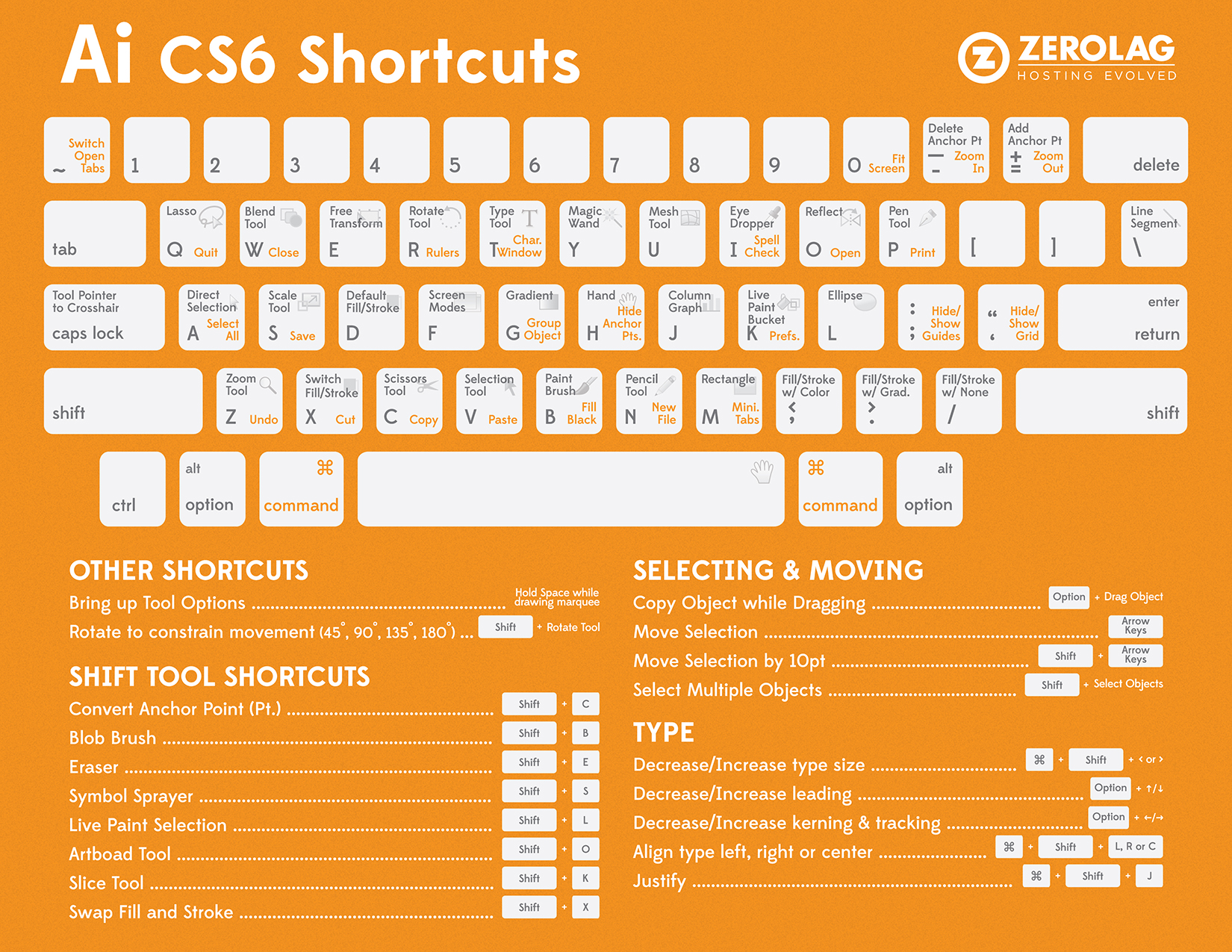
Adobe Illustrator is almost as important to web designers and creative professionals as Photoshop. For some, it is even more essential. Most of the veterans probably have every keyboard shortcut memorized, but when you’re getting started it can take quite a while to really get the shortcuts down. Thankfully, the folks at ZeroLag put together a cheat sheet so you can always quickly find the shortcut you need. Before long, you’ll know them like the back of your hand.
Before you can use the cheat sheet, you’ll need the key to understand the image. The grey text show Adobe Illustrator tool shortcuts, while the orange text stands for an action shortcut. The tool shortcuts only require you to press the corresponding key. The orange shortcuts require you to hold the Command key, then press the action shortcut indicated by the orange text.
There are also a multitude of shortcuts not shown directly on the keyboard. Some are listed below on the graphic, but over time you’ll find even more that wouldn’t fit. They are usually found through a combination of the Command or Shift button and a specific letter key.
It can seem overwhelming trying to commit all of these shortcuts to memory, but the ones you use regularly become second nature extremely quickly. For all the others, you’ll save more time by checking the cheat sheet rather than searching through all the menus in the program.
00TMOhttps://www.tulsamarketingonline.com/wp-content/uploads/2018/07/TMO-Logo.pngTMO2013-08-12 11:45:462013-08-12 11:45:46Adobe Illustrator Cheat Sheet Saves You Time
Colors do more than most people give them credit for. In web design, they aren’t just physically helping define a page. They can set a mood, establish trust, excite viewers, and define your brand. Colors can help a company secure their professional image or severely damage it. Colors can be out of date, and they can be hip or trendy.
Red is a color with perhaps the strongest associations, possibly because it is such a bright, attention grabbing color. It is such a dominant color, it seems to always be extroverts favorite color.
These associations tend to be dramatic connections. Red is normally associated with passion, danger, sacrifice, blood, passion, fire, beauty, and anger. In contrast, in many cultures the color is associated with happiness and love.
Because of these dramatic associations, red is one of the most powerful colors for expressing moods or grabbing attention in all types of media. It encourages appetite, inspires activity, and evokes emotion all depending on the shade used. Pale shades like pink can be soft and feminine, while pure bright reds can be harsh, aggressive, and overbearing. Meanwhile, deep dark shades of red like crimson can evoke warmth and comfort or creepy sinister vibes.
As you can see, red is one of the most versatile colors on the spectrum. If you can choose the right shade for your design, you can create heightened emotion and attention with ease. Or, you can pair it with white and black to create a formal, professional perception.
Due to its incredible versatility red is obviously a popular color on the web and in all other kinds of design. Onextra Pixel has a showcase of websites using red in many different ways to portray a huge variety of moods and emotions.
00TMOhttps://www.tulsamarketingonline.com/wp-content/uploads/2018/07/TMO-Logo.pngTMO2013-08-08 12:49:252013-08-08 12:49:25What Does Red Mean in Web Design?
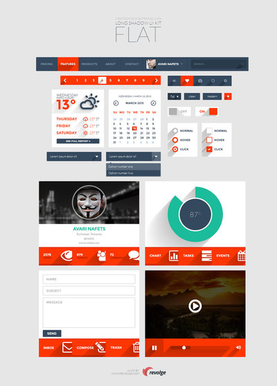
Flat design has officially become commonplace, but it is hard to tell how long its offspring, long shadow design, will last. At first glance, it seemed long shadow design would just be a small isolated derivative from the popular flat style, but it seems to have taken on a life of its own by providing a sense of depth while still maintaining a flat and minimal aesthetic.
For those who have yet to run into the style, it is characterized by appearing largely similar to flat design, but with a 45 degree angle that extends much further than any standard dropshadow would. Onextra Pixel estimates the shadow is around 2.5 times the size of the object normally.
If you want proof of long shadow design’s spread through the web design community, look no further than the number of free resources being released to make implementation quick and easy. Onextra Pixel has highlighted two over the past week alone, and there are many more included in theirs and other sites’ weekly round-ups of resources.
The first resource is a simple set of icons created by Christopher Behr that cover all you basic needs from music, settings, messaging, mail, and social media icons. They are all clearly inspired by the Apple icon style, while bringing long shadow aesthetics to the table.
The other free offering comes from a Bucharest based design and development studio called Responsive. They are giving away a complete long shadow flat UI kit which will make development a breeze.
Who knows if long shadow design is going to pass out of favor in the coming months, but it is currently riding high on the back of flat design. It certainly offers a solution to flat design’s complete rejection of depth while still providing a sleek and clean design.
00TMOhttps://www.tulsamarketingonline.com/wp-content/uploads/2018/07/TMO-Logo.pngTMO2013-08-06 14:39:102013-08-06 14:39:10Long Shadow Design Resources Make The Trend Easy To Implement
Navigation has always been one of the most important aspects of a website’s design. If you can’t move throughout the site, chances are you won’t use it. However, navigation is also one of the few site design aspects with no tried and true solution. What might be right for me, may not be right for you.
Of course, there are some pretty good criteria you can use to judge what type of navigation you need. A small site can get by with a simple drop-down menu or the basic “three line” toggle menu. Larger sites have a much trickier task. They can use “mega menus” for their desktop version, but they will need another option for the mobile site.
Thankfully, most menus aren’t created from the ground up, so you can experiment fairly easily. Paul Andrew from Speckyboy compiled 15 jQuery plugins for navigation. They’re even responsive. Once you’ve found the one that matches the needs of your site, you can customize it and make it truly feel like a part of your website.
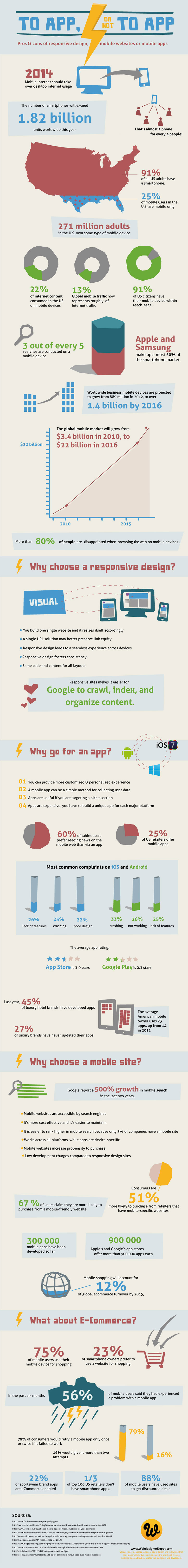
Every brand with a reasonable web presence should be aware of the importance of making your content accessible to the legions of smartphone wielding consumers out there. Nearly everyone has a smartphone now, and mobile web use shows absolutely no signs of slowing down.
But, “going mobile” isn’t exactly an exact science. There are many options for a mobile strategy with pros and cons for each. Of course, at this point the most popular options are building responsively, building a mobile only site, or building a mobile app.
Responsive design takes a bit of a one-size-fits-all approach and relies on the assumption that everyone wants to interact with your content in the same manner, but mobile sites split traffic and create numerous logistical issues. Building a mobile app on the other hand can be an incredible part in establishing yourself on the mobile web, but it simply can’t replace having an actual website.
So how do you decide what approach to take? For most brands, I personally would suggest an approach combining responsive websites and a mobile app, but many companies don’t have the resources to do both as well as they need to be done. That’s when it becomes decision time. To help make the decision, the folks at Web Designer Depot put together an infographic (seen below) to show the facts about mobile design, and going into more detail about the benefits and drawbacks.
00TMOhttps://www.tulsamarketingonline.com/wp-content/uploads/2018/07/TMO-Logo.pngTMO2013-08-02 11:08:182013-08-02 11:08:18How Do You Choose The Right Mobile Solution For You?
It is a little ironic that most web designers hate coding. We’re all familiar with it, and we’ve all spent sleepless night chugging coffee and endlessly editing code until we feel like we’ve lost touch with reality. But, the best coders realized the entire process can be simplified and sped up with all the free tools available online.
Web Design Ledger created a “cheat sheet” of tools and resources designers can use to cut through the fog of coding. You’ll never be able to completely escape coding, but you can at least make it as painless as possible.
Code Editors
One of the main tools any designer should already have is a code editor such as Sublime Text 2. Back in the dark days of coding, many designers were forced to create Notepad files that seemed to endlessly drag on as they were filled with line upon line of code, but no one should know that pain in these days. Code editors can help you quickly jump between the tags you want to work on, and best of all, they highlight problems in your code as you write. To anyone who has ever searched for hours trying to find the proverbial needle in the haystack, that alone is reason to find a new editor to use.
CSS Pre-Processors
CSS is notorious for spiraling into obscenely long and confusing script that becomes eventually unworkable. Sass (Syntactically Awesome Style Sheets) is a meta-language that can be put on top of the original CSS to clean up all that messy code and make it workable and lightweight again. If you combine Sass with Compass, an open-source CSS authoring framework, you can easily create responsive designs with cross-browser friendly scripts to keep everything simple.
Code for Humans
We all have to deal with our own code, but writing for yourself or entirely for machines can leave the code hard to understand when you come back to it later. If you get caught up using entirely your own coding style, colleagues may not be able to make sense of it all, but if you write exactly as computers read it, your code can become difficult to update and read. Instead, write in a way that will keep everything easy to find and understand, with small file names and consistent organization. You can use Codekit (Mac) or Mixture (Mac/Windows) to convert it all into computer-friendly language later.
Use GoMockingbird
Wireframing is one of the first steps designers go through when constructing a site and creates the entire foundation you will build the site upon. These foundations are also used to present site designs to clients, so using sketches and doodles is a bit too unprofessional of an option. Instead, GoMockingbird creates professional looking wireframes that can portray even the more tricky elements of a page to everyone who needs to approve the design. You can include widgets, sliders, check boxes, and even social buttons, so that clients get a clear and complete understanding of how their site will end up.
Conclusion
There are tons of other tools included in Nicola Allen’s cheat sheet over at WDL. The ones I highlighted here can make the biggest effect on the time spent slaving over code, but every shortcut helps. There are tools and resources for every design task, including creating Lorem Ipsum dummy text so that you don’t have to. If you want to design, but hate the long nights associated with coding, you’ll appreciate everything the cheat sheet offers.
00TMOhttps://www.tulsamarketingonline.com/wp-content/uploads/2018/07/TMO-Logo.pngTMO2013-07-29 15:30:312013-07-29 15:30:31Cut Down On Coding Time With a Design Cheat Sheet


