Tag Archive for: typography

Source: Flickr

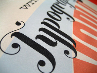
Typography lagged behind a lot of innovation online for years because of constrictions on font use. Text on the internet relied on a few fonts that would be on almost every visitor’s computer, and even then you were doubly limited by text legibility. Web-safe fonts opened the doors a little for designers, but they also created their own set of unique problems.

It hasn’t been until just recently that creative typography became easily achievable and widespread online thanks to a few technological jumps. Higher display resolutions, more control over text, and the wonderful @font-face implementation has made typography not just a creative flourish, but a necessary concern when trying to make a gorgeous site.

Whether or not this is related to the burst in popularity for typography in design as a whole is hard to tell, but it is hard to deny that while the internet has been making typography easier, more traditional designers have also been enjoying a renaissance for calligraphy and innovative use of text.

Paula Borowska is as big of a typography lover as I am, and she agrees that 2013 is going to be huge for online typography. She predicted the typography trends for this year over at Designmodo, and it is interesting to see how many of her predictions are parallel with the wider trends for web design at the moment. The first trend she mentions, an increased utilization of white or negative space, has been on every web design list for this year, and it is hard to deny that eye-popping use of text has helped push minimalistic design to new heights recently.

Source: Flickr

Web typography is blossoming right now thanks to new font solutions like @font-face and Google Fonts, but we still often feel limited by how much control we have over the typography in designs and publishing apps. There are some jQuery plugins out there however that are beginning to catch up to the other new font solutions gaining popularity.

Chris Spooner compiled some of the best jQuery plugins for web typography that help offer the precise control designers desire, and any designer concerned about their text can benefit from them.

The Lettering.js plugin is a super simple plugin, and that simplicity has also assisted it in gaining huge popularity. The plugin splits up text and wraps each letter in a custom <span> element giving you exact control over kerning, or even customizing CSS styles for individual letters.

Other plugins like FitText.js help solve issues that responsive design has created for typography. Responsive design changes the containers for text, which makes the text reformat to match the size, but that often makes headings and titles looking worse for wear. The FitText.js plugin allows you to scale your headings and titles just like responsive images, keeping everything on the same line.

My favorite plug Spooner has found is great for its name as well as its function. Bacon is a plug in the allows you to shape your text around a bezier curve directly within the design. InDesign has allowed designers to easily shape text around images, but HTML and CSS has traditionally made text flow in square blocks. Now, rather than using tedious and dirty HTML markups, Bacon makes it easy to easily, and cleanly, design your text around shapes with just a series of coordinates.

If you are a stickler about typography like I am, all of the plugins offered in Spooner’s article will seem like life-savers, as well as huge time-savers. Designers have struggled to take control over fonts and text since the invention of the internet, but only recently has web typography become fun rather than tiresome.

Source: Flickr

In the past decade, typography has re-risen as a huge interest for designers and artists of all kinds, to the point that it is possible for one to make a living designing type and custom lettering.

But, as with any newly popular area, the renewed popularity has come with misinformation and misunderstanding to what typography and lettering are. With all of the talk surrounding typography, now is as pertinent of a time as any to set the record straight on what it really is. Joseph Alessio explains it all in depth at Smashing Magazine, but I’ll walk you through the basics here.

Typography

Typography is basically how letters are arranged on a surface, and the term has existed since the creation of movable type printing systems. It is actually a subset of lettering, as it is concerned with how letters are applied to typefaces.

The most simplified and easily understandable explanation comes from Gerrit Noordzij, professor of typeface design at the Royal Academy of Art in the Hague from 1960 to 1990, and his definition helps show how typography is different from the broader category of lettering. Typography is “writing with prefabricated characters.” This makes it clearly distinct from lettering, handwriting, and even graffiti, because those types of writing do not use repeatable sets of characters.

Lettering

Lettering is simply “the art of drawing letters” as Alessio puts it. While lettering can cover a huge area of character creation, it is easiest to think of it as custom letterforms created for a single use, usually focusing on the overall composition, rather than strict adherence to established characters. It can be made on the computer, but not by laying different fonts next to each other.

While typography is a subset of lettering, when talking to clients or other designers, it is wise to distinguish between the two. Lettering is usually thought of as design made of custom letters, whereas typography is a design made out of existing fonts and typefaces.

The two are easily confusable, and it is of little surprise that their definitions have largely become entangled, but understanding the differences can help you communicate what you want more easily, as well as keeping you from looking uninformed at an important moment.

Not too long ago, web designers were restricted to a set of universal type faces that were installed on nearly every computer. If they wished to use more extravagant typographical designs, they pretty much always had to create images with them instead of directly placing the text on the page.

With the @font-face CSS rule, designers can input their own fonts on websites, not relying on the visitor to have the font already installed. In a design community where there are literally hundreds of thousands of free fonts available, having the freedom to use any font you desire is like taking blinders off of a horse.

Keep in mind the rules of design however. More than three fonts on one page is going to look excessively busy, and will likely slow down the loading times of your site. Designmodo helps walk designers through adding the @font-face CSS rule, and they urge everyone to use universal fall back fonts, which is smart advice. Not every browser supports @font-face, and you don’t want to ruin accessability for any group of users.


You’ve heard me preaching the benefits of responsive web design, but you probably haven’t seen much about responsive typography. This is interesting because for most websites, the text is by far the most important content on the page.

Well, good news everybody, because responsive typography is pretty easy. You just need to think through how you want type to respond to the changes in screen size, and then follow through.

Responsive typography has two main factors. The first is resizable type, which is obvious. Resizable type rescales itself based on the size of the screen, but it is also important that it is resizable by the user.

The second factor is optimized line lengths, which are still readable. On some screens, keeping content areas smaller actually makes more sense, though they technically could be larger.

Cameron Chapman has all the code and technical information you need at Weddesigner Depot to implement solid responsive typography. Most importantly, you should be using rems for sizing your type because they are relative to html elements, which makes maintaining proper sizing of your type very efficient. Chapman also will help you through how to keep your line lengths the optimum length, which is slightly more tricky than just making your text resizable.

Designers should never neglect their typography on the page, and making it readable for any size screen is essential. Sure, if your site is more image and video heavy, it may not be as important for you as it is for bloggers, but I doubt your site has zero text on the page. Even in those situations, you want every part of your page to work perfectly for everyone.


There are infinite ways to approach typography, and you will see just about every imaginable strategy across the internet. Some go over-the-top with their typographic choices, and some, either out of ignorance or laziness, underwhelm with blah text.

There are places for both of these approaches, but there is never an excuse for outright ignoring how your text looks on-screen. Typographic choices are absolutely essential to your design, and even if you don’t have much text on your page, the wrong typographic decisions can leave viewers with a bad taste in their mouth.

To keep you from making the mistakes many pages have, I’ve compiled a list of things to keep in mind when choosing typography for your designs.

Message

One of the first things a designer should consider when starting a design is what type of message you want to send. This should be equally true when it’s decided what text you are going to use. Gabi Azilla uses the example of fliers for disaster aid programs when considering what message you want to send. In this example, you want your message to be along the lines of “hope” and “aid”, so you don’t want your text to look like something from an action movie or business memo. If that example is too specific for your current project, think along the lines of whether your design is aiming for a happier, or darker concept. Happy designs should use light, soft fonts, while darker themes rely on sharp, dramatic text.

Legibility

It really doesn’t matter what you are working on, using text that is illegible is always a negative. It may look neat, but nothing annoys viewers quicker than having to struggle to read a simple header. There are times when more abstract fonts can be good, but they should be used very sparingly for effect, rather than the main font for any aspect of your page. Think about it in terms of the heavily illustrated letters beginning paragraphs in classic, old books. They liven up the entire page, but the illustrated, complex area of text only covers one letter.

Size and Placement

This one goes overlooked often, but where and how big your typography is has a huge effect on the success of your design. Placement and size are all about balance. No one wants to strain to read your text, and overly large text is just annoying, but you also want to make something eye-catching. Make sure the typography complements the rest of the design, and effectively uses the space it covers. The general rule for designers is the header or title area should be the main focus, and everything else should be roughly half the size of the header, or smaller depending on importance. Keeping a heirarchy in your text lets readers know where you want their eyes to focus.

Conclusion

With the near infinite choices designers have for typography, it is easy to want to dive in and play with your design to create something truly wild. There is plenty of room for experimentation and innovation, but restraint is key. Remember why you are designing the current project, and fit your typography to match the point of the design.


In a constantly changing industry, it can be difficult to predict trends for the future. For designers, this means heightened responsibility during transition periods. Designers have to be able to create client pleasing designs based on what has been popular this year, while also constantly learning new tricks to innovate for what is to come. Hopefully, these predictions can help you be prepared for some trends that should become popular within the next year.

  1. Responsive Web Design – At this point, this prediction is more of a foregone conclusion, as new kinds of mobile and desktop devices are constantly being released into the market. Each device has a unique screen size, proportion, and resolution. To create specific websites for each device would cost you a fortune in time and money, and responsive web designs eliminate all of these problems by responding to the size of the device accessing the page. Designers won’t need too make new layouts for different devices, when a single layout will work smoothly with all devices.
  2. Designed Typography – There have never been more fonts and variations for designers to work with than there is today, and choosing what typography to use is always an important decision. In the next year, it seems this will only become more important  and typography may finally cement its place as an essential part of design. Typography is the foundation of any website, and it is time it received recognition.
  3. Vertical Scrolling – Optimizing websites will continue to lead to crucial decisions for layouts. Many websites are still using vertical and horizontal scrolling, but through the next year vertical scrolling will become dominant. Vertical scrolling is convenient and easy. It also allows implementation of vertically scrolling buttons and header menus. All of these features combined make for user friendly navigation across your entire website.
  4. Big Buttons – More and more sites keep optimizing for “touch and tap” on mobile devices, which means buttons are getting bigger. Originally, these large buttons were being used to try to streamline pages and make them more visually pleasing, but they also make using pages on mobile devices infinitely easier. The only drawback is these large buttons require more graphics, which slow down sites. Hopefully designers can find ways around this, or this prediction may never come to full fruition.
  5. Branding Will Take a Hike – All business want their brand to be recognizable, and the year ahead of us seems more likely to focus on designing the brand, rather than trying to build a website based on the newest trends. Designers will choose things that complement the brand rather than choosing features that seem popular at the moment. It will become more important for designers to focus on translating a webpage business through the webpage and represent the brand’s image.
  6. Parallax Scrolling Will Rise – Parallax scrolling has been around for some time now, but it has mainly been used in video games  This year, it seems likely to finally transition to the web. This feature allows designers to control the depth of design objects on the webpage being designed.

While these are only predictions, many of these seem undeniably likely to come true. By studying what looks likely to become popular, you can be on the cutting edge of web design, rather than always playing catch up.

For examples of these predictions, check out Ali Qayyum’s article at Smashing Hub.