Tag Archive for: mobile search

Google has been encouraging webmasters to make their sites as fast as possible for years, but now they’re making it an official ranking requirement.

The company announced this week that it will be launching what it is calling the “Speed Update” in July 2018, which will make page speed an official ranking signal for mobile searches.

Google recommends checking your site’s speed using its PageSpeed report, as well as using tools like LightHouse to measure page speed and improve your loading times.

As Google’s Zhiheng Wang and Doantam Phan wrote in the announcement:

The “Speed Update,” as we’re calling it, will only affect pages that deliver the slowest experience to users and will only affect a small percentage of queries. It applies the same standard to all pages, regardless of the technology used to build the page. The intent of the search query is still a very strong signal, so a slow page may still rank highly if it has great, relevant content.

While Google says the update will only affect a “small percentage of queries”, it is impossible to tell exactly how many will be impacted. Google handles billions of queries a day, so a small piece of that could still be a substantial number of searches.

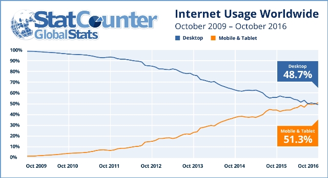
This is the first time page speed will be made a ranking factor for mobile searches, but it has been a ranking factor on desktop since 2010. It makes sense to expand this to mobile since there is a wealth of evidence showing that mobile users prioritize loading time when clicking search results. If a page doesn’t load within three-to-five seconds, they are likely to leave the page and find another relevant search result.

Google has already begun rolling out its mobile-first index to some users, but there are still a lot of questions about how exactly the search engine’s new separate index actually functions.

One such question got a surprising answer yesterday during the Google State of Search conference, as Maile Ohye told the audience that Google won’t index the AMP version of your page in the mobile search index – even when you don’t have a mobile-friendly alternative.

Google’s Gary Illyes also confirmed the news on Twitter after the conference:

That means if you’ve been using AMP pages as an alternative to making your website mobile-friendly, the search engine will skip over indexing your AMP pages in the mobile-friendly search index. Instead, it will by default choose to index the desktop version within its older index.

There is a way to force Google to index your AMP pages in this situation using a rel alternate attribute, but otherwise Google’s index will default to your desktop versions of pages.

This is particularly surprising because Google has pushed AMP as the ultimate way to deliver content to mobile users quickly and without losing ad revenue. But, in this case it seems the streamlined design of AMP pages leaves something to be desired. It may be the lack of site navigation options is what made Google decide to favor desktop over AMP in their index.

This change will most likely only affect a very small number of websites, but it is an odd choice for the search engine. The vast majority of websites who have adopted AMP also maintain a mobile version of their site.

As announced last month, Google is officially making its first step towards the launch of mobile-first indexing with the test of its mobile-first search index.

The company confirmed the testing has officially started via its company blog:

“Although our search index will continue to be a single index of websites and apps, our algorithms will eventually primarily use the mobile version of a site’s content to rank pages from that site, to understand structured data, and to show snippets from those pages in our results. Of course, while our index will be built from mobile documents, we’re going to continue to build a great search experience for all users, whether they come from mobile or desktop devices.”

This means in the future Google will increasingly prioritize crawling the mobile versions of a site’s content, rather than treating desktop as the “main” version of your site.

The company also gave some quick tips to help you make the most of this change as it is happening:

  • If you have a responsive site with identical content across mobile and desktop, you shouldn’t have to change anything.
  • If you have a site where the primary content and markup is not identical across mobile and desktop, you should consider making some changes to your site.
  • Make sure to serve structured markup for both the desktop and mobile version.
  • Google recommends using the Structured Data Testing Tool to verify the equivalence of structured markup across desktop and mobile by typing the URLs of both versions into the Structured Data Testing Tool and comparing the output.
  • When adding structured data to a mobile site, avoid adding large amounts of markup that isn’t relevant to the specific information content of each document.
  • Use the robots.txt testing tool to verify that your mobile version is accessible to Googlebot.
  • Sites do not have to make changes to their canonical links.
  • If you are a site owner who has only verified their desktop site in Search Console, please add and verify your mobile version.
  • If you only have a desktop site, Google will continue to index your desktop site just fine.
  • If you are building a mobile version of your site, do not launch it until it’s ready. Google says: “a functional desktop-oriented site can be better than a broken or incomplete mobile version of the site.”

Mobile Internet Usage

Mobile internet usage has been steadily gaining ground for years, and just last month it hit another milestone. According to a press release issued yesterday from StatCounter, mobile and tablet internet usage has finally exceeded total desktop usage for the first time ever.

Last month, mobile and tablet devices made up 51.3% of total internet usage compared to 48.7% by desktop. This is the first time worldwide monthly mobile internet usage has overtaken desktop according to StatCounter’s measure.

mobileusage

It is almost guaranteed this trend will continue in the long-term, but the short-term gains may not hold up. Mobile web usage has historically increased leading up to the holiday season and may deflate in the first part of next year. Even if this happens, the new milestone shows mobile usage is still consistently growing and will likely be the dominant way to access the web in the coming years.

Aodhan Cullen, CEO of StatCounter, says the new numbers should show businesses how important it is to make mobile a priority now, rather than later:

“This should be a wake up call especially for small businesses, sole traders and professionals to make sure that their websites are mobile friendly. Many older websites are not.”

Of course, mobile usage varies by country. While major markets like the US and the UK still primarily rely on desktop computers. Emerging markets like India overwhelmingly use mobile devices for internet usage and show no signs of slowing down.

google-mobile

Google is making a huge change to their search engine that could have huge implications for the future of search.

Until now, Google has maintained a single search index, which cataloged the entire web for Google’s algorithm to sort through. However, that will be changing soon as Google’s Gary Illyes announced the search engine would be releasing a separate mobile search index.

The new mobile index will become Google’s “primary” index that it uses to deliver the majority of search results. At the same time, the company will continue to maintain a separate desktop search index which will be slightly less up-to-date.

The announcement came last week during a keynote address at Pubcon from Gary Illyes, webmaster trend analyst with Google. While Illyes later confirmed to Search Engine Land the rollout of the new index would be coming within “months,” he was otherwise short on details of how the mobile index will work.

It is also unclear in which circumstances Google will use which search index or just how behind the desktop index is. What is clear is that Google sees mobile as the future of search despite still seeing significant desktop usage.

Most likely, the new index means Google will be switching from a system which selectively pulls information from the single index for mobile results to a new system which uses the separate index for queries coming from mobile devices.

More information is likely to come in the near future, but for now, all we know is Google is gearing up for big changes to further prioritize mobile searchers.

mobileonly

It is no secret that the majority of people online change devices several times a day, but new research from Google shows that a growing number of users are adopting a “mobile only” lifestyle.

The new “cross-device” research shows that while plenty of people still move from desktop to mobile to tablet as they need to throughout the day, but almost 40% of searchers have dropped desktop devices from their online search process entirely.

Google says the study is based on “behavioral measurement of a convenience sample of 11,964 opt-in Google users between January 1, 2016 and March 31, 2016,” and that the data was “calibrated to reflect a U.S. demographic of 18 to 49-year-old cross-device users.”

screen-shot-2016-10-06-at-2-43-45-pm-800x558

According to the findings, the average user spends 170 minutes on their smartphone every day, compared to 120 minutes on PC’s and approximately 75 minutes on tablets (that user owns a tablet). They most often use their smartphones at four physical locations:

  1. Home
  2. Work
  3. Stores
  4. Restaurants and Bars

Every day, approximately 80% of users search the internet on their smartphones, while 67% use PC’s. Over half (57%) move between devices throughout the day and 21% are likely to use more than one device simultaneously.

But, perhaps the most surprising finding of the study is that approximately 39% of people who conduct searches on an average day use only smartphones, compared to 32% who search only on PC. When measuring all internet use, rather than just searches, 27% of users are smartphone-only.

The report shows mobile usage varies by industry with year-over-year growth of mobile search for different markets.

screen-shot-2016-10-06-at-4-05-36-pm-800x353

If you want to find out more, check out the full report here.

This week, Google announced it will be boosting “the effect of the ranking signals” for its mobile-friendly ranking algorithm. While this means mobile-friendly sites will be prioritized even further in search results “beginning in May,” don’t expect the second coming of “Mobilegeddon.”

As Google said, if your site is already mobile-friendly, you have no need to fear, because “you will not be impacted by this update.”

The update is going to roll out gradually, meaning its impact will be even less noticeable.  Since the mobile-friendly algorithm runs on a page-by-page basis, it could take some time for Google to re-index all affected pages.

Between the slow rollout and the limited expected impact, the update might not seem like much to get excited about. But, if your site isn’t mobile-friendly, it means you have even more motivation to make the change before May. Even if your audience isn’t particularly likely to convert on mobile, you could be missing out on leads and traffic that is going to your competitors instead.

You can use the Google mobile-friendly tool to make sure your site passes the bar and won’t be impacted by the coming update.

Google Mobile

Google’s Accelerated Mobile Pages (AMP) have been rumored to rollout in late February for some time, and it appears they are finally starting to appear. The AMP listings are being spotted in mobile search results, but it seems they are not available for all searchers.

Accelerated Mobile Pages are pages designed to be super lightweight and allow for incredibly fast load times. It does this by using a unique, streamlined version of HTML that is able to be heavily caches to provide the fastest loading experience possible.

To see if you have access to the new AMP search results, just perform a search on Google.com for any query that would typically trigger a news box. If you can’t think of anything, you can try ‘Trump’, ‘Google’, or ‘Obama’.

Barry Schwartz shared a few screencaps of what you can expect to see as the listings become more widely available. You can see them below:

google-amp-live

This screencap shows AMP listings appearing in the news listings, rather than the carousel:

google-amp-non-carousel

SuperBowl50

Online searchers are increasingly turning to mobile devices during the biggest trending moments, and this year’s super bowl makes that clearer than ever. According to Google, 82 percent of all TV ad-driven searches during the Super Bowl came from smartphones, a 12-point increase from last year.

Desktop continues to trail mobile searches with just 11 percent of Super Bowl searches during the game, while tablets accounted for only 7 percent.

In total, Google says the big ads during this year’s Super Bowl drove over 7.5 million incremental searches. That is a 40 percent increase compared to last year’s game.

google-super-bowl-ad-searches-by-quarter-800x342

Perhaps due to the close game, the majority of searches driven by Super Bowl TV ads came during the first two quarters of this year’s match. Ad’s related searches dipped significantly at half-time and continued to stay relatively low through the end of the 4th quarter. This is similar to what happened during last year’s close match-up.

This pattern is quite a bit different from 2014, when the Broncos were dominated by the Seahawks. As the score widened in the second half searches increased, suggesting viewers were getting bored with the actual game and paying more attention to ads.

Google’s infographic from the big game shares many other details, like what big brands came out on top and which team won the most searches. The biggest takeaway is that brands who want to capitalize on emerging events and trending moments should prioritize mobile like their audience is.

mobile-closeup-campaign

Last week, during Recode’s Code/Mobile conference, Amit Singhal, senior vice president of Google Search, announced that over half of all searches conducted on Google each month are coming from mobile devices.

Mobile has quickly become a dominant force in search, but it has only overtaken desktop in both search and ad volume over the past year.

For this count, Google is not including mobile devices with screens over 6 inches in size, such as tablets. According to the company, Google is primarily counting mobile views as those coming from smartphones.

During his announcement, Singhal explained how the definition of search is changing as the way people interact with their devices and the internet evolves:

“Search as we think about it is fundamentally how you will interact with computing. Computing may live in a 4-to-6-inch device, it may live in a desktop, it may live on a 1-inch round device.”

The news was leaked by John Mueller on Google+ this week, while offering a warning to those who have yet to make their sites mobile-friendly:

“More than half of Google’s searches are now coming from mobile. If you haven’t made your site (or your client’s sites) mobile-friendly, you’re ignoring a lot of potential users. “

According to Search Engine Journal, Google also announced it has indexed over 100 billion links within apps, showing how Google is growing beyond the traditional idea of the web page.