It is no secret that visual content is more engaging to readers. Whether you use infographics, social media images, video content, or just creating ads that are visually attractive, users will always react more to content that is more than just text on a screen.
But, just because you are using more visuals in your content and doesn’t mean they automatically work. Aesthetically pleasing content can be a great way to engage users, but you can still lose a huge amount of visitors if your content isn’t compelling and exciting.
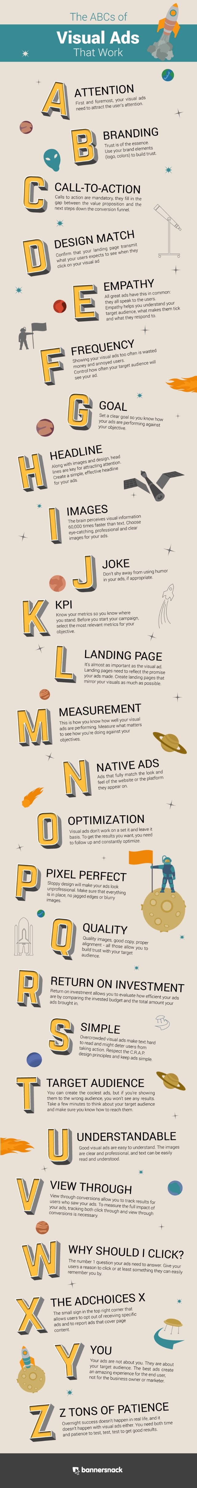
To help you guarantee your visual ads are truly visually compelling and engaging, Bannersnack recently shared an infographic breaking down everything you need to know about visual ad creation. If you want to guarantee your visual ads are killing it every time, check out the infographic below or at Bannersnack.
00Taylor Ballhttps://www.tulsamarketingonline.com/wp-content/uploads/2018/07/TMO-Logo.pngTaylor Ball2016-05-13 11:57:202016-05-13 11:57:20Learn The ABCs of Making Visual Ads That Work [Infographic]
The holiday shopping season is in fever pitch, which means most business owners and marketers are going full-steam-ahead on their online marketing strategies to rake in their piece of the $650 billion predicted to be spent this year.
So how can you get in on the action? Pixel Road Designs recently shared an infographic that can give your holiday marketing strategies the extra boost they need to make this holiday season a huge success.
Check out the infographic below, or at Pixel Road Designs’ website here.
Retailers across the country are preparing for the upcoming holiday season, but you never want to waste your efforts on marketing practices that won’t produce results.
According to a recent report from Campaigner, social integration, mobile optimization, list segmentation, and personalization are the keys to running a successful holiday email campaign this year. The report comes from a survey of 198 internet retailers conducted in August of this year.
Social integrations were the breakout star of the survey, with almost three-quarters (71%) of the respondents identifying these as the most important add-ons for your holiday email campaigns. Similarly, 70% predicted mobile sales would continue to rise this year.
Over half (57%) of the participants said they would be prioritizing email list segmentation this holiday season, with 40% planning to prioritize personalization.
The infographic below shares these insights and more from the Campaigner survey.
The phrase “content marketing” is thrown around all over the place, but marketers seem to be forget that content can mean more than blog posts. While blogs can play a big role in online marketing and catching the attention of your audience, there are several other tools at our disposal that are often more effective.
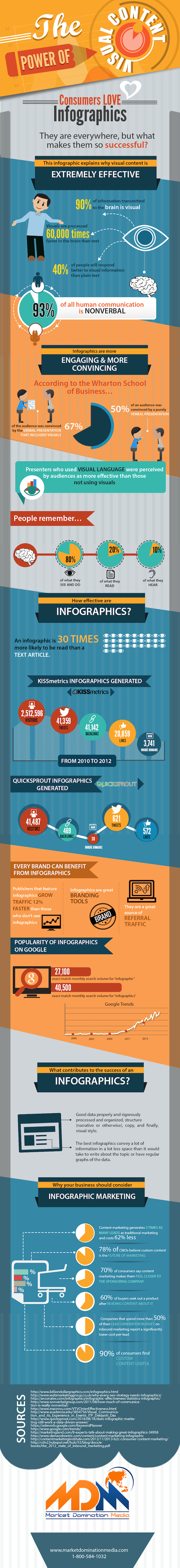
Audiences almost always respond better to visual marketing better than text, so long as your visual content reaches the same level of quality. Market Domination Media wanted marketers to know that visual content packs a heavy punch that makes the heightened investment more than worthwhile.
To do so, MDM published an infographic which highlights the reasons why visual content consistently performs so much better.
00Taylor Ballhttps://www.tulsamarketingonline.com/wp-content/uploads/2018/07/TMO-Logo.pngTaylor Ball2014-09-29 13:19:392014-09-29 13:19:39Visual Marketing Is An Important Tool In Every Content Marketers Toolbox [Infographic]
It constantly surprises me how many local businesses don’t believe in investing in proper online marketing and optimization. Given, I see every day how establishing a quality online presence and optimizing it for higher visibility can benefit a business. Still, many local businesses hold the conception that online marketing is only important for national level businesses, and they couldn’t be more wrong.
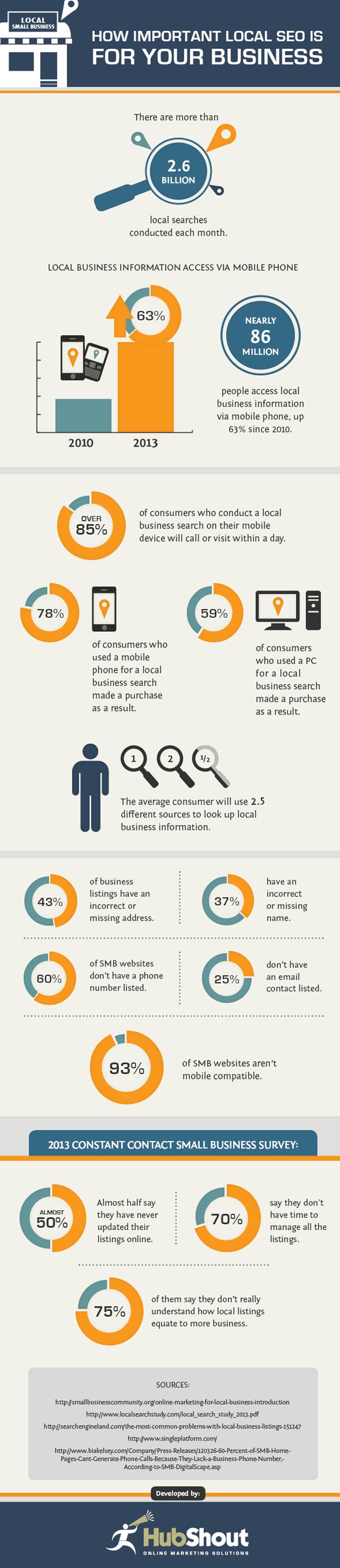
Current estimates say that more than 2.6 billion local searches are conducted every month. More importantly, statistics show that these local searchers are becoming more and more mobilized to quickly go from search to purchase thanks to the use of smartphones to search on the go. Nearly 86 million people are regularly using their mobile phones to look up local business information, and these searchers are highly primed to convert. Simply put, without an online presence and the optimization to make your brand visible you are missing out on a large chunk of potential customers.
Hubshout recently created an infographic to illustrate how important local search engine optimization (SEO) really is for your business. Not only does the infographic show what you are missing out on by neglecting your online presence, it also shows how many many businesses have yet to establish themselves online in a meaningful way. There is still a lot of untapped opportunity online, you just have to make the leap.
00Taylor Ballhttps://www.tulsamarketingonline.com/wp-content/uploads/2018/07/TMO-Logo.pngTaylor Ball2013-12-02 11:25:002013-12-02 11:25:00What Are You Missing Out On Without Local Search Engine Optimization [Infographic]
If you’ve spent much time online in the past year or two, it is almost certain you’ve come across an infographic. They are highly enjoyed by the public, as well as being educational. This is why more companies and content creators are using infographics to communicate and share knowledge with the public than ever before. Some may say it is just a trend, but either way the data shows that searches for infographics have risen over 800 percent in just two years, from 2010 to 2012.
Even if you don’t know what an infographic is, the chances still favor that you have seen one either in your Facebook feed, a news article, or maybe even your email. Infographics are images intended to share information, data, or knowledge in a quick and easily comprehensible way. They turn boring information into interesting visuals which not only make the information easier to understand, but also make the average viewer more interested in what is being communicated.
According to Albert Costill, multiple studies have found that 90 percent of the information we retain and remember is based on visual impact. Considering how much information take in on a day to day basis, and that means you’re content should be visually impressive if you want to have a hope of viewers remembering it. If you’re still unsure about infographics, there are several reasons you should consider at least including them occasionally within your content strategy.
Infographics are naturally more eye-catching than printed words, and a well laid-out infographic will catch viewers attention in ways standard text can’t. You’re free to use more images, colors, and even movement which are more immediately visually appealing.
The average online reader tends to scan text rather than reading every single word. Infographics combat this tendency by making viewers more likely to engage all of the information on the screen, but they also make it easier for those who still scan to find the information most important to them.
Infographics are more easily sharable than most other types of content. Most social networks are image friendly, so users are given two very simple ways to show their friends their favorite infographics. Readers can share a link directly to your site, or they can save the image and share it directly. The more easily content can be shared, the more likely it is to go viral.
Infographics can subliminally help reinforce your brand image, so long as you are consistent. Using consistent colors, shapes, and messages, combined with your logo all work to raise your brand awareness. You can see how well this works when you notice that every infographic relating to Facebook naturally uses “Facebook Blue” and reflects the style of their brand.
Obviously you shouldn’t be putting out an infographic every day. Blog posts still have their place in any content strategy. Plus, if you are creating infographics daily, it is likely their quality will suffer. Treat infographics as a tool that can be reserved for special occasions or pulled out when necessary. With the right balance, you’ll find your infographics can be more powerful and popular than you ever imagined.
00Maxhttps://www.tulsamarketingonline.com/wp-content/uploads/2018/07/TMO-Logo.pngMax2013-10-25 11:27:502013-10-25 11:27:504 Reasons You Should Be Including Infographics in Your Content Strategy
It is undeniable that social media has completely changed the ways we share information. Gone are the days when loaning a book was the best way to help your friends learn about a topic. Even long form blog posts are often smothered by easy-to-understand content delivered in direct and immediate formats that are fun to read and tempting to share.
This is clearest when you look at the infographic, poster styled graphics aimed at informing people in depth on topics, similar to the way some of the more detailed posters you find in schools function. The difference is that infographics tend to give much more information than any of those posters ever could, thanks to the removal of site constraints.
Infographics engage users and attract them with stylish graphics and colors, which make readers more interested in the information that would normally be boring. Because of how easy it is to digest the information and get excited about what they present, infographics are incredibly popular on Facebook.
For a while, creating one of these infographics basically required a dedicated designer on staff, as no one gets interested in equally boring or sterile graphics without any of the style that bring infographics to life. That has changed much over the past year however, with a lot of credit belonging to the number of free tools and web applications that quickly help put together infographics with minimal design knowledge.
Crazy Pixels shared 10 of these free resources for businesses or bloggers hoping to share a lot of information in an exciting way. Of course, if you just slap something together on one of these applications, it is still going to come out bad. But if you take the time to compose the graphic and market it towards the proper audience, the rest will take care of itself.
00TMOhttps://www.tulsamarketingonline.com/wp-content/uploads/2018/07/TMO-Logo.pngTMO2013-07-10 13:35:462013-07-10 13:35:4610 Resources That Will Help You Make an Infographic
I believe pretty much every web designer that hasn’t been living under a rock knows what responsive web design (RWD) is, but for the few that might be unaware, responsive design is a technique that allows websites to have flexible layouts that change depending on the screen size of the device accessing the site.
I’ve already discussed the pros and cons of responsive design at length, but there is much more to know about the technique than simply what it is good and bad for. There is so much to know, in fact, that it can fill ten whole infographics, like the ones compiled by Jacob Gube at Design Instruct.
Of course, there is an infographic devoted entirely to simply stating the beneficial aspects of RWD, and the obvious infographic focused on explaining exactly what responsive design is in clear visuals. But, other infographics contain basic tips for RWD I haven’t heard elsewhere, or the numbers on how many people are moving to mobile devices and how our use of the web is impacting how people interact with web pages.
Enjoy the infographic showing you what exactly responsive design is below, and you can see the rest at Design Instruct.
00TMOhttps://www.tulsamarketingonline.com/wp-content/uploads/2018/07/TMO-Logo.pngTMO2013-04-02 13:30:292013-04-02 13:30:29Ten Infographics About Responsive Web Design
Google has been fighting spam with algorithms and manual penalties, but the best tool this whole time may have been information. Google has offered Webmaster Guidelines for ages now, but there has still been quite a bit of misinformation as to how exactly search works. Those who don’t spend their time reading tech and internet books, blogs, and websites probably don’t have any idea how search works.
As Search Engine Journal pointed out on Friday, Google has heightened their resolution towards open information with an infographic entitled How Search Works. The infographic is broad and won’t give a lot of new information towards exactly what search signals are being favored or what the best methods are (that’s what the Webmaster Guidelines are for after all) but the infographic will be very helpful to those who may not understand how Google handles indexing the entire internet.
What may be of some interest to SEOs and other internet professionals is the additional information Google released along with the unveil of How Search Works, including Search Quality Rating Guidelines, charts of what type of spam they have been removing, and how often Google gets Reconsideration Requests. Even when they don’t give a lot of specifics, any information directly from Google is always great for those of us trying to make our websites fit their requirements as well as possible.
Typography is one of the most deceptively complex components of design imaginable. I mean, to the outsider, it is just arranging letters and picking fonts. The uninitiated have no idea about the complexities and the history of typography; they don’t know typography has a rule book all its own.
Now, I’ve said infographics will tell you “all you need to know” about a couple different design aspects, but the truth is, you can never learn too much about design, and just about every part of design has books upon books worth of material to learn. But, reading books about design seems kind of boring right? Everyone in the field at this point got into it because we love looking at awesome images.
Instead of reading a book about typography – which you should totally do – you can always look at infographics which will put all of that information in visually stimulating ways. Typography lovers and experts certainly love making them.
Jacob Gube collected ten different infographics from across the web on Design Instruct. I am posting one of the ten below, but you’ll have to go to their site to see the rest. The one I’m showing you is “A Brief Introduction to Typography”, which you will notice is not particularly brief. That should give you an idea just how much there is to say about the “simple science” of “arranging letters”. Click on the image to see the full size.