Tag Archive for: Carrie Cousins

There are so many articles out there fawning over the design of Apple’s products. Starting with the third or fourth version of the iPod, every new product has gotten nothing but love for their revolutionary design, all the way up to the iPad. Every part of the iPad’s design, including the interface, have been broken down and critiqued.

There is one aspect of the iPad that Apple can’t control, however. Apple designs a few apps, but the vast majority are made by other companies. Sure, a good amount of them are cheaply designed, but there are also high quality apps made by designers that care, and it is in those apps that you can learn some of the best rules for modern design. Carrie Cousins collected ten things she learned from iPad apps at Design Shack, and they can be transferred over to any other medium today.

It all begins with an emphasis on simplicity, and Cousins pinpoints one of the most undeniable reasons why web design has taken a turn towards minimalism. Too much on a small screen can overwhelm the user, and simple, easy to use designs help the on-the-go user access what they want, when they want it.

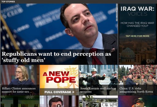
Almost every major trend in web design is also observable through iPad apps. Simple color schemes, and flat designs are all the rage right now, reflecting the continued push towards simplicity on these small screens and it is hard to deny how effective the design changes are. Apple has never been a proponent of flat design, but recent redesigns by CNN and Facebook show that flat design looks great on tablet screens.

CNN App

The unforgiving Retina Display of the iPad will also teach any lazy web designer a good lesson very quickly. You can’t cut corners on any visual aspect of an app. One low quality icon will stick out like a sore thumb on an otherwise crisp and clear interface, and one small shoddy image will destroy the value of your content just like a crack in the foundation of a house will one day destroy that home.

There are plenty more lessons to learn from iPad apps. Cousins has a few more in her article, but if you are critical of iPad apps as you use them, you’ll learn even more. The best part is, because apps are constantly updating their designs, and new innovative apps are coming out every day, you will be able to keep up to date with design so long as you keep killing time on your tablet.

Color PencilsFor almost any problem you run into while doing web design, there is a tutorial or forum with the solution that can be found with just a couple searches, but there is one big problem that can’t be overcome so easily. Technical problems have technical answers, but designer’s block isn’t like that.

However, there are ways to get past it. You just need to step away, clear your mind, and then force yourself to get back to work. A few simple tips can make overcoming designer’s block even easier, though ultimately, the solution to the block likely depends on the person. Carrie Cousins offers her ways to get over designer’s block, and at the very least they may help you find your own unique solutions to the issue.

Get Inspired – Nothing makes designers feel like working like viewing other people’s great creations. Taking a break to browse through well designed projects may sound like a waste of time, but in reality, it can get your creativity jump started again. Many designers have a set of bookmarks of saved images for inspiration, but most of us don’t tend to go look at those sources often. If you have designer’s block, it is the time to break out those sources. Also, don’t limit yourself to web design just because you work on the web. Inspiration and great design is everywhere. Browse print, go for a walk and explore the great designs littering the city around you, or just look at some photo websites. You’ll be surprised where you find inspiration.

Turn on Music – Despite what your high school teachers said, listening to music while you work encourages creative thought. Numerous studies have shown that areas of the brain beneficial to creativity are stimulated and activated by music, no matter your favorite genre. It also blocks out other distractions, which is especially helpful if you work in a noisy office, or even freelancing at a coffee shop  Try out different kinds of music. The song that got you feeling amped up on the ride to work may not have the same effect while you are trying to work.

Work for Fun – Even when you have a big project looming, taking some time to do a project that doesn’t count can get the creative juices going again without the pressure of a deadline or client’s desires. Simply taking an old project and reworking it using newer design trends and methods can help get you working again so that you can tackle a big project that does matter.

Talk It Out – I always come up with my best ideas for designs in the middle of conversations with my friends. Talking allows you to formulate ideas freely, while someone you respect can point out any holes or problems you might be missing before you encounter them. Find someone who is happy to talk design and you trust. Just explaining what you need to do to someone else can trigger new ideas on how to accomplish the task. If talking doesn’t help you, keep a notebook of ideas, issues, thought on designs, and even when you get designer’s block. Seeing it on the page might help you make sense of your creative problems.

Eye CloseupIn pretty much every way, good web design is subjective. Trends come and go, and limitations are removed which open up entirely new options for how a site can look and act. While user experience can be quantified through testing, there is nothing scientific about what people want either. There are objective ways to look at the current desires of the public, and some things, like easily understandable navigation methods, will never go out of style, but in a decade, the rules for “good web design” will be barely recognizable from the standards we have today.

However, the way people read is likely to stay the same for the foreseeable future, even on the web. Eye tracking has allowed up to study just how people tend to look at text on the web and paying attention to how users read and look at websites, designers can make informed decisions on how to design their site around their visitors’ patterns.

Eye tracking has been around since the late 1800’s, though it only became commonly used for studying design and marketing in the 1980’s and 90’s. The first big study on web page viewing happened in 2006 by Jakob Nielson, which shows that visitors read web pages in a steady pattern; people’s eye make horizontal swipes across the page, then move down vertically. There have been numerous other studies since, and they all show that internet users continuously scan websites in the same pattern.

The pattern is usually referred to as an F-shape pattern because of how eyes start at the top left corner, moving to the right in a straight pattern, then back to the left hand side where they scan about a third of the way down the page, then back out to the right in a straight line.

If you want to know how you can harness eye movement patterns to inform your web design decisions, Carrie Cousins from Designmodo explores all of the possible implications of eye tracking studies. She breaks down every pattern seen in the studies and even gives examples of websites that are already designed around viewing patterns.

The limits that come from working with a strict color scheme can feel restricting and maybe even frustrating at first, but once you’ve put in some thought, it is easy to see the effect they can have on a design.

Strict color schemes add coherence to your overall layout and establishing consistency. Working with a monochromatic palette makes designing all about contrasts, and automatically establishes a message or mood on a web page.

Don’t get excited if you think working with just one color will be easier. A single set of colors have such a huge range of tints and shades that you can carefully manipulate to create a striking layout. There are plenty of ways to go about it, but Carrie Cousins from Designmodo suggests starting with a dark color scheme, and I agree it is a good place to start.

Before you try to start with a dark palette, remember that black can easily overwhelm the rest of the page and make content hard to digest. Balance is as essential as contrast when trying to design a page with black as a base color.

The first step is of course selecting the colors you want to use. As I’ve suggested before, using a full black is tricky for any composition, be it on a web page of a canvas. Instead, saturate your blacks with the other main color of your composition, so that “real black” is only used extremely selectively. Even using a dark gray is usually preferable to completely black.

For your lighter colors, select your other main color, and add black in ten percent increments to create a “set” of consistent hues for your page. You also need to decide how much contrast you want on your page, which is usually reliant on the feeling you are attempting to cultivate. If you want a moody atmosphere, less contrast can help create a spooky or creepy feel, while brighter colors and contrasts may suggest a slicker or hipper mood.

Carrie Cousins’ article on dark color palettes and designs includes some quick color palette tools you might use if you don’t know where to start.