WordPress has gone from a simple blogging platform into one of the most popular tools for sharing a variety of different web content. We use it, and chances are so do many other websites and blogs you visit. Whole sites can be run with the platform, but WordPress’ heart will always be with blogging.

With the huge rise in popularity, and extensive fleshing out of WordPress, the bar has been risen in regards to what visitors demand of a blog’s look and layout. Ugly layouts diminish credibility in the eye’s of the viewer, plus no one wants to stay on a blog long enough to read even the best content if it hurts their eyes or sense of taste. If you are new to blogging, but want to get your page up to the level visitors desire, Jo Stevenson offers a few tips for how to get the jump on WordPress blogging.

One of the key moments in establishing how well your blog will look comes with choosing a template. Pretty much no one builds their blog from the ground up. There is a whole community out there dedicated to creating and sharing templates, often for free, and unless you have been coding for years, this will be almost any blogger’s first stop. The trick is finding one that suits the content and focus of your blog. News or politics blogs should look formal and authoritative, while cooking blogs might be a lively green or warm red palette with welcoming fonts.

Once you have a template, it is time to begin refining the structure of your blog. Directing the reader’s eye where you want it to go is essential in keeping their interest, and if the wrong thing dominates the screen, the reader may not be able to find the content you want them to see. Stevenson suggests video-heavy blogs would likely benefit from single column formats, while text-laden blogs would likely benefit from giving the copy room to breathe with a two or three column layout.

Most important for making a blog with a look that fits it perfectly is to learn to code, even if you just learn a little bit. Just a small amount of HTML and CSS knowledge will help you customize a template to make it your own, and eventually you may learn enough to design an entire site from scratch.

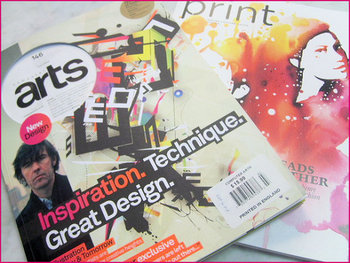
Magazine DesignSometimes I find myself, as well as plenty of others, writing about web design as if it is entirely separate from other mediums. Sure, there are plenty of things that distinguish web design, such as coding and even specific layout patterns for the internet, but there are a lot of principles of layout and design that can be easily transferred onto every medium.

Cameron Chapman got her start in magazine publishing, but she is now a web and graphic designer and prolific blogger. She knows better than anyone that good design rules can often transcend the medium they were established in and help designers across the board. She used her experience in magazine publishing to choose a few design principles that almost any design grad has heard and shows how easily they can be applied to web design.

The first principle seems to be common sense, but a simple background makes reading easier. This is why magazine background colors are almost always white, or at the very most a simple solid color. Readers give up if text is hard for them to read, but yet some less well known websites still present their text over busy images or colors without enough contrast to offset the text. Even if your page’s background is a large image, it is easy to offset your text with a simple text box to deliver your message.

Some websites have numerous pages that all look like different versions of a website. The “about” page may be professional looking and understated, while their “services” or “product” pages are vibrant and sometimes cluttered. If you look at a magazine, every page or section retain several cues from other areas of the magazine. Fonts remain the same, layouts are fairly standardized, and images are shown in the same style. While each page of your site can be a little different from others, it is important to establish consistency by presenting the bulk of your information in similar formats.

One of the most important rules that websites break all the time is clearly marking advertising. In magazines, it is tradition to clearly separate the advertising from the actual content. Even if the advertising is designed to match the style of the magazine in some ways, as some magazine ads have begun doing, there are clear labels added to ensure readers know where the articles end and the ads begin. The same should be implemented in web design, but some sites allow their ads to either be entirely intrusive or sometimes indistinguishable from the content. When readers can’t tell if you are selling them something or delivering them information, they stop trusting your content.

There are plenty of other design rules that web design can learn from, and Chapman explores more of them in her article for Web Designer Depot, but she doesn’t want you to focus on the specific rules she outlines. The most important thing she hopes for you to understand is that any design rule you learn should be at least experimented with in other mediums. Sometimes it won’t transfer well, but most of the time it will make your site look better.

Eye CloseupIn pretty much every way, good web design is subjective. Trends come and go, and limitations are removed which open up entirely new options for how a site can look and act. While user experience can be quantified through testing, there is nothing scientific about what people want either. There are objective ways to look at the current desires of the public, and some things, like easily understandable navigation methods, will never go out of style, but in a decade, the rules for “good web design” will be barely recognizable from the standards we have today.

However, the way people read is likely to stay the same for the foreseeable future, even on the web. Eye tracking has allowed up to study just how people tend to look at text on the web and paying attention to how users read and look at websites, designers can make informed decisions on how to design their site around their visitors’ patterns.

Eye tracking has been around since the late 1800’s, though it only became commonly used for studying design and marketing in the 1980’s and 90’s. The first big study on web page viewing happened in 2006 by Jakob Nielson, which shows that visitors read web pages in a steady pattern; people’s eye make horizontal swipes across the page, then move down vertically. There have been numerous other studies since, and they all show that internet users continuously scan websites in the same pattern.

The pattern is usually referred to as an F-shape pattern because of how eyes start at the top left corner, moving to the right in a straight pattern, then back to the left hand side where they scan about a third of the way down the page, then back out to the right in a straight line.

If you want to know how you can harness eye movement patterns to inform your web design decisions, Carrie Cousins from Designmodo explores all of the possible implications of eye tracking studies. She breaks down every pattern seen in the studies and even gives examples of websites that are already designed around viewing patterns.

Apple Logo1One of the most crucial design decisions for a new company is the logo. Great logos are instantly recognizable and evoke the brand image with just one image. When anyone discusses McDonald’s, Apple, Nike, or NBC, it is hard not to imagine the Golden Arches, iconic apple, or swoosh because they are so deeply ingrained in their corporate image.

Creating a logo that perfect is deceptively difficult to do however. The business world is awash with bad logos that no one will ever remember. There is no magic recipe for a great logo, but there are some rules to follow that will help a logo stick out. I’ve given some tips on logos before, but Sarah Clare from Vandelay Design had some suggestions designers should keep in mind.

One of the most common mistakes is just over-doing the logo. Clean lines and simple contrast are striking and easily able to be replicated in any format, neon sign to stationary. Text can be included but only when necessary, and limit it to the brand name. Even if you’ve been in business for 200 years and you’re doing a logo redesign, your icon isn’t the place to tell people that.

It is hard to understate how important it is that your logo is able to be reproduced anywhere. Something may look good on a computer screen, but logos are sometimes printed on endless materials like pens, paper, mugs, and even mints, and stress balls. You want people to be able to recognize the logo whether it is 1″ x 1″ on a memo, or plastered on a billboard.

While a logo has to be simple, it also has to convey the tone and personality of your business. A high tech company with a childish logo may have trouble convincing potential customers of their abilities, especially because everyone in tech hates comic sans. Usually bright colors are reserved for companies more associated with children as well, but Google’s logo shows why that isn’t a hard rule.

As a business owner, you will see your logo more than you actually see your brand name, or at least it will feel like it. If you want your brand to be successful in the marketplace, you need a logo people will instantly be able to identify and connect with. It seems like a small task, but being lazy on the logo can torpedo a new brand.

Web design relies on the resources of others. Without them, we could still make good looking pages, but it would take exponentially more time. Of course there are textures, fonts, images, and any other visual aspect you want to incorporate for free or cheap use, but we also use time savers behind the scenes.

This isn’t to say we rip off people. It is always best to notify the owner of any resource when you use it, and it is better to use as much original content as possible. Using boring standardized icons won’t ever have the same effect as specialized icons that fit the page they are made for.

Frameworks are what we use behind the scenes, and they are packages made of a structure of files and folders of standardized code used to build websites. They help get you started without making you spend hours typing in code that is normally extremely similar to others such as gridding systems. All websites have a similar structure, and these frameworks allow you to use a “standard” version of that structure and modify it as you need to.

Awwwards has an article explaining the different types of frameworks you might use on a new site, and a collection of great packages to get started.

For users, the biggest factor in whether they will stay on a page is the usability and user experience of the page. They want it to look pretty, obviously, but even the nicest looking pages don’t keep their visitors unless the page functions the way they want.

There are hundreds of thousands of books about web design and user experience (UX), and even textbooks preaching specific ways to guide users throughout a site. So why does a site that breaks every rule of design continuously draw scores of news seekers and win design awards all over the place?

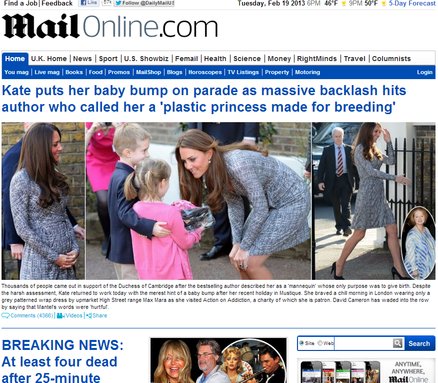
Mail Online is a British tabloid-type of news source with celebrity gossip, indignant moral opinion pieces, and of course “coverage” of breaking news. The recent Oscar Pistorious case held the same pagespace as a headline about Amanda Bynes. The site is also heavily addicting, even for those like me who try to be picky about their news sources. It outperforms almost every major news website including The New York Times and Britain’s The Guardian.

Mail Online’s disregard for traditional web design rules is apparent from their scrolltastic front page, which would be close to four foot long if printed out and laid end to end. They draw reader’s immediately by removing all advertising on the front page and doubling the rate of ads everywhere else.

The news source’s site is like a maze that you can’t ever be totally lost in. Sidebars have over 50 stories, each with images, and a visitor can end up pages deep before they realize they haven’t been to the front page, but they don’t feel lost. The feeling is similar to Wikipedia’s site structure where visitors follow links down the rabbit hole, but are still connected with almost every navigational tool the front page offers.

Kelsey Campbell-Dollaghan explored Mail Online’s rule-breaking design innovation more at Co.Design. I’m unsure whether this type of rule breaking is actually good for web design, but I have always been attached to overly designed styles which emphasize aesthetics. Mail Online suggests that aesthetics may actually be holding back design.

The debate between skeuomorphism and flat design has been covered thoroughly, but when I talked about it I found it hard to think of many examples of flat design. Possibly because I largely use Apple products or because flat design is a new-ish trend, I find myself interacting with skeuomorphic design interfaces much more often than flat design schemes.

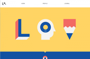
That doesn’t mean there aren’t plenty of sites out there using the ideas behind flat design to create striking pages. For those unfamiliar, flat design is a style that drops all forms of imitation of depth or “realism” in favor of designing based on the flat screens we actually use. A great deal of new sites are using the style to create clean, minimal pages that emphasize simplicity and interaction, and Chris Spooner compiled a list of sites that have sprung up using flat design, complete with images for each website.

The actual debate between the two design methods is of course overblown. Some writers act as if the schism will decide the future look of the internet in the same way VHS and Laserdisk competed for how we watched movies at home. Unlike that type of competitive market, neither is “better” for the internet, though one may be more suited for your current project. These pages definitely make it clear that flat design can inspire creative and user-friendly interfaces just like skeuomorphism can.

Source: Flickr

Typography lagged behind a lot of innovation online for years because of constrictions on font use. Text on the internet relied on a few fonts that would be on almost every visitor’s computer, and even then you were doubly limited by text legibility. Web-safe fonts opened the doors a little for designers, but they also created their own set of unique problems.

It hasn’t been until just recently that creative typography became easily achievable and widespread online thanks to a few technological jumps. Higher display resolutions, more control over text, and the wonderful @font-face implementation has made typography not just a creative flourish, but a necessary concern when trying to make a gorgeous site.

Whether or not this is related to the burst in popularity for typography in design as a whole is hard to tell, but it is hard to deny that while the internet has been making typography easier, more traditional designers have also been enjoying a renaissance for calligraphy and innovative use of text.

Paula Borowska is as big of a typography lover as I am, and she agrees that 2013 is going to be huge for online typography. She predicted the typography trends for this year over at Designmodo, and it is interesting to see how many of her predictions are parallel with the wider trends for web design at the moment. The first trend she mentions, an increased utilization of white or negative space, has been on every web design list for this year, and it is hard to deny that eye-popping use of text has helped push minimalistic design to new heights recently.

High quality images are one of the best ways to make a website look great, but they pose a problem. No matter how nice a website looks, if it takes too long to load, your audience won’t stick around to see it. Images are one of the biggest slow downs on a websites loading time, but there are ways to optimize your images so that they don’t kill your speed.

Gisele Muller found a few tools that help lessen your images’ load on your site. They all are mostly simple, like TinyPNG which uses smart lossy compression techniques to make your PNGs smaller without destroying the quality of the image. Most function by removing the unnecessary information included in every photo, such as color profiles or comments.

No matter what, if you want a gorgeous site, you are going to want to use quite a few images. If you want people to actually use your site, you will have to find ways to optimize those images so they don’t slow you down and hold you back.

The cloud has changed how many use the internet drastically, especially designers. In the past, we were forced into filling hard drive after hard drive with revisions, inspiration, textures, and every other sort of file needed for work. Then, for collaboration, you either e-mailed these files to a coworker, or dropped off a flash drive.

Now, instead of endless e-mails of different versions of the same project, designers, developers, and clients can all access the newest version, compare it to past versions, provide input, and even make revisions in some cases, all at the same time while only saving the most important files to a physical hard drive.

Of course, there have always been online storage sites, but the largest differences between older storage services and new cloud-based ones is the speed that the information is delivered to others, and the wider accessibility. The cloud uses multiple servers to deliver one set of information, rather than finding the server with the site or image you were looking for and relying on that server alone to return the proper page. It also allows multiple accounts to be able to have access to the same files without having to create a hierarchy of accounts, though you can if you need to.

If you don’t understand how the cloud works, I suggest checking out Rob Toledo’s article at Vandelay Design. The cloud is revolutionizing the internet, yet again, and if you ignore it you will be left behind.