Email marketing is considered one of the old standards for online marketing. It has existed since the internet boom, and it still works today. Basically, email marketing is making specialized custom emails to generate leads, promote your brand or a specific offer, and initiate deals with consumers.

However, there is a common mistake many marketers are still making that diminishes your brand’s reputation and credibility. Many email marketers are still not creating proper email templates that are optimized for typical inboxes. Simply put, seeing a poorly formatted or designed email sends consumers looking for the button leading back to the inbox, or worse, looking to label your email as spam.

Web Designer Depot writer Lior Levin has a list of 10 ways marketers fail to properly structure their emails, ranging from writing the body copy of the email in a word processor (which attaches extra HTML code that will likely ruin the layout) to forgetting to create a plain text copy for those who require it.

With how long email marketing has existed, you would think most would have it down already. But, judging from my inbox littered with random emails that look terrible or don’t load, it seems some at least need a refresher.

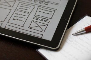
Prototyping your web designs can come in many different forms, from sketches on a napkin or in a notebook, wireframes, or high-fidelity mock-ups. No matter what way your prototyping takes shape, it is critical that the prototyping process is treated as an important part of your workflow.

Wireframe

Source: Flickr

There are quite a few reasons prototyping is integral to the web design process, but the main point is that they can save you extra effort you might otherwise use on creating a design that may not work. This is because prototypes take relatively little time to create, and they can help you identify issues in your design early on. Instead of spending hours laying out a page and tweaking it to find what works best, you can start crafting your design with a solid idea what you want, if you’ve spent the time beforehand to plan it out.

Prototypes also allow you to create variations on designs and compare them much more easily. Instead of coding different designs and layouts to compare. Using sketches or high-fidelity mock-ups, you can easily put the different iterations side-by-side. This means no switching between tabs and saved layouts and designs.

Jacob Gube points out more reasons prototyping is a must for any designer’s work process. Most importantly, putting your ideas on paper before investing time and energy allows you to cut any bad ideas at the beginning of the process. It also makes it easier to communicate your ideas to clients or employers who may need to approve a design.

Pretty much anything connected to the internet is in a constant state of flux and evolution. Web design is certainly not exempt from this. That’s why it is important for every working designer to stay in touch with what is current, but for someone who may have graduated from school five, ten, or even more years ago, it is easy to not realize how out of touch you really have become by sticking to what you know.

Brian Morris, writing on Creative Overflow, realizes how easy it is to get disconnected from current web design if you aren’t making a point to stay up to date. But he also points out seven easy ways to make yourself a good current designer again.

Getting back in touch with what is happening is as easy as taking a class at a community college. I’m sure you don’t need a design 101 class, but just looking at a class catalog  you can identify areas where they may be teaching programs, skills, or ideas that weren’t en vogue or even created when you were in school.

The largest reason there isn’t an excuse for being behind the times is the community of web designers just spewing out tutorials, resources, and helpful articles available for free. Just browse design blogs until you find something you don’t know how to do, then follow the tutorial while you watch it. Just viewing a movie of someone telling you how to do something won’t help you learn it very well.

Honestly, most of Morris’ suggestions are things any good designer should be doing to start with. Constantly viewing colleagues and peers’ work helps jump start the creative process, and you can see ideas and skills you might not know, just like entering contests keeps you pushing to make the best design possible. What the suggestions do show though is the one thing you can’t do in web design: become complacent.

I’ve explained what responsive design is fairly exhaustively. We all know its benefits  and at this point it is one of the biggest buzzwords in web design around. But, with any hugely popular web design method, a fair amount of misunderstandings came with the rise in popularity.

Many people have read about what responsive design is, and they understand that information fairly well, but what most people don’t understand is what responsive design is not. Jeff Orlor helps clarify what responsive design is and isn’t, and by pointing out what responsive design can’t do, it is a lot easier to understand exactly what the method is as a whole.

One of the biggest misunderstandings is the idea that responsive design provides the exact same experience on every screen. This isn’t possible, and if it was, you wouldn’t like it because all text and images would be absolutely tiny. If you’ve ever come across an un-optimized page which you’ve had to pinch and pull at to see anything, you have an idea what it would be like if a page looked the exact same on every device.

Instead, responsive design squeezes the content from a big screen into a smartphone at the expense of some content – namely images and graphics. Responsive design doesn’t recreate the site exactly, but tries to replicate the experience in the best way possible.

It is also widely believed that responsive design is a huge time saver, because designers don’t have to design a page over and over for different devices. This means, yes, designers may save time in the actual designing stage, but responsive design isn’t a miracle time saver. Testing is still required for every device to make sure everything is working properly. That testing takes time.

Responsive design is going to stay around, as people show they prefer to get their news and other text based content from websites rather than apps. It has amazing benefits which most will appreciate, but, like every method, it has its limits.


Photoshop is the program for graphic design. At this point, that is considered more of a fact than an opinion. It is the standard which just about everyone that can afford it uses. It might not actually be the best for web design anymore, however.

Fireworks, originally made by Macromedia, is another Adobe product, which Harish Chouhan believes makes more sense for web design, especially with its recent integration with other creative suite software.

So why is it better? First off, it allows for much faster and easier prototyping and sketching. You don’t have to constantly worry about layers because Fireworks automatically makes each element an individual object to be edited, scaled, etc.

Fireworks also uses PNG as it’s native file type, which makes Fireworks files much more sharable than Photoshop documentaries. PNG, or Portable Network Graphics, is a patent free file format which allows for saving of multiple Meta data.

Chouhan has even more reasons you might consider switching to Fireworks. It can do almost anything Photoshop can, but it will save you time and frustration.

Not too long ago, web designers were restricted to a set of universal type faces that were installed on nearly every computer. If they wished to use more extravagant typographical designs, they pretty much always had to create images with them instead of directly placing the text on the page.

With the @font-face CSS rule, designers can input their own fonts on websites, not relying on the visitor to have the font already installed. In a design community where there are literally hundreds of thousands of free fonts available, having the freedom to use any font you desire is like taking blinders off of a horse.

Keep in mind the rules of design however. More than three fonts on one page is going to look excessively busy, and will likely slow down the loading times of your site. Designmodo helps walk designers through adding the @font-face CSS rule, and they urge everyone to use universal fall back fonts, which is smart advice. Not every browser supports @font-face, and you don’t want to ruin accessability for any group of users.


Web designers find themselves continuously facing the largest issue for anyone in an artistic career. It is often difficult to start a career making work you love while earning enough money to live comfortably. Every artist is used to cutting costs when they have to, like eating Ramen noodles for a week or two to afford a program or drawing tablet.

Of course, there are less drastic ways to save money so that you can be a successful designer. One of the biggest costs for designers is software. $400 Adobe products that get updated every year can take a huge chunk out of your budget, but there are plenty of small software developers creating cheap or free alternatives. For $50-$100 you can find software that can accomplish nearly everything that $1000 dollar Creative Suite can do.

Speaking of free resources, the design community also serves as one of the greatest methods to get free textures, photography, icons, WordPress themes, and any sort of plug-in you could imagine. Searching for blogs and sites that offer these types of free resources also gives you an opportunity to interact with others in your community which can lead to strong professional relationships down the road. Just a simple, friendly “thanks” for the free stuff leaves a nice impression.

The active design community offers another type of resource that can save you tons of money on books and classes as well. There are all sorts of free tutorials and workshops online you can participate in that will keep you up to date on the latest design standards while putting you in direct interaction with others in the community.

Brian Spero from Web Designer Depot has plenty of other ways designers  can keep their costs down. If you are a recent graduate or a newer freelancer, these ideas are definitely better than living off of Ramen.

If you look at the tags for most articles on responsive design, you will notice the way most writers connect responsive design to mobile design. Thinking of responsive design as a mobile design method kind of misses the point however.

When Ethan Marcotte first coined the term ‘responsive design’, he wrote, “responsive design is not about ‘designing for mobile’. But it’s not about ‘designing for the desktop’, either. Rather, it’s about adopting a more flexible, device-agnostic approach to designing for the web.”

So what exactly is device-agnosticism? It is the main selling point of responsive design. The device-agnostic approach to design is designing for every device at the same time, or focusing on no specific device. PC Magazine defines it simply as saying the approach is “not tied to a particular device.”

I won’t say more about the benefits of thinking agnostically about devices, as it is already covered in just about every article I’ve done about responsive design. But, what I will say is I made the same mistake many have by slipping responsive design under the idea of mobile design. Thinking that way still focuses on the needs of devices. Instead, as Sarita Harbour from Web Designer Depot, explains, you should stop thinking about the needs of devices, and start thinking about the needs of the consumer. Isn’t that what is most important anyways?


You know how sometimes a group of words are thrown around together so much their meaning becomes blurry? If you don’t understand what I mean, think about how you understand brand, identity, and logo. Almost any article about logo design will intrinsically link these three words together without clarifying where the line between each one is. I’m as guilty of this as anyone else.

Jacob Cass from Just Creative noticed this and put it upon himself to clarify the differences between brand, identity, and logo, and what each does. Breaking it down simply:

  • Brand is the “perceived emotional corporate image” of the business all together.
  • Identity combines all of the visual aspects that form a brand.
  • Logos identify a business in the simplest form by using icons.
It is a heirarchy in which a logo is part of the visual identity of a company, which helps mold the brand as a whole.

Branding

It is hard to write shortly about branding, as Cass even points out, but to summarize the concept, it is the audience’s idea of a service, product, or organization. Visual aspects of the brand including its marketing and logo can help mold it, but ultimately, the audience decides the shared perception overall. “A designer can’t make a brand […] a designer forms the foundation of the brand”, which the audience then builds upon with their reception of the product and marketing as a whole.

Identity Design

That foundation the brand is built on is it’s identity, or its image. Every business creates sets of visual devices they use to interact with their audience including color palettes, fonts, layouts, etc. Every visual aspect is considered part of the identity, even things like a web page design, and especially the logo.

Logos

I’ve talked quite a bit about logos before, but when it comes down to it, a logo identifies your brand. It becomes one of the most prevalent aspects of the image, and shapes how customers perceive your brand.
According to Cass, a logo doesn’t sell or describe a company, but that is the only aspect of his article with which I don’t completely agree. Once a business is established, their logo is understood by the quality of the company and product it represents. However, for young businesses trying to establish themselves, a quality logo is important in attracting companies by letting them quickly know what that company does and showing they care about how their audience feels about them.

Conclusion

The three are absolutely linked, but when writing about them we often make it unclear what each seperate part really is. Logos affect identities, which set the floor for a brand. All are important, but they are all unique to each other

The internet relies on agreements and standards to work, especially web design. With the constant barrage of new devices and input types, there is the need for each design to follow these agreed upon practices, less our entire system fall apart. This is why it confuses designers when a device or browser seems to ignore those practices.

The iPad Mini is a huge problem for many designers. The device-width viewport tag is set to the same values as the original (and obviously larger) iPad, which means that every button, logo, and line of text, appears 40 percent smaller. To someone using the tablet, this means everything is tiny.

That’s not to say the iPad Mini is the only rule breaker out there, but it is the latest high profile case which makes us all have to reconsider how we do design. The writers from A List Apart have used the issue to try to understand just what the issue is, and why breaking the agreed upon practices could actually be good for designers.