Tag Archive for: tutorial

ResponsiveRetinaFriendlyMenu

Responsive websites are all the rage right now, but there are still a lot of common problems with implementation that need to be taken care of. One of the biggest problems is navigation.

Many websites have problems figuring out how to handle shrinking extensive navigation systems so that they can fit onto a smaller device’s screen, but the truth is, if you can’t minimize your navigation tools into few enough buttons to make easily usable on a smartphone screen, you already need to redo your navigation.

It’s true, some web sites need more menus and navigational options than others, but if you have more than two layers of drop down menus or more than seven or eight main navigational categories, you are statistically more likely to be suffering from bad website organization rather than running a sprawling media empire.

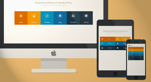
Codrops created a tutorial to help solve both problems, and it teaches you how to make an icon font at the same time, just for the sake of it! The tutorial teaches you how to make a more simplified, classy looking responsive menu that is retina-ready, making it perfectly up-to-date with all the current design trends. If you want a quick way to learn all the modern tricks, their tutorial has got it all covered.

Image courtesy of Web Treats

Image courtesy of Web Treats

Icons are essential for web design, especially when it comes to navigation. But, a problem comes with these icons. They look great at their normal size on a website, but as soon as you start pinching and zooming on a mobile device, the begin to blur similar to how pictures become more abstract the more you zoom in.

Considering these mobile devices are quickly reaching a standard with Retina or similarly high definition displays which bring attention to every low quality, blurry, or pixelated image and icon on a page, even the tiniest icon with a bad resolution when you zoom in is a big eyesore. Even when you use the Retina optimization trick of using images that are twice as large as normal and displaying them at half their actual size doesn’t protect your icons.

There is a solution however. If you notice when you are using a smartphone or tablet with a high resolution screen, when you zoom in the text maintains its integrity. Even the most scaled letters look crisp and clear. This is because fonts use a different technique to make what are essentially vector graphics in smaller file sizes so that the “image”of the letter rescales as you pinch and zoom. Luckily, your symbols and icons can be turned into these types of “icon fonts.”

The process is mostly painless and there are some clear advantages to icon fonts such as smaller file sizes, and compatibility with all modern browsers, including older versions. There is also the added benefit of not having to keep huge collections of differently sized versions of the same icons.

Web Designer Depot will help you get started turning all your vector icons into web fonts with the use of a free web app called IcoMoon.

Everyone wants their landing page to make a splash, but how do you make an impressive header, include navigation, and not end up covering up too much of your page?

This used to be an issue solved by sidebar navigation, or other secondary navigation systems, but it seems there may be a way to show your readers a big visually stimulating header/menu bar combo that gets out of the way when viewers begin looking at your content.

Websites like This is the Brigade and All You have implemented this dynamic, animated menu that resizes as you scroll down, shrinking the navigation to let your content breathe.

It gives you the opportunity to show your brand or logo, and make a huge first impression, but then you can move the focus to what really matters to readers. Antonio Pratas has a tutorial at Web Designer Depot for anyone who wants to try this new style of header out.

Building a backlink profile is considered a staple of SEO techniques, but eventually you may have to do some cleaning up, especially now that Google has introduced multiple algorithms to clamp down on the use of low-quality links.

If you’ve seen a sudden drop in traffic or rankings lately, it is likely you were hit by one of these algorithms. You may have received a notification of being penalized, but unless it was a manual action, it is highly likely you got no warning that you were hit by the changes. Either way, one way towards repairing the drop in traffic is to do some pruning on your backlinks, and removing low-quality links that are pointing to your site.

Cleaning up your links is neither fast nor easy. It takes time and patience, but with effort you can restore your site’s health. You can’t just go in and cut out random links hoping to solve the issue. Attacking the problem broadly could cause more problems, and pruning backlinks is considered a last-ditch effort according to SEO.com. “You should exhaust all of your other efforts like updating your content, building higher quality links and producing good content to promote and engage users before you consider removing bad links.”

After you have tried all these methods and determined whether your website was hit by a penalty or an algorithm update, then you can create a strategy for fixing your backlinks. Neither problem can be fixed automatically. If you received a manual penalty, you will have to do everything you can to fix the issue identified, and submit a reconsideration request. Algorithm updates, on the other hand, require changing your methods and waiting to see positive growth for your site.

If you are ready to put in the work and time to try to properly repair your site, and you’ve already tried everything else, then it is time to really get your hands dirty. SEO.com has a full tutorial for cleaning up backlinks, and it walks you through every step, including suggesting tools for analyzing backlinks.

Retina capable displays don’t seem to be going anywhere, and every new analysis of mobile browsing shows that Apple dominates the mobile browsing market. Add to that the number of people using new MacBook Pros, and you have a fairly large audience using very powerful screens.

For the designer, this poses an issue. How are you supposed to go about creating graphics at high enough resolutions for these screens? Even worse, how are you supposed to make your old website look good on these new screens?

Well Chris Spooner has made a tutorial available at Line25 to help you through this, and he makes it much easier than you probably thought. From creating new graphics to optimizing those old images, the tutorial covers just about everything you need to know, including the code.