In just a few years, mobile browsing has gone from laughably tedious to one of the fastest growing ways we access the internet. With that meteoric rise to popularity comes misunderstandings thanks to generalizations, but the reality of mobile browsing is much more complex.
Karolina Szczur wades through the misconceptions about mobile browsing and design, attempting to clarify the truth about mobile design and show how believing these inherently false ideas leads to designs that don’t really work for the current web.
The biggest misconception is that mobile is well-defined or even monolithic. This isn’t helped by most articles which suggest tips for mobile design which lump all devices, browsers, and even tablets all into one category. It is easy to forget when we write about mobile browsing like this, that ‘mobile’ doesn’t actually refer to the handheld devices. It it refers to the user, according to Barbara Ballard, author of Designing the Mobile User Experience.
Focusing on devices when designing for mobile misses the more important factors surrounding users. Context defines more of what mobile users are doing than their devices. The most wide-held view of mobile users focuses on out-and-about shopping, but studies have shown that 70% of Americans use their phones in the bathroom, and just as many use them while sitting on the sofa, away from their desktop.
The usual decision when thinking about mobile users as “on the go” is to streamline everything on a site, but this forgets that mobile users are often trying to perform complicated transactions or reach full length articles from areas where a desktop isn’t feasible.
This monolithic attitude about mobile browsing also leads people to think that mobile browsing is dominated by Apple devices. While those with iOS devices are the most high profile smartphones and tablets, Google owns roughly 53% of the smartphone market in the US.
The difference is, Apple uses one standard device, whereas Google’s smartphones are spread across a vast array of Android devices with wildly different display sizes. Designing just for Apple is actually designing for less than half of the market out there, and ignores the huge variances available. When you then include the number of browsers available on smartphones and tablets, designing strictly thinking about Apple’s Safari browser is focusing on just a small share of users.
These are just two of the wide-held misconceptions about mobile browsing, and they spawn from generalizations meant to make the field of mobile browsing seem digestable, but it ignores every big of fact available. The reason for the huge boom in responsive design over the past year is a reaction to just this problem, and it serves a strong solution. Mobile browsing is anything but singular, and design now has to take into consideration the hugely different ways we all browse.
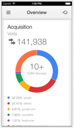 A few weeks ago Google finally got around to releasing the iOS version of Google Analytics. The app had been available for Android for quite some time, but the release to iOS makes website data available to webmasters at any time and it is fair to assume some business owners and webmasters may be trying to use Google Analytics for their first time.
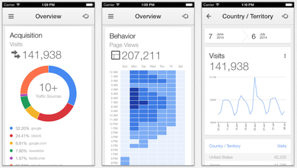
