Tag Archive for: design resources

Design Kit Screenshot

In general, web designers seem to like tools and resources that speed up their work and ease some headaches. This is most notable by the sheer number of them available. Nearly every design blog or website offers some unique design kit or has a recent blog post sharing the best recent kits.

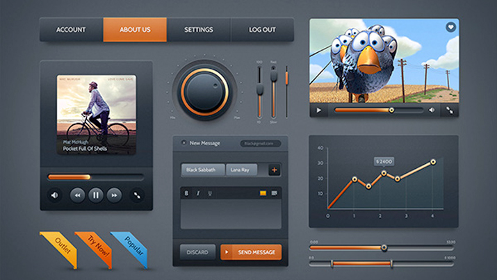
You might be asking what a design kit is, but these kits aren’t uniform. They come in all shapes and sizes, varying wildly in scope and cost. They also range in quality from ‘incredibly useful’ to ‘waste of harddrive space.’ The best definition for a design kit is any prepackaged tool or piece of software which aids in the creation of a digital design project.

Some design kits come with interface packs, buttons, and graphics all intended to be used together. They may come with a specific color and font palette, but they are almost always customizable. Some kits are niche designs aimed at solving a specific problem, while others are catch-all assortment or full design templates.

The thing is, while these design kits can definitely help a designer in a time-crunch, they have their fair share of drawbacks, as Carrie Cousins discussed in her recent article for Design Shack.

  • Costs – One of the biggest issues with these kits is they don’t always come cheap. There are some great free kits available, but you should expect to pay for kits filled with premium features. For some budgets, this alone can rule out using a specific design kit. Thankfully most kits are relatively cheap for single license use.
  • Too Similar – Some kits begin to look bland because all of the parts are designed to be used together, but without a full finished design in mind. This can result in kits with 50 nearly identical buttons in an assortment of colors. It is up to the designer to choose parts that will look interesting together, but it can be tiring trying to sort out a repetitive and boring kit.
  • Incomplete Kit – Be careful to read all of the details for any kit before you buy so you know what you’re getting. A 1,000 piece kit may seem really useful and interesting until you discover it is largely made or elements you can’t really use. Many kits are themed and only contain certain types of icons such as social media buttons or calendar icons. Don’t spend money on something that doesn’t offer what you need.
  • Looks Too Much Like Another Site – Obviously the biggest problem with using pre-made tools and elements is eventually you’re site will look astonishingly like someone else’s who also used the tool. Many designers aspire to work solely from scratch specifically to avoid this problem, but you don’t have to completely swear off design kits to be original. Use the kit as a starting point. If you use all the elements and layouts as they came, you’re much more likely to look like any other site. If you spend the time to give these elements your own personal touch, you’ll look equally unique.

Sidr jQuery Plugin

Navigation has always been one of the most important aspects of a website’s design. If you can’t move throughout the site, chances are you won’t use it. However, navigation is also one of the few site design aspects with no tried and true solution. What might be right for me, may not be right for you.

Of course, there are some pretty good criteria you can use to judge what type of navigation you need. A small site can get by with a simple drop-down menu or the basic “three line” toggle menu. Larger sites have a much trickier task. They can use “mega menus” for their desktop version, but they will need another option for the mobile site.

Thankfully, most menus aren’t created from the ground up, so you can experiment fairly easily. Paul Andrew from Speckyboy compiled 15 jQuery plugins for navigation. They’re even responsive. Once you’ve found the one that matches the needs of your site, you can customize it and make it truly feel like a part of your website.

Easy Infographics Graphic


It is undeniable that social media has completely changed the ways we share information. Gone are the days when loaning a book was the best way to help your friends learn about a topic. Even long form blog posts are often smothered by easy-to-understand content delivered in direct and immediate formats that are fun to read and tempting to share.

This is clearest when you look at the infographic, poster styled graphics aimed at informing people in depth on topics, similar to the way some of the more detailed posters you find in schools function. The difference is that infographics tend to give much more information than any of those posters ever could, thanks to the removal of site constraints.

Infographics engage users and attract them with stylish graphics and colors, which make readers more interested in the information that would normally be boring. Because of how easy it is to digest the information and get excited about what they present, infographics are incredibly popular on Facebook.

For a while, creating one of these infographics basically required a dedicated designer on staff, as no one gets interested in equally boring or sterile graphics without any of the style that bring infographics to life. That has changed much over the past year however, with a lot of credit belonging to the number of free tools and web applications that quickly help put together infographics with minimal design knowledge.

Crazy Pixels shared 10 of these free resources for businesses or bloggers hoping to share a lot of information in an exciting way. Of course, if you just slap something together on one of these applications, it is still going to come out bad. But if you take the time to compose the graphic and market it towards the proper audience, the rest will take care of itself.

Photoshop IconRaw, high-quality PSD files are one of the most treasured finds online for web designers. They aren’t particularly easy to find, especially compared to all of the readily available resources out there like tutorials, scripts, and templates. A combination of contractual restrictions for much of our professional work, and fear of outright plagiarism of our hard work keep many from sharing their finished PSD files for others to use.

We should be sharing more of them however. PSDs speed the design process up dramatically, as designers can cut and borrow elements of existing files rather than building nearly identical looking versions from scratch, as often happens.

PSDs are also great for learning. Rather than reading tutorials, designers can dig into PSD files and see how every layer acts, individual settings for simple elements, and truly get hands on while studying other designers’ techniques.

While these files aren’t as popularly shared online, there are some sites devoted strictly to sharing PSDs for our own use. Jacob Gube listed the ten best sites posting new files on a regular basis that are high enough quality to be used professionally.

grid4


Apple’s keynote event earlier this month made news across the world, and few were impacted by the announcement of the new mobile operating system iOS7 more than designers and developers. While consumers will be receiving an updated user experience and new aesthetics on their phones and iPads in the next few months, designers are rushing to update apps and icons to keep their content up to date and optimized for the new operating system.

These designers won’t be forced to redesign from the ground up, however. There are already numerous resources available to help update to the new iOS. Designmodo is gradually collecting the best of these resources, and they recently highlighted two different icon grids for iOS, which are templates which you build icons on top of.

Beyond offering a few simple grids to assist the icon redesign process, there are also tons of examples of updated icons to help get designers steered in the right direction before the public has even gotten a hands-on turn at the operating system.

Reading a BookOver the weekend, I got on a reading kick, but often the biggest challenge in those instances is picking the best book to start up. Of course, you could always try to trudge through A Song of Fire and Ice, or some other fiction, but lately I’ve been hoping to get a little more out of my reading.

Thankfully, there are practically an unlimited number of books for designers and developers that there is no shortage of information or discussion for me to choose from. The best part is, the most recent wave of books have almost entirely been ebooks that cut out all the production costs and are available for free.

You can look into any design topic you want and almost certainly find a book focused on that idea. Whether you want to learn a new coding language, research the latest trends, or learn some historical perspective to inform your designs, there is undoubtedly a book on it. Rather than making you do a lot of Googling and vetting to pick the best book for your interest, Paul Andrews put together a list of 19 free ebooks that cover everything you want to know.

Some of the ebooks are simple guides like Mobile Web Design Best Practices from Mobify which (as the title suggests) walks you through 50 of the best ways to build the best mobile site possible. Similarly, you could check out Web Design and Mobile Trends for 2013 from Awwwards if you are looking to catch up on what is all the rage right now.

There are also much more in-depth texts you can dig into such as Learning JavaScript Design Patterns by Addy Osmani. The ebook teaches designers how to write beautiful, organized, and most importantly, maintainable JavaScript through the application of classical and modern design patters to the language.

Whether you’re looking to pick up a new skill or refine and improve your existing ones, there’s an ebook that will take you from start to finish with half the headaches of digging into a myriad of tutorials and online articles from a whole bunch of conflicting sites and writers.

Flat Design IconsFlat design doesn’t seem to be going away. The popular use of pastel colors and minimalistic layouts is getting bigger every day, and even the biggest proponents of skeuomorphism (ahem, Apple) seem to be caving to the new focus on designing for the screen rather than designing based on the physical world.

For many designers, this might mean an entire overhaul of your site if you are trying to stick with the trends. However, before you go banging your head against the wall about having to build your site from the ground up, remember that any big web design trend probably has tons of free resources already available to help speed up the conversion.

This is obviously the case with flat design, and while there are scripts to help with making a flat web site responsive or managing navigation, there are also free sets that will help you fill out the details of your site with any icon you need in a style that will match your new page.

Speckyboy recently compiled twenty free icon sets that will help with navigation, social sharing, or payment methods that your users will be seeing. Designmodo also created their own personal set of icons they shared wih their readers designed specifically for social media and sharing.

The icons are all high quality, resizable PNGs or PSD files, and you won’t have to worry so much about the tiny details while you’re working on the bigger picture of your site. Oh, and don’t be confused if you think many of them look like app icons. Rounded corners and geometric shapes are a big part of flat design.

CSS lets us do wonderful things as designers, but it can sometimes be a hassle. If you are super experienced, you may have learned to avoid the problems, but the majority of us are way to accustomed to beginning with a very simple CSS file, and watching it spiral out of control as you continue development.

As you create your site, your CSS gradually becomes a mess. It looks disorganized, borderline unreadable, and there are inevitably quite a few mistakes spread throughout. It doesn’t mean you’re a bad designer. In fact, this could happen to anyone.

Usually there are two ways to deal with this, you can either regularly stop your site development and clean up the CSS, or you can wait until the end and dive into fixing everything all at once. Either way, it takes forever.

Recently, a third (much faster) way has come up. Why not just use a tool to keep your CSS sorted and formatted? No tool is going to keep your CSS looking perfect, but they can at least keep it organized enough to be readable when it becomes time to edit, and you won’t have to do near as much editing as you did in the past.

Speckyboy Design Magazine collected a whole bunch of different options for keeping CSS code looking clean while you work. While none of them will recognize your unique way of writing the code, but you should be able to find something that fits you well enough to make your life much easier.

retinize-it

Making “retina-ready” images isn’t exactly difficult, but it is definitely tiresome and far from fun. No one likes looking back on all of their website’s images and having to painstakingly go through and rescale and resave individual images all day. That’s exactly why web design tools are so popular. Designers aren’t quite lazy, but boy do we hate doing tedious tasks.

Artiom Dashinsky from Tel-Aviv was the designer who decided this issue needed a free tool to speed up creating high definition images for high density “retina” screens. His creation, “Retinize It” is an automated set of two Photoshop actions.

As Noupe explains, the first action slices a selected layer or group into a single image, then opens the dialog for saving the image for the web. The second one does the same, scaled the sliced area up 200-percent, and reopens “Save for Web” so that you end up with two differently scaled versions of the same image almost automatically.

Before you use Retinize It, you should always make sure your image relies on shapes or has been turned into a smart object. Traditional pictures will just be pixelated by the simple upscaling.

Dashinsky’s tool is far from revolutionary, and won’t accomplish much that any competent designer wouldn’t be able to do for themselves, but it cuts down on wasted time spent manually reworking individual images.

Responsive Screen CaptureYou’ve heard all about the pros and cons of responsive web design. You know it creates a consistent experience across different devices, and how it will save you from developing many different versions of the same site, but you’ve also heard that it “isn’t easy.”

Well responsive design may not be something a toddler can do, but Kendra Gaines has a way to make responsive design easy enough for almost every competent web designer out there. Thanks to the endless tools, frameworks, and plug-ins, responsive design is possible for everyone without too much fussing over the little details.

Gaines gathered 13 different responsive design tools you can use, and if you implement them all in your work flow, making your site responsive will be a simple matter you don’t have to fret over.

Even better, normally when you trade pure hard design work for tools, scripts, and other free resources, you end up sacrificing control and precision. The wide selection of these tools as well as the niche abilities of many of them make it so that you don’t have to compromise any longer.

Responsive websites are quickly becoming the standard, so it is imperative to learn how to adapt your sites to the new design world. You can still get away with your special, mobile-optimized websites if you so desire, but you are giving away consistency and features. Don’t give users a lite version. Use these easy resources to make your full website fit into anyone’s pocket.