Just because we are a month into the year, it doesn’t mean some aren’t still giving their predictions for what will be popular this year. Jake Rocheleau is a little late to the fray, but he makes a couple predictions which pique my interests, especially because he stays away from the standard for this years’ lists, responsive design.

Instead of just repeating that responsive design will be big this year, Rocheleau suggests responsive design is going to shift our workflows to starting on mobile and building sites up from there. Mobile first design allows you to identify what is important from the beginning, then flesh out the site for other platforms. The traditional method of starting on desktop usually turns into a game of squishing and cutting elements when scaled down for mobile.

Rocheleau also uses a popular implement for many social media websites as a sign that soon infinite scrolling will be common on the web. Facebook, Tumblr, Pinterest, and Twitter have all popularized the layout style, and even Reddit’s most popular add-on, Reddit Enhancement Suite, adds in infinite scrolling, as well as numerous other features. This style doesn’t work for every type of site, but it certainly is spreading.

His other predictions aren’t as interesting as the last two advancements. White space and minimalist designs have had a niche following for years in web design, and while many sites use this style, it is hard to see it becoming widespread. The idea behind using minimalist designs or a lot of negative space is that it removes clutter and helps users focus more on pages. Clutter on a webpage is never good, but most companies will continue to opt for other solutions, if the trend continues as it has been.

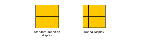
The same goes for big photography. In the circles extra large photography online benefits, big photography has been common in some form for years. Design portfolios and personal websites have long organized their main pages around large, high quality images. The newer high definition displays out there definitely make these types of pages pop a little more than they used to, but it is hard to see it becoming any more common than it already is.

It is always interesting to look at predictions or annual lists that arrive a little behind the rest of the pack. Most lists for 2012 that came out in early January or late December tended to focus on responsive design and parallax scrolling. Those two design implements are keeping their foothold, but as this list shows, we’re already moving further with design.

I recently wrote about the current debate over skeuomorphism and flat design, but after investigating more into the topic, I don’t feel like I explained skeuomorphism as well as possible. Of particular interest to me was Paula Borowska’s article for Designmodo specifically looking at skeuomorphism.

The biggest misconception about skeuomorphism is also the one I failed to address in my original definition of the concept. Skeuomorphism isn’t simply mimicking the way something looks. It is copying the aesthetic properties of the material, the shape, and most importantly, the functionality. Those apps using faux leather backgrounds aren’t part of skeuomorphic design.

More than anything, Skeuomorphic design is about functionality and shape, not texture. The object doesn’t have to physically do something, but it has to convey the idea of functionality  For example, a paperclip on a “stack” of photos is skeuomorphic design, because it appears to be holding them together.

Apple, always noted for their use of skeuomorphism, have the newsstand, the most famous case of the design technique. It, of course, has the wooden texture of a bookshelf, but it also used the newsstand shape and shelved to organize the magazines like they would be on an actual newsstand. Sure, it looks pretty, but it also uses the idea of a real object to better help you understand and interact with the content.

The debate between skeuomorphism and flat design is most likely just posturing. Despite proponents on either side, neither style is inherently better than the other. Most importantly, the web is not a cohesive entity. Neither style of design is going to eradicate the other, though they may fluctuate in popularity. If the internet can’t seem to completely rid itself of Geocities style pages from 1998, neither of these techniques will be disappearing any time soon.

Designing with grids is common practice online. Every template is based around grids which let you input what you want, and most popular websites have their pages broken up along a grid. There are some issues with relying on grids for your design however.

The biggest practical issue with putting your faith into a pre-made grid is that the internet is not static, and boundaries are vague at best. Sure, every device has a set width and height, but those measurements vary wildly and there are uncountable other variables. Images are shown at different densities, text can be resized, and there are constant updates to how the web is processed.

This issue only hints at the bigger problem with relying on templates. If you aren’t making the active decisions of how your content needs to be presented, you are instead molding your content to fit the grids. Web pages are supposed to exist to present information, not the other way around. Your design affects everything on the screen, including the information you are putting out there.

Taking control and shaping your design around your content lets you decide how your design enhances your content. Adhering to a strict grid limits your content by confining it. This isn’t to say using grids in your layouts is bad.

Grids are tools, and should be used to highlight your content, and visually group related items, establish a hierarchy of importance, and create a sense of rhythm on the webpage. The issue is when webpage owners decide that using a premade gridded template rather than trusting a professional. Ben Gremillion thinks grids can even be used to bring new life to webpages, but you have to be actively deciding how to use grids and not simply slapping some information into slots.

Think about the programs you use for design. You probably think of Photoshop, Illustrator, or one of a few prominent desktop code editors. You probably didn’t immediately think of your web browser, and the numerous online tools you can use that a large amount of your workflow relies on. While there aren’t any web based graphic design tools that rival Photoshop (yet), the same can’t be said for the code editors that developers use.

While in the past, the web was just where you went to see simple HTML and find the vast number of programs you would have to use offline, now only extremely specific things require actually installing programs. Web development is one of the few arenas that has been slow on taking up web integrated tools, but that has changed significantly over the past year.

Now, I understand anyone’s reluctance to shift from a program they have been using for years to a web based coding interface, but it actually makes a lot of sense. Online tools allow for faster and easier collaboration, and they can help keep things much more organized than the endless folders could ever do. Matt Pass breaks down why you should make the switch over at Webdesigner Depot. Change is hard, but sometimes it is very worth it.

Source: Flickr

Web typography is blossoming right now thanks to new font solutions like @font-face and Google Fonts, but we still often feel limited by how much control we have over the typography in designs and publishing apps. There are some jQuery plugins out there however that are beginning to catch up to the other new font solutions gaining popularity.

Chris Spooner compiled some of the best jQuery plugins for web typography that help offer the precise control designers desire, and any designer concerned about their text can benefit from them.

The Lettering.js plugin is a super simple plugin, and that simplicity has also assisted it in gaining huge popularity. The plugin splits up text and wraps each letter in a custom <span> element giving you exact control over kerning, or even customizing CSS styles for individual letters.

Other plugins like FitText.js help solve issues that responsive design has created for typography. Responsive design changes the containers for text, which makes the text reformat to match the size, but that often makes headings and titles looking worse for wear. The FitText.js plugin allows you to scale your headings and titles just like responsive images, keeping everything on the same line.

My favorite plug Spooner has found is great for its name as well as its function. Bacon is a plug in the allows you to shape your text around a bezier curve directly within the design. InDesign has allowed designers to easily shape text around images, but HTML and CSS has traditionally made text flow in square blocks. Now, rather than using tedious and dirty HTML markups, Bacon makes it easy to easily, and cleanly, design your text around shapes with just a series of coordinates.

If you are a stickler about typography like I am, all of the plugins offered in Spooner’s article will seem like life-savers, as well as huge time-savers. Designers have struggled to take control over fonts and text since the invention of the internet, but only recently has web typography become fun rather than tiresome.

Source: Flickr

Browser plug-ins can be a huge help or a major hassle, depending on what is installed. Many of us still have nightmares about asking to use a friend’s computer, only finding Internet Explorer, and opening the program to see toolbars and add-ons clogging up half of the window space.

With time (and better browsers) however, many browser extensions have risen that actually help improve productivity. Google Chrome, for example, has tons of great free extensions in the Chrome Web Store, and Awwwards.com has cherry-picked some of the best for designers and developers.

One extension seems almost magical for us designers who have seen a fantastic font online, and then spent hours looking through collections of typefaces trying to find the closest match. WhatFont quickly inspects fonts on webpages just by hovering over them, no fuss or hassle.

Resolution Test, on the other hand, is an extension that allows developers to test web pages in different screen resolutions, simulating testing on various devices.

Some plug-ins aren’t meant to replace tools like the two listed above, but instead are intended to add to other tools. Firebug Lite for Google Chrome isn’t intended to replace Firebug or Chrome Developer Tools. It works together with them to provide rich visual representations developers are used to seeing in Firebug.

Awwwards have twelve more tools many designers and developers will find useful. Everyone loves free tools and resources, and these plug-ins can help streamline your work process without taking up hardly any space on your computer.

Lately, some designers have been championing flat design as the new frontier for layouts and interfaces, opposed to the skeuomorphism we have all come to know and love (even if we didn’t know the name for it). Since flat design may be a new bandwagon in the next year, let’s talk about what the two terms mean.

Flat design is basically what it sounds like. It is a style of interface and design that makes no attempts to cross into three dimensional realism. Microsoft 8 is the easiest example, because it is truly entirely flat. Flat design uses no gradients, bevels, shadows, or any other ways of simulating depth, instead relying on strictly designing for the two dimensional screen.

Of course, flat design has been around a while. Facebook and Google both use the style to different extents, but why are some thinking it is the best, “honest” approach to screen-based design? Wouldn’t you think designs that simulate familiar real world objects seem more user-friendly?

As Mike Redaelli puts it in his comparison of the two, “Why not make the notepad look like a legal pad if that will help your average tech user to understand the concept of the application in one glance?”

The answer to this whole debate is sadly the same as it is to most cases where someone claims a certain style is the savior we’ve all been waiting for who will revolutionize web design. Both styles are entirely valid, and can be used in wonderful exciting ways, but it really relies on what you are trying to accomplish, and who you are designing for. If your audience can’t use the design, no matter how cool it looks, it is a failure.

Retina Displays have become a buzzword for design and Apple alike, as it has managed to become synonymous with any display able to show high definition graphics, but many don’t actually understand what Retina means. For starters, “Retina Display” is just Apple’s term for any devices that can put out the high quality graphics, but almost every other brand of mobile device has devices with the same capability.

In other words, asking if your PC has a Retina capable display is like asking if HP makes an iPad.

The misunderstanding, combined with Apple’s penchant for promoting the capability without stating what it actually means in their ads, has made a huge number of people think they understand the term, without knowing the details.

Retina Display is Apple’s brand name for liquid crystal displays that show pixels at higher densities than ever before. These high definition displays pack twice the number of pixels in the same amount of space a normal display would show. This causes text, icons, and even even optimized pictures to look crisper and less blurry than before.

Source: Designmodo

This raises a couple problem however. Most websites haven’t optimized for Retina Displays, so instead many pictures and text will appear pixelated, and the new set of display capabilities adds to the already huge variance of screen resolutions and sizes accessing websites.

Paula Borowska knows how to fix these issues though, and the solution is already one of the most popular design methods available right now. Her article at Designmodo covers the different ways you can create Retina graphics and text that utilize responsive design.If you want your site to look as crisp and beautiful as it can, creating Retina level graphics is the way to go, and it can be surprisingly easy.

In just a few years, mobile browsing has gone from laughably tedious to one of the fastest growing ways we access the internet. With that meteoric rise to popularity comes misunderstandings thanks to generalizations, but the reality of mobile browsing is much more complex.

Karolina Szczur wades through the misconceptions about mobile browsing and design, attempting to clarify the truth about mobile design and show how believing these inherently false ideas leads to designs that don’t really work for the current web.

The biggest misconception is that mobile is well-defined or even monolithic. This isn’t helped by most articles which suggest tips for mobile design which lump all devices, browsers, and even tablets all into one category. It is easy to forget when we write about mobile browsing like this, that ‘mobile’ doesn’t actually refer to the handheld devices. It it refers to the user, according to Barbara Ballard, author of Designing the Mobile User Experience.

Focusing on devices when designing for mobile misses the more important factors surrounding users. Context defines more of what mobile users are doing than their devices. The most wide-held view of mobile users focuses on out-and-about shopping, but studies have shown that 70% of Americans use their phones in the bathroom, and just as many use them while sitting on the sofa, away from their desktop.

The usual decision when thinking about mobile users as “on the go” is to streamline everything on a site, but this forgets that mobile users are often trying to perform complicated transactions or reach full length articles from areas where a desktop isn’t feasible.

This monolithic attitude about mobile browsing also leads people to think that mobile browsing is dominated by Apple devices. While those with iOS devices are the most high profile smartphones and tablets, Google owns roughly 53% of the smartphone market in the US.

The difference is, Apple uses one standard device, whereas Google’s smartphones are spread across a vast array of Android devices with wildly different display sizes. Designing just for Apple is actually designing for less than half of the market out there, and ignores the huge variances available. When you then include the number of browsers available on smartphones and tablets, designing strictly thinking about Apple’s Safari browser is focusing on just a small share of users.

These are just two of the wide-held misconceptions about mobile browsing, and they spawn from generalizations meant to make the field of mobile browsing seem digestable, but it ignores every big of fact available. The reason for the huge boom in responsive design over the past year is a reaction to just this problem, and it serves a strong solution. Mobile browsing is anything but singular, and design now has to take into consideration the hugely different ways we all browse.

Source: Flickr

In the past decade, typography has re-risen as a huge interest for designers and artists of all kinds, to the point that it is possible for one to make a living designing type and custom lettering.

But, as with any newly popular area, the renewed popularity has come with misinformation and misunderstanding to what typography and lettering are. With all of the talk surrounding typography, now is as pertinent of a time as any to set the record straight on what it really is. Joseph Alessio explains it all in depth at Smashing Magazine, but I’ll walk you through the basics here.

Typography

Typography is basically how letters are arranged on a surface, and the term has existed since the creation of movable type printing systems. It is actually a subset of lettering, as it is concerned with how letters are applied to typefaces.

The most simplified and easily understandable explanation comes from Gerrit Noordzij, professor of typeface design at the Royal Academy of Art in the Hague from 1960 to 1990, and his definition helps show how typography is different from the broader category of lettering. Typography is “writing with prefabricated characters.” This makes it clearly distinct from lettering, handwriting, and even graffiti, because those types of writing do not use repeatable sets of characters.

Lettering

Lettering is simply “the art of drawing letters” as Alessio puts it. While lettering can cover a huge area of character creation, it is easiest to think of it as custom letterforms created for a single use, usually focusing on the overall composition, rather than strict adherence to established characters. It can be made on the computer, but not by laying different fonts next to each other.

While typography is a subset of lettering, when talking to clients or other designers, it is wise to distinguish between the two. Lettering is usually thought of as design made of custom letters, whereas typography is a design made out of existing fonts and typefaces.

The two are easily confusable, and it is of little surprise that their definitions have largely become entangled, but understanding the differences can help you communicate what you want more easily, as well as keeping you from looking uninformed at an important moment.