Despite public perception, web designers and developers know their job is part of a system that relies on multiple people doing their jobs to create a finished product. Web design isn’t just throwing things onto a site in away that looks pleasant and matches the subject matter.
You have to know how to make a website work in a way that users will want to use. Layout, functionality color palette and different features are all part of the website as a whole and a single weak part will drag down the entire thing.
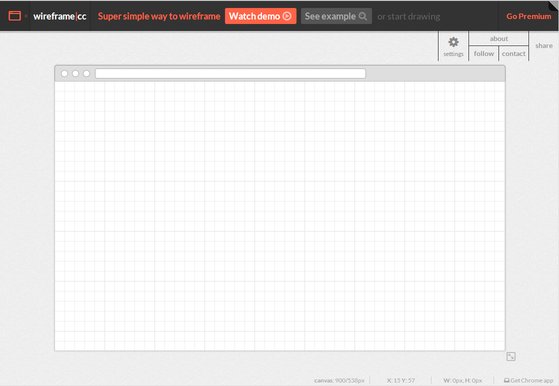
That’s why most designers now rely on prototypes and wireframes to work out their designs with clients and coworkers before leaping into a full site design. With prototypes you can lay out potential site maps, application flow, and general makeup of the site without wasting countless hours building the real thing.
While you can do a lot of this type of work on pen and paper if you want, there are tools out there designed strictly to help with this process which will make your clients feel impressed by a simple idea for a webpage and showcase how the site will function.
John Conor at Designmodo collected ten of the latest and best of these tools for wireframing and prototyping. They all have their own strengths and weaknesses, but that means no matter what problem you are having with brainstorming your website, you have a tool made to fit your needs.
00TMOhttps://www.tulsamarketingonline.com/wp-content/uploads/2018/07/TMO-Logo.pngTMO2013-04-03 12:52:062013-04-03 12:52:06The Best Tools For Wireframing and Prototyping
I believe pretty much every web designer that hasn’t been living under a rock knows what responsive web design (RWD) is, but for the few that might be unaware, responsive design is a technique that allows websites to have flexible layouts that change depending on the screen size of the device accessing the site.
I’ve already discussed the pros and cons of responsive design at length, but there is much more to know about the technique than simply what it is good and bad for. There is so much to know, in fact, that it can fill ten whole infographics, like the ones compiled by Jacob Gube at Design Instruct.
Of course, there is an infographic devoted entirely to simply stating the beneficial aspects of RWD, and the obvious infographic focused on explaining exactly what responsive design is in clear visuals. But, other infographics contain basic tips for RWD I haven’t heard elsewhere, or the numbers on how many people are moving to mobile devices and how our use of the web is impacting how people interact with web pages.
Enjoy the infographic showing you what exactly responsive design is below, and you can see the rest at Design Instruct.
00TMOhttps://www.tulsamarketingonline.com/wp-content/uploads/2018/07/TMO-Logo.pngTMO2013-04-02 13:30:292013-04-02 13:30:29Ten Infographics About Responsive Web Design
The more we get used to using responsive web design, the more we learn its limitations. When it first came out, responsive design seemed like the hero web design has been craving since phones have allowed us to browse the internet practically.
They had some reason to think this way. Responsive designs solve all sorts of headaches that otherwise were only solved with creating multiple versions of the same web site. But, responsive design comes with its own set of issues.
Alvaris Falcon decided to dig into some of these imperfections of responsive design. Though he doesn’t discuss the normal “drawback” of responsive web design, if you could call it that, which is responsive web design doesn’t actually save you that much time, when you include testing and tweaking for the assortment of devices out there being used to access the page.
Instead, Falcon points out another way responsive design slows us down, or more specifically slows down the web page. Fast loading times are more important than ever, and studies show that users actually have higher standards for fast loading speeds on their mobile devices. However, responsive design isn’t great for quick loading.
Responsive designs have the benefit of offering all the content your regular website would, instead of a watered down mobile version, but all that extra information, combined with the restrictions of responsive sites, takes much longer to load than those light mobile sites. There are ways to speed the site up, however.
If content is slowing you down, you can start being selective about what you load on what device by using the conditional tag. You could also opt for engineered solutions to optimize loading times, such as Adaptive Images, which dynamically delivers scaled images to users based on screen size.
Some of the problems of responsive design stem from problems already rooted in using mobile devices. The change in screen size breaks advertising models, which can be extremely troublesome because inadvertent changes in ads can also break your contract.
To keep ads placed where they are supposed to be on a responsive site, you would have to change the resolution, which you are contractually unable to do. But, keeping them large makes the ads get shifted down the page causing problems with your layout, and possibly shoving other content or ads off the screen.
Some web designers are solving the problem with ad bundles they sell together, rather than selling single leaderboard style ads for desktop sites. Instead, they include many versions of ads exclusive to different device resolutions in a package deal.
Of course, there are more than just two problems with responsive design. Falcon has three others in his article, but I’m sure plenty of others out there have already found plenty of other limitations frustrating them. What other problems do you think responsive design has?
Minimalism is all the rage in web design at the moment, and extra negative space is an essential aspect of the style’s aesthetic But, is minimalistic design and the white space accompanying it just a trend or is there more to it?
To the more business minded designers, all the “empty” space could be used for ads, more content, or more usability features that guide a user through the site. If you compress the amount of space between images, columns, and every other visual component, in theory you can fill the page with more of what users want to see, right?
That mindset favors business, but it doesn’t favor aesthetics. As Carrie Cousins puts it, “space is the thread that holds your design together.” White space separates objects, letting users find what they want to more easily. Space between objects groups things together, and it creates a sense of balance that makes a design seem cohesive and professional.
For most designers, there is a rule about keeping white space around content for the sake of making it more readable, but the same is true for just about any aspect on the screen. It draws attention to the most attractive aspects of a site by singling them out from others, while also organizing your site.
Neglecting negative space can make your site seem busy, cluttered, and hard to comprehend. While filling extra space with adds, or squishing everything together to present the reader with more seems like a good idea, in reality less is often more. Readers don’t want everything at once, they just want to be able to easily find what they’re looking for.
But, minimalistic design is not even close to risking using too much white space. Most designers are already thinking about using small amounts of negative space to organize content, but the new design trend is taking that idea to its extremes.
Using huge amounts of white space can have its problems. While it can be used to create stark contrast, white space can also make objects feel small, or detached from the rest of your design, unless you make your negative space feel deliberate.
White space draws attention to one object in a way so forceful users can’t help by stop and notice the object floating in a sea of space, but it is possible to go overboard.
Good use of white space makes the “empty” space feel active or purposeful. Bad white space makes a page feel empty or incomplete. The best place, or at least the most common area, to use white space is the header. When a viewer lands on a site with a lot of negative space in the header, they are met with a striking and simple statement of what the site is all about, all encapsolated in a singled out set of images or text.
If you use negative space in the header, the limits white space can put on content are removed, because content still flows fairly traditionally underneath. Many clients worry about forsaking content for “empty” space, but if the content focused areas of the site still present everything clients would expect to find, negative space won’t detract from the design.
However, if users can’t find what they are looking for on a minimalistic page, they might place the blame on the amount of space not being used to provide a better navigational system.
Not every site needs a minimalistic or negative space heavy approach. These aesthetics are tools just like everything else in a designer’s repertoire, to be pulled out when the time is right. You don’t have to start at the extreme end. Just try letting your content breathe a little and see how you like it.
00TMOhttps://www.tulsamarketingonline.com/wp-content/uploads/2018/07/TMO-Logo.pngTMO2013-03-27 13:47:372013-03-27 13:47:37Why Are So Many Sites Using So Much White Space?
Responsive design is one of the most popular website design methods out right now. Users like having a consistent experience across different devices, without having to worry about pinching, zooming, or being restricted to a downsized version of a website. But, going responsive raises some concerns for the SEO professional managing a site.
Bonnie Stefanick explores some of the issues of high importance to SEOs when redesigning a site to be responsive, but before dealing with the questions she separates redesigns into two categories – cosmetic and full redesigns.
The main distinction between a cosmetic redesign and going all the way is URL management. If URLs are going to be changing during your redesign, you have substantially more issues than just updating the appearance of your site. The issues raised by Stefanick run closer to cosmetic redesigns, as complete redesigns have their own, much larger, can of worms to deal with.
Responsive design has its own unique style and appearance, and some times it can conflict with the best SEO practices. Such is the case with the area above the fold. Responsive design relies on negative space and giving elements area to breathe and move, but navigation and critical linking elements often get pushed down by big banners popular in responsive designs.
These large banners designers constantly put in responsive designs lead to important SEO elements being under the fold, only reached by scrolling down to find menus By talking to the designer before the prototype is made and establishing where you main categories are on your homepage, you can avoid losing the SEO elements.
Another issue with the content above the fold in responsive designs is simply that there is no actual content. Responsive design is intrinsically visual, and designers favor the visual design elements over delivering content directly to users. Search engines notice when none of your content is above the fold, and can rank sites differently for their efficiency in directing users to the content they are trying to reach.
There are plenty of other major considerations for responsive redesigns. Clear communication with designers through the entire process can help manage many of them, but you will also have to pull your own weight to make sure your new design is working as well within your SEO strategy as your last design.
https://www.tulsamarketingonline.com/wp-content/uploads/2018/07/TMO-Logo.png00TMOhttps://www.tulsamarketingonline.com/wp-content/uploads/2018/07/TMO-Logo.pngTMO2013-03-27 11:25:192013-03-27 11:25:19Responsive Redesign SEO Considerations: Above The Fold
Website designers share a lot of information with each other, but there are some hard truths many designers still don’t seem to understand. Sometimes, people just don’t want to hear the truth, or at least it isn’t easy to accept. Designrfix shared some of those things designers don’t like to talk about, but its best you hear them anyways.
You Can’t Innovate All The Time – The large majority of web designers get into the field because we love to be creative and push our skills, but for the most part we are at the will of our clients, and sometimes they don’t want to push the envelope. Many clients would much rather play it safe and use established design solutions. There are times when you’ll be able to use your creativity, but it may not be your next job you take on.
Every Aspect of the Design Matters – This can’t be stressed enough. If you slack on a single part of your design, it will be the aspect your client and users fixate on and hate. A website is like a puzzle and a sub-par piece of the site is like a missing piece in the puzzle.
Hosting Consideration Matters – Without a host, you don’t have a site. Hosting considerations need to be a part of your strategy from the pitch to the finished project. You have to maintain your host to be able to deliver content to the public, so make sure you choose wisely.
Trends Are Not Our Friends – Design follows trends like leaves get caught up in the wind. With every passing gust, we get blown in a new direction. Staying up to date and creating modern designs is usually good, especially in a commercial field where becoming outdated is career death. But, if you spend all your time following what is popular, you won’t ever be ahead of the curve. Try something new. Risks may scare some clients, but that doesn’t mean you can’t try something new in your free time.
Users Matter More Than You – As a designer it is easy to get caught up in your own wants and preferences, but it is important to remember you aren’t the target demographic most of the time. Your design serves to solve your client and your users’ needs, not to be your own personal creation.
https://www.tulsamarketingonline.com/wp-content/uploads/2018/07/TMO-Logo.png00TMOhttps://www.tulsamarketingonline.com/wp-content/uploads/2018/07/TMO-Logo.pngTMO2013-03-26 12:11:592013-03-26 12:11:59The Hard Truth About Web Design
Few new designers appreciate how important design briefs are. It usually takes a few years and a couple frustrating and seemingly directionless projects to realize how effective briefs are in giving a designer good direction, and saving designers from numerous redrafts.
Even once you realize how importance a design brief is, many designers have trouble integrating them into their practice. How do you get that type of information out of a client? What do I ask?
That last question is probably the most notable. Asking the right questions can give you all the information you need to make a great finished product, but you have to know what to ask. In Claire Roper’s opinion, it only takes ten questions to make a great design brief.
Of course, even if you followed Claire’s rule, you’ll find yourself asking way more than that. For example, if you ask your client, “what do you want to achieve with the design,” there is no way for a client to respond that won’t solicit at least five follow up questions from a good designer.
The goal of a good design brief is to collect as much information as possible from your client to know what they want out of a project, and that involves asking questions you might not otherwise consider. You want to learn everything about the company you are representing, their history, and how they do work, but you also want to learn exactly what they like.
Asking a client to show you designs they like may seem like the first step to plagiarism but its far from it. As a designer, your tastes are likely different from your client, and you need to know what each client likes. Asking them to show you what they like and dislike will give you a better idea of what you are trying to create and what to stay away from.
While you can start out with ten questions to ask clients, don’t stop there. Ask questions until you feel confident you understand the desires of your client and their business as a whole. These ten questions will get you going, but if your client isn’t bothered by answering twenty-one question, you should ask as many as you need.
00TMOhttps://www.tulsamarketingonline.com/wp-content/uploads/2018/07/TMO-Logo.pngTMO2013-03-25 12:24:082013-03-25 12:24:08What Questions Do You Ask For An Effective Design Brief?
It is no secret how important a mobile SEO strategy is in today’s market, especially with predictions coming out stating mobile internet usage will overtake desktop internet usage in the next year.
Eventually, mobile search could catch up to desktop search, and users aren’t just staying on any website they find. Two-thirds of consumers say they are more likely to purchase from a website that has a mobile-friendly website, and more than a few survey has shown how low-quality sites or long load times repel searchers like a disease.
You probably knew all this. The debate over the importance of a mobile SEO strategy is over. The real question for most web designer’s is how do I achieve a mobile-friendly website? You have two options: a responsive web design, or an entirely separate mobile website.
There are pros and cons to both methods of course, but gradually it appears responsive designs are winning, especially when SEO is a factor. Jay Taylor, writer for Search Engine Watch, breaks down three reasons why responsive design seems to be taking the lead.
The biggest reason stems from a big endorsement from Google. It is an SEO professional’s job to please the almighty Google, since they command more searches than all of the other engines combined, and Google loves responsive design so much they called it the best practice for the industry.
Google’s preference for responsive design is likely because responsive sites have one URL and the same source code, regardless of how it is viewed, which makes the site easier for Google to crawl and contextualize. Separate mobile sites, on the other hand, have separate URLs and HTML, which complicates everything for the search engine.
Further more, content on responsive sites is easier for users to interact with and share than content that is separated between different websites. If that seems weird, imagine what happens when you get a link over Facebook from a friend who was on their phone. If you open that link on your desktop, you might get sent to a stripped-down mobile website if they use the separate website method.
When Google recommends a method for achieving your mobile SEO strategy, it is always best to do as they say, but there are other reasons responsive design is slowly taking over the search market. It allows a more uniform experience across devices, and makes managing your entire strategy easier. Everyone likes their work to be easy right?
00TMOhttps://www.tulsamarketingonline.com/wp-content/uploads/2018/07/TMO-Logo.pngTMO2013-03-25 10:37:162013-03-25 10:37:16Why Responsive Design Is Winning The Mobile SEO Debate
While it is always important to design a website that looks pretty and makes search engines happy, it is always better to make sure users like your site. User experience is equivalent to customer satisfaction, but unfortunately some designers only test their usability at the end of the process, if at all.
Testing usability throughout every stage of the design process possible means the end design will be completely tailored to what your visitors want. Testing in different stages can tell you what you should focus on next and what can be improved overall.
Some people confuse usability testing with A/B testing, which is comparing two different versions of a web site on a wide audience and has quantitative results. Usability testing is all about subjective experience and qualitative insights.
As Jenny Shen puts it in her article at Onextrapixel, “Through A/B testing you can find out which version performs better, but usability testing helps you know the reason behind the results or why one version was preferred over the other.”
Shen also explains every step of usability testing in her article. I suggest reading it and taking notes so that you can start implementing testing on your next design. It won’t matter if you make a nice looking site if users don’t enjoy using it.
Everyone wants their landing page to make a splash, but how do you make an impressive header, include navigation, and not end up covering up too much of your page?
This used to be an issue solved by sidebar navigation, or other secondary navigation systems, but it seems there may be a way to show your readers a big visually stimulating header/menu bar combo that gets out of the way when viewers begin looking at your content.
Websites like This is the Brigade and All You have implemented this dynamic, animated menu that resizes as you scroll down, shrinking the navigation to let your content breathe.
It gives you the opportunity to show your brand or logo, and make a huge first impression, but then you can move the focus to what really matters to readers. Antonio Pratas has a tutorial at Web Designer Depot for anyone who wants to try this new style of header out.
https://www.tulsamarketingonline.com/wp-content/uploads/2018/07/TMO-Logo.png00TMOhttps://www.tulsamarketingonline.com/wp-content/uploads/2018/07/TMO-Logo.pngTMO2013-03-19 12:44:112013-03-19 12:44:11How To Make A Resizing Navigation Bar


