Responsive design is definitely the most talked about web design method right now, especially when discussing designing for mobile. It isn’t the only option though. There are three real options currently and each has its own pros and cons to them. Choosing the way you interact with mobile customers should reflect the type of business you are running and what you hope to accomplish.

Source: Flickr

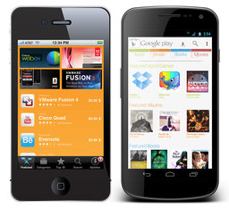
Responsive Design – Though it is well covered, responsive websites are those that adapt to different sized screens across all platforms, from mobile to tablet to desktop. The idea is that you only build one website for everyone rather than different sites for all different devices. That time you would have spent designing sites for different platforms will have to be spent testing your one site on all of the devices. It also removes some of the ability to customize sites for certain devices.

Mobile Sites – A mobile site is optimized for that specific section of on-the-go customers. The sites are usually minimal, with large, finger-friendly buttons, and they load faster than responsive sites. This allows more direct control of how sites appear on different devices, but more importantly, the content selected to appear is tailored for the mobile demographic accessing it.

Native Mobile Apps – If you own a smartphone, you know what an app is. They are specific to their platforms so they have the benefit of being able to curate mobile content like websites do while further focusing on the differing needs of different platform users.

All three have their merits. Responsive websites create a sense of consistency and deliver the full experience of a desktop website in an accessible form for a specific device. Some hail it as a time saver, which isn’t quite true, but it does allow you to spend equal time on a site for all devices. Mobile sites and apps load faster and cater to specific audiences, while allowing them to act immediately.

Diksha Arora compares the three against each other at Vandelay Design. If you don’t know what is best for your business, she can help you identify your needs.

The debate between skeuomorphism and flat design has been covered thoroughly, but when I talked about it I found it hard to think of many examples of flat design. Possibly because I largely use Apple products or because flat design is a new-ish trend, I find myself interacting with skeuomorphic design interfaces much more often than flat design schemes.

That doesn’t mean there aren’t plenty of sites out there using the ideas behind flat design to create striking pages. For those unfamiliar, flat design is a style that drops all forms of imitation of depth or “realism” in favor of designing based on the flat screens we actually use. A great deal of new sites are using the style to create clean, minimal pages that emphasize simplicity and interaction, and Chris Spooner compiled a list of sites that have sprung up using flat design, complete with images for each website.

The actual debate between the two design methods is of course overblown. Some writers act as if the schism will decide the future look of the internet in the same way VHS and Laserdisk competed for how we watched movies at home. Unlike that type of competitive market, neither is “better” for the internet, though one may be more suited for your current project. These pages definitely make it clear that flat design can inspire creative and user-friendly interfaces just like skeuomorphism can.

Last week, Matt Cutts responded to a question he receives fairly regularly concerning the PageRank feature in the Google toolbar. Specifically, why haven’t they removed it? It is apparent that many believe that the PageRank feature is “widely used by link sellers as a link grading system.”

There is, of course, some truth to this. While spammers do take advantage of the PageRank system, Cutts says that it is still relevant to many others. “There are a lot of SEO’s and people in search who look at the PageRank toolbar, but there are a ton of regular users as well.” Apparently, many internet users see the PageRank feature as indicative of reputability  and Google doesn’t plan on forcing them to stop.

That doesn’t mean PageRank is here to stay forever. While Google plans to keep supporting it so long as it is relevant to their users, it is telling that Chrome does not have the PageRank feature built into Chrome. Now, IE 10 is disavowing add ons, meaning Google’s toolbar will no longer work with the browser.

Considering that Internet Explorer was the only browser supporting the Google toolbar, it is highly likely the PageRank feature, as well as the toolbar as a whole, will fade away before long. As Matt Cutts puts it, “the writing is on the wall” that the new iteration of IE could be the end of PageRank, but we will have to wait and see.