Perhaps one of the most effective ways to market your business on social media is to use it as a customer service tool. The benefits include being able to publicly respond and alleviate any negative feedback or issues and it shows other potential customers that they’ll have a direct line to you.
As Business Journal reports however, great customer service, which in turn means great PR for your business, doesn’t happen by accident. It takes planning and effectively executing that plan.
That all starts simply enough by having the right people in place. If you want great customer service, you should employ a staff capable of humanizing your social media presence while staying within your desired message. Second, in order for them to execute your plan, they have to know what it is. You should clearly define and spell out how quickly they should respond to messages and a plan of action of how to deal with them.
While building your customer service practices, be sure to measure how well you’re doing just as you would study analytics for new ad campaigns. If your customer service isn’t bringing you more customers or more repeat business, you need to change something.
https://www.tulsamarketingonline.com/wp-content/uploads/2018/07/TMO-Logo.png00TMOhttps://www.tulsamarketingonline.com/wp-content/uploads/2018/07/TMO-Logo.pngTMO2013-06-04 21:28:592013-06-04 21:28:59Some Tips For Great Customer Service Through Social Media
While on the surface, creating content is about sharing important information of different kinds with the public, we’d all be lying if we said that we didn’t hope to get the most traffic possible coming to your site thanks to some great blog post or infographic. It isn’t easy. Getting over 100,000 views on a page as a startup is a lot of luck, but it also takes a lot of work to make quality content.
There are no magic tricks to make content that will get you exponentially more site visitors and creating one post that gets that many eyes on it doesn’t mean they will necessarily keep coming back, but it can tell us a lot about what people are looking for on the web and what counts as great quality.
Stephen Kenwright works at Branded3 who recently hit the coveted 100,000 pageview benchmark, and he wrote about what he has learned from the short term success over at SEOMoz. You can learn a lot from their isolated case, and the tips Kenwright offers.
https://www.tulsamarketingonline.com/wp-content/uploads/2018/07/TMO-Logo.png00TMOhttps://www.tulsamarketingonline.com/wp-content/uploads/2018/07/TMO-Logo.pngTMO2013-05-28 11:47:402013-05-28 11:47:40Learning From a Post With 100,000 Views: A Case Study
Great content can do just about anything you want it to. You want to draw in more visitors? They’ll come for quality content. Need more conversions? Get some great content. In the best cases, it can go viral. But how do you know what great content is? How do you know what the public wants?
The internet is so insanely populated with content at this point that it is just getting harder and harder to stand out. There are many lists like this one, and they offer different opinions in different ways, but what makes one of those articles more attractive than all the others? It answers people’s needs.
That sounds so incredibly basic that many would say there’s no way it is the whole story, but in reality answering to people’s needs is much harder than you think. There are no guaranteed right answers, and the only way to truly know if you gave the public what they want it to get it out there, but you can get some hints beforehand, if you look in the right places.
Jason DeMers shared some ways you can find out what your target audience is looking for and create the content they need. If you want your content to stick out from the rest, you need to know how to understand your audience.
Competitors’ Forums – This slightly controversial method is also one of the easiest ways to get in the mind of your target audience, and it is definitely one of the easiest. Just find the competitor in your field with the best web presence, and keep tabs on what their audience is interested in and responding to. Of course, some argue that this leads to blatant copying or spylike business practices, and I suggest discretion with the tactic, but if you are looking for a quick way to find out what your market wants, this will show you.
Comments Sections – Just like your competitors’ forums, any place where your audience can directly interact with you offers boundless opportunities to find out what they want and need. Comments sections on your own website, as well as others out there like Reddit, are filled with people looking for solutions, and they are often vocal about looking for it. If you keep your eye on places where the public is interacting, you should be able to easily discern what is on their minds.
Surveys – Where comment threads create an open forum feeling of interaction, surveys allow your audience to speak directly to you and tell you what they want and need. You don’t even have to do your own survey if you don’t have the resources. Just keep your eyes on other public surveys going on. They are everywhere, just look in your daily newspaper.
Product Forums a.k.a. the Support Boards – If you have a niche product and people are looking for support solutions, chances are there is a support board going on somewhere filled with people voicing their problems and opinions all at the same time. In the best situation, you run these boards and can create some good PR while also helping customers and monitoring their interests simultaneously but even if your customers are using a public forum, you can benefit from listening in.
The public is often very open about their feelings and desires, you just have to go where they are voicing them. The internet offers many popular options, and it is easier than ever to keep tabs on what your target audience is thinking. There isn’t any excuse to ignore their needs.
https://www.tulsamarketingonline.com/wp-content/uploads/2018/07/TMO-Logo.png00TMOhttps://www.tulsamarketingonline.com/wp-content/uploads/2018/07/TMO-Logo.pngTMO2013-05-22 15:36:082013-05-22 15:36:08Finding Out What Your Audience Wants
Want to know if your company understands branding? Just ask if you have a brand bible. If you don’t, your business probably has some large flaws in their branding and their marketing.
Every brand, from the smallest startups to the giants you see on your drive to work, should have their “bible” establishing the guidelines and rules of maintaining their corporate image.
What is a Brand Bible?
A brand bible is a document shared throughout the company that lays out how the company achieves its personality and public voice across many individuals and different departments. It is, as Designshack explains, “the basis for all interactions on behalf of the company.”
These documents, which range from a few pages to a couple hundred depending on the size and needs of the company, cover every sort of public interaction. Brand bibles or books distinguish what types of marketing should be pursued or taken off the table, letterhead, logo usage, and even the specific colors that can be used for corporate design. This book is how every Facebook employee knows exactly what color blue is Facebook Blue.
Creating a Brand Bible
See, above all, a brand bible is about cohesion and consistency. From the first design or memo you send out, creating a brand bible is as easy as keeping notes on what fonts you use, how you lay out public documents, and how letterhead is arranged. Over time, if you keep good notes, putting together your brand bible will be as easy as arranging these notes into a document to share with your employees.
If you’ve waited to create these guidelines, it isn’t much more difficult. Start keeping notes. Set a standard. It may take longer to get established across the company, but it will speed up marketing and design. If you need more specific ideas on how to establish a brand book, Designshack has a few suggestions in their article.
00TMOhttps://www.tulsamarketingonline.com/wp-content/uploads/2018/07/TMO-Logo.pngTMO2013-05-15 14:22:002013-05-15 14:22:00Building a United Brand Image With a Brand Bible
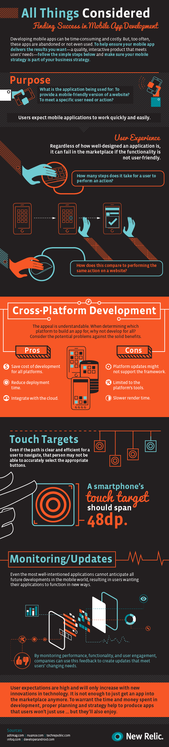
These days, everyone has an app. Apple has over 800,000 apps in their store, and Android is close behind. Search for anything you need an app for, and there is little chance you won’t find an option delivering the solution, quite possibly even for free.
With that many apps out there, making one of your own has more than a few risks. How do you attract users? How do you find a market not already covered? How do you improve over the already available options? You’re trying to get people to flock to your application when, according to Noupe, over 60-percent of apps in Apple’s store have not been downloaded a single time.
The truth is, getting your app in front of others’ eyes requires creating a quality product, then optimizing the heck out of it. App stores work just like search engines, and there is plenty of App Store Optimization to be done.
However, just like with SEO, simply optimizing a bad product isn’t going to get you far. There are numerous concerns you must address if you want your own app to stand a chance before you even get to the optimization stage. New Relic, an analytics service, recently released a new product specifically for Apps, and they accompanied the release with an infographic any App designer would be smart to keep around for their next project.
00TMOhttps://www.tulsamarketingonline.com/wp-content/uploads/2018/07/TMO-Logo.pngTMO2013-05-08 15:00:382013-05-08 15:00:38What Do You Do To Make Your App A Success? [Infographic]
We see banners everywhere, especially in advertising. Whether they’re online, printed on cloth and draped across an entrance, or splashed across a billboard, banner ads all have the same core principles.
Some of the entries are a little obvious like “grab attention” but they go the extra mile (or pixel if you enjoy the same type of lame humor I do) by explaining shock or surprise isn’t the real way to grab attention. Making viewers want to interact is the real trick to getting someone’s full attention.
Some of the other seemingly obvious suggestions shouldn’t need to be said, but so clearly are needed in the current marketing environment. There are only so words you can fit on a banner before it becomes illegible, and complex fonts make that word limit somewhere between one and five words. If someone can’t tell you what your ad said with just a one to two second glance, you’re trying to squeeze too much in.
Seriously, clarity is so important their list includes it three times with the entries “Message Clarity” and “Succinctness” and I don’t fault them for it. Keep your banner short. I’ve seen far too many ads at the top of my screen and running along the tops of subway cars absolute packed with words in a variety of fonts and all they ever do is hurt my eyes. Viewers remember the short and sweet.
There is obviously more to banner design than keeping it simple, but it opens up the big question addressed by many more of Onextrapixel’s list; “how do I convey a memorable message with so little?” If you can find an answer to that question, you are already well on your way to a great banner.
00TMOhttps://www.tulsamarketingonline.com/wp-content/uploads/2018/07/TMO-Logo.pngTMO2013-04-17 12:06:362013-04-17 12:06:36The Alphabetical Guide To Great Banner Design
Years ago, all a local business had to do was build a lot of links and their business would show up on the first results page. SERPs have gotten much more competitive in that time, and Google has introduced a strict local algorithm, so now local SEO has become a unique sector that is often more difficult to implement than almost any other online marketing strategy.
You can always hire a company to take care of all of your SEO needs, but if you have a tight budget and are willing to get your hands dirty, there are steps you can take to try to get onto the coveted first page of local results, called the 7 Pack. You’ll recognize the 7 Pack as the listing of businesses directly under the map of the area. Search Engine Journal set out a five step plan to improve your local business rankings.
The first step is checking to see if your target keywords actually trigger the local algorithm. Usually simply including key phrase combinations such as the city and most important keyword should connect with the local search results, but sometimes this doesn’t work. If that is the case, then it would seem your SEO strategy should be less localized as Google doesn’t register your service as part of its local algorithm.
One of this biggest tricks for local businesses is knowing where to establish your company online. Google’s algorithm always gives preference to businesses located within the city limits searched for, often called the “centroid” bias. This means Google will rank businesses located closer to the heart of the city higher than those on the outskirts if all other factors are equal.
For businesses located in suburbs or just outside of city limits this is poses a big question. Most want to capitalize on the bigger market from the closest city than the small market in their local town, but trying to rank in a metropolitan area when you aren’t physically established within that boundary is a incredibly difficult task. You have to decide if you want to fight to get into the rankings for the city, and possibly only achieving the second or third page on the local listings, or you can aim to corner the market in your town and rank first every time for a smaller audience.
Deciding that move usually requires determining how competitive your niche is, and even businesses already well situated in a metropolitan market will be rewarded for investigating. The quickest way to find out how competitive your market is starts ith taking the #1 ranking in the 7 Pack and copying all of their information exactly as it is displayed in the search bar with quotation marks. This gives you an approximate estimate as to how many directories and citations you will need to outrank the top listing in the 7 Pack. You can do the same for the lowest ranking. Your results obviously have to outdo the lowest ranked business in the 7 Pack to overtake it, so exploring will give you an idea just how tall the SEO mountain you have to climb is.
Once you’ve done your research you can actually begin working on your local SEO, but the process will be much easier thanks to informed decisions only possible through understanding your local online market. Search Engine Journals last two steps can get you going on improving your local site’s ranking but nothing happens overnight. Local SEO is competitive and time consuming, but without it you are falling behind the times.
https://www.tulsamarketingonline.com/wp-content/uploads/2018/07/TMO-Logo.png00TMOhttps://www.tulsamarketingonline.com/wp-content/uploads/2018/07/TMO-Logo.pngTMO2013-04-11 13:47:142013-04-11 13:47:143 Steps to Take Before You Start Your Local SEO Strategy
Mobile optimization has fallen out of popularity a little bit as the new responsive design trend makes the need for a secondary mobile website obsolete. Of course, there are many businesses that have opted to have a specific mobile website, but there is no denying that responsive design is gradually merging mobile and desktop optimization.
What responsive design doesn’t negate is the possible need for an app. There are over 600,000 apps in the Apple App Store alone, and more businesses are deciding to create an app for their products every day.
What many don’t realize is that apps require optimization just like websites. With the huge number of apps out there, you can’t simply get your app approved and expect to see a huge number of people downloading it.
Over the past few weeks, there has been a discussion about ASO (App Store Optimization) stemming from a Techcrunch article claiming ASO is the new SEO. We use apps more every day, relying on them for weather, news, entertainment, shopping, and organization, but I was initially skeptical as to whether ASO will ever achieve some sort of dominance.
Then I started considering my tablet usage throughout each day. I check a number of news sources including CNN and Vice, skim through the more lighthearted Buzzfeed and Cracked, and often browse Reddit. The only one of those activities I don’t do in an app is read news from Vice only because there isn’t one to use and I have checked more than once to see if an app existed (there is one for the iPhone however).
The thing is, I use these apps regularly in the morning and evenings when I’m away from work. For more casual viewers, these apps may not be used enough to justify the space they take up. Most of the apps I acquire either serve a distinct purpose, or allow me quicker access to content I would normally have to open in a web browser. The only type of apps I download without already being familiar with a company are tools.
None of this is to say apps do not have their purpose, or that optimization should be an important part of creating and managing an app, as well as reaching out to the public. However, there are many markets where the apps largely serve to make frequent visitors’ interaction with your content more efficient, and won’t reach as many uninitiated consumers as other markets would.
If you decide an app is an important product you release to the public however, ASO is practically required to keep your app from going nowhere. There are simple steps you can take such as making sure to clearly advertise the app on your website and sharing it on social media, but you can also do keyword research and find out what people are searching for.
While ASO certainly has its place, the debate over whether it will be the “new” SEO seems kind of silly to me. We may reach a point where it is important for every company to have an app, though I don’t think we are quite there. Even then, ASO will only be a small portion of what we do. SEO applies to every business online, and I don’t see it going away any time soon.
00TMOhttps://www.tulsamarketingonline.com/wp-content/uploads/2018/07/TMO-Logo.pngTMO2013-04-08 12:34:472013-04-08 12:34:47App Store Optimization: Is It Really The New SEO?
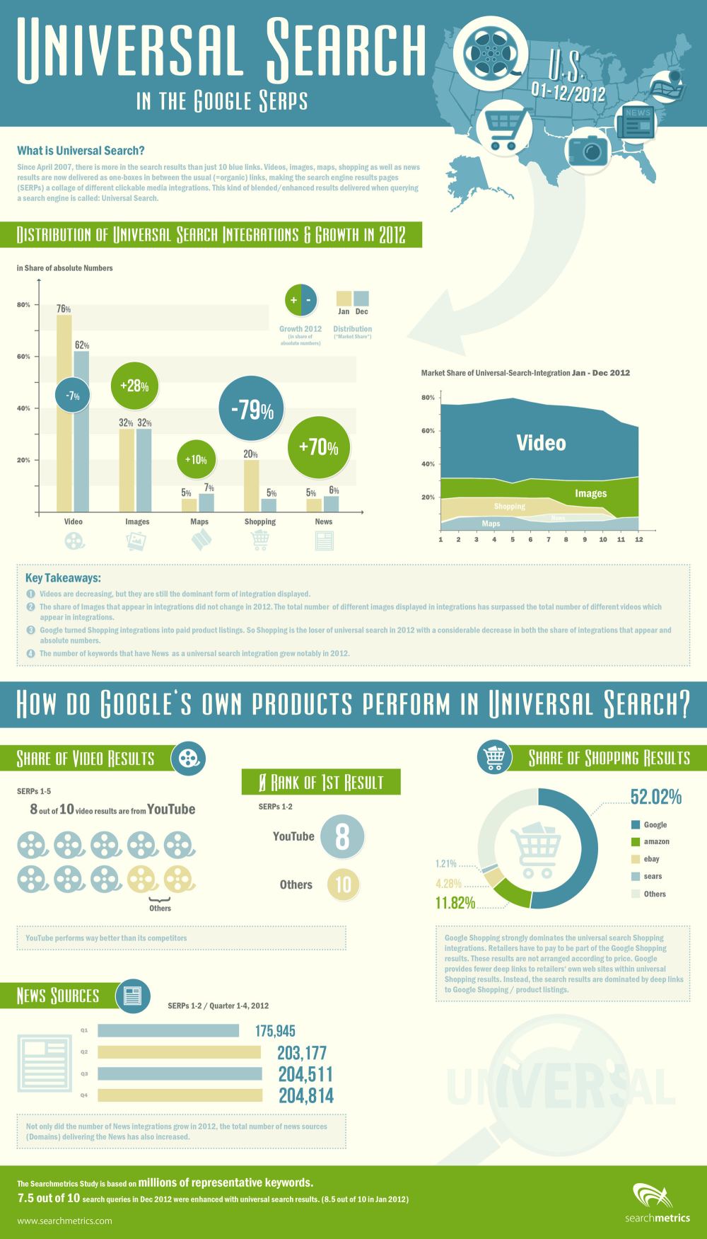
It can be hard to notice, but Google’s search engine results pages (SERPs) are constantly changing. Sometimes it is a result of new algorithms or updates to Penguin or Panda, but often it is a result of Google’s non-stop tweaking of their formula. If you weren’t consistently studying and analyzing SERPs, you probably haven’t even noticed.
SearchMetrics does just that type of analyzing of SERPs, and they just released their study of last years result pages, and there are some interesting points for all search marketers wanting to know what Google is favoring in their results. The highlights of the study, as pointed out by Search Engine Journal, are:
A small decline in video integration
A significant increase in image integration
A sharp decline in shopping
A large increase in news integration
The decline in video integration is one of the most surprising, as I’ve heard more than one analyst predict video will be one of the most popular mediums for content marketing this year. If they’re predictions are true, video makers will have stiff competition getting their content onto the SERPs.
Similarly, eCommerce pages are on the rise, and the data suggests business owners should be considering paying into the Google Shopping network to have their products seen by more people.
On the other hand, the big increase in news shows big opportunities for content creators reporting on events and doing news worthy journalism.
SearchMetrics made an infographic to go along with the release of their study, which you can view below or here.
00TMOhttps://www.tulsamarketingonline.com/wp-content/uploads/2018/07/TMO-Logo.pngTMO2013-04-01 12:04:142013-04-01 12:04:14What Showed Up On SERPs Last Year? [Infographic]
Responsive design is one of the most popular website design methods out right now. Users like having a consistent experience across different devices, without having to worry about pinching, zooming, or being restricted to a downsized version of a website. But, going responsive raises some concerns for the SEO professional managing a site.
Bonnie Stefanick explores some of the issues of high importance to SEOs when redesigning a site to be responsive, but before dealing with the questions she separates redesigns into two categories – cosmetic and full redesigns.
The main distinction between a cosmetic redesign and going all the way is URL management. If URLs are going to be changing during your redesign, you have substantially more issues than just updating the appearance of your site. The issues raised by Stefanick run closer to cosmetic redesigns, as complete redesigns have their own, much larger, can of worms to deal with.
Responsive design has its own unique style and appearance, and some times it can conflict with the best SEO practices. Such is the case with the area above the fold. Responsive design relies on negative space and giving elements area to breathe and move, but navigation and critical linking elements often get pushed down by big banners popular in responsive designs.
These large banners designers constantly put in responsive designs lead to important SEO elements being under the fold, only reached by scrolling down to find menus By talking to the designer before the prototype is made and establishing where you main categories are on your homepage, you can avoid losing the SEO elements.
Another issue with the content above the fold in responsive designs is simply that there is no actual content. Responsive design is intrinsically visual, and designers favor the visual design elements over delivering content directly to users. Search engines notice when none of your content is above the fold, and can rank sites differently for their efficiency in directing users to the content they are trying to reach.
There are plenty of other major considerations for responsive redesigns. Clear communication with designers through the entire process can help manage many of them, but you will also have to pull your own weight to make sure your new design is working as well within your SEO strategy as your last design.
https://www.tulsamarketingonline.com/wp-content/uploads/2018/07/TMO-Logo.png00TMOhttps://www.tulsamarketingonline.com/wp-content/uploads/2018/07/TMO-Logo.pngTMO2013-03-27 11:25:192013-03-27 11:25:19Responsive Redesign SEO Considerations: Above The Fold