Everyone involved in SEO will tell you how drastically everything has changed this past year. They’ll emphasize how Penguin and Panda “changed everything” and they will be more than happy to talk about how dramatically linkbuilding strategies have been affected, but it seems like very few are talking about what these changes mean for SEO as a whole.

John Mihalik wrote about four strategic SEO trends that he sees as important for the rest of the year, but his predictions also work as a summary of where SEO is at right now. He misses a couple things that can’t be ignored like local SEO, but remembering these four trends Mihalik points out should be enough to give you a good idea of what SEO means for website owners today.

Quality is the New Standard – To be blunt, SEOs used to be able to take any site of almost any quality, and improve performance significantly with keyword stuffing, link buying, and all sorts of other borderline spammy tactics, but Google’s algorithm’s have advanced to unbelievable levels. With their complex set of metrics to evaluate sites by, Google can pretty confidently tell if a site is low quality, and there will be no way to bring a site out of the ether until the quality problem is solved.

Social is Important – Social signals are just now beginning to affect search results, but Google has made it more than clear they are implementing social signals into their algorithms and Facebook is working on improving their own search engine relying almost entirely on social data. Aside from questionable privacy practices, implementing social data into search makes sense. Interests, friend circles, location, and even internet habits can help search engines deliver results more tailored for individual people.

You Aren’t Mobile Friendly Yet? – At this point, any website without a responsive or mobile friendly version is beyond behind the times. More and more people are doing their searches on their phones and tablets. You can’t just throw together a low quality mobile portal either. Search engines look for the same quality signatures they do on desktop sites, and you won’t be getting any more traffic with a shoddy mobile page.

Knowledge Graph

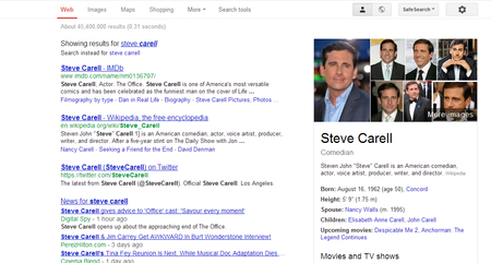
The Knowledge Graph – Google’s knowledge graph, or that box of information in the top-right corner of your screen when you search for a celebrity or prominent brand, has been slowly becoming more common on SERPs over the past year. Mihalik also believes it offers an opportunity for brands to optimize their web presence and gain a little added performance for direct searches.

I question to efficiency or importance of the last one. The knowledge graph information does allow searchers to easily find concise information, but for a brand to appear on a SERP, the user has to search directly for that brand. If there is another company somewhere with the same name as yours, you could use the knowledge graph to gain a foot up on them, but otherwise I don’t see the knowledge graph becoming a cornerstone of SEO. Every other trend mentioned is pretty much a certainty at this point, however.

There are so many articles out there fawning over the design of Apple’s products. Starting with the third or fourth version of the iPod, every new product has gotten nothing but love for their revolutionary design, all the way up to the iPad. Every part of the iPad’s design, including the interface, have been broken down and critiqued.

There is one aspect of the iPad that Apple can’t control, however. Apple designs a few apps, but the vast majority are made by other companies. Sure, a good amount of them are cheaply designed, but there are also high quality apps made by designers that care, and it is in those apps that you can learn some of the best rules for modern design. Carrie Cousins collected ten things she learned from iPad apps at Design Shack, and they can be transferred over to any other medium today.

It all begins with an emphasis on simplicity, and Cousins pinpoints one of the most undeniable reasons why web design has taken a turn towards minimalism. Too much on a small screen can overwhelm the user, and simple, easy to use designs help the on-the-go user access what they want, when they want it.

Almost every major trend in web design is also observable through iPad apps. Simple color schemes, and flat designs are all the rage right now, reflecting the continued push towards simplicity on these small screens and it is hard to deny how effective the design changes are. Apple has never been a proponent of flat design, but recent redesigns by CNN and Facebook show that flat design looks great on tablet screens.

CNN App

The unforgiving Retina Display of the iPad will also teach any lazy web designer a good lesson very quickly. You can’t cut corners on any visual aspect of an app. One low quality icon will stick out like a sore thumb on an otherwise crisp and clear interface, and one small shoddy image will destroy the value of your content just like a crack in the foundation of a house will one day destroy that home.

There are plenty more lessons to learn from iPad apps. Cousins has a few more in her article, but if you are critical of iPad apps as you use them, you’ll learn even more. The best part is, because apps are constantly updating their designs, and new innovative apps are coming out every day, you will be able to keep up to date with design so long as you keep killing time on your tablet.

Resting PandaLast week the internet felt tremors that were very similar to the shock waves unleashed by Google’s Panda Updates, but something was different this time. Google didn’t announce or confirm the update, and they say they won’t confirm any updates in the future.

At this point, it is widely assumed the small shakeup last week was the Panda Update that Google’s Web Spam guru Matt Cutts said would be coming sometime soon at SMX West early on last week. But, as Search Engine Land reports, while he was talking, Cutts also said that Google’s Panda Updates would no longer be unveiled in big monthly changes. From now on, Panda’s changes will occur gradually.

The shift from big abrupt changes to a more fluid update system means that sites hit for low-quality content may not be able to diagnose their issue as easily. Site owners can’t look at their Analytics and see a big drop correlated with a confirmed update around that time period. However, Danny Goodwin says it may mean a faster recovery.

Site owners who have done their proper due diligence will no longer have to wait for the next update to roll around to see if Google has viewed their work favorably.

Google confirmed 24 of the Panda Updates, and the 25th is believed to have occurred late last week, but from now on, there won’t be any big announcements or confirmations. Just like everything else at Google, their web spam algorithms will be constantly changing over time rather than abruptly transforming.

They say a picture is wort a thousand words. Every designer knows how tired that cliche statement is, and just how true it is when you use the right pictures. But, sometimes designers don’t have access to a quality staff photographer or a subscription to Getty Images or a similar stock photo collection website. How is a designer supposed to find quality images to use?

Some designers will settle for using lower quality images they find elsewhere, or using a confusing stock photo with little connection to the content. Neither actually improves content or web designs. Thankfully, there are collections of great free stock photos designers and bloggers can use without using the little money they have.

Stephen Jeske collected ten websites which offer high-quality free stock images. I’ve used one of the sites, Stock.XCHNG, for months and you can always find photographers willing to share their images through it. It is well organized, and easy to use, but no one stock photo site will have pictures for your every need.

When using any sort of images you didn’t create yourself however, it is always essential to make sure you are following the licensing terms and attributing the creator of the image, if you can find out that information. Read the licensing terms for every image you plan to use, and if you are unsure of any details, ask the author of the image.

Source: Panayotis Vryonis

Source: Panayotis Vryonis

Analytics is one of the most ignored aspects of web marketing, despite the fact that everyone is concerned with their site’s statistics. Tons of SEOs check their statistics even daily, but almost everyone relies on either a set of analytics tools or the generic settings in Google Analytics rather than looking deeper, and using more focused methods like Custom Reporting.

Relying on the generic settings in Google Analytics has two downsides. One, obviously, is the lack of focus and clarity that comes with not personally directing what statistics you are watching, and how you are gathering that data. The other is that Google Analytics changes just as often as every other part of Google, and if you aren’t holding the reins, your results will probably shift, making your data inaccurate.

If you want to take on custom reporting for your analytics, you will have a better idea of how you are performing, and what aspects of your site need work. Greg Habermann suggests starting your custom reports by looking at five recent changes to Google Analytics that you can take advantage of. All you have to do is take the initiative.

Many freelancers chose a creative career because they enjoy the ability to create art. Many of them also happen to not be the corporate shark types of people, and the process of building a portfolio of clients can be an intimidating and difficult journey. It requires a combination of throwing yourself out there, creating opportunities, and dumb luck.

For those that might be a little scared of putting themselves in the way of opportunity and fostering business relationships with strangers, there are some key areas you can focus on to attract clients. Social psychologist Robert Cialdini selects six key areas of influence everyone uses to create new relationships, and Sarah Horowitz says you can use them to build a collection of clients.

The areas are ideas that would allow anyone to create positive relationships with others. Reciprocity and the virtue of sharing opens yourself to others’ goodwill. If you put yourself out there when someone is in need, for no purpose other than sharing or helping, it is more likely someone will go out of their way to help you later. If you help one person, you open yourself to a new relationship which can grow into a great business relationship.

Similarly, if you have a focus, be consistent and show exactly what your expertise is. If you have a niche that sets you apart from others, display it for others, and be a part of anything in that field. Clients and others in the industry will begin to associate you with your special area until your expertise is well established.

There are more areas you can pay attention to in order to begin creating new business relationships and start a freelancing portfolio, but the ideas are pretty general. Be a nice person and a good friend, put yourself out there to others, and display your value, and before long people will be coming to you for your work.

Source: Phil Campbell

Source: Phil Campbell

There is no longer a question in analysts mind as to whether the huge growth in tablet and smartphone usage is changing how consumers behave. Mobile users are impossible to deny, and easy to actually observe. All you have to do is look outside to see the number of people with a smartphone attached to their hand as if they are glued together.

What is in question is just how consumers are using these new devices. Mobile devices change how we find businesses and services, especially locally, but they also affect how we interact socially, how we engage media, and how we organize our lives.

To try to understand how we are using mobile devices, and how they are changing the way we live, BrightLocal conducted a consumer panel survey. They investigated how consumers find local businesses, and what content is the most important to users while they are on the go. Myles Anderson broke down the result on Search Engine Land, but the most notable finding is that while mobile and tablet use is bursting through the roof, less than a third of users are regularly finding local businesses with mobile devices.

Forty percent of consumers claim the have never used their smartphone or tablet to look up local businesses. This should come as a shocker to any SEO analyst who has been keeping up with trends lately. There is a lot of discussion about mobile SEO out there, and plenty of people focus on the local capabilities of smartphones and tablet to find businesses while consumers are already out. They say “shoppers want to be able to find the store they want and buy now” or something like that.

Now, a fair percentage of mobile users are doing just that. Almost twenty percent of users have looked up local businesses at least once a week, and twenty-nine percent do so at least once a month, but the amount of users who have never looked up a local business should still be a very interesting statistic for SEOs.

Popular LiesGraphic design is fond of truisms. It might be partially because designers kind of cling to the few hard-and-fast rules we hear, or maybe we just let these common sayings get into our minds just like we internalize trends and styles. Either way, ask any twenty-something about graphic design and you will probably hear one of a handful of well-propagated lies.

“Comic Sans is the worst font ever,” is probably the one you’re most familiar with. There are entire blogs devoted to documenting and chiding every use of Comic Sans that the creator finds. Searching Comic Sans on Tumblr is just a stream of childish remarks insulting a typeface like “You should be ashamed of yourself, you used Comic Sans for the give-away and it hurts me to see” and hilarious tags like “#comic sans is the devil”.

According to Craig Ward, Comic Sans “is the typographic equivalent of an innocent man on death row.” It’s not a pretty font. That is fair. It isn’t “sophisticated” like many perceive Helvetica to be. But, what about all the other terrible handwriting fonts no one talks about? The illegible, the illogical, and other fonts that no one will devote a blog to?

Comic Sans shouldn’t be used on a high level brand by any means, and it may offend the pretentious palette  but it actually serves a purpose. Comic Sans is more easily readable for people with dyslexia, which makes the use of the font on every office note ever make a little more sense, and there have to be some fonts for childlike designs.

The Comic Sans truism isn’t the only one running wild through graphic design. I’ve quoted the old “less is more” philosophy more than once, and I’ve subconsciously adopted plenty others. None of that makes them any more true however. Most truisms aren’t. That’s why Craig Ward decided to take them on in his pocket-sized book Popular Lies About Graphic Design. He covers the Comic Sans debate, but he also challenges many other age old graphic design beliefs. He shared seven lies and his arguments against them over at Co.Design.

There are more than a few articles out there telling you the “right” way to do link building. Despite what they say, link building isn’t a uniform process for every website. If it was, it would probably be able to be totally automated at this point. There are more than a few wrong ways to do link building, but the right link building process for your site depends on a lot of different factors. Pratik Dholakiya explains why there will never be a single “right” link building strategy.

Repeatable Means Replaceable – An easily-explainable and easily accomplishable link building strategy sounds great, but it isn’t good in a competitive market. Any strategy simple enough to be easily copied, can be easily scaled. A smart, unique strategy will out-think your competition, but a repeatable strategy means it will be a competition of who can spend more on scaling.

Search Engines Don’t Stay The Same – There will never be a “one-size-fits-all” strategy for link building because the internet doesn’t sit still. Everything is constantly being made obsolete and reworked. In the past, link building was only about the number of links you could get. Now, search engines judge the quality of links, devalue paid links, automated links, press releases, and many other forms of old “standards.” Even if you find the perfect link building strategy for your site, it won’t work forever. It might even stop working next week.

Every Niche is Different – Link building inevitably relies on the creation and sharing of content. The better the content is, the more impact it will have on a site’s performance, and the quality of the links being generated. But, content comes in virtually endless forms, and different content is more appropriate for different industries. SEO loves long informative blog posts, lists, eBooks, infographics, and that type of thing, but long blog posts and videos don’t work as well on web design blogs. Restaurants looking for links won’t have any use for infographics, but photographs and social media will be essential for their market. You have to find what works for your specific website.

Even if you already know that link building isn’t easy or uniform, it is easy to fall into habits and using the same strategies over and over. Every website is different, and link building has to be tailored to each individual site, otherwise there will always be wasted potential.

For web designers, the focus is normally on how things look. But, for users, when you strip everything to its most essential parts, all you are left with is content and navigation between that content. The internet, in its barest form, is nothing but text, and clicking links to travel to pages with more text and links.

With today’s internet, you can’t have a website without a great layout, but coherent and easily understandable navigation will always be a necessity for every web page. Usable navigation is as important as the content on your page.

Different websites will try to achieve good navigation a variety of different ways. Some will relegate a large amount of “boring” information to a few links hidden away at the bottom of the page, like Terms of Use or Privacy Policy. I’ve also seen contact links hidden in the bottom links, employment information, and a few other “boring” but often very important facets of a website.

White House Navigation


It kind of makes sense. Clutter is bad, and you don’t want people to see things they won’t be excited by. However, if you have to hide links in a secondary navigation bar, you aren’t doing navigation correctly.

Dan Rajan, writer for Web Designer Depot, knows how to make effective navigation systems for websites that don’t rely on hiding information or secondary navigation bars. By just following his five tips, you will be able to fit everything you need into one navigation system, keeping everything more cleanly organized, and helping customers use your site more easily.