Your daily schedule is pretty tightly booked. Usually, trying to cram in some time to optimize your AdWords campaigns to get the most out of your online advertising budget is pretty low on the list of priorities. But, if you put in a little time upfront, you can run an efficient and effective campaign for just minutes a day.
That’s the premise that Ben Cohen works from in his article for Business2Community. He’ll tell you where to allocate your precious time and how to set up your account so you can manage it quickly and get on to your other duties. If you have an AdWords account already, you understand how valuable this information could be. If you’ve been hesitant to start an account because it is so time consuming, this could be just what you need to get started.
00TMOhttps://www.tulsamarketingonline.com/wp-content/uploads/2018/07/TMO-Logo.pngTMO2013-02-26 21:07:202013-02-26 21:07:20Time Savers For Managing Your AdWords Account
For companies looking for an SEO, the process can be confusing. There is a lot of jargon that the uninitiated business owner likely doesn’t know, and the field is absolutely full of companies offering what initially look like the same thing. But, as they say, the devil is in the details.
There are certain things the uninformed local business owner can keep an eye out for to help the process. Stoney deGeyter knows these warning signs as well as anyone, as he writes about small business SEO all the time, and has seen more than a few SEOs offering questionable or outdated methods.
Some SEOs will advertise that they can get you ranked on a selection of websites like MSN, Ask.com, or AltaVista. The more search engines they can get you on, the better right? Nope. I personally have seen sites offering to get you on MSN rankings which is an immediate red flag considering MSN isn’t a search engine anymore. It changed to Bing years ago. Ask.com is the fourth most used search engine and it only pulls in around 3-percent of all searches. The point is, if they can’t get you on Google or Bing, they won’t actually be able to help you much.
Another misleading promise is to get your site the number one spot in the rankings, no matter what. If this was possible, SEO would be stunningly easy, but it is not possible and SEO is far too competitive and complex for any guarantee of this kind to be anything but a bluff. SEO companies have no direct control over where search engines rank sites. Our job isn’t to achieve a certain ranking, but to get your page ranking as high as possible over numerous keywords in a competitive market. A good SEO should certainly be able to raise your ratings, but you can’t expect to get the top ranking for “local restaurant” just because a company promised it.
One way to tell if an SEO is out of touch with the current SEO climate is to look to see if they advertise search engine or directory submission services. This went out of vogue in 1998, but there are still companies proclaiming their services as if they are useful. Aside from Pay-Per-Click, and Pay-To-Be-Included type results, the only way to get your site found is to design it to be found. There is a reason Google doesn’t have a submission option. They haven’t been needed in years.
There are tons of other warning signs to watch out for, and deGeyter shares four more in his article. Unfortunately, SEO has just enough bad eggs that uninformed local business owners are often taken advantage of with false promises or downright ineffective methods. Some are actively trying to pull one over on innocent business owners, some are just out of touch with current SEO, but either way they aren’t worth your dollar.
00TMOhttps://www.tulsamarketingonline.com/wp-content/uploads/2018/07/TMO-Logo.pngTMO2013-02-26 11:18:012013-02-26 11:18:01Warning Signs To Look For When Hiring an SEO
Sometimes I find myself, as well as plenty of others, writing about web design as if it is entirely separate from other mediums. Sure, there are plenty of things that distinguish web design, such as coding and even specific layout patterns for the internet, but there are a lot of principles of layout and design that can be easily transferred onto every medium.
Cameron Chapman got her start in magazine publishing, but she is now a web and graphic designer and prolific blogger. She knows better than anyone that good design rules can often transcend the medium they were established in and help designers across the board. She used her experience in magazine publishing to choose a few design principles that almost any design grad has heard and shows how easily they can be applied to web design.
The first principle seems to be common sense, but a simple background makes reading easier. This is why magazine background colors are almost always white, or at the very most a simple solid color. Readers give up if text is hard for them to read, but yet some less well known websites still present their text over busy images or colors without enough contrast to offset the text. Even if your page’s background is a large image, it is easy to offset your text with a simple text box to deliver your message.
Some websites have numerous pages that all look like different versions of a website. The “about” page may be professional looking and understated, while their “services” or “product” pages are vibrant and sometimes cluttered. If you look at a magazine, every page or section retain several cues from other areas of the magazine. Fonts remain the same, layouts are fairly standardized, and images are shown in the same style. While each page of your site can be a little different from others, it is important to establish consistency by presenting the bulk of your information in similar formats.
One of the most important rules that websites break all the time is clearly marking advertising. In magazines, it is tradition to clearly separate the advertising from the actual content. Even if the advertising is designed to match the style of the magazine in some ways, as some magazine ads have begun doing, there are clear labels added to ensure readers know where the articles end and the ads begin. The same should be implemented in web design, but some sites allow their ads to either be entirely intrusive or sometimes indistinguishable from the content. When readers can’t tell if you are selling them something or delivering them information, they stop trusting your content.
There are plenty of other design rules that web design can learn from, and Chapman explores more of them in her article for Web Designer Depot, but she doesn’t want you to focus on the specific rules she outlines. The most important thing she hopes for you to understand is that any design rule you learn should be at least experimented with in other mediums. Sometimes it won’t transfer well, but most of the time it will make your site look better.
00TMOhttps://www.tulsamarketingonline.com/wp-content/uploads/2018/07/TMO-Logo.pngTMO2013-02-26 10:43:292013-02-26 10:43:29Design Rules From Magazines That Work In Any Medium
AdWords’ cost-per-click has fallen over the last five quarters. Perhaps that’s why there recent efforts have been to enhance their keyword advertising with respects to mobile users.
As Steven Musil reports for CNet, Google’s AdWords Enhanced Campaign seeks to simplify advertiser’s experience when dealing with multiple device platforms. As with most advertising platforms, there is still a mystery surrounding how to get mobile users, on tablets and smart phones, to click ads the way desktop and laptop users will.
The AdWords Enhanced Campaign also includes ad copy, links and extensions for mobile optimized ads. Ideally, this is an update that helps both advertisers and Google without sacrificing user experience, but that may be too idealistic to hope for.
00TMOhttps://www.tulsamarketingonline.com/wp-content/uploads/2018/07/TMO-Logo.pngTMO2013-02-25 20:08:312013-02-25 20:08:31AdWords Looks To Increase Mobile Revenue
One of the best parts of the SEO online community is how happy everyone is to share their knowledge, tips, strategies, and tools for others to use. Maybe it is because some of the best SEO practices actually involve sharing information, and we all get into a habit of being genuinely happy to help others out, or maybe nearly everyone in SEO is just happy to share the knowledge, but for all SEO’s problems, lack of information isn’t one of them.
While blogs tend to be the go-to source for public sharing of information, there are also lots of documents passed around “behind the scenes” through Google Documents. It isn’t that they are secretive, but most of these documents are only found by those who directly ask experts for information, or those who explore some of the more technical minded blogs. Search Engine Journal isn’t where you would normally expect to find many of these documents, but Benjamin Beck shared some of the most helpful Google Docs that he has found while working in SEO.
One Google Doc by Annie Cushing is a well organized list for just about every tool out there for keyword research, SEO analysis, and numerous other areas of SEO you will ding helpful. Other documents, like the one from Stoked SEO help make link prospecting easier by scaling the prospecting on queries that have initial positive results. No matter what your needs are, there is likely a document in Beck’s list that will help.
00TMOhttps://www.tulsamarketingonline.com/wp-content/uploads/2018/07/TMO-Logo.pngTMO2013-02-25 15:30:312013-02-25 15:30:31Google Documents For All Your SEO Needs
In pretty much every way, good web design is subjective. Trends come and go, and limitations are removed which open up entirely new options for how a site can look and act. While user experience can be quantified through testing, there is nothing scientific about what people want either. There are objective ways to look at the current desires of the public, and some things, like easily understandable navigation methods, will never go out of style, but in a decade, the rules for “good web design” will be barely recognizable from the standards we have today.
However, the way people read is likely to stay the same for the foreseeable future, even on the web. Eye tracking has allowed up to study just how people tend to look at text on the web and paying attention to how users read and look at websites, designers can make informed decisions on how to design their site around their visitors’ patterns.
Eye tracking has been around since the late 1800’s, though it only became commonly used for studying design and marketing in the 1980’s and 90’s. The first big study on web page viewing happened in 2006 by Jakob Nielson, which shows that visitors read web pages in a steady pattern; people’s eye make horizontal swipes across the page, then move down vertically. There have been numerous other studies since, and they all show that internet users continuously scan websites in the same pattern.
The pattern is usually referred to as an F-shape pattern because of how eyes start at the top left corner, moving to the right in a straight pattern, then back to the left hand side where they scan about a third of the way down the page, then back out to the right in a straight line.
If you want to know how you can harness eye movement patterns to inform your web design decisions, Carrie Cousins from Designmodo explores all of the possible implications of eye tracking studies. She breaks down every pattern seen in the studies and even gives examples of websites that are already designed around viewing patterns.
One of the most crucial design decisions for a new company is the logo. Great logos are instantly recognizable and evoke the brand image with just one image. When anyone discusses McDonald’s, Apple, Nike, or NBC, it is hard not to imagine the Golden Arches, iconic apple, or swoosh because they are so deeply ingrained in their corporate image.
Creating a logo that perfect is deceptively difficult to do however. The business world is awash with bad logos that no one will ever remember. There is no magic recipe for a great logo, but there are some rules to follow that will help a logo stick out. I’ve given some tips on logos before, but Sarah Clare from Vandelay Design had some suggestions designers should keep in mind.
One of the most common mistakes is just over-doing the logo. Clean lines and simple contrast are striking and easily able to be replicated in any format, neon sign to stationary. Text can be included but only when necessary, and limit it to the brand name. Even if you’ve been in business for 200 years and you’re doing a logo redesign, your icon isn’t the place to tell people that.
It is hard to understate how important it is that your logo is able to be reproduced anywhere. Something may look good on a computer screen, but logos are sometimes printed on endless materials like pens, paper, mugs, and even mints, and stress balls. You want people to be able to recognize the logo whether it is 1″ x 1″ on a memo, or plastered on a billboard.
While a logo has to be simple, it also has to convey the tone and personality of your business. A high tech company with a childish logo may have trouble convincing potential customers of their abilities, especially because everyone in tech hates comic sans. Usually bright colors are reserved for companies more associated with children as well, but Google’s logo shows why that isn’t a hard rule.
As a business owner, you will see your logo more than you actually see your brand name, or at least it will feel like it. If you want your brand to be successful in the marketplace, you need a logo people will instantly be able to identify and connect with. It seems like a small task, but being lazy on the logo can torpedo a new brand.
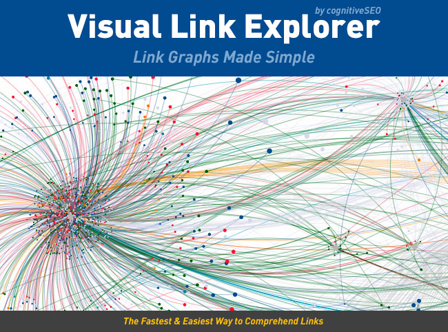
Sometimes it helps to step back and get a more visual idea of your link profile, but until now the only way to do this was to export all of your links to Excel and create a bunch of charts. CognitiveSEO has released the Visual Link Explorer to make the whole process easier and let you see your link profile all at once in a visually comprehensive way. It can also be used to help easily explain a profile to clients or even help figure out why you were penalized by Google. You can view competitors backlinks to analyze them and stay ahead of your closest competition.
One of the things this visual tool is best at is showing the importance of deep links and homepage links. It is always hard to explain to clients why it is a bad idea to direct all links to the homepage, and the way the Visual Link Explorer depicts your links is perfectly suited for showing how building a deep link profile as well boosts you site’s overall authority.
Judging overall link quality is also made incredibly easy and quick. In this tool, the lowest-quality links are placed closer to the center of the clusters of dots while the best link are portrayed with larger dots further away from the center.
There are a ton of other ways you can use the Visual Link Explorer to analyze your link profile, and any SEO worth their salt understands the importance of a your profile. Kristi Hines has more ideas for how the tool can be used at Search Engine Journal, but needless to say, I think it is a must have.
00TMOhttps://www.tulsamarketingonline.com/wp-content/uploads/2018/07/TMO-Logo.pngTMO2013-02-22 11:52:472013-02-22 11:52:47Get a Visual Perspective on Your Link Profile
Web design relies on the resources of others. Without them, we could still make good looking pages, but it would take exponentially more time. Of course there are textures, fonts, images, and any other visual aspect you want to incorporate for free or cheap use, but we also use time savers behind the scenes.
This isn’t to say we rip off people. It is always best to notify the owner of any resource when you use it, and it is better to use as much original content as possible. Using boring standardized icons won’t ever have the same effect as specialized icons that fit the page they are made for.
Frameworks are what we use behind the scenes, and they are packages made of a structure of files and folders of standardized code used to build websites. They help get you started without making you spend hours typing in code that is normally extremely similar to others such as gridding systems. All websites have a similar structure, and these frameworks allow you to use a “standard” version of that structure and modify it as you need to.
https://www.tulsamarketingonline.com/wp-content/uploads/2018/07/TMO-Logo.png00TMOhttps://www.tulsamarketingonline.com/wp-content/uploads/2018/07/TMO-Logo.pngTMO2013-02-21 15:13:332013-02-21 15:13:33What are Frameworks?
A recent Google Webmaster Hangout seems to have implied that Google is pushing out Penguin Updates without announcing them. Penguin has only been officially updated twice after its initial release, and the last update was in October 2012. In the video, John Meuller from Google makes it appear that Google has been updating Penguin on a regular basis but has not announced them all. The comments come at around the four minute mark in the video below.
When asked for clarification by Search Engine Land, Meuller says that he was referring to general “link analysis” refreshes, but does not include the Penguin algorithm. They also confirmed the last update was the one announced in October.
One of the reasons some questioned if Penguin was being refreshed is Panda, the update always mentioned in association with Penguin, has been updated on roughly a monthly basis. Google didn’t confirm another update is coming, but the updates have been coming steadily, and there are signs a new one should arrive in the next few days.