Tag Archive for: Web Design


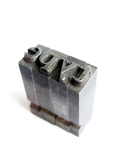
There are infinite ways to approach typography, and you will see just about every imaginable strategy across the internet. Some go over-the-top with their typographic choices, and some, either out of ignorance or laziness, underwhelm with blah text.

There are places for both of these approaches, but there is never an excuse for outright ignoring how your text looks on-screen. Typographic choices are absolutely essential to your design, and even if you don’t have much text on your page, the wrong typographic decisions can leave viewers with a bad taste in their mouth.

To keep you from making the mistakes many pages have, I’ve compiled a list of things to keep in mind when choosing typography for your designs.

Message

One of the first things a designer should consider when starting a design is what type of message you want to send. This should be equally true when it’s decided what text you are going to use. Gabi Azilla uses the example of fliers for disaster aid programs when considering what message you want to send. In this example, you want your message to be along the lines of “hope” and “aid”, so you don’t want your text to look like something from an action movie or business memo. If that example is too specific for your current project, think along the lines of whether your design is aiming for a happier, or darker concept. Happy designs should use light, soft fonts, while darker themes rely on sharp, dramatic text.

Legibility

It really doesn’t matter what you are working on, using text that is illegible is always a negative. It may look neat, but nothing annoys viewers quicker than having to struggle to read a simple header. There are times when more abstract fonts can be good, but they should be used very sparingly for effect, rather than the main font for any aspect of your page. Think about it in terms of the heavily illustrated letters beginning paragraphs in classic, old books. They liven up the entire page, but the illustrated, complex area of text only covers one letter.

Size and Placement

This one goes overlooked often, but where and how big your typography is has a huge effect on the success of your design. Placement and size are all about balance. No one wants to strain to read your text, and overly large text is just annoying, but you also want to make something eye-catching. Make sure the typography complements the rest of the design, and effectively uses the space it covers. The general rule for designers is the header or title area should be the main focus, and everything else should be roughly half the size of the header, or smaller depending on importance. Keeping a heirarchy in your text lets readers know where you want their eyes to focus.

Conclusion

With the near infinite choices designers have for typography, it is easy to want to dive in and play with your design to create something truly wild. There is plenty of room for experimentation and innovation, but restraint is key. Remember why you are designing the current project, and fit your typography to match the point of the design.


There is more than one way to do responsive web design. The most prominent seems to be adaptive web design, which is more rigid and structured because the elements of the site only change when reaching different breakpoints.

Just because bloggers and media specialists focus on adaptive web design doesn’t mean there isn’t another approach with merit. Both approaches have pros and cons, and both will help you more in certain instances.

Adaptive Web Design

The adaptive approach is best when used on sites that frequently go through design changes. Adaptive design doesn’t have to think too far into the future because adaptive designs require regular updates to make them optimized for the latest technology.

The approach uses breakpoints set with media queries as the only changing visual aspect. Usually, this results in about three different layouts, which provide a good experience on most platforms. The downside is along the outer edges of these breakpoints (for example if the range has a maximum of 620 px and the device used to access the content is 619 px) users will begin to have design issues.

The upsides to adaptive design are you don’t have to test it at every conceivable width to ensure it renders properly, and it makes sure the majority of users will have a good experience. Unfortunately, if you aren’t using the most recent and popular devices, you are more likely to have a problem, and it requires periodic changes to keep up to date.

The Fluid Approach

The fluid approach responds to different viewing widths allowing the design to create a suitable layout on nearly every platform. The viewers are able to get a good experience that is catering to the dimensions of their device, but for the designer, the fluid approach requires a lot of time spent checking the site at different widths to see where the design breaks.

The design doesn’t have a “true form”, but an ever-changing appearance molded to fit the needs of the viewer’s device. The ability to achieve this type of design comes from keeping all of the aspects of the site proportional. Everything is rendered based on the size the screen is viewed on.

The best part of this type of design is fluid designs are practically timeless. It is impossible to really predict what will happen in the industry in a few months, let alone years, but fluid designs have the ability to still look aesthetically pleasing on all devices for much longer than adaptive designs.

Conclusion

Both design approaches have their merits. Adaptive design is feasible to be able to make routine changes to stay current, and offers an almost universally pleasing experience with little testing. Fluid designs don’t require the regular updates of adaptive designs, but you will likely end up spending the same amount of time testing widths.

No approach is ever perfect for everything, but these two should keep you covered in most situations.

For more technical information about these two approaches, read Jamal Jackson’s article from 1stwebdesigner.


Sometimes it is clear when you need a redesign. For example, if your site is still using Flash, it isn’t viewable on many smartphones, and you definitely should consider redesigning.

Other times, it can be less clear. Sometimes even bad designs are meeting the needs of your client, so it can be hard to give a good reason why they need a design. Why pay money to improve something that is working at the time?

Usually the reason most designers cite for needing a redesign is to make their site “look better.” This isn’t really a viable reason for clients however. Kendra Gaines, writer for Webdesigner Depot, has a different argument for redesigns that your clients will love.

Redesigns aren’t only a way to offer clients the latest design trends or “make things look better.” Redesigns can be a way to entirely revitalize a brand or business. A redesign can be enough to breath new life into a business or brand that might be stagnating.

Gaines uses examples from business such as Keds, who subtly redesigned their product line to re-invigorate their popularity, but doesn’t tend to connect the ideas to web redesigns. This is interesting because Webdesigner Depot just did a massive redesign of their webpage.

The website redesigned to a responsive web layout allowing their content to be available on all platforms, but it also helped refine their image. The site seems more efficiently laid out, and they have made social media buttons readily available at all times.

This redesign acts as the perfect example of what you should be thinking when trying to redesign for a client. The site was brought up to date with the current design standards, as well as adding usability features that are great for users, but they also used the opportunity to help refine their brand as a whole.

When you are preparing to do a redesign for any brand, try to remember these ideas. If you are just trying to add the newest trendy features to a site, all your work will be undone when the next wave of features hits the industry. If you subtly try to help the brand define itself, your work will be making a lasting impact on the company in a positive way.


Online branding ruins everything you thought you knew about branding. It is no longer strictly a marketing activity for multinationals with million dollar budgets. Online branding is simple and practically free.

The internet allows businesses of all sizes to participate with their webpages, secondary sites, social media outlets, and company blogs. These areas are also exactly where it is important to establish a successful branding strategy. But how?

It is first important to remember branding is a lot more than a name and a logo. It is a philosophy encompassing the values and way of doing things. Branding alone can increase the perceived value of any kind of product by creating an image that depicts the product as more than its actual value. Gucci is just a clothing designer, but because of the image cultivated around the brand, their products are perceived as higher value than most others.

Ray Vellest, writer for Web Designer Depot, argues the most important aspect of creating this type of image is consistency. Making sure all of your messages are on point establishes an idea in potential customers’ minds.

People associate Gucci with luxury because they only present images of their products with luxury settings. The people in their ads are always dressed in some form of high fashion, and in an extravagant setting.

Similarly, Louis Vuitton has had a long running campaign of images of pop culture icons with their luggage, and they choose these celebrities carefully. Sean Connery, Madonna, and Keith Richards have all been in ads for Louis Vuitton, and the imagery suggests that of the “rebellious” upper class.

When bringing this strategy online, think digital presence consistency. Start with your username, or profile. Using the same username across the web is a big step towards creating brand consistency online. It brings continuity to interactions customers have with the persona or company through various methods.

Another method of establishing consistency is visually. You begin working with the company’s logo, keeping it absolutely consistent across all platforms. But it is also important to design a secondary logo that will fit within the square profile image space alloted by social media platforms. The second logo has to be a visual continuation of the first.

When interacting with potential customers online, you need to be keeping a consistent voice as well. Many companies have multiple people handling their social media accounts, but their voice needs to match the voice of the company. To do this, define your tone by finding one that matches your brand image. Law firms should maintain a serious and formal tone, while a record store, for instance, has more liberty to be less formal and maybe opinionistic.

By creating a consistent image all across the web, you can begin to cultivate the type of branding that huge corportations spend millions on every year. It is as simple as keeping everything focused in the same direction, and sending the same message.


Now as much as ever, the web design industry and the SEO industry are intertwined. The question that arises anytime a business industry and a creative industry become so connected is whether the business side limits the creative side or not.

Most in the web design industry will agree that SEO shouldn’t limit web designers at all. SEO is important, but limiting art isn’t necessary.

One of the most important things for web designers and SEO professionals to be concerned about is load times. Lots of designers want to make amazing headers, but these lead to slow load times. There are sites where load times do matter less. Portfolio sites should have plenty of quality graphics of work, but in these instances SEO doesn’t matter.

For commercial websites however, fast load times are essential because customers will go elsewhere rather than wait.

For those that think standard navigation practices limit their artistic license, think about this. The job of a web designer isn’t just to create an aeshtetically pleasant site, but to make one that is also functional and user-friendly. Breadcrumbs and easily accessible navigation systems make users happy, and it allows them to see all of the well designed areas of the site.

Overall, if you aren’t designing overly flashy sites, SEO shouldn’t be limiting your abilities as a designer. The latest SEO practices rely on quality content, and the designer’s job is to to deliver this content is a good looking package. If anything, SEO guidelines will help you understand how to create a site your viewers will like.

For some more pros and cons of the relationship between SEO and web design, Rean Jean Uehara has a great article at 1stwebdesigner.


Most designers are aware of Dieter Rams’ Ten Principles of Good Design, and, if you aren’t, you should definitely check it out. Rams created the entire visual language Apple is still using, and products he designed over fifty years ago are still being made today. He made the ten principles in 1970, when he decided he needed an objective way to criticize his own designs.

The list was originally made to critique physical products, but lately web designers have been using the principles for interactive design. While the list works wonderfully with interactive design, there is one issue stemming from how long ago the principles were established. In Rams’ time, there was no interaction design, UI, or UX. It doesn’t take into consideration the constantly changing software out today.

Fourty years ago, when Rams created the ten principles, designs were mostly for print or physical products, which rarely were updated. This is as far from true now as imaginable. That’s why Wells Riley, designer for Kicksend, has proposed an eleventh principle of design. 

Good Design is Iterative

Iterative design is flexible, and reduces the friction created from growth and change. It is common to think of every project with an “end date.” Designers usually consider themselves finished when they hand in a design, and get their money. Unfortunately, that manner of working will usually result in a total breakdown when it comes time to integrate new features.

Fixed, complex designs lead to complete disasters when it is time to update. Big companies have the money to invest to overcome this issue. Small companies, which normally need to update at a much quicker rate than huge corporations, can’t afford to not iterate on design just as quickly as engineers can code.

So how do you make an interative design from day one?

  1. Responsive Web – Responsive layouts allow pages to respond to different mobile and desktop browsers, which makes for much easier design changes. Sites using responsive layouts can make small changes constantly to continuously mold their entire product and brand image.
  2. Less is More – Designers love to build complex and interesting sites, but aside from possibly confusing visitors, these intricacies are also blocking fast updates from happening. Instead, stick with only what is essential. Minimalistic approaches to design allow for innovation. Think about Google’s front page. It is simple and clean, which makes it spectacular when Google Doodles show up to highlight an important day in history. If the page was cluttered with extra nonsense, the doodles would be harder to implement, and their effect would be severely diminished.
  3. Ship Every Day – Don’t ever let your design go stagnant. As any art student knows, there is always room for improvement in a design, and you should always be working on improving it. Use customer feedback and research, as well as your constantly growing knowledge of what is new, so that your designs grow at the same rate you grow as a designer.

The Ten Principles Rams set down 40 years ago are still an important way to critique your own designs, but, as with any list 40 years old, it needed an update. By adding a focus on iterant design, you will be able to criticize your own work objectively while making sure it works for the constantly changing field of web design.


There is one simple color rule that has helped me endlessly in my designs, and I learned it in junior-high school. Unless you absolutely need to, never use black. It sounds strange to many, but it is a rule I live by now.

When you see dark things, it is common to assume they are black. It is actually very hard to find things that are pure black. It is possible, but most of the common things you will think of aren’t. Roads, for example, are not black no matter how recently they were paved.

Not even shadows are black. Any good painter knows this. Shadows are tints of a background color, and they are pretty much never actually black. They also reflect what type of light is being cast.

Now the reason it is important to note how hard it is to find a pure black is because pure black always overpowers other colors by comparison. It just does not naturally sit with most color palettes.

This goes double for web design. Even in apps or sites that seem to have black as a prominent part of the color scheme actually use dark grays, which are muted so they sit better in the composition.

Ian Taylor Storm, co-founder of Segment.io, also warns about the importance of saturation. Adding some color to grays helps liven them up a little. If you have a really dark gray, saturate it really heavily. Light grays will only need around 3%-5% usually.

The design for Facebook is a great example of this idea. All of the grays are saturated with the trademark Facebook Blue. The same goes for Facebook’s apps.

There is always a time and place for pure black, but it should be a rare occasion. Usually, a more natural color will suit your needs much better.


Multimedia is clearly a popular form of communication online, but classic text is still the standard for effectively communicating with visitors. You would think, with close to a decade of the internet being accessible from most homes, most site creators would know how to handle text, but plenty are still struggling with text presentation.

So how can you make sure your content is readable? Well, there are some things you should know first. For example, reading online is 25 percent slower than when reading printed material, and according to a Nielson study, visitors are only reading between 20 and 28% percent of the words on your page. When reading printed text, readers usually take in every word, but online visitors scan, and hop from place to place.

But, we have eight ways to help you make your content more readable and help you communicate with your visitors.

1) Pick You Fonts Wisely – It hasn’t been this way forever, but thanks to web fonts, designers are able to use any font they want in their designs. This can be a gift and a curse though. While creative use of fonts can improve a page, it often comes at the expense of readability.

You can use more creative headlines because they are shorter and often larger, making them easier to scan. Just make sure the font utilizes both capital and lowercase letters. The height makes scanning more easy. For body texts, always use clear sans-serif fonts. On screen, serifs can blur together, so while serif fonts make printed text easier to read, they actually impede the process online.

2) Font Size & Line Spacing Are Important – As a designer, you should be designing for the huge range of internet capable devices out thereand their widely varying screen sizes. This is why using a fixed font size can work on large desktop screens, but often are far too big for mobile. The modern web design requires a flexible approach and percentages rather than fixed heights adapt to personal browser settings and varying screen resolutions.

When picking font sizes and line spacing, remember that the standard line height is too small. More room equals better readability.

3) Use High Contrasts – You never want your text to bleed in to the background. The more contrast between the background and text, the more readable text will be. It is also true that noisy backgrounds make almost all types of text unreadable. If you are going to place text on top of background images, make sure it is placed in the least busy area of the image, like maybe a blurred out area, or areas lacking texture. Another way to deal with this issue is placing an extra layer between your image and the text. This will help seperate the two.

4) Keep Lines Short – Because readers online tend to only skim, you want to keep your lines of text short. The best length is between 50-60 characters. If your lines are bigger, some readers may not even skim because the text appears overwhelming. They may think it will take too much time or work to read. Long lines also make it harder for your eyes to jump from one line to the next.

One way to get readers engaged is to start each article with short lines. Keeping the intro short and inviting helps hook the reader, and from there, expanding the text is more accessible.

5) Keep Paragraphs Short – 75 percent of readers online are estimated to not read websites word for word. They scan for what is most relevant to them. You want to keep your readers attention, but you also want to make sure anyone skimming your content can find what they are looking for quickly and easily.

6) Cut to the Point – It is common for writers to ramble for a few reasons. It is easy, and in print media, it helps make readers feel like they got their money worth. On the web, readers don’t care about the picture you paint with your words and they will leave if they can’t find what they are looking for.

This also suggests that simple sentences and vocabulary are more attractive to readers than long verbose sentences. If you have a new point, start a new sentence. It may seem weird, but it helps readers scan for what is important.

7) Avoid Jargon – Of course you want to appear to be an expert in your field, but you should also realize most experts are able to explain what they are talking about to the average person. Being able to simplify what you are talking about to the level a child could understand shows a real command over the technical and complicated information you possess.

Trying to use too much technical jargon can intimidate users, or make them feel like they need a dictionary near by to get through your post. This usually results in the user leaving. Instead, try to think like a normal person. Keep your posts accessible, and easy to understand.

8) Use Highlights, Lists, and Images – This also deals with the scanning nature of your visitors. Highlighting relevant keywords can help identify the main points of the paragraph, and lead reader’s eyes to what they are probably looking for. Likewise, structure your content in a way to help readers. Lists lay out specific ideas in an easily searchable format, or lay out step by step guides clearly. Images also help people stay focused on your post, especially when using image captions that act as reference points.

It is easy to see that most web readers are lazy when it comes to reading, and you want to make sure you are catering to their needs. Formatting your posts in a way that accomodates the scanning nature of online readers will actually help make viewers see more of your content. It may seem backwards, but simplifying your page format and structure can help keep readers on your site longer.

For more ways to improve your site’s usability, check out Sabina Adler’s posts at Usabilla.