Tag Archive for: Web Design

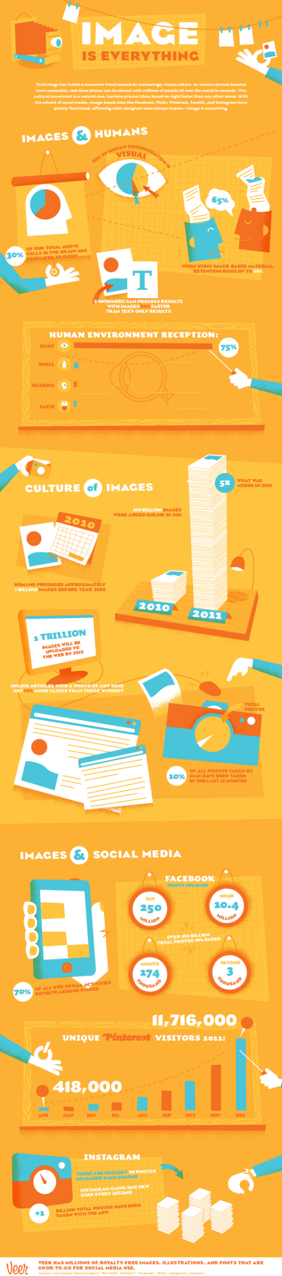
Design isn’t for everyone. There are plenty of programmers who can attest to that. It is absolutely required for people to believe your site looks credible, but design is intimidating and confusing.

For programmer Anna Powell-Smith, design was scary because the rules are complicated and often contradictory, as well as completely unwritten. It also requires a sense of taste “possessed only by a black-clad elite.”

Being intimidated by design doesn’t change that your site needs to look attractive if you want other people to see it and take it seriously. That is why there are plenty of tools to try to make design doable for those that don’t get design. Of course, having a professional designer work on the site will probably have better outcomes, but these resources will at least help you spruce up what you have.

Powell-Smith collected eight of these resources to make a sight look great with just programming knowledge at 24 Ways. No design instinct required.

Mobile navigation can be difficult because you are forced to condense everything your site or app offers into a simple list or set of buttons. For the iPhone, three naviagational patterns rose up that are fairly good solutions to the problems of mobile navigation. You have the tab bar, the table view (like Messages or Mail), and the card stack, like what you find in Weather.

That doesn’t mean there aren’t designers trying other navigational solutions. Some of the more experimental ways to move around apps and sites work great, but there are some that just don’t work. Facebook’s mobile left nav flyout pattern is a perfect example of a mobile navigation system that should be gotten rid of.

Brent Jackson agrees that Facebook’s navigation system needs to be replaced, and argues why on his Tumblr page. More than anything, the issue I have with the system is it hides a lot of the functionality the app offers under small, hard to tap buttons.

As Jackson points out, the left nav flyout is also innefficient. While normally you have a small set of buttons always available to help you get where you want to be, Facebook makes you continuously wait for new lists or areas of the app to load. It becomes very tedious to do anything except look at the News Feed.

If you can think of times when a lefy nav flyout works, I’m all ears. There are none that work for me, or wouldn’t benefit from another site navigation system.


Web design changes so quickly. If you don’t think it has changed that much, think about web design 3 years ago. Not just the styles popular at the time, but the way they were made. The entire system websites used to go through as they were created has shifted greatly from a team assembly line type production to a small efficient unit.

Just three years ago, every website went from person to person, emerging from concept, to wireframe, to Photoshop, until it finally ended up on the web. Each step along the way took work from different people, and they all molded the design in their own ways.

Sophie Sheperd was doing wireframe design back then, and her work largely consisted of adding more visual details to the blueprints of websites, so that the style and textures would become more established. As she puts it, “designers were makeup artists for wireframes.”

Now, Sheperd’s job is more complicated, just like web design has become. Wireframes have been replaced by prototypes because of the number of different devices and screens. Most of the design can be done in browsers now and don’t need to be done in Photoshop, other than a little of preliminary design.

Because of this, Sheperd’s job has expanded to UX designer, graphic designer, illustrator, and front-end developer. The size team she works on has shrunk to about three people.

Web design isn’t going to slow down. It is a quickly changing beast, and it requires a lot of effort to keep up with. In the past, it was entirely possible to be a designer and have no knowledge of code. Now, it is almost impossible. The debate over whether designers should code is over, and they definitely have to. But thats ok, all the new skills also count as new job descriptions.


You’ve probably already heard about the importance of images on the web. They catch the eye, foster interest, and statistically make people spend more time on any text than they would without pictures.

It’s all true, visual media is consistently present in your life, and the amount of websites and social media platforms centering on visual media are becoming more and more popular. In a society where almost everyone has a smartphone with a respectable quality camera, pictures are only going to become more ubiquitous.

Veer, a service for images, illustrations, and fonts, made an infographic to try to convey the importance of images online today. The graphic covers the history of internet graphics, and the popularity of image-based social media such as Flickr, Pinterest, and Instagram. They also have an animated version of the infographic here.

Every designer or developer wants to find ways to make their life easier. That’s why we are always on the lookout for new great tools. This is why Cats Who Code writer Jean-Baptiste Jung compiled a list of all of his favorite tools for front-end development.

Almost every tool he lists is free, more than anything they will make your job easier and quicker to accomplish. One of my favorites made the list, as Colllor helps any designer out with color associations and creating beautiful color palettes becomes really easy.

I won’t waste your time walking you through each one, but I advise checking out at least some of the tools. Unless you like your work being difficult, that is.

Almost every designer has ended up working with a bad client. We all try to avoid it, but sure enough, eventually you end up with a client that will drive you up the wall. Wouldn’t it be great if you could easily pick out which clients are going to be more hassle than they are worth?

Justin Spencer has created a list of tell-tale signs at Designrfix that a client might not be worth the money. It is important to note, a bad client is not just one that doesn’t pay you on time. Slow payment, while highly frustrating, is not always the sign of a bad client, especially if they are a small company.

Instead, bad clients are those that create completely unnecessary problems as professionals. During negotiations to work with these types of clients, they will often do things like understating the difficulty of a project to lower fees. They could also try to get you to work at low prices by promising they will give you lots of work in the future.

Spencer has plenty more signs that will help clue you into a bad client. If you see more than one of these issues early on, seriously consider if the work you are going to put in for them will be worth the headaches later on.

There is a rule in design based on the principle that the closer and larger a target is, the faster it is to click on it. The concept seems self evident, but it is surprising how much that concept affects on a web page. Users are actually less likely to respond to a call-to-action if it takes more effort than they want to expend on navigating to the button.

The concept is called Fitt’s Law, and it can have a big impact on how users respond to your website, but don’t start redesigning your page around it quite yet. Anastasios Karafillis pinpoints some instances where Fitt’s Law is not the best design principle to follow. She explores every aspect of the law, and how it can help or hurt you in specific circumstances.

Think of logos for the biggest businesses right now. Maybe you’re thinking of Facebook, or Twitter, or maybe you went towards technology manufacturers like Intel, Philips, or Dell. You may have even thought of a huge company like GE. Either way, the logos you thought of were most likely blue.

The colors of a logo are always important, as they decide how viewers will respond to your company. Restaurants or people handling food will often use green to convey a healthy image, or red because it supposedly stimulates appetite. While those colors work for that market, blue works for almost any non-food related business.

Helen Bailey from Web Designers Blog wrote one of many articles exploring why blue works so well for branding, but if you really want to explore the use of blue for branding, check out the infographic from Template Monster. The static version is below, but they have an interactive version at their site.

Since the release of Apple’s retina capable displays, the internet has been running behind the devices accessing it. Instead of improving the way browsing the web looks, the end result of using retina devices to look at the internet is usually blurry images.

Some have begun upscaling their images so that higher resolution images will be loaded only on these high resolution displays, but these images will only look good until screen resolution makes another leap forward. Basically, upscaling images is just optimizing your site for two different kinds of displays, and not preparing for the future.

Adam Fairhead has a different option that may help designers be prepared for future advances, as well as promising a great experience for users right now. By using Scalable Vector Graphics (SVGs) you can create images that are responsive to displays. Rather than hardcoding every pixel to an individual color, these graphics act as instructions for the display to show the image in the best way possible for that resolution.

If you want to not just upgrade your site to the current display standards (which most of the web has yet to actually do), you can upgrade your site’s images to hopefully be able to stand up to any advances future displays throw at us.

Creating a responsive website design from the ground up can be exhausting and costly. Thankfully, for those of us without the time or money to completely build a brand new site, there are lots of frameworks or boilerplates you can use.

Chris Spooner from Line25 compiled a bunch of these free frameworks, from the most popular, Bootstrap which was made by the guys at Twitter, to some more obscure but helpful frameworks. They also all have the complicated grids and layouts prepared so you can almost completely customize them.

Responsive design has never been so easy.