Tag Archive for: user experience

User experience is more important now than ever. A few years ago, visitors would put up with a glitchy or poorly functioning site because the internet as a whole was less developed. Now, if one site doesn’t work well, visitors will simply look for another that was designed properly and responds how they want it to.

Visitors aren’t the only ones who care about user experience, either. Search engines are putting a bigger and bigger emphasis on how much users will enjoy a site instead of focusing on technical things like linkbuilding that visitors won’t ever notice.

Robert Hoekman has been working in the web industry for thirteen years and has first hand seen the changes happening as user experience became one of the most important aspects of running a website. While there are a few dissenters, Hoekman is part of the majority who are happy to see websites being designed for users, not for designers or search engines. However, he knows some designers have had some growing pains during the transition.

To help designers understand the importance of user experience and why it is the key to creating a well ranked and well liked site, Hoekman created a list of 13 tenets of user experience (one for every year he has spent in the business). If you don’t get what the big deal is or why user experience was bound from the beginning to become the most prized aspect of design, his rules should make it all clear.

For users, the biggest factor in whether they will stay on a page is the usability and user experience of the page. They want it to look pretty, obviously, but even the nicest looking pages don’t keep their visitors unless the page functions the way they want.

There are hundreds of thousands of books about web design and user experience (UX), and even textbooks preaching specific ways to guide users throughout a site. So why does a site that breaks every rule of design continuously draw scores of news seekers and win design awards all over the place?

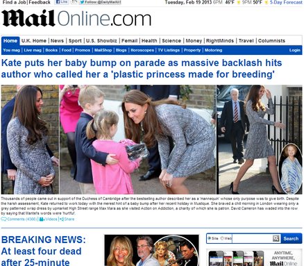
Mail Online is a British tabloid-type of news source with celebrity gossip, indignant moral opinion pieces, and of course “coverage” of breaking news. The recent Oscar Pistorious case held the same pagespace as a headline about Amanda Bynes. The site is also heavily addicting, even for those like me who try to be picky about their news sources. It outperforms almost every major news website including The New York Times and Britain’s The Guardian.

Mail Online’s disregard for traditional web design rules is apparent from their scrolltastic front page, which would be close to four foot long if printed out and laid end to end. They draw reader’s immediately by removing all advertising on the front page and doubling the rate of ads everywhere else.

The news source’s site is like a maze that you can’t ever be totally lost in. Sidebars have over 50 stories, each with images, and a visitor can end up pages deep before they realize they haven’t been to the front page, but they don’t feel lost. The feeling is similar to Wikipedia’s site structure where visitors follow links down the rabbit hole, but are still connected with almost every navigational tool the front page offers.

Kelsey Campbell-Dollaghan explored Mail Online’s rule-breaking design innovation more at Co.Design. I’m unsure whether this type of rule breaking is actually good for web design, but I have always been attached to overly designed styles which emphasize aesthetics. Mail Online suggests that aesthetics may actually be holding back design.