Tag Archive for: tips

Frustrated WomanIf you don’t have a website for your small business, you are certainly missing out on potential business and growth for your company. But, some business owners are nervous about branching out and getting online because they are afraid to lose money on a venture they don’t entirely mistake.

It is a fair concern. There are countless thrown together websites that litter the web, neglected and forgotten by everyone except the bots search engines send out. But, that shouldn’t be enough to stop you from reaching out with your own company. The majority of sites that have gone unnoticed and cost their businesses money share a number of fatal flaws that will stop any traffic from trusting you or returning to your company’s site.

Today, we are going to discuss the most common mistakes that drag down websites that have the potential to engage and excite visitors, and how we can help brands turn their struggling website into a real platform to expand your customer base and engage with your audience in new ways.

Visual Mistakes

Hidden Contact Information: For smaller businesses a website serves as an entry point for customers. While your website should demonstrate your expertise and services, the most important thing on all of your site is your contact information. Far too often, this information is stuffed and hidden away at the bottom of the front page or an obscure tab. Instead, put the contact information front and center, or at least above the fold. Visitors should be able to contact you within seconds from the front page of your site.

Crowding the Page: In web design, less can certainly be more. Your front page shouldn’t look like a crowded advertisement you send out to local papers or a mishmash of information crowded into as little space as possible. With online design you never really run out of space, so don’t be afraid to let your site breathe and let the white space of the page shine through where it needs to. If your page gets too busy, ask yourself what is essential, and prioritize what information should be immediately visible when your page loads. Then build from there.

Dead Links: Nothing says “this website is not well maintained” to a customer like a site filled with links that no longer work. But, if you only work on your site from one computer or network, you might not ever know the links are broken. Regularly check your site from a different computer and check to make sure all the sites you are linking to are still up to date and don’t lead to pages that no longer exist.

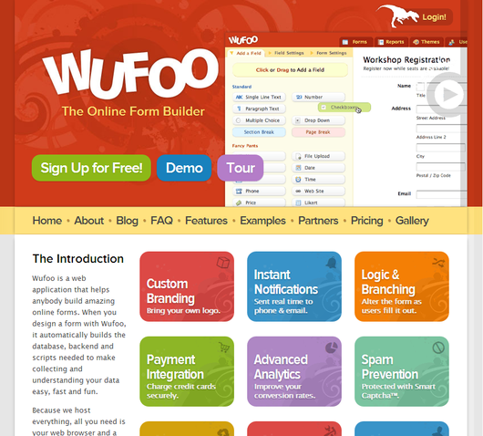
Animated Logos: When you visit websites for highly respected brands or prominent companies, do you ever see logos that spin, flash, or shoot glitter? While Google’s animated “Doodles” are a popular feature of their site, the vast majority of successful sites put their animated logos out to pasture years ago. Just use your professional logo in the cleanest looking format you can.

Content Mistakes

Typos and Grammatical Errors: There should NEVER be grammatical errors or typos on your page, especially on your front page. Yet, I still see this all the time, and audiences notice. If you have to hire someone to proof read all copy you publish, do it. The bottom line is that visitors and readers automatically respect and trust you less when they notice errors on the digital face for your company.

Stale Content: One of the biggest ways to push away your audience is to appear out of date. If you have content that is just sitting there and is never udpated, visitors will start to wonder if you are still in operation, and if so, why did you leave your website and content to rot? Regularly publishing fresh content shows that your business is up-to-date, in touch with its customer base, and an expert in your field.

Outdated Calendars: The same problems with stale content are inherent in outdated calendars, but worse. If a visitor sees your online calendar hasn’t been updated since November of 2011, they will assume that is the last time your website was updated. Similarly, they will assume you have either neglected your site or gone out of business. If you don’t have enough events to fill a calendar, cut it. If not, then start updating the calendar with all your events so your audience can join in on the fun.

The Big Picture

Yes, there is plenty of room for failure online. But, with a little bit of wisdom and a skilled hand to guide you through the process, it is actually much easier to gain a bit of traction online than you probably think. But, you can’t use full measures. By waiting to get online you are just missing out on potential customers, but a poorly done website projects disinterest in your own business or a lack of professionalism that won’t attract any new faces. Most importantly, you won’t see any new sales with a site like that.

Logo design is one of the most deceptively difficult jobs in all of design. It sounds so easy, pick a font, type out the company name, and maybe underline or circle it. There are designers out there who really do think that way. But, if you actually care about delivering a quality product, its much more complicated.

There are endless brands and logos out there today, and the vast majority fall away into the noise. To create a truly successful logo in the modern day, you have to design something simple but brilliant enough to make people instantly take note. In the best logos, the viewers don’t even realize why they are so attracted to the logo.

But, how do you actually create a logo that accomplishes this? It takes some studied knowledge of design and a bit of ingenuity. Joshua Johnson from Design Shack has a few ways you can approach logo design to create something truly remarkable.

1) The Visual Double Entendre

Many of my favorite logos can be interpreted in at least two ways. The visual entendre is exactly this tactic, which wraps two images into the same visual object. There are quite a few examples of this design strategy out there, but the example Johnson uses is too perfect to ignore, the WinePlace logo.WinePlace LogoThe logo is shaped like a thumbtack, seemingly marking a place or location, but if you look for more than a split second you will easily see the object also looks like an upside down wine glass. This sort of visual “trickery” encourages viewers to look a little longer and absorb the image (and brand name) more than the average glance. It is memorable for its creativity, but also because you force people to pay attention for longer.

Another added benefit of the strategy is that by nature your design must be simple to play two objects into the same image. As you’ll see, simplicity is a great rule of logo design.

2) Pay Attention to Color

One of the most basic facts of design is that color is not simply an aesthetic decision. Every color and tint carries a specific set of meanings and ideas, which often seem so embedded in our brains that our reactions are subconscious.

Many brands will have already noted this and might very well require you to stick to a very specific brand palette, but thats not always the case. On the chance that you have freedom to choose the colors of the design, you will want to pay close attention to picking the colors that will not only look good together, but also represent the nature of the brand.

On top of this, you should make sure the logo will also look clear and distinguishable if it must be printed in grayscale. Not every memo and press release will be full color, and you don’t want to lose the impact or recognizability of the logo just because someone xeroxed a company report.

3) Avoid Cliches

Trends are something that are unavoidable, but you might think twice before playing into what is hot at the moment with your logo design. Sure a popular styled logo might gain you some favor in the moment, but your logo is intended to represent your brand for years to come. You want it to be memorable enough that your logo outlives the current trends.

Fake Hipster Logo - Source: Design Shack

The current example is the dramatic overuse of the circular logo, generally styled vaguely like an old college patch or badge. Circles are popular in design and these types of logos are slightly retro, but just modern enough to have become a terribly common site across the web. But, it also means they are all interchangeable. I don’t remember any brand using the style because they all look the same eventually.

4) Custom Type Never Goes Out Of Style

Coca-Cola Logo

Some of the most popular logos throughout time rely on very little to be successful. Just think of Coca-Cola’s logo. All they need is their signature red color and a custom typeface so notable it has become the source of countless rip-offs and parodies.

The best part of using custom type is that it isn’t immediately able to be copied. Designers looking for a quick and easy way to jump on a potentially successful bandwagon are quick to begin using a font. But, if you have your type hand-designed, it takes a lot more effort to mimic. The irregularities that make custom type so special also make it too unique for a simple conversion to a font.

5) Keep It Simple

Apple-Nike Logos

While custom fonts are certainly a simple but effective way to make your mark, some designers don’t specialize in illustration or typography. That doesn’t mean they are out of luck. Many of the most famous logos in the modern day don’t feature any type whatsoever.

These logos take design to an even simpler stage, where all you need are simple shapes that are as iconic as they are refined. Apple began with their trademark bit apple shape, but originally it was striped with color. Gradually, they began to shift the logo to what looked like a brushed metal apple, but these days you won’t find any of those flourishes. All they need to be memorable is the silhouette of the apple, with that special bite taken out.

Conclusion

There are of course many other approaches you can take to making a memorable logo. For example, Johnson also brings up a discussion of symmetry and proportion in logo design that is better fit for a more in-depth analysis. Simply put, great logos don’t leave things to chance. But the truth is, if you want a truly memorable logo, you might start by trying to create something unlike those before.

There are more than a few lists of the most important rules to follow in SEO, and to their credit, they all largely say the same things. This is good for site owners and SEOs getting started, but what do you do when you’ve checked off every one of those standard entries? Is your site perfect? Does that mean there is nothing left to perfect? Of course not.

Your site’s SEO is always able to be improved upon, and some things left off the more popular lists can still hurt you terribly. Bill Slawski created his own list of SEO rules that features suggestions you might not have seen before if you stick with just the biggest websites available.

Slawski’s suggestions approach slightly more technical issues than many will give you, and many of them seem trivial until you understand how picky Google’s crawlers and indexers are. For example, site architecture doesn’t seem that important so long as it is organized in some ways, but in reality there are very specific ways you should have your site set up. Having more than one web address that search engine crawlers are able to visit your site from, for instance, can end up frustrating Google’s bots, and you may even end up with a message in your Google Webmaster Tools telling you to cut it out.

Another common site architecture mistake for commerce sites is creating different product pages for all manner of tiny variances. Some will create individual pages for different sizes and different colors, which only creates a mess for your visitors and Google’s crawlers alike. Keeping the architecture of your site as streamlined and efficient as it can be to fit your needs is always important, and unnecessary bulks of pages don’t attract the search engines.

On-site SEO is also a wide spread problem for many site owners, and that is never more obvious than when you see pages that don’t have unique titles. Titles are supposed to describe a page and explain what is featured on the page. Consider it the title for a book. Would you look for a book with no title? Would libraries be able to organize those books? In this case, searchers are wary of any site that doesn’t make every effort to tell them what they offer before they click onto the page, and search engines are the librarians unable to sort your mess without titles on your pages. Don’t upset the librarian.

Of course, even for Slawski, one of the most common problems is simply that people create sites that are too slow for our current standards. It may look nice, but visitors are impatient and won’t hesitate to hit the back button if your page isn’t loading quickly. This is even more true for mobile users who are on-the-go and don’t want to wait for their content. The slower your page loads, the more prospective visitors you’ve lost.

Those were some of Bill Slawski’s most important rules for SEO. What are the rules you always keep in mind while working on a site?

There is a lot of fun in web designing, but creating web forms is not involved in any way. Not only are forms time consuming and insanely frustrating, but they also become a difficult task when you need things like conditional logic, multi-page forms, and payment integration.

Thankfully, there are always helpful tools out there to make the process a little faster and a lot less of a headache. Vandelay Design collected twelve options for making these forms, and they cover everything from the simple little forms to the complicated multi-page forms you always hate making.

Wufoo is probably the most popular thanks to its easy to interact with user interface and wealth of features including custom branding, payment integration, and even file upload capabilities amongst many other options. It also has over 150 pre-built form templates, spam prevention, and user management.

Wufoo Screenshot

The cost is the main drawback for most of the tools, especially for more independent or low-budget designers. There is a free option for Wufoo, but it only allows for 1 user, 10 form fields, and 100 entries per month.

The paid plans range from $20 a month to $200. Most of the others are similar in cost, though it depends on what they do, and what you plan on using the forms for. Many are priced depending on the number of users, forms, form fields, and entries per month.

There is a unique entry on Vandelay Design’s list, in that there is a WordPress plugin. Gravity Forms offers most of the same form building features you’ll find in most of the other resources, but its all available from the WordPress dashboard of the sites you are working on.

One of the most best benefits to Gravity Forms is that forms can be created to insert form data into blog posts, such as setting up a form where users can submit news or pictures to be posted to your site. It’s also just nice not having to change tools or sites to manage your forms.

The best tool for you all depends on what type of work you have to do, and how much you are willing to spend to speed up your time spent making forms. Sure, you could make the forms on your own, but isn’t your effort better spent elsewhere?

Apple Logo1One of the most crucial design decisions for a new company is the logo. Great logos are instantly recognizable and evoke the brand image with just one image. When anyone discusses McDonald’s, Apple, Nike, or NBC, it is hard not to imagine the Golden Arches, iconic apple, or swoosh because they are so deeply ingrained in their corporate image.

Creating a logo that perfect is deceptively difficult to do however. The business world is awash with bad logos that no one will ever remember. There is no magic recipe for a great logo, but there are some rules to follow that will help a logo stick out. I’ve given some tips on logos before, but Sarah Clare from Vandelay Design had some suggestions designers should keep in mind.

One of the most common mistakes is just over-doing the logo. Clean lines and simple contrast are striking and easily able to be replicated in any format, neon sign to stationary. Text can be included but only when necessary, and limit it to the brand name. Even if you’ve been in business for 200 years and you’re doing a logo redesign, your icon isn’t the place to tell people that.

It is hard to understate how important it is that your logo is able to be reproduced anywhere. Something may look good on a computer screen, but logos are sometimes printed on endless materials like pens, paper, mugs, and even mints, and stress balls. You want people to be able to recognize the logo whether it is 1″ x 1″ on a memo, or plastered on a billboard.

While a logo has to be simple, it also has to convey the tone and personality of your business. A high tech company with a childish logo may have trouble convincing potential customers of their abilities, especially because everyone in tech hates comic sans. Usually bright colors are reserved for companies more associated with children as well, but Google’s logo shows why that isn’t a hard rule.

As a business owner, you will see your logo more than you actually see your brand name, or at least it will feel like it. If you want your brand to be successful in the marketplace, you need a logo people will instantly be able to identify and connect with. It seems like a small task, but being lazy on the logo can torpedo a new brand.

Pretty much anything connected to the internet is in a constant state of flux and evolution. Web design is certainly not exempt from this. That’s why it is important for every working designer to stay in touch with what is current, but for someone who may have graduated from school five, ten, or even more years ago, it is easy to not realize how out of touch you really have become by sticking to what you know.

Brian Morris, writing on Creative Overflow, realizes how easy it is to get disconnected from current web design if you aren’t making a point to stay up to date. But he also points out seven easy ways to make yourself a good current designer again.

Getting back in touch with what is happening is as easy as taking a class at a community college. I’m sure you don’t need a design 101 class, but just looking at a class catalog  you can identify areas where they may be teaching programs, skills, or ideas that weren’t en vogue or even created when you were in school.

The largest reason there isn’t an excuse for being behind the times is the community of web designers just spewing out tutorials, resources, and helpful articles available for free. Just browse design blogs until you find something you don’t know how to do, then follow the tutorial while you watch it. Just viewing a movie of someone telling you how to do something won’t help you learn it very well.

Honestly, most of Morris’ suggestions are things any good designer should be doing to start with. Constantly viewing colleagues and peers’ work helps jump start the creative process, and you can see ideas and skills you might not know, just like entering contests keeps you pushing to make the best design possible. What the suggestions do show though is the one thing you can’t do in web design: become complacent.

I’ve talked a lot about how important it is to try to think like your customers. It’s always important to find out what people are thinking, what questions they are asking, etc., but I didn’t offer any specific ways to accomplish this. But today I have one method of finding out what questions people are asking about topics important to you.

Justin Arnold from The Mighter Pen suggests using Twitter because it offers real time feedback on what people are talking and thinking about relative to keywords.

Of course, this is pretty common knowledge, but what people don’t realize is Twitter has some key features built into its search engine that really benefit the person looking for questions people are asking.

Finding out what questions people are asking is as simple as adding a space and a question mark after a querie. Suppose you are writing about painting. You can search ‘painting’ but you probably will get a lot of extraneous posts not of interest to you. If you search ‘painting ?’ however, Twitter filters your results to only include tweets with questions.

Now, the problem we are faced with is Twitter is used pretty heavily for promotion. Don’t you wish you could filter out any tweet containing links to avoid all of the ads? Well, you can. Just add ‘-filter:links’ to your searches to do away with all of the promotions. What you have now is a list of questions users are asking about a topic in real time.

This is just one way to try to get into the minds of your audience. Trying to gain some perspective is always important when creating content.