 It’s easy to take text for granted as a designer. However for most users, text is the most common component across the web. Designers can lose focus or patience on text when we want to get to the more fun aspects of design, but you can’t communicate effectively in any way without good typography, and good type is built upon a few basic principles.
Web Designer Depot set down a list of rules that designers can follow for excellent typography, or at least prevent the most basic mistakes. While some of these considerations may seem unimportant or odd when you begin trying to work them into your page compositions, before long they will be second nature to you.
- Establish a Typographic Hierarchy – Text is all about conveying information, and readers on the internet want to obtain that information quickly. They scan and look for the most interesting or important parts, which they can’t easily do without an organized typographic hierarchy. Even for readers who don’t skim, the hierarchy keeps information organized and accessible.
- Keep Text Large Enough To Read – While 12pt. fonts may have been acceptable on the web a few years ago, no one wants to be squinting at a computer screen anymore. Make your text large enough for people to easily read. I’d suggest 16pt. fonts, but certainly no smaller than 14pt.
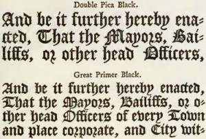
- Choose Appropriate Fonts For Body Texts – Conveying information is also all about legibility. Choosing a flowery, superfluous, or otherwise hard to read font for body copy is off-putting to visitors and will keep them from sticking around the page for long. There is a time and a place for extravagant fonts, but that isn’t in the body paragraphs.
- Don’t Use Too Many Fonts On One Page – The web ran on only a handful of fonts years ago, but now we have the abilities to work with a practically endless number of fonts in our designs. That doesn’t mean every one of those fonts should go into a single design. Using too many fonts in a single design can be clashy, distracting, and just plain ugly. The old rule is too stick to two or three fonts. I don’t suggest using more.
- Give Your Text Some Room To Breathe – Just like on school essays, having extra space between each line of text makes everything much easier to read than trying to make sense of jumbled cluttered letters. The problem is evenly solved too, all by increasing line-heights. Be careful not to overdo it though, too much space can be bad.
Web Designer Depot has a few other rules on their page, but these basic rules will be enough to protect you from the biggest typographic sins. Remember, text is the best way to convey information to your visitors, so make the text easy to read above all else.


