Tag Archive for: Smashing Magazine

Blank gridded notepad
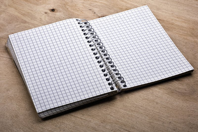
Conceptualizing a mobile or desktop site has never been as easy as it is today with the huge range of wireframing and prototyping tools at our fingertips. Long gone are the days of sitting down with pen and paper and tossing away pages every time you wanted to change a small detail. To many designers out there, that is a relief, but Lennart Hennigs, writer for Smashing Magazine, suggests it may be better for the final product to revert back to the old ways and undertaking hours of sketching.

Hennigs suggests that these tools which have made getting started on a website faster than ever before are also making us skip over key step that leads to the best results possible: taking to time to actually understand the problem.

Many designers are afraid of white or empty space. The pressure to start from nothing can sometimes be intense, especially on important projects, but when we start to map out the project and work out the problems we also start to create solutions. We aren’t just fixing problems on the paper when we sketch, though. We also generate new ideas out of the lack of established details. Your brain automatically fills in the blanks, and you can often be surprised by what you imagine. The best part of all of this is exploring these options without being forced to commit.

With sketches, you can have three our four different options for a single screen on a single page, all in progress at the same time. You can explore every option you want, and if something goes wrong, mark that design out or throw it away. With prototyping, it isn’t so easy. Prototyping is slower and when it takes more time to create something, we get more attached to it even when it isn’t the best possible design. It is hard to outright throw away a prototype you’ve spent an hour or more on.

The big reason some designers were so happy to see prototyping tools become widely available is they were sketching wrong. Your sketches don’t have to look good, and you definitely don’t need to spend hours cleaning up lines or making them look good. You are conveying ideas, not the final product. You don’t need to be Rembrandt, you just need to get the ideas on the paper. Think of it like writing, you have to be legible enough to communicate the information, but sloppy penmanship doesn’t matter if it is still legible. Similarly, you’re sketches don’t need to look pretty so long as they formulate ideas and could communicate them to collaborators.

If you’re sold on stepping back one step in your design process and opening yourself to new ideas you normally wouldn’t get during the prototyping step, don’t worry about your artistic skills or anything like that. Hennigs suggests more than a few tips in his article for getting started and how to approach the new old part of design.

User experience is more important now than ever. A few years ago, visitors would put up with a glitchy or poorly functioning site because the internet as a whole was less developed. Now, if one site doesn’t work well, visitors will simply look for another that was designed properly and responds how they want it to.

Visitors aren’t the only ones who care about user experience, either. Search engines are putting a bigger and bigger emphasis on how much users will enjoy a site instead of focusing on technical things like linkbuilding that visitors won’t ever notice.

Robert Hoekman has been working in the web industry for thirteen years and has first hand seen the changes happening as user experience became one of the most important aspects of running a website. While there are a few dissenters, Hoekman is part of the majority who are happy to see websites being designed for users, not for designers or search engines. However, he knows some designers have had some growing pains during the transition.

To help designers understand the importance of user experience and why it is the key to creating a well ranked and well liked site, Hoekman created a list of 13 tenets of user experience (one for every year he has spent in the business). If you don’t get what the big deal is or why user experience was bound from the beginning to become the most prized aspect of design, his rules should make it all clear.

TypelateWeb designers can never have enough tools and kits for making their websites look great quickly. With the rise of typography, there are numerous kits coming out that help designers catch up to the huge advances in a robust area of design. In the past, designers were limited to a select few fonts, so extensive knowledge of typography wasn’t necessary. Now, there is a steep learning curve when it comes to using text to enhance your design.

Smashing Magazine just released a new free-range and open-source typographic starter kit to help designers do just that. The goal of the framework, called Typeplate is to assist designers without forcing them into any sort of mold. Pattern libraries quickly make a design look good, but they tend to have generic results, and normal web frameworks force you to code “their way.”

Instead, this “starter kit” helps give your project a jump start, but making no assumptions about how you write code. Typelate lets you set base styles with conventional typographic features, created with solid markup and extra flexible styling. It isn’t meant to be a framework you add a little information to and expect a finished product. Instead, it is meant to be extended and customized while allowing designers to make the process of instituting typography onto their page a little faster.

In just a few years, mobile browsing has gone from laughably tedious to one of the fastest growing ways we access the internet. With that meteoric rise to popularity comes misunderstandings thanks to generalizations, but the reality of mobile browsing is much more complex.

Karolina Szczur wades through the misconceptions about mobile browsing and design, attempting to clarify the truth about mobile design and show how believing these inherently false ideas leads to designs that don’t really work for the current web.

The biggest misconception is that mobile is well-defined or even monolithic. This isn’t helped by most articles which suggest tips for mobile design which lump all devices, browsers, and even tablets all into one category. It is easy to forget when we write about mobile browsing like this, that ‘mobile’ doesn’t actually refer to the handheld devices. It it refers to the user, according to Barbara Ballard, author of Designing the Mobile User Experience.

Focusing on devices when designing for mobile misses the more important factors surrounding users. Context defines more of what mobile users are doing than their devices. The most wide-held view of mobile users focuses on out-and-about shopping, but studies have shown that 70% of Americans use their phones in the bathroom, and just as many use them while sitting on the sofa, away from their desktop.

The usual decision when thinking about mobile users as “on the go” is to streamline everything on a site, but this forgets that mobile users are often trying to perform complicated transactions or reach full length articles from areas where a desktop isn’t feasible.

This monolithic attitude about mobile browsing also leads people to think that mobile browsing is dominated by Apple devices. While those with iOS devices are the most high profile smartphones and tablets, Google owns roughly 53% of the smartphone market in the US.

The difference is, Apple uses one standard device, whereas Google’s smartphones are spread across a vast array of Android devices with wildly different display sizes. Designing just for Apple is actually designing for less than half of the market out there, and ignores the huge variances available. When you then include the number of browsers available on smartphones and tablets, designing strictly thinking about Apple’s Safari browser is focusing on just a small share of users.

These are just two of the wide-held misconceptions about mobile browsing, and they spawn from generalizations meant to make the field of mobile browsing seem digestable, but it ignores every big of fact available. The reason for the huge boom in responsive design over the past year is a reaction to just this problem, and it serves a strong solution. Mobile browsing is anything but singular, and design now has to take into consideration the hugely different ways we all browse.

Most average people have know idea what SEO is, and have probably never even heard the term before. Still, the industry is essential to running a popular and credible website. It is important enough that there are an inordinant amount of people writing about it every day online. That wide amount of people writing has lead to the spread of apparent misinformation, usually by well-meaning people who were never exactly explained what SEO is and what one does.

That type of misinformation, though well intentioned, seems to have lead to a bit of an identity crisis for the market. We can see it in a couple recent articles for Smashing Magazine. The first is called “The Inconvenient Truth About SEO” and the second is its rebuttal. The first simulataneously cites the spread of misinformation as a huge issue in the field, while also attributing numerous non-SEO practices to the industry. While trying to show that a lot of the practices offered by so-called “SEO experts” are can actually be wastes of money, Paul Boag also shows that his own idea of SEO has slipped askew from what SEO does.

The rebuttal, by Bill Slawski, on the other hand is aimed at resolving these questions about what an SEO does, and more importantly, doesn’t do. Summarizing it in short would not do justice to the full explanation he offers, so I suggest just diving in and reading what he has to say.

It is hard to say that Bill Slawski’s idea of what SEO does is exactly correct either, as the people working in the field are the ones who define it, and some SEOs have been using these practices. Instead, think of it as a way to get closer to a more traditional spin on current SEO practices, and what SEO really means.

There is a rule in design based on the principle that the closer and larger a target is, the faster it is to click on it. The concept seems self evident, but it is surprising how much that concept affects on a web page. Users are actually less likely to respond to a call-to-action if it takes more effort than they want to expend on navigating to the button.

The concept is called Fitt’s Law, and it can have a big impact on how users respond to your website, but don’t start redesigning your page around it quite yet. Anastasios Karafillis pinpoints some instances where Fitt’s Law is not the best design principle to follow. She explores every aspect of the law, and how it can help or hurt you in specific circumstances.