Retina Displays have become a buzzword for design and Apple alike, as it has managed to become synonymous with any display able to show high definition graphics, but many don’t actually understand what Retina means. For starters, “Retina Display” is just Apple’s term for any devices that can put out the high quality graphics, but almost every other brand of mobile device has devices with the same capability.
In other words, asking if your PC has a Retina capable display is like asking if HP makes an iPad.
The misunderstanding, combined with Apple’s penchant for promoting the capability without stating what it actually means in their ads, has made a huge number of people think they understand the term, without knowing the details.
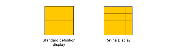
Retina Display is Apple’s brand name for liquid crystal displays that show pixels at higher densities than ever before. These high definition displays pack twice the number of pixels in the same amount of space a normal display would show. This causes text, icons, and even even optimized pictures to look crisper and less blurry than before.
Source: Designmodo
This raises a couple problem however. Most websites haven’t optimized for Retina Displays, so instead many pictures and text will appear pixelated, and the new set of display capabilities adds to the already huge variance of screen resolutions and sizes accessing websites.
Paula Borowska knows how to fix these issues though, and the solution is already one of the most popular design methods available right now. Her article at Designmodo covers the different ways you can create Retina graphics and text that utilize responsive design.If you want your site to look as crisp and beautiful as it can, creating Retina level graphics is the way to go, and it can be surprisingly easy.
