While on the surface, creating content is about sharing important information of different kinds with the public, we’d all be lying if we said that we didn’t hope to get the most traffic possible coming to your site thanks to some great blog post or infographic. It isn’t easy. Getting over 100,000 views on a page as a startup is a lot of luck, but it also takes a lot of work to make quality content.
There are no magic tricks to make content that will get you exponentially more site visitors and creating one post that gets that many eyes on it doesn’t mean they will necessarily keep coming back, but it can tell us a lot about what people are looking for on the web and what counts as great quality.
Stephen Kenwright works at Branded3 who recently hit the coveted 100,000 pageview benchmark, and he wrote about what he has learned from the short term success over at SEOMoz. You can learn a lot from their isolated case, and the tips Kenwright offers.
https://www.tulsamarketingonline.com/wp-content/uploads/2018/07/TMO-Logo.png00TMOhttps://www.tulsamarketingonline.com/wp-content/uploads/2018/07/TMO-Logo.pngTMO2013-05-28 11:47:402013-05-28 11:47:40Learning From a Post With 100,000 Views: A Case Study
It’s easy to take text for granted as a designer. However for most users, text is the most common component across the web. Designers can lose focus or patience on text when we want to get to the more fun aspects of design, but you can’t communicate effectively in any way without good typography, and good type is built upon a few basic principles.
Web Designer Depot set down a list of rules that designers can follow for excellent typography, or at least prevent the most basic mistakes. While some of these considerations may seem unimportant or odd when you begin trying to work them into your page compositions, before long they will be second nature to you.
Establish a Typographic Hierarchy – Text is all about conveying information, and readers on the internet want to obtain that information quickly. They scan and look for the most interesting or important parts, which they can’t easily do without an organized typographic hierarchy. Even for readers who don’t skim, the hierarchy keeps information organized and accessible.
Keep Text Large Enough To Read – While 12pt. fonts may have been acceptable on the web a few years ago, no one wants to be squinting at a computer screen anymore. Make your text large enough for people to easily read. I’d suggest 16pt. fonts, but certainly no smaller than 14pt.
Choose Appropriate Fonts For Body Texts – Conveying information is also all about legibility. Choosing a flowery, superfluous, or otherwise hard to read font for body copy is off-putting to visitors and will keep them from sticking around the page for long. There is a time and a place for extravagant fonts, but that isn’t in the body paragraphs.
Don’t Use Too Many Fonts On One Page – The web ran on only a handful of fonts years ago, but now we have the abilities to work with a practically endless number of fonts in our designs. That doesn’t mean every one of those fonts should go into a single design. Using too many fonts in a single design can be clashy, distracting, and just plain ugly. The old rule is too stick to two or three fonts. I don’t suggest using more.
Give Your Text Some Room To Breathe – Just like on school essays, having extra space between each line of text makes everything much easier to read than trying to make sense of jumbled cluttered letters. The problem is evenly solved too, all by increasing line-heights. Be careful not to overdo it though, too much space can be bad.
Web Designer Depot has a few other rules on their page, but these basic rules will be enough to protect you from the biggest typographic sins. Remember, text is the best way to convey information to your visitors, so make the text easy to read above all else.
00TMOhttps://www.tulsamarketingonline.com/wp-content/uploads/2018/07/TMO-Logo.pngTMO2013-05-24 15:40:552013-05-24 15:40:55The Guide To Great Typography
Like most designers and web design bloggers, I try to keep up to date with the latest tools and resources available, and I try to pass them along when I get the chance. One of the best places to find the latest and greatest tools, extensions, apps, and kits is Web Designer Depot’s monthly compilation for designers and developers. Most of them are free, and almost all of them can be of use in your workflow.
This month’s wrap up has everything from web apps, jQuery plygins and JavaScript resources to wireframing kits and coding resources. As always, there are also some awesome fonts, most of which you can get on a budget.
One of my favorite resources, though one of the least directly usable on this list, is a free ebook calledThe Productivity Manifesto, which is filled with tips on upping your productivity. All you have to do to get the ebook is sign up for the free newsletter.
If you’re looking for more practical tools, you’ll like WireKit, a set of Photoshop shape layers for iPhone apps, or the interactive usability checklist Userium that comes with categories for user experience, homepage, accessibility, navigation, and every other facet of site usability.
Those couple tools are just scratching the surface of what is offered at Web Designer Depot this month, and I highly advise you check out everything else they are showcasing this month. You’re bound to find at least one tool you like.
00TMOhttps://www.tulsamarketingonline.com/wp-content/uploads/2018/07/TMO-Logo.pngTMO2013-05-23 13:31:382013-05-23 13:31:38Free Resources: The Best Tools For Designers This Month
Google is always fighting to maintain diversity on their search engine results pages (SERPs). It has proven difficult over time to walk the line between offering searchers the content they want in easily browsable form, and keep the big established sites from completely dominating the results.
Matt Cutts, head of Google’s Webspam team, recently used one of his YouTube videos to talk about how Google is managing this, and highlight an upcoming change that will hopefully keep you from getting pages full of essentially the same results. No one wants to see eight results from Yelp when they are looking for a restaurant review.
The change Google is making is aimed at making it harder for multiple results from the same domain name to rank for the same terms. Basically, once you’ve seen three or four results from a domain, even over the spread of a few results pages, it will become increasingly harder for any more pages from that domain to rank.
If you don’t quite get what this means, it is easier to understand in context. In the video, Matt walks us through the history of Google’s domain result diversity efforts. It also shows how Google tries to manage bringing you the best authoritative and reputable search results without allowing bigger brands to form monopolies on the results.
You can see the full breakdown of the domain diversity history at Search Engine Land or in Cutts’ video, but basically when Google started out there were no restrictions on the number of results per domain. It was quickly apparent that this system doesn’t work because you will get page upon page of results from the single highest ranked domain. Then came different forms of “host clustering” which prevented more than two results per domain to be shown in the search results, but this was easily worked around by spammers.
More recently, Google has used a sort of tiered system where the first SERPs for a term are as diverse as possible, allowing only a few results from the same domains, however as you progress into the later search result pages, more and more results were allowed from repeat domains. Now, Google is tightening the belt and making it harder for those repeat domains to even get onto the later SERPs.
Great content can do just about anything you want it to. You want to draw in more visitors? They’ll come for quality content. Need more conversions? Get some great content. In the best cases, it can go viral. But how do you know what great content is? How do you know what the public wants?
The internet is so insanely populated with content at this point that it is just getting harder and harder to stand out. There are many lists like this one, and they offer different opinions in different ways, but what makes one of those articles more attractive than all the others? It answers people’s needs.
That sounds so incredibly basic that many would say there’s no way it is the whole story, but in reality answering to people’s needs is much harder than you think. There are no guaranteed right answers, and the only way to truly know if you gave the public what they want it to get it out there, but you can get some hints beforehand, if you look in the right places.
Jason DeMers shared some ways you can find out what your target audience is looking for and create the content they need. If you want your content to stick out from the rest, you need to know how to understand your audience.
Competitors’ Forums – This slightly controversial method is also one of the easiest ways to get in the mind of your target audience, and it is definitely one of the easiest. Just find the competitor in your field with the best web presence, and keep tabs on what their audience is interested in and responding to. Of course, some argue that this leads to blatant copying or spylike business practices, and I suggest discretion with the tactic, but if you are looking for a quick way to find out what your market wants, this will show you.
Comments Sections – Just like your competitors’ forums, any place where your audience can directly interact with you offers boundless opportunities to find out what they want and need. Comments sections on your own website, as well as others out there like Reddit, are filled with people looking for solutions, and they are often vocal about looking for it. If you keep your eye on places where the public is interacting, you should be able to easily discern what is on their minds.
Surveys – Where comment threads create an open forum feeling of interaction, surveys allow your audience to speak directly to you and tell you what they want and need. You don’t even have to do your own survey if you don’t have the resources. Just keep your eyes on other public surveys going on. They are everywhere, just look in your daily newspaper.
Product Forums a.k.a. the Support Boards – If you have a niche product and people are looking for support solutions, chances are there is a support board going on somewhere filled with people voicing their problems and opinions all at the same time. In the best situation, you run these boards and can create some good PR while also helping customers and monitoring their interests simultaneously but even if your customers are using a public forum, you can benefit from listening in.
The public is often very open about their feelings and desires, you just have to go where they are voicing them. The internet offers many popular options, and it is easier than ever to keep tabs on what your target audience is thinking. There isn’t any excuse to ignore their needs.
https://www.tulsamarketingonline.com/wp-content/uploads/2018/07/TMO-Logo.png00TMOhttps://www.tulsamarketingonline.com/wp-content/uploads/2018/07/TMO-Logo.pngTMO2013-05-22 15:36:082013-05-22 15:36:08Finding Out What Your Audience Wants
What does it mean to be Pantone’s Color of the Year? It seems like an arbitrary designation to many, but if you watch the design trends close enough, it is easy to see how emerald was chosen as this year’s favorite color.
Emerald works great as a base color or as an accent, and it is an easy choice in a year when colors have gone slightly more natural and pastel. It is a favorite of many, and has always been a staple in fashion, beauty, and design. It was really only a matter of time until emerald had its moment in the sun.
Pantone’s emerald chosen as the color of the year is very specific, and very in line with the design trend of subdued light colors that still pack a lot of punch. Emerald 17-5641 is the lush blue-green that works wonders as a background and is a friendly complement to many colors without clashing.
“The most abundant hue in nature, the human eye sees more green than any other color in the spectrum,” said Leatrice Eiseman, executive director of the Pantone Color Institute, following the announcement of the color of the year. “Symbolically, Emerald brings a sense of clarity, renewal and rejuvenation, which is so important in today’s complex world. This powerful and universally-appealing tone translates easily to both fashion and home interiors.”
Green has always been a popular color because it lacks many negative connotations. Greens are common and associated with health, and is a the second most common favorite color, following only blue. We are used to greens and they don’t have the aggressive or overly feminine associations harsh reds or soft yellows do.
Emerald specifically has many positive emotional associations such as soothing, relaxation, and harmony and there are almost no negative color meanings. The only bad connection that can be drawn is greed or death, which are normally more thought of with more sickly or saturated greens, not the comforting blue-green you’ll find in this type of emerald.
If you want to get inspired or hear some tips on how to use the color of the year, Designshack has created an entire page devoted to uses of the color in design and pop culture, as well as exploring the color’s meaning a little deeper.
00TMOhttps://www.tulsamarketingonline.com/wp-content/uploads/2018/07/TMO-Logo.pngTMO2013-05-16 15:20:322013-05-16 15:20:32Understanding Pantone’s Color of the Year: Emerald
There are more than a few lists of the most important rules to follow in SEO, and to their credit, they all largely say the same things. This is good for site owners and SEOs getting started, but what do you do when you’ve checked off every one of those standard entries? Is your site perfect? Does that mean there is nothing left to perfect? Of course not.
Your site’s SEO is always able to be improved upon, and some things left off the more popular lists can still hurt you terribly. Bill Slawski created his own list of SEO rules that features suggestions you might not have seen before if you stick with just the biggest websites available.
Slawski’s suggestions approach slightly more technical issues than many will give you, and many of them seem trivial until you understand how picky Google’s crawlers and indexers are. For example, site architecture doesn’t seem that important so long as it is organized in some ways, but in reality there are very specific ways you should have your site set up. Having more than one web address that search engine crawlers are able to visit your site from, for instance, can end up frustrating Google’s bots, and you may even end up with a message in your Google Webmaster Tools telling you to cut it out.
Another common site architecture mistake for commerce sites is creating different product pages for all manner of tiny variances. Some will create individual pages for different sizes and different colors, which only creates a mess for your visitors and Google’s crawlers alike. Keeping the architecture of your site as streamlined and efficient as it can be to fit your needs is always important, and unnecessary bulks of pages don’t attract the search engines.
On-site SEO is also a wide spread problem for many site owners, and that is never more obvious than when you see pages that don’t have unique titles. Titles are supposed to describe a page and explain what is featured on the page. Consider it the title for a book. Would you look for a book with no title? Would libraries be able to organize those books? In this case, searchers are wary of any site that doesn’t make every effort to tell them what they offer before they click onto the page, and search engines are the librarians unable to sort your mess without titles on your pages. Don’t upset the librarian.
Of course, even for Slawski, one of the most common problems is simply that people create sites that are too slow for our current standards. It may look nice, but visitors are impatient and won’t hesitate to hit the back button if your page isn’t loading quickly. This is even more true for mobile users who are on-the-go and don’t want to wait for their content. The slower your page loads, the more prospective visitors you’ve lost.
Those were some of Bill Slawski’s most important rules for SEO. What are the rules you always keep in mind while working on a site?
https://www.tulsamarketingonline.com/wp-content/uploads/2018/07/TMO-Logo.png00TMOhttps://www.tulsamarketingonline.com/wp-content/uploads/2018/07/TMO-Logo.pngTMO2013-05-15 11:10:022013-05-15 11:10:0210 Major SEO Tips You Need To Hear
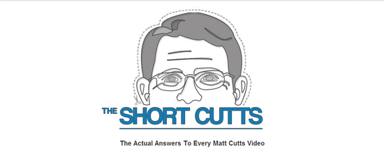
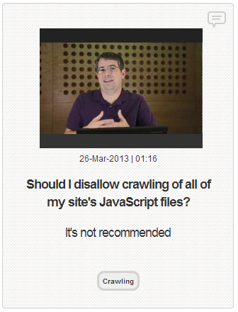
Are you familiar with Matt Cutts, the head of the Google Webspam team, and his YouTube videos? I share them here frequently, but even the ones I write about are just a selection of some of his best. Since he has started making the short informative videos in 2009, Cutts has made over five hundred of the videos.
Five hundred videos are a lot to sort through, and YouTube isn’t the best at helping you navigate large numbers of videos so Cutts’ videos were starting to get a bit jumbled. That’s why the online marketing company Click Consult created The Short Cutts, a site which organizes all of the Cutts videos into an easily usable resource for all SEO questions you may have.
For anyone not already aware of Cutts’ YouTube posts, they all follow the fame pattern. A Google user asks a question about a topic, and Cutts answers the question as well as he can within a short two or maybe three minutes. Some question the usefulness of the videos because Cutts often can’t go into depth in the short time limit, but I think anyone can understand how important it is to hear information and answers to common SEO questions straight from his mouth, even if it is a little vague.
Possibly the best part of The Short Cutts is their method of displaying videos above two sets of text which may help give you a quick answer. The first block of text consists of the question Cutts is asked, and the second block of text gives a quick “yes or no” type answer which can help give you the answer to many of the more simple issues.
00TMOhttps://www.tulsamarketingonline.com/wp-content/uploads/2018/07/TMO-Logo.pngTMO2013-05-14 12:34:302013-05-14 12:34:30The Short Cutts Help You Sort Through Matt Cutts’ Videos
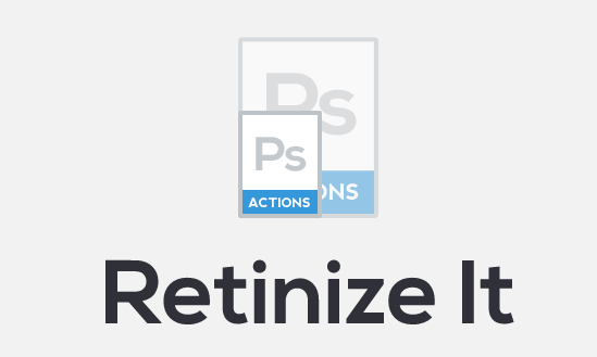
Making “retina-ready” images isn’t exactly difficult, but it is definitely tiresome and far from fun. No one likes looking back on all of their website’s images and having to painstakingly go through and rescale and resave individual images all day. That’s exactly why web design tools are so popular. Designers aren’t quite lazy, but boy do we hate doing tedious tasks.
Artiom Dashinsky from Tel-Aviv was the designer who decided this issue needed a free tool to speed up creating high definition images for high density “retina” screens. His creation, “Retinize It” is an automated set of two Photoshop actions.
As Noupe explains, the first action slices a selected layer or group into a single image, then opens the dialog for saving the image for the web. The second one does the same, scaled the sliced area up 200-percent, and reopens “Save for Web” so that you end up with two differently scaled versions of the same image almost automatically.
Before you use Retinize It, you should always make sure your image relies on shapes or has been turned into a smart object. Traditional pictures will just be pixelated by the simple upscaling.
Dashinsky’s tool is far from revolutionary, and won’t accomplish much that any competent designer wouldn’t be able to do for themselves, but it cuts down on wasted time spent manually reworking individual images.
00TMOhttps://www.tulsamarketingonline.com/wp-content/uploads/2018/07/TMO-Logo.pngTMO2013-05-10 13:22:522013-05-10 13:22:52‘Retinize It’ Saves You Time and Tedium
While we all like to believe our blogs have weight and share important information with mass of internet users out there, the truth is the majority of blogs are white noise in a field so congested that few actually rise above the static and build a reputation and brand image for themselves.
So how do those select few succeed while the others flounder? The top blogs and content based websites out there all do two things that the majority of the other content creators out there don’t do. They produce great content, and they market their content to reach out to the public.
That seems like such an easy plan. While the first part is a combination of talent and dedication, the marketing side is entirely teachable. The problem is, most don’t actually know what great content looks like, at least when it comes time to gauge their own work.
The foundation of great content is almost always writing ability. You may not be the best writer at the start, but over time you can refine your voice and motivation for writing, and before long, you will be much better. But being able to write well doesn’t mean you’re automatically creating great content. Data is what raises competent writing to the level of great content.
Bloggers can write formally, but the blogging medium is largely used for subjective sharing. People don’t look for boring press releases when they search blogs. They are looking for one person to share their experience and information on a topic in a way that hopefully cuts past the normal politics that make up other advertising formats. The problem is, subjective information isn’t very useful unless you back it up with real quantitative information. It just isn’t very believable without stats and data to prove your point.
Just throwing objective data into a blog post won’t make your mediocre content great however. You have to know how to use the data within your post and build your argument around that data. Chris Warden gives some examples of blogs that do just that, as well as explaining more about how you can improve your content with objective data, all at Search Engine Journal.
https://www.tulsamarketingonline.com/wp-content/uploads/2018/07/TMO-Logo.png00TMOhttps://www.tulsamarketingonline.com/wp-content/uploads/2018/07/TMO-Logo.pngTMO2013-05-10 11:47:582013-05-10 11:47:58Using Data To Make Your Content Go From Competent To Outstanding