For web designers, the focus is normally on how things look. But, for users, when you strip everything to its most essential parts, all you are left with is content and navigation between that content. The internet, in its barest form, is nothing but text, and clicking links to travel to pages with more text and links.
With today’s internet, you can’t have a website without a great layout, but coherent and easily understandable navigation will always be a necessity for every web page. Usable navigation is as important as the content on your page.
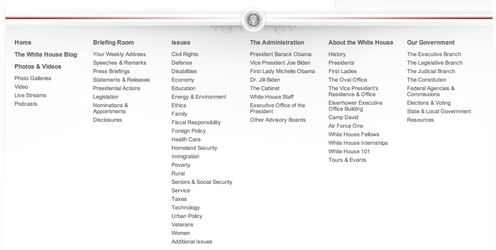
Different websites will try to achieve good navigation a variety of different ways. Some will relegate a large amount of “boring” information to a few links hidden away at the bottom of the page, like Terms of Use or Privacy Policy. I’ve also seen contact links hidden in the bottom links, employment information, and a few other “boring” but often very important facets of a website.
It kind of makes sense. Clutter is bad, and you don’t want people to see things they won’t be excited by. However, if you have to hide links in a secondary navigation bar, you aren’t doing navigation correctly.
Dan Rajan, writer for Web Designer Depot, knows how to make effective navigation systems for websites that don’t rely on hiding information or secondary navigation bars. By just following his five tips, you will be able to fit everything you need into one navigation system, keeping everything more cleanly organized, and helping customers use your site more easily.


