There are so many articles out there fawning over the design of Apple’s products. Starting with the third or fourth version of the iPod, every new product has gotten nothing but love for their revolutionary design, all the way up to the iPad. Every part of the iPad’s design, including the interface, have been broken down and critiqued.

There is one aspect of the iPad that Apple can’t control, however. Apple designs a few apps, but the vast majority are made by other companies. Sure, a good amount of them are cheaply designed, but there are also high quality apps made by designers that care, and it is in those apps that you can learn some of the best rules for modern design. Carrie Cousins collected ten things she learned from iPad apps at Design Shack, and they can be transferred over to any other medium today.

It all begins with an emphasis on simplicity, and Cousins pinpoints one of the most undeniable reasons why web design has taken a turn towards minimalism. Too much on a small screen can overwhelm the user, and simple, easy to use designs help the on-the-go user access what they want, when they want it.

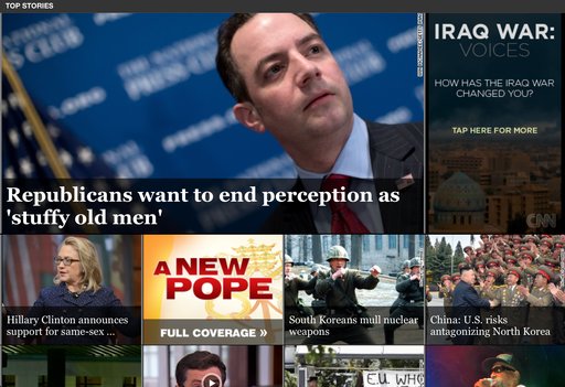
Almost every major trend in web design is also observable through iPad apps. Simple color schemes, and flat designs are all the rage right now, reflecting the continued push towards simplicity on these small screens and it is hard to deny how effective the design changes are. Apple has never been a proponent of flat design, but recent redesigns by CNN and Facebook show that flat design looks great on tablet screens.

CNN App

The unforgiving Retina Display of the iPad will also teach any lazy web designer a good lesson very quickly. You can’t cut corners on any visual aspect of an app. One low quality icon will stick out like a sore thumb on an otherwise crisp and clear interface, and one small shoddy image will destroy the value of your content just like a crack in the foundation of a house will one day destroy that home.

There are plenty more lessons to learn from iPad apps. Cousins has a few more in her article, but if you are critical of iPad apps as you use them, you’ll learn even more. The best part is, because apps are constantly updating their designs, and new innovative apps are coming out every day, you will be able to keep up to date with design so long as you keep killing time on your tablet.

They say a picture is wort a thousand words. Every designer knows how tired that cliche statement is, and just how true it is when you use the right pictures. But, sometimes designers don’t have access to a quality staff photographer or a subscription to Getty Images or a similar stock photo collection website. How is a designer supposed to find quality images to use?

Some designers will settle for using lower quality images they find elsewhere, or using a confusing stock photo with little connection to the content. Neither actually improves content or web designs. Thankfully, there are collections of great free stock photos designers and bloggers can use without using the little money they have.

Stephen Jeske collected ten websites which offer high-quality free stock images. I’ve used one of the sites, Stock.XCHNG, for months and you can always find photographers willing to share their images through it. It is well organized, and easy to use, but no one stock photo site will have pictures for your every need.

When using any sort of images you didn’t create yourself however, it is always essential to make sure you are following the licensing terms and attributing the creator of the image, if you can find out that information. Read the licensing terms for every image you plan to use, and if you are unsure of any details, ask the author of the image.

Many freelancers chose a creative career because they enjoy the ability to create art. Many of them also happen to not be the corporate shark types of people, and the process of building a portfolio of clients can be an intimidating and difficult journey. It requires a combination of throwing yourself out there, creating opportunities, and dumb luck.

For those that might be a little scared of putting themselves in the way of opportunity and fostering business relationships with strangers, there are some key areas you can focus on to attract clients. Social psychologist Robert Cialdini selects six key areas of influence everyone uses to create new relationships, and Sarah Horowitz says you can use them to build a collection of clients.

The areas are ideas that would allow anyone to create positive relationships with others. Reciprocity and the virtue of sharing opens yourself to others’ goodwill. If you put yourself out there when someone is in need, for no purpose other than sharing or helping, it is more likely someone will go out of their way to help you later. If you help one person, you open yourself to a new relationship which can grow into a great business relationship.

Similarly, if you have a focus, be consistent and show exactly what your expertise is. If you have a niche that sets you apart from others, display it for others, and be a part of anything in that field. Clients and others in the industry will begin to associate you with your special area until your expertise is well established.

There are more areas you can pay attention to in order to begin creating new business relationships and start a freelancing portfolio, but the ideas are pretty general. Be a nice person and a good friend, put yourself out there to others, and display your value, and before long people will be coming to you for your work.

Popular LiesGraphic design is fond of truisms. It might be partially because designers kind of cling to the few hard-and-fast rules we hear, or maybe we just let these common sayings get into our minds just like we internalize trends and styles. Either way, ask any twenty-something about graphic design and you will probably hear one of a handful of well-propagated lies.

“Comic Sans is the worst font ever,” is probably the one you’re most familiar with. There are entire blogs devoted to documenting and chiding every use of Comic Sans that the creator finds. Searching Comic Sans on Tumblr is just a stream of childish remarks insulting a typeface like “You should be ashamed of yourself, you used Comic Sans for the give-away and it hurts me to see” and hilarious tags like “#comic sans is the devil”.

According to Craig Ward, Comic Sans “is the typographic equivalent of an innocent man on death row.” It’s not a pretty font. That is fair. It isn’t “sophisticated” like many perceive Helvetica to be. But, what about all the other terrible handwriting fonts no one talks about? The illegible, the illogical, and other fonts that no one will devote a blog to?

Comic Sans shouldn’t be used on a high level brand by any means, and it may offend the pretentious palette  but it actually serves a purpose. Comic Sans is more easily readable for people with dyslexia, which makes the use of the font on every office note ever make a little more sense, and there have to be some fonts for childlike designs.

The Comic Sans truism isn’t the only one running wild through graphic design. I’ve quoted the old “less is more” philosophy more than once, and I’ve subconsciously adopted plenty others. None of that makes them any more true however. Most truisms aren’t. That’s why Craig Ward decided to take them on in his pocket-sized book Popular Lies About Graphic Design. He covers the Comic Sans debate, but he also challenges many other age old graphic design beliefs. He shared seven lies and his arguments against them over at Co.Design.

For web designers, the focus is normally on how things look. But, for users, when you strip everything to its most essential parts, all you are left with is content and navigation between that content. The internet, in its barest form, is nothing but text, and clicking links to travel to pages with more text and links.

With today’s internet, you can’t have a website without a great layout, but coherent and easily understandable navigation will always be a necessity for every web page. Usable navigation is as important as the content on your page.

Different websites will try to achieve good navigation a variety of different ways. Some will relegate a large amount of “boring” information to a few links hidden away at the bottom of the page, like Terms of Use or Privacy Policy. I’ve also seen contact links hidden in the bottom links, employment information, and a few other “boring” but often very important facets of a website.

White House Navigation


It kind of makes sense. Clutter is bad, and you don’t want people to see things they won’t be excited by. However, if you have to hide links in a secondary navigation bar, you aren’t doing navigation correctly.

Dan Rajan, writer for Web Designer Depot, knows how to make effective navigation systems for websites that don’t rely on hiding information or secondary navigation bars. By just following his five tips, you will be able to fit everything you need into one navigation system, keeping everything more cleanly organized, and helping customers use your site more easily.

Color PencilsFor almost any problem you run into while doing web design, there is a tutorial or forum with the solution that can be found with just a couple searches, but there is one big problem that can’t be overcome so easily. Technical problems have technical answers, but designer’s block isn’t like that.

However, there are ways to get past it. You just need to step away, clear your mind, and then force yourself to get back to work. A few simple tips can make overcoming designer’s block even easier, though ultimately, the solution to the block likely depends on the person. Carrie Cousins offers her ways to get over designer’s block, and at the very least they may help you find your own unique solutions to the issue.

Get Inspired – Nothing makes designers feel like working like viewing other people’s great creations. Taking a break to browse through well designed projects may sound like a waste of time, but in reality, it can get your creativity jump started again. Many designers have a set of bookmarks of saved images for inspiration, but most of us don’t tend to go look at those sources often. If you have designer’s block, it is the time to break out those sources. Also, don’t limit yourself to web design just because you work on the web. Inspiration and great design is everywhere. Browse print, go for a walk and explore the great designs littering the city around you, or just look at some photo websites. You’ll be surprised where you find inspiration.

Turn on Music – Despite what your high school teachers said, listening to music while you work encourages creative thought. Numerous studies have shown that areas of the brain beneficial to creativity are stimulated and activated by music, no matter your favorite genre. It also blocks out other distractions, which is especially helpful if you work in a noisy office, or even freelancing at a coffee shop  Try out different kinds of music. The song that got you feeling amped up on the ride to work may not have the same effect while you are trying to work.

Work for Fun – Even when you have a big project looming, taking some time to do a project that doesn’t count can get the creative juices going again without the pressure of a deadline or client’s desires. Simply taking an old project and reworking it using newer design trends and methods can help get you working again so that you can tackle a big project that does matter.

Talk It Out – I always come up with my best ideas for designs in the middle of conversations with my friends. Talking allows you to formulate ideas freely, while someone you respect can point out any holes or problems you might be missing before you encounter them. Find someone who is happy to talk design and you trust. Just explaining what you need to do to someone else can trigger new ideas on how to accomplish the task. If talking doesn’t help you, keep a notebook of ideas, issues, thought on designs, and even when you get designer’s block. Seeing it on the page might help you make sense of your creative problems.

If your company is trying to establish itself on the internet, a low quality site isn’t an option any more. If you want your business to stand a chance online, you must have a quality design that is as professional as it is memorable.

But, as a business owner that doesn’t focus on web design, getting a great looking professional website can be hard. A lot of startups, hoping to save by not hiring a professional, push a non-designer into the role of developer. Others settle for a shoddy website or no site at all, hoping to have the extra resources to do it properly. Neither works well.

There are ways for startups to get the professional website they want, however there isn’t a magic formula. Getting a great website that will draw in customers takes a lot of hard work and time, but it pays off well. To help get you started, Lior Levin gives some tips on how to work towards the design you want and save a little time and money while you’re doing it. With his tips, all you will need is a competent designer and the drive to create a webpage people will want to visit.

Now, I know what you’re thinking. “It’s March! It’s too late to be making predictions for 2013!” You’re right, and I normally write off any list coming out at this point, but a full ebook analyzing what is coming up in web design trends should perk the ears of any web designer trying to stay up to date.

The team at Awwwards released an ebook called Web Design and Mobile Trends for 2013 in mid February with some analysis, but they weren’t done there. They took the feedback they received on their opinions, created a new list with ten key trends web designers should be aware of and re-released the ebook with corrections last week.

Their list doesn’t reinvent the wheel. I’ve already written about a fair number of their trends such as flat design supposedly usurping skeuomorphism, device or technology agnostic designs, and content first approaches. What the list does is show what the public is talking about, and what web designers are doing.

For example, I scarcely believe that any style of design like flat design or skeuomorphism will ever be monolithic on the web, but there are a few aesthetic and technical reasons to believe flat designs will continue to become more prominent. First, web design is refining itself towards a more minimalistic layout as designers are learning that clutter is an enemy. Secondly, The wide variety and quality of devices connecting to the internet creates a need for designs that will look and perform great on fancy new retina displays as well as on mobiles in the non-western market with likely slower internet connections and eReaders.

Meanwhile, predictions like going content first on your website seem like they should always have been common sense, but less advanced algorithms couldn’t favor in the past. As Google has improved their spam fighting campaign, questionable backdoor habits have been thrown out in favor of creating websites people will want to see.

It is always best to let the people making their predictions qualify them, and Awwwards is a great source of intelligent conversation on web design, so I highly advise reading their ebook and checking out their list.

TypelateWeb designers can never have enough tools and kits for making their websites look great quickly. With the rise of typography, there are numerous kits coming out that help designers catch up to the huge advances in a robust area of design. In the past, designers were limited to a select few fonts, so extensive knowledge of typography wasn’t necessary. Now, there is a steep learning curve when it comes to using text to enhance your design.

Smashing Magazine just released a new free-range and open-source typographic starter kit to help designers do just that. The goal of the framework, called Typeplate is to assist designers without forcing them into any sort of mold. Pattern libraries quickly make a design look good, but they tend to have generic results, and normal web frameworks force you to code “their way.”

Instead, this “starter kit” helps give your project a jump start, but making no assumptions about how you write code. Typelate lets you set base styles with conventional typographic features, created with solid markup and extra flexible styling. It isn’t meant to be a framework you add a little information to and expect a finished product. Instead, it is meant to be extended and customized while allowing designers to make the process of instituting typography onto their page a little faster.

Typography is one of the most deceptively complex components of design imaginable. I mean, to the outsider, it is just arranging letters and picking fonts. The uninitiated have no idea about the complexities and the history of typography; they don’t know typography has a rule book all its own.

Now, I’ve said infographics will tell you “all you need to know” about a couple different design aspects, but the truth is, you can never learn too much about design, and just about every part of design has books upon books worth of material to learn. But, reading books about design seems kind of boring right? Everyone in the field at this point got into it because we love looking at awesome images.

Instead of reading a book about typography – which you should totally do – you can always look at infographics which will put all of that information in visually stimulating ways. Typography lovers and experts certainly love making them.

Jacob Gube collected ten different infographics from across the web on Design Instruct. I am posting one of the ten below, but you’ll have to go to their site to see the rest. The one I’m showing you is “A Brief Introduction to Typography”, which you will notice is not particularly brief. That should give you an idea just how much there is to say about the “simple science” of “arranging letters”. Click on the image to see the full size.

Brief Introduction