They say a picture is wort a thousand words. Every designer knows how tired that cliche statement is, and just how true it is when you use the right pictures. But, sometimes designers don’t have access to a quality staff photographer or a subscription to Getty Images or a similar stock photo collection website. How is a designer supposed to find quality images to use?
Some designers will settle for using lower quality images they find elsewhere, or using a confusing stock photo with little connection to the content. Neither actually improves content or web designs. Thankfully, there are collections of great free stock photos designers and bloggers can use without using the little money they have.
Stephen Jeske collected ten websites which offer high-quality free stock images. I’ve used one of the sites, Stock.XCHNG, for months and you can always find photographers willing to share their images through it. It is well organized, and easy to use, but no one stock photo site will have pictures for your every need.
When using any sort of images you didn’t create yourself however, it is always essential to make sure you are following the licensing terms and attributing the creator of the image, if you can find out that information. Read the licensing terms for every image you plan to use, and if you are unsure of any details, ask the author of the image.
00TMOhttps://www.tulsamarketingonline.com/wp-content/uploads/2018/07/TMO-Logo.pngTMO2013-03-14 12:49:362013-03-14 12:49:36Great Free Resources: Stock Photos You Can Use
Many freelancers chose a creative career because they enjoy the ability to create art. Many of them also happen to not be the corporate shark types of people, and the process of building a portfolio of clients can be an intimidating and difficult journey. It requires a combination of throwing yourself out there, creating opportunities, and dumb luck.
For those that might be a little scared of putting themselves in the way of opportunity and fostering business relationships with strangers, there are some key areas you can focus on to attract clients. Social psychologist Robert Cialdini selects six key areas of influence everyone uses to create new relationships, and Sarah Horowitz says you can use them to build a collection of clients.
The areas are ideas that would allow anyone to create positive relationships with others. Reciprocity and the virtue of sharing opens yourself to others’ goodwill. If you put yourself out there when someone is in need, for no purpose other than sharing or helping, it is more likely someone will go out of their way to help you later. If you help one person, you open yourself to a new relationship which can grow into a great business relationship.
Similarly, if you have a focus, be consistent and show exactly what your expertise is. If you have a niche that sets you apart from others, display it for others, and be a part of anything in that field. Clients and others in the industry will begin to associate you with your special area until your expertise is well established.
There are more areas you can pay attention to in order to begin creating new business relationships and start a freelancing portfolio, but the ideas are pretty general. Be a nice person and a good friend, put yourself out there to others, and display your value, and before long people will be coming to you for your work.
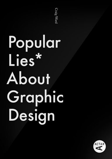
Graphic design is fond of truisms. It might be partially because designers kind of cling to the few hard-and-fast rules we hear, or maybe we just let these common sayings get into our minds just like we internalize trends and styles. Either way, ask any twenty-something about graphic design and you will probably hear one of a handful of well-propagated lies.
“Comic Sans is the worst font ever,” is probably the one you’re most familiar with. There are entire blogs devoted to documenting and chiding every use of Comic Sans that the creator finds. Searching Comic Sans on Tumblr is just a stream of childish remarks insulting a typeface like “You should be ashamed of yourself, you used Comic Sans for the give-away and it hurts me to see” and hilarious tags like “#comic sans is the devil”.
According to Craig Ward, Comic Sans “is the typographic equivalent of an innocent man on death row.” It’s not a pretty font. That is fair. It isn’t “sophisticated” like many perceive Helvetica to be. But, what about all the other terrible handwriting fonts no one talks about? The illegible, the illogical, and other fonts that no one will devote a blog to?
Comic Sans shouldn’t be used on a high level brand by any means, and it may offend the pretentious palette but it actually serves a purpose. Comic Sans is more easily readable for people with dyslexia, which makes the use of the font on every office note ever make a little more sense, and there have to be some fonts for childlike designs.
The Comic Sans truism isn’t the only one running wild through graphic design. I’ve quoted the old “less is more” philosophy more than once, and I’ve subconsciously adopted plenty others. None of that makes them any more true however. Most truisms aren’t. That’s why Craig Ward decided to take them on in his pocket-sized book Popular Lies About Graphic Design. He covers the Comic Sans debate, but he also challenges many other age old graphic design beliefs. He shared seven lies and his arguments against them over at Co.Design.
00TMOhttps://www.tulsamarketingonline.com/wp-content/uploads/2018/07/TMO-Logo.pngTMO2013-03-12 13:29:172013-03-12 13:29:17Debunking The Most Common Lies In Graphic Design
For web designers, the focus is normally on how things look. But, for users, when you strip everything to its most essential parts, all you are left with is content and navigation between that content. The internet, in its barest form, is nothing but text, and clicking links to travel to pages with more text and links.
With today’s internet, you can’t have a website without a great layout, but coherent and easily understandable navigation will always be a necessity for every web page. Usable navigation is as important as the content on your page.
Different websites will try to achieve good navigation a variety of different ways. Some will relegate a large amount of “boring” information to a few links hidden away at the bottom of the page, like Terms of Use or Privacy Policy. I’ve also seen contact links hidden in the bottom links, employment information, and a few other “boring” but often very important facets of a website.
It kind of makes sense. Clutter is bad, and you don’t want people to see things they won’t be excited by. However, if you have to hide links in a secondary navigation bar, you aren’t doing navigation correctly.
Dan Rajan, writer for Web Designer Depot, knows how to make effective navigation systems for websites that don’t rely on hiding information or secondary navigation bars. By just following his five tips, you will be able to fit everything you need into one navigation system, keeping everything more cleanly organized, and helping customers use your site more easily.
00TMOhttps://www.tulsamarketingonline.com/wp-content/uploads/2018/07/TMO-Logo.pngTMO2013-03-11 14:47:522013-03-11 14:47:52How To Improve Your Site’s Navigation
For almost any problem you run into while doing web design, there is a tutorial or forum with the solution that can be found with just a couple searches, but there is one big problem that can’t be overcome so easily. Technical problems have technical answers, but designer’s block isn’t like that.
However, there are ways to get past it. You just need to step away, clear your mind, and then force yourself to get back to work. A few simple tips can make overcoming designer’s block even easier, though ultimately, the solution to the block likely depends on the person. Carrie Cousins offers her ways to get over designer’s block, and at the very least they may help you find your own unique solutions to the issue.
Get Inspired – Nothing makes designers feel like working like viewing other people’s great creations. Taking a break to browse through well designed projects may sound like a waste of time, but in reality, it can get your creativity jump started again. Many designers have a set of bookmarks of saved images for inspiration, but most of us don’t tend to go look at those sources often. If you have designer’s block, it is the time to break out those sources. Also, don’t limit yourself to web design just because you work on the web. Inspiration and great design is everywhere. Browse print, go for a walk and explore the great designs littering the city around you, or just look at some photo websites. You’ll be surprised where you find inspiration.
Turn on Music – Despite what your high school teachers said, listening to music while you work encourages creative thought. Numerous studies have shown that areas of the brain beneficial to creativity are stimulated and activated by music, no matter your favorite genre. It also blocks out other distractions, which is especially helpful if you work in a noisy office, or even freelancing at a coffee shop Try out different kinds of music. The song that got you feeling amped up on the ride to work may not have the same effect while you are trying to work.
Work for Fun – Even when you have a big project looming, taking some time to do a project that doesn’t count can get the creative juices going again without the pressure of a deadline or client’s desires. Simply taking an old project and reworking it using newer design trends and methods can help get you working again so that you can tackle a big project that does matter.
Talk It Out – I always come up with my best ideas for designs in the middle of conversations with my friends. Talking allows you to formulate ideas freely, while someone you respect can point out any holes or problems you might be missing before you encounter them. Find someone who is happy to talk design and you trust. Just explaining what you need to do to someone else can trigger new ideas on how to accomplish the task. If talking doesn’t help you, keep a notebook of ideas, issues, thought on designs, and even when you get designer’s block. Seeing it on the page might help you make sense of your creative problems.
If your company is trying to establish itself on the internet, a low quality site isn’t an option any more. If you want your business to stand a chance online, you must have a quality design that is as professional as it is memorable.
But, as a business owner that doesn’t focus on web design, getting a great looking professional website can be hard. A lot of startups, hoping to save by not hiring a professional, push a non-designer into the role of developer. Others settle for a shoddy website or no site at all, hoping to have the extra resources to do it properly. Neither works well.
There are ways for startups to get the professional website they want, however there isn’t a magic formula. Getting a great website that will draw in customers takes a lot of hard work and time, but it pays off well. To help get you started, Lior Levin gives some tips on how to work towards the design you want and save a little time and money while you’re doing it. With his tips, all you will need is a competent designer and the drive to create a webpage people will want to visit.
https://www.tulsamarketingonline.com/wp-content/uploads/2018/07/TMO-Logo.png00TMOhttps://www.tulsamarketingonline.com/wp-content/uploads/2018/07/TMO-Logo.pngTMO2013-03-05 14:22:282013-03-05 14:22:28What Startups Needs To Know Before Making a Site
Web designers can never have enough tools and kits for making their websites look great quickly. With the rise of typography, there are numerous kits coming out that help designers catch up to the huge advances in a robust area of design. In the past, designers were limited to a select few fonts, so extensive knowledge of typography wasn’t necessary. Now, there is a steep learning curve when it comes to using text to enhance your design.
Smashing Magazine just released a new free-range and open-source typographic starter kit to help designers do just that. The goal of the framework, called Typeplate is to assist designers without forcing them into any sort of mold. Pattern libraries quickly make a design look good, but they tend to have generic results, and normal web frameworks force you to code “their way.”
Instead, this “starter kit” helps give your project a jump start, but making no assumptions about how you write code. Typelate lets you set base styles with conventional typographic features, created with solid markup and extra flexible styling. It isn’t meant to be a framework you add a little information to and expect a finished product. Instead, it is meant to be extended and customized while allowing designers to make the process of instituting typography onto their page a little faster.
Typography is one of the most deceptively complex components of design imaginable. I mean, to the outsider, it is just arranging letters and picking fonts. The uninitiated have no idea about the complexities and the history of typography; they don’t know typography has a rule book all its own.
Now, I’ve said infographics will tell you “all you need to know” about a couple different design aspects, but the truth is, you can never learn too much about design, and just about every part of design has books upon books worth of material to learn. But, reading books about design seems kind of boring right? Everyone in the field at this point got into it because we love looking at awesome images.
Instead of reading a book about typography – which you should totally do – you can always look at infographics which will put all of that information in visually stimulating ways. Typography lovers and experts certainly love making them.
Jacob Gube collected ten different infographics from across the web on Design Instruct. I am posting one of the ten below, but you’ll have to go to their site to see the rest. The one I’m showing you is “A Brief Introduction to Typography”, which you will notice is not particularly brief. That should give you an idea just how much there is to say about the “simple science” of “arranging letters”. Click on the image to see the full size.
WordPress has gone from a simple blogging platform into one of the most popular tools for sharing a variety of different web content. We use it, and chances are so do many other websites and blogs you visit. Whole sites can be run with the platform, but WordPress’ heart will always be with blogging.
With the huge rise in popularity, and extensive fleshing out of WordPress, the bar has been risen in regards to what visitors demand of a blog’s look and layout. Ugly layouts diminish credibility in the eye’s of the viewer, plus no one wants to stay on a blog long enough to read even the best content if it hurts their eyes or sense of taste. If you are new to blogging, but want to get your page up to the level visitors desire, Jo Stevenson offers a few tips for how to get the jump on WordPress blogging.
One of the key moments in establishing how well your blog will look comes with choosing a template. Pretty much no one builds their blog from the ground up. There is a whole community out there dedicated to creating and sharing templates, often for free, and unless you have been coding for years, this will be almost any blogger’s first stop. The trick is finding one that suits the content and focus of your blog. News or politics blogs should look formal and authoritative, while cooking blogs might be a lively green or warm red palette with welcoming fonts.
Once you have a template, it is time to begin refining the structure of your blog. Directing the reader’s eye where you want it to go is essential in keeping their interest, and if the wrong thing dominates the screen, the reader may not be able to find the content you want them to see. Stevenson suggests video-heavy blogs would likely benefit from single column formats, while text-laden blogs would likely benefit from giving the copy room to breathe with a two or three column layout.
Most important for making a blog with a look that fits it perfectly is to learn to code, even if you just learn a little bit. Just a small amount of HTML and CSS knowledge will help you customize a template to make it your own, and eventually you may learn enough to design an entire site from scratch.
00TMOhttps://www.tulsamarketingonline.com/wp-content/uploads/2018/07/TMO-Logo.pngTMO2013-02-27 12:38:002013-02-27 12:38:00Tips For Making a Great Looking WordPress Blog
Sometimes I find myself, as well as plenty of others, writing about web design as if it is entirely separate from other mediums. Sure, there are plenty of things that distinguish web design, such as coding and even specific layout patterns for the internet, but there are a lot of principles of layout and design that can be easily transferred onto every medium.
Cameron Chapman got her start in magazine publishing, but she is now a web and graphic designer and prolific blogger. She knows better than anyone that good design rules can often transcend the medium they were established in and help designers across the board. She used her experience in magazine publishing to choose a few design principles that almost any design grad has heard and shows how easily they can be applied to web design.
The first principle seems to be common sense, but a simple background makes reading easier. This is why magazine background colors are almost always white, or at the very most a simple solid color. Readers give up if text is hard for them to read, but yet some less well known websites still present their text over busy images or colors without enough contrast to offset the text. Even if your page’s background is a large image, it is easy to offset your text with a simple text box to deliver your message.
Some websites have numerous pages that all look like different versions of a website. The “about” page may be professional looking and understated, while their “services” or “product” pages are vibrant and sometimes cluttered. If you look at a magazine, every page or section retain several cues from other areas of the magazine. Fonts remain the same, layouts are fairly standardized, and images are shown in the same style. While each page of your site can be a little different from others, it is important to establish consistency by presenting the bulk of your information in similar formats.
One of the most important rules that websites break all the time is clearly marking advertising. In magazines, it is tradition to clearly separate the advertising from the actual content. Even if the advertising is designed to match the style of the magazine in some ways, as some magazine ads have begun doing, there are clear labels added to ensure readers know where the articles end and the ads begin. The same should be implemented in web design, but some sites allow their ads to either be entirely intrusive or sometimes indistinguishable from the content. When readers can’t tell if you are selling them something or delivering them information, they stop trusting your content.
There are plenty of other design rules that web design can learn from, and Chapman explores more of them in her article for Web Designer Depot, but she doesn’t want you to focus on the specific rules she outlines. The most important thing she hopes for you to understand is that any design rule you learn should be at least experimented with in other mediums. Sometimes it won’t transfer well, but most of the time it will make your site look better.
00TMOhttps://www.tulsamarketingonline.com/wp-content/uploads/2018/07/TMO-Logo.pngTMO2013-02-26 10:43:292013-02-26 10:43:29Design Rules From Magazines That Work In Any Medium