Tag Archive for: Vandelay Design

There is a lot of fun in web designing, but creating web forms is not involved in any way. Not only are forms time consuming and insanely frustrating, but they also become a difficult task when you need things like conditional logic, multi-page forms, and payment integration.

Thankfully, there are always helpful tools out there to make the process a little faster and a lot less of a headache. Vandelay Design collected twelve options for making these forms, and they cover everything from the simple little forms to the complicated multi-page forms you always hate making.

Wufoo is probably the most popular thanks to its easy to interact with user interface and wealth of features including custom branding, payment integration, and even file upload capabilities amongst many other options. It also has over 150 pre-built form templates, spam prevention, and user management.

Wufoo Screenshot

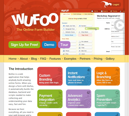
The cost is the main drawback for most of the tools, especially for more independent or low-budget designers. There is a free option for Wufoo, but it only allows for 1 user, 10 form fields, and 100 entries per month.

The paid plans range from $20 a month to $200. Most of the others are similar in cost, though it depends on what they do, and what you plan on using the forms for. Many are priced depending on the number of users, forms, form fields, and entries per month.

There is a unique entry on Vandelay Design’s list, in that there is a WordPress plugin. Gravity Forms offers most of the same form building features you’ll find in most of the other resources, but its all available from the WordPress dashboard of the sites you are working on.

One of the most best benefits to Gravity Forms is that forms can be created to insert form data into blog posts, such as setting up a form where users can submit news or pictures to be posted to your site. It’s also just nice not having to change tools or sites to manage your forms.

The best tool for you all depends on what type of work you have to do, and how much you are willing to spend to speed up your time spent making forms. Sure, you could make the forms on your own, but isn’t your effort better spent elsewhere?

Apple Logo1One of the most crucial design decisions for a new company is the logo. Great logos are instantly recognizable and evoke the brand image with just one image. When anyone discusses McDonald’s, Apple, Nike, or NBC, it is hard not to imagine the Golden Arches, iconic apple, or swoosh because they are so deeply ingrained in their corporate image.

Creating a logo that perfect is deceptively difficult to do however. The business world is awash with bad logos that no one will ever remember. There is no magic recipe for a great logo, but there are some rules to follow that will help a logo stick out. I’ve given some tips on logos before, but Sarah Clare from Vandelay Design had some suggestions designers should keep in mind.

One of the most common mistakes is just over-doing the logo. Clean lines and simple contrast are striking and easily able to be replicated in any format, neon sign to stationary. Text can be included but only when necessary, and limit it to the brand name. Even if you’ve been in business for 200 years and you’re doing a logo redesign, your icon isn’t the place to tell people that.

It is hard to understate how important it is that your logo is able to be reproduced anywhere. Something may look good on a computer screen, but logos are sometimes printed on endless materials like pens, paper, mugs, and even mints, and stress balls. You want people to be able to recognize the logo whether it is 1″ x 1″ on a memo, or plastered on a billboard.

While a logo has to be simple, it also has to convey the tone and personality of your business. A high tech company with a childish logo may have trouble convincing potential customers of their abilities, especially because everyone in tech hates comic sans. Usually bright colors are reserved for companies more associated with children as well, but Google’s logo shows why that isn’t a hard rule.

As a business owner, you will see your logo more than you actually see your brand name, or at least it will feel like it. If you want your brand to be successful in the marketplace, you need a logo people will instantly be able to identify and connect with. It seems like a small task, but being lazy on the logo can torpedo a new brand.

Responsive design is definitely the most talked about web design method right now, especially when discussing designing for mobile. It isn’t the only option though. There are three real options currently and each has its own pros and cons to them. Choosing the way you interact with mobile customers should reflect the type of business you are running and what you hope to accomplish.

Source: Flickr

Responsive Design – Though it is well covered, responsive websites are those that adapt to different sized screens across all platforms, from mobile to tablet to desktop. The idea is that you only build one website for everyone rather than different sites for all different devices. That time you would have spent designing sites for different platforms will have to be spent testing your one site on all of the devices. It also removes some of the ability to customize sites for certain devices.

Mobile Sites – A mobile site is optimized for that specific section of on-the-go customers. The sites are usually minimal, with large, finger-friendly buttons, and they load faster than responsive sites. This allows more direct control of how sites appear on different devices, but more importantly, the content selected to appear is tailored for the mobile demographic accessing it.

Native Mobile Apps – If you own a smartphone, you know what an app is. They are specific to their platforms so they have the benefit of being able to curate mobile content like websites do while further focusing on the differing needs of different platform users.

All three have their merits. Responsive websites create a sense of consistency and deliver the full experience of a desktop website in an accessible form for a specific device. Some hail it as a time saver, which isn’t quite true, but it does allow you to spend equal time on a site for all devices. Mobile sites and apps load faster and cater to specific audiences, while allowing them to act immediately.

Diksha Arora compares the three against each other at Vandelay Design. If you don’t know what is best for your business, she can help you identify your needs.

The cloud has changed how many use the internet drastically, especially designers. In the past, we were forced into filling hard drive after hard drive with revisions, inspiration, textures, and every other sort of file needed for work. Then, for collaboration, you either e-mailed these files to a coworker, or dropped off a flash drive.

Now, instead of endless e-mails of different versions of the same project, designers, developers, and clients can all access the newest version, compare it to past versions, provide input, and even make revisions in some cases, all at the same time while only saving the most important files to a physical hard drive.

Of course, there have always been online storage sites, but the largest differences between older storage services and new cloud-based ones is the speed that the information is delivered to others, and the wider accessibility. The cloud uses multiple servers to deliver one set of information, rather than finding the server with the site or image you were looking for and relying on that server alone to return the proper page. It also allows multiple accounts to be able to have access to the same files without having to create a hierarchy of accounts, though you can if you need to.

If you don’t understand how the cloud works, I suggest checking out Rob Toledo’s article at Vandelay Design. The cloud is revolutionizing the internet, yet again, and if you ignore it you will be left behind.