 Chances are no matter what medium you work in, you consider yourself a designer. Not a web designer, or a print designer, but simply a designer. It is increasingly rare to find a designer that restricts themselves to a specific medium. Why should they when they have almost limitless possibilities for matching their design to the best medium?
The biggest distinction that still lies between digital and print design is the language. Every medium has its own technical jargon, and as a designer it is important for you to understand and be able to speak the language. Even if you think you don’t, Carrie Cousins points out there is a good probability that at some point a client will ask for print components to go with the website. Eventually a client will want to be able to put part of the design onto posters, or business cards, or pamphlets.
You don’t want to be caught off guard and look amateurish in that scenario, and getting informed isn’t difficult. All you need to do is add some new words to your vocabulary. Design Shack put together a list of the ten most important terms. I’ve explained some of them below, but there are always more terms you could learn to be a more rounded designer.
1) DPI
Dots per inch is a literal measure of printing quality. Many traditional printing methods still being used today work by creating tiny dots to create an image. The more dots used per square inch, the higher quality and accuracy of the detail. Most print jobs use 300 or 600 DPI, but lighter papers require lower DPI to prevent color bleed and over saturation.
Many programs include settings to increase or decrease DPI, but the settings only refer to print design. Increasing the DPI will increase a file size, but it means absolutely nothing to digital projects because screen resolution is measured using pixels, not DPI. DPI can improve the quality of printing, but it doesn’t intrinsically affect the quality or size of an image.
2) CMYK
Digital designers are familiar with the RGB color profile, but printing uses a CMYK color model. The CMYK model refers ro a four-color (or plate) process of printing where each letter refers to a color used in the process: Cyan, Magenta, Yellow, and Black (K equals black).
This means any design you create on a computer for a print design needs to be created with CMYK profiles so that the color is accurately reproduced. Many printers will even require that a job be converted before being submitted. Above all it creates consistency across all print jobs.
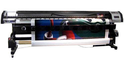
3) Large Format
Large format refers to any project that needs to be printed on a specialty printer, usually larger than 16 by 20 inches. Usually these types of print jobs are for banners, posters, and sometimes billboards. These types of projects are also made to be viewed from afar, and are usually rather low quality or pixelated up close. From a distance however, they look great. It does require a high quality image to print these projects, but they also tend to be printed at lower DPI.
4) Pantone Color
Pantone is the worldwide standard for color. The company has been around since 1963, and they have established a universal system for understanding and matching colors created by mixing a set of standard colors in precise combinations. This way, they can be precisely printed across different presses and substrates.
The colors are identified by number, but what sets the system apart is the detail they take into consideration. They include information on how to account for different types of paper based on a lettering system.
5) Overprint
Overprint is exactly what it sounds like; it is the process of printing on top of other things. Specifically overprint is when inks are printed directly on top of each other. The effect ca be used to create special effects, but it can also create issues during the printing process if not taken account for. The most common issue is the use of pure black, which can become richer when overprinted, and tends to overwhelm images. Instead, it is suggested to use rich black created with all four color plates to prevent overprinting.