Tag Archive for: Mobile-First Index

This week, Google announced it will begin adding new websites to its mobile-first index by default beginning July 1. However, older sites that have yet to be added to the mobile-first index will still be exempt until they are updated to be mobile-friendly.

In the announcement, Google explained that “mobile-first indexing will be enabled by default for all new, previously unknown to Google Search, websites starting July 1, 2019. It’s fantastic to see that new websites are now generally showing users – and search engines – the same content on both mobile and desktop devices.”

While new sites will be moved to the mobile-first index, older sites which have not been added will not be migrated over yet.

“For older websites, we’ll continue monitoring and evaluating pages for their readiness for mobile first indexing and will notify them through Search Console once they’re seen as being ready,” as the announcement said.

No Notifications

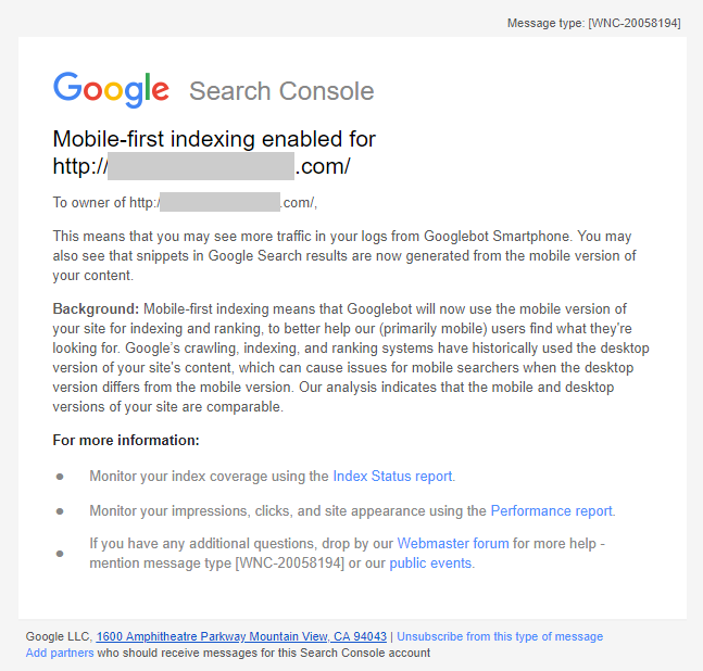
Google has been notifying site owners when their site has been migrated to the mobile-first index through Search Console notifications. However, this will not be the case for new sites that are added to the index by default.

“Since the default state for new websites will be mobile-first indexing, there’s no need to send a notification,” Google stated.

What is the mobile-first index?

Google’s mobile-first index is the search engines primary way of cataloging sites across the internet. Launched a few years ago, the mobile-first index analyses the mobile version of a page first and uses that information to rank web pages. Although it started small, the index has become Google’s primary search engine index with more than 50% of what is indexed by Google being added to the mobile-first index.

The news adds even more motivation to new site creators and business owners to ensure they provide a smooth experience with the same content on both desktop and mobile when the site is launched. Not only will many of your customers likely visit your site through mobile devices, but how mobile-friendly your site is will directly affect your search engine ranking.

This month, Google announced that more than half of all web pages in its search results around the globe are being pulled from its mobile-first index.

That means that the majority of pages being shown in Google’s search results were crawled, indexed, and ranked based on the mobile version of that page. As such, it marks a huge turning point for the increasing mobile-emphasis in web design and optimization.

What exactly is mobile-first indexing?

Over the past two years, Google has established a second, distinct index which prioritizes mobile pages and search results. This came as more than half of all search results were originating from mobile devices, rather than desktop computers.

Gradually, Google has expanded this index with the intent of eventually making it the primary search index.

With the launch of this index, Google also changed how it approached website indexing. Rather than defaulting to the desktop version of a page to assess its optimization and search value, the search engine began indexing mobile pages over their desktop counterpart. Thus, Google began its process of “mobile-first indexing.”

Is your site in Google’s mobile index?

If your site has been added to Google’s mobile-first index, you will likely have been notified within Google Search Console. Simply check your messages to see if your site has been migrated over.

If your site has not been migrated over, there is a chance that Google is having issues viewing the mobile version of your site, has found significant discrepancies between the mobile and desktop versions of your site, or has decided your mobile version is not up to snuff.

You should probably take the time to review the mobile version of your site to ensure it is properly optimized and laid out for Google’s search crawlers. You should also ensure that both versions of your site are largely similar, as Google prefers websites with parity across devices.

Google is sending emails to webmasters that are being migrated to the search engine’s new mobile-first index. If your site gets indexed, Google will start choosing the mobile version of your site as the default choice – meaning your site is fast enough and optimized for mobile users.

The search engine first said they would start sending notifications to websites being migrated into the mobile-first index, but the emails have only started being actually seen in the wild over the past few days.

The notifications are coming a bit late, considering Google has confirmed that it began moving websites over to the mobile-first index months ago.

You can see a copy of the email as shared by The SEM Post or read the full text below:

”Mobile-first indexing enabled for <URL>

To owner of <URL>

This means that you may see more traffic in your logs from Googlebot Smartphone. You may also see that snippets in Google Search results are now generated from the mobile version of your content.

Background: Mobile-first indexing means that Googlebot will now use the mobile version of your site for indexing and ranking, to better help our (primarily mobile) users find what they’re looking for. Google’s crawling, indexing, and ranking systems have historically used the desktop version of your site’s content, which can cause issues for mobile searchers when the desktop version differs from the mobile version. Our analysis indicates that the mobile and desktop versions of your site are comparable.”

As announced last month, Google is officially making its first step towards the launch of mobile-first indexing with the test of its mobile-first search index.

The company confirmed the testing has officially started via its company blog:

“Although our search index will continue to be a single index of websites and apps, our algorithms will eventually primarily use the mobile version of a site’s content to rank pages from that site, to understand structured data, and to show snippets from those pages in our results. Of course, while our index will be built from mobile documents, we’re going to continue to build a great search experience for all users, whether they come from mobile or desktop devices.”

This means in the future Google will increasingly prioritize crawling the mobile versions of a site’s content, rather than treating desktop as the “main” version of your site.

The company also gave some quick tips to help you make the most of this change as it is happening:

  • If you have a responsive site with identical content across mobile and desktop, you shouldn’t have to change anything.
  • If you have a site where the primary content and markup is not identical across mobile and desktop, you should consider making some changes to your site.
  • Make sure to serve structured markup for both the desktop and mobile version.
  • Google recommends using the Structured Data Testing Tool to verify the equivalence of structured markup across desktop and mobile by typing the URLs of both versions into the Structured Data Testing Tool and comparing the output.
  • When adding structured data to a mobile site, avoid adding large amounts of markup that isn’t relevant to the specific information content of each document.
  • Use the robots.txt testing tool to verify that your mobile version is accessible to Googlebot.
  • Sites do not have to make changes to their canonical links.
  • If you are a site owner who has only verified their desktop site in Search Console, please add and verify your mobile version.
  • If you only have a desktop site, Google will continue to index your desktop site just fine.
  • If you are building a mobile version of your site, do not launch it until it’s ready. Google says: “a functional desktop-oriented site can be better than a broken or incomplete mobile version of the site.”