Tag Archive for: list

Social Media Icons Engraved in Wood

Source: Alan Reeves

It seems like every business has some sort of social media presence, but you’d be surprised at the huge difference of engagement across many companies. When you look at businesses struggling with social media, you’ll often hear that they signed up simply “because everyone else is on there.” That could be a good argument for keeping up with your competitors, but it doesn’t actually mean you need to be on Facebook.

The problem is that many companies who try to branch out to social media don’t actually understand the platform and can be actually injuring their brand’s reputation. Blindly following the competition into the online arena can be leading yourself to slaughter if you can’t follow the best practices and actually establish your brand’s online presence.

Marketing Land came up with five reasons you might consider not signing up for Facebook, Twitter, or whatever the next popular social media platform is. Don’t get me wrong, social media can be hugely beneficial for your brand, but if you have any of these problems you won’t be seeing any of the benefits.

  1. Not Updating – The number one issue with small company social media accounts is the eventual neglect they fall into. It is easy to set up an account, get going steadily for a week or two, then gradually let the account slip into an artifact from an earlier time. Even worse, rather than giving up, most accounts stay “active” but without any actual presence or content. Not updating your social account may not seem like a big deal “because they can still find me that way” but in reality it gives the perception that your company may not be current. Visitors may find themselves thinking, “are they still in business?” or “what else are they neglecting?”
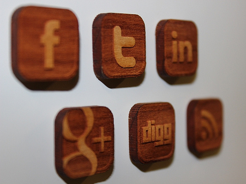
  2. Using the Wrong Platform for Your Industry – Not every social media platform is created equally. In fact, they all have their own niches which can be confusing when you are unfamiliar with the market. LinkedIn is for business professionals and companies looking to recruit workers, while Twitter facilitates direct interaction between brand and consumer. For that reason, advertising your local plumbing business on LinkedIn or Pinterest can be confusing or desperate looking. The best trick is to figure out what others in your field are using, and try to learn about those social platforms.
  3. Not Knowing What You’re Doing – Even companies that manage to select the right platforms for their brand might not know what to do once they are there. While personal Facebook pages are often used for sharing baby pictures, family events, or whining about life in general, most of those things shouldn’t go on a company account (unless you’re company is family based and your family event is related to business). Figure out what your customers care about, and focus on providing them with that type of content. The best guideline would be to post roughly 60-70% industry-related news and content, and 30-40% personalized content related to your business such as company events or important aspects to company culture. Customers want to be informed, but they don’t want to be blasted with things they don’t care about.
  4. Not Responding – Social media works both ways. It isn’t strictly for you to yell about your business at customers, but to create an environment where individuals and brands can freely and directly interact. That means you will start getting comments, questions, and posts from your user base (if you’re posting the right content.) It is your responsibility to respond in a respectable amount of time. Not responding makes it appear that you are only trying to sale things, not interact with your community.
  5. Not Taking Advantage of Interaction – While it is awesome that social media makes it possible for consumers to directly contact you, you should also be contacting them. Ask the community for their opinions and feedback about anything you want to know. How are they reacting to your products? What about your services? Consumers are usually more than happy to share their opinions, so give them the opportunity and listen to their thoughts.

All of these issues can be easily fixed and a social media account can always be salvaged, but it takes time and resources, which many small businesses don’t have. If you have the means to do it right, social media can be a big boost to online brand engagement. But, if you can’t afford to do it right, leave it alone. There are other ways to make your company findable online without taking on the responsibilities of social media.

SEO changed so much, it is hard to predict what will be best for 2013. Just this past year, Google has issued so many changes that it has become pretty much a constant. Trying to pinpoint where we will be a year from now almost feels impossible.

Paul Bruemmer from Search Engine Land, however, believes he knows how to keep up with everything for the next year with just a few tactics that can help guide you. Some are timeless, such as always keeping up with the best SEO practices, specifically starting with the Google 2012 Search Engine Optimization Starter Guide. When in doubt, Google usually has an answer for any SEO practice you should be focusing on.

Social Media is, of course, also going to be a strong driving force in SEO for the next year, as there are no signs of them losing popularity. Even with the ever-changing heirarchy of sites, Facebook, Twitter, and Youtube are solid constants that can be leveraged increasingly to keep in touch with consumers.

Falling behind in SEO is dangerous for your career and your clients, and any good SEO knows to keep up. Brummer’s suggestions are by no means comprehensive, but if you are wanting to make sure you’re in a good place to take on the coming year, the article is a great start.

We’re officially in 2013 now, and it is time to plan for the year ahead, if you haven’t started already. Planning means trying to predict the biggest trends that will hit design before they get here, which can be tricky, but there are plenty of lists already out there of people making their predictions.

The one I believe is the most accurate is Andrew Kuchariavv’s article on Intechnic. He starts with the same item that has topped just about every list I’ve seen, and seems less like a prediction than a statement. Yes, responsive and adaptive design will only be more important in the next year. There are a few drawbacks, but the bottom line is responsive design means a quality design will look good, if not great, on any display from an iPhone to a desktop.

Predicting parallax scrolling will be more common in 2013 however is a bit more of a reach. Parallax scrolling is a technique where multiple layers of a website scroll at different speeds, creating a 3D effect. For an example, check out Bagigia’s website. There have been sites with parallax scrolling for a short while now, but it is only now beginning to catch on, because it works great for product presentations and looks excellent on smart phones or tablets.

Probably my favorite prediction Kuchariavv made might be more of a hope than a foresight, but it is still fairly probable Flash could finally die in the next year. Javascript, HTML 5, and CSS3 enable just about every animation effect you could make with Flash, but without the need for plug-ins, and compatibility issues with mobile devices.

The next year looks promising for web design, and I personally am excited to see what comes out. There are always the new things we can’t see before they get here, but just these trends suggest websites will keep getting sleeker and more fun to use.


One of the biggest priorities for designers is creating and maintaining a client base. Without one, the designer is out of work. Unfortunately, even after months of work with a client, you can lose them with just a single, simple mistake.

Alexa D’Agostino has a list of 15 mistakes you can make that will lose you clients. Most of the mistakes seem like common knowledge, but they are also mistakes we all still make.

From not responding fast enough to having a messy office, these small issues are enough to drive you out of business.


You can do a lot of different things with landing pages, be it selling something, encouraging visitors to subscribe to a newsletter, or trying to get people to sign a petition. No matter which of these goals you have, you are ultimately trying to get visitors to perform an action.

Making a great landing page seems like it should be easy, but it is more complex than you may think. This leads to poor sales because a landing page is only working if it is getting people to convert.

With that in mind, let’s examine the most common problems with landing pages.

  1. Mismatching Text Ad Copy and Landing Page Headline – There are numerous reasons you should make sure your Google AdWords text ads match your landing page headline. For users, the text ad creates an expectation, and you don’t want to confuse your visitors or make them feel mislead. The quality of your landing page also decides cost-per-click in AdWords, so if you raise your quality score, you will lower your cost-per-click.
  2. Poor Grammar and Misspelled Words – Throwing up a quick landing page is always a terrible idea because it leads to a ton of smaller problems. One of those is bad spelling and grammar. This is one of those mistakes that just shouldn’t be allowed to happen. Your visitors will take any reason you give them to not convert, and this one is a big reason to leave.
  3. No Trust Signals – To get visitors to convert, you have to establish trust. You can build this into your landing page in just a few ways. If you establish your brand’s popularity, people will view it as credible. You can also present your 3rd party certifications with organizations like Verisign or the Better Business Bureau. You can also establish trust by making positive mentions of your brand in the press easily available on the landing page.
  4. Lack of Good Call-to-Actions – You’re call to actions are important to help make people convert. They should also be compelling, with practical language, and solid, consistent design. You should also keep it short, between 90 and 150 characters. You need to make it clear what you want the visitor to do, but short enough to keep their attention.
  5. Poor Quality Videos or Images – Videos on your landing page can help boost conversion rates by about 80%. Images don’t raise conversions that much, but they still have their own positive effect on visitor activity. This doesn’t mean you can just toss up any image or video you want however. Poor quality images or videos will actually lower conversion rates rather than improve them.

Eric Siu from Unbounce has even more common mistakes, but these will help get you started with making sure users are converting. Remember, if users aren’t converting, your landing page has problems.


I’ve written a lot about branding for your clients, but do you know that personal branding is just as important to your success as a designer?

You hopefully do, because personal branding is far from a new idea, but social media has made personal branding as available as ever before. It is also a much more competitive field now.

To make yourself a valued brand, follow this collection of tips. They will help you climb above the competition.

  1. Set Goals and Plan Ahead – Before you ever begin to define your brand, you have to think ahead and see where you want to be a few months or even a year or two from now. Are you trying to get a new job, or do you want to stay a freelancer? How do you want to grow your business? Once you know where you want to be, you can layout a plan to help get you there.
  2. Know and Understand Your Brand – The look and feel of your brand is a lot more than just a brand or a couple of social media accounts. You have to keep a consistent image in all mediums at all times. As Jacob Cass from Just Creative puts it, “The fundamental idea and core concept behind having this ‘corporate image’ is that everything you do, everything you own and everything you produce, should reflect the values and aims of your personal brand as a whole.”
  3. Create and Maintain Your Brand – One of the best ways to set yourself apart from the crowd is to have a unique visual identity that is consistent and reflective of your goals. You should also maintain social media accounts in ways that reflect your brand positively. Are you of any value to your followers and friends? Or are you wasting the biggest platforms to promote your brand?

Above all, the secret to personal branding is the same for many things in life. Plan ahead, and follow through. If you put forth a solid, planned image to the public, and follow through with valuable content, people will come to respect your personal brand.


Most designers are aware of Dieter Rams’ Ten Principles of Good Design, and, if you aren’t, you should definitely check it out. Rams created the entire visual language Apple is still using, and products he designed over fifty years ago are still being made today. He made the ten principles in 1970, when he decided he needed an objective way to criticize his own designs.

The list was originally made to critique physical products, but lately web designers have been using the principles for interactive design. While the list works wonderfully with interactive design, there is one issue stemming from how long ago the principles were established. In Rams’ time, there was no interaction design, UI, or UX. It doesn’t take into consideration the constantly changing software out today.

Fourty years ago, when Rams created the ten principles, designs were mostly for print or physical products, which rarely were updated. This is as far from true now as imaginable. That’s why Wells Riley, designer for Kicksend, has proposed an eleventh principle of design. 

Good Design is Iterative

Iterative design is flexible, and reduces the friction created from growth and change. It is common to think of every project with an “end date.” Designers usually consider themselves finished when they hand in a design, and get their money. Unfortunately, that manner of working will usually result in a total breakdown when it comes time to integrate new features.

Fixed, complex designs lead to complete disasters when it is time to update. Big companies have the money to invest to overcome this issue. Small companies, which normally need to update at a much quicker rate than huge corporations, can’t afford to not iterate on design just as quickly as engineers can code.

So how do you make an interative design from day one?

  1. Responsive Web – Responsive layouts allow pages to respond to different mobile and desktop browsers, which makes for much easier design changes. Sites using responsive layouts can make small changes constantly to continuously mold their entire product and brand image.
  2. Less is More – Designers love to build complex and interesting sites, but aside from possibly confusing visitors, these intricacies are also blocking fast updates from happening. Instead, stick with only what is essential. Minimalistic approaches to design allow for innovation. Think about Google’s front page. It is simple and clean, which makes it spectacular when Google Doodles show up to highlight an important day in history. If the page was cluttered with extra nonsense, the doodles would be harder to implement, and their effect would be severely diminished.
  3. Ship Every Day – Don’t ever let your design go stagnant. As any art student knows, there is always room for improvement in a design, and you should always be working on improving it. Use customer feedback and research, as well as your constantly growing knowledge of what is new, so that your designs grow at the same rate you grow as a designer.

The Ten Principles Rams set down 40 years ago are still an important way to critique your own designs, but, as with any list 40 years old, it needed an update. By adding a focus on iterant design, you will be able to criticize your own work objectively while making sure it works for the constantly changing field of web design.


Most corporate social media accounts are ignored or unknown. It is possible their audience isn’t engaged, or maybe just not sharing their posts. Either way, they struggle and rarely improve their status.

This is because most sites offer the same tips for getting out there, but they don’t address the real issues hiding behind the scenes that are really keeping you back. This is why we are addressing three less-known reasons your company’s social media pages aren’t getting any traction.

1) Your Material Isn’t Sharable – Very few people will share commercial messages or content. Social media are phobic of direct sales pitches, but the whole point of making corporate social media pages is to eventually sell with it. So what do you do?

You need to make sharable content that promotes your brand, rather than pitching the sale then and there. You want to use social media content to “bait-the-hook”, and once the public is on board, you can try the sale.

There are a few ways you can make sharable content. You can aim to market your product as being extraordinarily useful, but if it doesn’t provide incredible benefits immediately, most people will still view this as a sales pitch.

A better tip is to go for timeless content. The public is usually aware when a company is simply chasing the latest trend, and while it may earn the company some good short term PR, that attention will fade as quickly as it came. Most of all, just make sure your content is simple to spread. You don’t want to dumb it down, but you want your content to be streamlined so that it is easy to grasp.

Most importantly, don’t try to aggressively sell to your customers on this platform. Promote the lifestyle they want to have, and make it clear your brand will help them get there. The rest will almost do itself.

2) Lacking Core Benefit – Incentives are a great way to get others to participate and share your content. It is very easy, you offer them a reward for taking action, and they will be likely to participate in the future. However, this strategy doesn’t always work long term. Instead, try to focus on your audience’s pain points, and position your brand or content as the solution.

You should always be able to answer this question: why should someone interact with me in the first place? You can try to keep your page humorous, but that can take some extra skill and often the legal departments hold you back quite a bit. But, providing relief for problems and pains in your customers’ lives always benefits the audience and gives them reason to engage.

3) You Lack Positioning or Value Proposition – Another question you should always be able to answer, is what makes you unique or interesting? Claiming to be “low-cost” is transparent, and every brand in the market will claim they have the lowest cost value. Even claiming to be “better” than your competition or the “best” in the field read as empty boasts to many consumers.

Instead, your social media pages should stand for some set of values or ideas, even if it means making some enemies.

Brad Smith at Social Media Today shares the strategy of Stone Brewery, the largest brewery in Southern California, who announced last year that that they plan a massive expansion so they can brew the best organic ingredients, and accommodate their constant stream of visitors.

You see, Stone Brewery has taken a strong and vocal stance in their way of doing business, openly disparaging light “tasteless” lagers and their consumers. They even take this stance on their bottle labels, and they include this stance in their social media presence.

Being bold and original will gain you customers that are truly engaged in your brand, and find consumers that share the same opinions you do.

If you can address these three issues, you will be much more likely to get your commercial social media pages off the ground, and strengthen your brand. All it takes is being a little fearless and some originality.


Multimedia is clearly a popular form of communication online, but classic text is still the standard for effectively communicating with visitors. You would think, with close to a decade of the internet being accessible from most homes, most site creators would know how to handle text, but plenty are still struggling with text presentation.

So how can you make sure your content is readable? Well, there are some things you should know first. For example, reading online is 25 percent slower than when reading printed material, and according to a Nielson study, visitors are only reading between 20 and 28% percent of the words on your page. When reading printed text, readers usually take in every word, but online visitors scan, and hop from place to place.

But, we have eight ways to help you make your content more readable and help you communicate with your visitors.

1) Pick You Fonts Wisely – It hasn’t been this way forever, but thanks to web fonts, designers are able to use any font they want in their designs. This can be a gift and a curse though. While creative use of fonts can improve a page, it often comes at the expense of readability.

You can use more creative headlines because they are shorter and often larger, making them easier to scan. Just make sure the font utilizes both capital and lowercase letters. The height makes scanning more easy. For body texts, always use clear sans-serif fonts. On screen, serifs can blur together, so while serif fonts make printed text easier to read, they actually impede the process online.

2) Font Size & Line Spacing Are Important – As a designer, you should be designing for the huge range of internet capable devices out thereand their widely varying screen sizes. This is why using a fixed font size can work on large desktop screens, but often are far too big for mobile. The modern web design requires a flexible approach and percentages rather than fixed heights adapt to personal browser settings and varying screen resolutions.

When picking font sizes and line spacing, remember that the standard line height is too small. More room equals better readability.

3) Use High Contrasts – You never want your text to bleed in to the background. The more contrast between the background and text, the more readable text will be. It is also true that noisy backgrounds make almost all types of text unreadable. If you are going to place text on top of background images, make sure it is placed in the least busy area of the image, like maybe a blurred out area, or areas lacking texture. Another way to deal with this issue is placing an extra layer between your image and the text. This will help seperate the two.

4) Keep Lines Short – Because readers online tend to only skim, you want to keep your lines of text short. The best length is between 50-60 characters. If your lines are bigger, some readers may not even skim because the text appears overwhelming. They may think it will take too much time or work to read. Long lines also make it harder for your eyes to jump from one line to the next.

One way to get readers engaged is to start each article with short lines. Keeping the intro short and inviting helps hook the reader, and from there, expanding the text is more accessible.

5) Keep Paragraphs Short – 75 percent of readers online are estimated to not read websites word for word. They scan for what is most relevant to them. You want to keep your readers attention, but you also want to make sure anyone skimming your content can find what they are looking for quickly and easily.

6) Cut to the Point – It is common for writers to ramble for a few reasons. It is easy, and in print media, it helps make readers feel like they got their money worth. On the web, readers don’t care about the picture you paint with your words and they will leave if they can’t find what they are looking for.

This also suggests that simple sentences and vocabulary are more attractive to readers than long verbose sentences. If you have a new point, start a new sentence. It may seem weird, but it helps readers scan for what is important.

7) Avoid Jargon – Of course you want to appear to be an expert in your field, but you should also realize most experts are able to explain what they are talking about to the average person. Being able to simplify what you are talking about to the level a child could understand shows a real command over the technical and complicated information you possess.

Trying to use too much technical jargon can intimidate users, or make them feel like they need a dictionary near by to get through your post. This usually results in the user leaving. Instead, try to think like a normal person. Keep your posts accessible, and easy to understand.

8) Use Highlights, Lists, and Images – This also deals with the scanning nature of your visitors. Highlighting relevant keywords can help identify the main points of the paragraph, and lead reader’s eyes to what they are probably looking for. Likewise, structure your content in a way to help readers. Lists lay out specific ideas in an easily searchable format, or lay out step by step guides clearly. Images also help people stay focused on your post, especially when using image captions that act as reference points.

It is easy to see that most web readers are lazy when it comes to reading, and you want to make sure you are catering to their needs. Formatting your posts in a way that accomodates the scanning nature of online readers will actually help make viewers see more of your content. It may seem backwards, but simplifying your page format and structure can help keep readers on your site longer.

For more ways to improve your site’s usability, check out Sabina Adler’s posts at Usabilla.