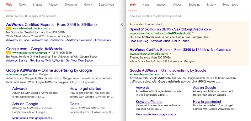
By now you’ve probably noticed your search results don’t look like they used to. Google told the public their new look was just an experiment earlier this week, but now everyone is getting to see Google’s search results pages with the new design.
Jon Wiley, Google’s lead designer for Google Search basically made the announcement the new style was rolling outto desktop when he said on Google+. “you may have noticed that Google Search on desktop looks a little different today.” He specifies desktop users because the style was showing up much more prominently on mobile before the full roll-out.
As many have noted, the new SERPs have much larger titles and the underlines have been removed. Jon also notes that Google “evened out all the line heights,” which he claims “improves readibility and creates an overall cleaner look.”
Most of those changes won’t have a huge impact on the usability of the search engine, but visitors will have to become accustomed to a different way of marking ads. Google has used smaller yellow tags to pinpoint which results were part of ads on mobile, but desktop users have still been relying on the lightly colored boxes Google has relied on for years to mark ads. Google says the change is intended to unify the mobile and desktop search experience. Jon explained:
Improving consistency in design across platforms makes it easier for people to use Google Search across devices and it makes it easier for us to develop and ship improvements across the board.
There are bound to be plenty of complaints about the redesign. I personally don’t enjoy it as much as the old style, but most will acclimate to it fairly quickly. But, it isn’t a high-profile site redesign unless people initially throw a small tantrum in the meantime.
00Taylor Ballhttps://www.tulsamarketingonline.com/wp-content/uploads/2018/07/TMO-Logo.pngTaylor Ball2014-03-14 13:37:292014-03-14 13:37:29Google Rolls Out New Search Results Design for Everyone
While most people outside of designers don’t tend to follow color trends, it can be surprising how much they affect what you see every day. Most consumers would be surprised to hear that colors come in and out of favor in design on a regular basis, and those trends affect marketing, purchasing decisions, and your perception of a brand or object.
One of the leading influencers in color studies and usage is the Pantone Color Institute, known for their widely used color system. Not only do they provide an organized way to communicate about color in exact terms, they also regularly analyze media, socio-political events, and technological advances to help decide the Color of the Year.
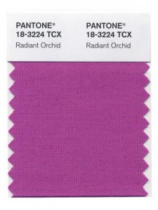
In 2014, you can expect to see a lot more “Radiant Orchid”, as the purplish-pink color has been chosen as the color of the year, as reported by Web Designer Depot.
Last year’s chosen color was the more recognizable Emerald, though the specific hue wasn’t what most actually associate with emerald. It was a bold but relaxing color of green “symbolizing growth, renewal, and prosperity”, which then became extraordinarily popular among the fashion and design world.
“Radiant Orchid reaches across the color wheel to intrigue the eye and spark the imagination,” says Leatrice Eiseman, executive director of the Institute. “An invitation to innovation, Radiant Orchid encourages expanded creativity and originality, which is increasingly valued in today’s society.”
It is hard to tell whether the analysis is so accurate that the team can predict a color that will become popular on its own, or whether Pantone’s influence is the primary factor making these colors so ubiquitous for a year. But, it is almost guaranteed 2014 is going to have its fair share of Radiant Orchid.
00Taylor Ballhttps://www.tulsamarketingonline.com/wp-content/uploads/2018/07/TMO-Logo.pngTaylor Ball2013-12-18 16:01:422013-12-18 16:01:42Pantone Announces The Color of the Year for 2014
The best websites are all designed with the unique needs of a business and their customers in mind, but don’t think there isn’t some common ground between them. Web designers have their own process and plan when it comes to making a new site, but they all share some web design elements that simply can’t be left out.
These elements make a site go from boring to exciting and they ensure users are always happy with their online experience. Today, Carrie Cousins shared 10 different parts of a website you can’t neglect if you’re hoping for success.
1. Space
Beatbox Academy
Space is the basis for all web design. Space dictates the flow, readability, mood, and style before you’ve even begun to consider the details of your site. The best designers all have a solid grasp on how to use space and they experiment with space in ways no one else is. Whether designers are playing with the idea of wide open space or creating a more clustered environment, you have to take the time to actively decide how you want to manage space if you want a successful design.
Space also plays a strong role in determining the focus of your page. Any image or text surrounded by open space will automatically seem more important and even larger than a design element crammed next to other aspects fighting for attention.
2. Simple Navigation
Visitors can’t actually use your site if they can’t easily navigate it. Every website should have obvious, easy to use, easily identifiable navigation. Even the most complex sites should be able to be fully explored from a set of five to ten menu items.
Navigation doesn’t always have to come in the form of a menu up at the top. Navigation can also be simply telling your visitors how to use your site, such as adding arrows to a parallax scrolling website.
3. About Us
While it may not be the most exciting part of web design, including an ‘About Us’ page is indescribably important for a smaller business or site owner to tell visitors who they are and what they offer. While it may not be as essential for major companies, you will notice even they tend to include one of these pages.
The trick is to keep it simple. You want to tell visitors enough about your brand and what you bring to the table to interest users, but you don’t want to bore them. This shouldn’t be just a simple template page. It should be kind of like a long-form business card. Short and sweet, but informative, and visually interesting enough to help you stand out without distracting.
4. Contact Information
Without contact information, how are you expecting to get feedback from visitors? Contact information is important for letting your visitors reach out to you, but it also helps validate that you are who you say you are. Nothing makes a site seem sketchy like not being able to find a way to contact a business easily.
To make it easier for users to find and reach out to you, you want your contact information to be highly visible and contain all of the modern ways users might want to connect. A phone number and physical address are absolute musts, but you should consider including social media profiles of yours such as Twitter and obviously an email address is expected for any website.
5. Call to Action
Most websites are created with an objective in mind. Whether you want to make a sale, educate the public, or gather contact information to more thoroughly connect with your audience, there is some goal you are hoping to achieve. A call to action is how you get your users to fulfill your goal, and it should be obvious and strong.
You wan to start out by determining exactly what your objective is, then design it so that action is immediately obvious. Color, contrast, and space are all useful tools for drawing users to the buttons and pages you want.
Even a common signup form is an example of a call to action in web design. The best way to use one of these sigup forms is to place it in a prominent location on the page and make it simple enough to not disuade users from filling it out.
6. Search
It is absolutely shocking how many sites feel they don’t need a search function. Think about all the times you wanted to look up some older information but you weren’t able. Chances are, if you use a site regularly, you will eventually want to search for something, and being stonewalled by a negligent designer can be a real problem.
Implementing search bars is rather common practice, and you all have to do is design that box to be unobtrusive but available. If you want to use an icon, the magnifying glass is accepted shorthand for search, using something else can be confusing.
7. Informational Footer
Many sites use the footer area as a dumping ground for all the information that would otherwise clutter up their site. These unorganized blocks of links aren’t entirely wrong, but they fails to take advantage of the space. Instead, you should try to use the area to communicate a short message or important information in a condensed form, while including those important links in a clear and organized form.
The footer should be simple and streamlined, but it is a good place to include contact information, a small site map, and a selection of important other information. Make it easy to use and understand.
8. Obvious Buttons
It should seem pretty obvious, but every button should look like a button. Pick a visual cue for your site and stick with it so every button is clearly available to users. Not only do you encourage user to click around your site more, but you’ll avoid frustrated users who can’t navigate your page. Using a consistent style is important for web design and branding.
9. High Quality Images
Consider how people are accessing the internet. Smartphones, tablets, and even gaming consoles are all used to browse the web, and most of these have high resolution screens which leave little to the imagination. Users want images to create a visual interest, but you can’t skimp. Low quality images are going to look awful on a ‘Retina’ display. However, with just a few high quality custom images, you can make your site stand out from the crowd.
10. Web Fonts
Just a few years ago, the internet ran on just a few typefaces for everything. They were considered to be the most readable and they solved the issue of making sure every visitor could see text. But, those limitations no longer exist. You can use almost any font you want and you won’t have too many problems.
However there are two reasons web fonts are still important: compatibility and licensing. When you use a web font service, you ensure your search engine optimization won’t be hurt and your site will look consistent on every platform.
00Taylor Ballhttps://www.tulsamarketingonline.com/wp-content/uploads/2018/07/TMO-Logo.pngTaylor Ball2013-11-21 14:42:112013-11-21 14:42:1110 Web Design Elements You Can’t Forget
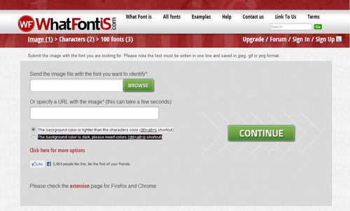
Choosing the right font has always been one of those tasks that sounds deceptively easy, but can slowly drive you crazy. It has become easier thanks to new websites with better searchability, but if anything we are now dealing with the problem of too many options. While we used to have to scavenge for the best fit from the low quality fonts available for graphic design ten or fifteen years ago, now we have to choose the exact best fit from countless options.
Thankfully, as with all design quandaries, there is a new tool to help us out. WhatFontIs allows you to find the exact font you are looking for by uploading an image containing the font or directing the tool towards a URL with the font present on the page.
All in all, the whole thing only takes around 10 seconds. You upload the image or enter a URL, then you confirm the letters the website recognized. From there, you’ll be given a list of font options that you can easily download. It is as easy as it sounds, and if for some reason, you can’t find the exact font you’re looking for, you will almost definitely be given an option that will get the job done well. They currently have a database cataloguing around 280,000 fonts, so you’ll always have options.
00TMOhttps://www.tulsamarketingonline.com/wp-content/uploads/2018/07/TMO-Logo.pngTMO2013-08-27 12:58:462013-08-27 12:58:46A New Tool Finds The Right Font For You
It is a little ironic that most web designers hate coding. We’re all familiar with it, and we’ve all spent sleepless night chugging coffee and endlessly editing code until we feel like we’ve lost touch with reality. But, the best coders realized the entire process can be simplified and sped up with all the free tools available online.
Web Design Ledger created a “cheat sheet” of tools and resources designers can use to cut through the fog of coding. You’ll never be able to completely escape coding, but you can at least make it as painless as possible.
Code Editors
One of the main tools any designer should already have is a code editor such as Sublime Text 2. Back in the dark days of coding, many designers were forced to create Notepad files that seemed to endlessly drag on as they were filled with line upon line of code, but no one should know that pain in these days. Code editors can help you quickly jump between the tags you want to work on, and best of all, they highlight problems in your code as you write. To anyone who has ever searched for hours trying to find the proverbial needle in the haystack, that alone is reason to find a new editor to use.
CSS Pre-Processors
CSS is notorious for spiraling into obscenely long and confusing script that becomes eventually unworkable. Sass (Syntactically Awesome Style Sheets) is a meta-language that can be put on top of the original CSS to clean up all that messy code and make it workable and lightweight again. If you combine Sass with Compass, an open-source CSS authoring framework, you can easily create responsive designs with cross-browser friendly scripts to keep everything simple.
Code for Humans
We all have to deal with our own code, but writing for yourself or entirely for machines can leave the code hard to understand when you come back to it later. If you get caught up using entirely your own coding style, colleagues may not be able to make sense of it all, but if you write exactly as computers read it, your code can become difficult to update and read. Instead, write in a way that will keep everything easy to find and understand, with small file names and consistent organization. You can use Codekit (Mac) or Mixture (Mac/Windows) to convert it all into computer-friendly language later.
Use GoMockingbird
Wireframing is one of the first steps designers go through when constructing a site and creates the entire foundation you will build the site upon. These foundations are also used to present site designs to clients, so using sketches and doodles is a bit too unprofessional of an option. Instead, GoMockingbird creates professional looking wireframes that can portray even the more tricky elements of a page to everyone who needs to approve the design. You can include widgets, sliders, check boxes, and even social buttons, so that clients get a clear and complete understanding of how their site will end up.
Conclusion
There are tons of other tools included in Nicola Allen’s cheat sheet over at WDL. The ones I highlighted here can make the biggest effect on the time spent slaving over code, but every shortcut helps. There are tools and resources for every design task, including creating Lorem Ipsum dummy text so that you don’t have to. If you want to design, but hate the long nights associated with coding, you’ll appreciate everything the cheat sheet offers.
00TMOhttps://www.tulsamarketingonline.com/wp-content/uploads/2018/07/TMO-Logo.pngTMO2013-07-29 15:30:312013-07-29 15:30:31Cut Down On Coding Time With a Design Cheat Sheet
Gathering inspiration is the first step of almost every design job, and those of us really invested in design are doing it constantly. We take inspiration from signs in store fronts, billboards, other websites, nature, photography, videos, and everywhere else we can. We are literally surrounded by inspiration at all times, which we then filter through our own tastes, skills, and preferences to deliver our take on what inspires us.
Those innate preferences can have a big effect on what we turn in. Some designers are drawn to grungy, dark looks, while others like the sleek modernism that results from a mix of 70’s sci-fi design and current modern art sensibilities. Others opt to go an entirely different direction, directly playing with retro styles and designs.
Normally, we take these inspirations from the world around us and apply them to the screen. Even as skeuomorphism is dissipating as the leading design style practice, we use our environment and the images we’re exposed to for our designs. It doesn’t have to be linear. Even flat, minimalistic designs can be inspired by the colors of nature or the mood of a relaxed summer day.
But, what happens when you take inspiration from graphic and web design and apply it to real life? We obviously can’t put a filter on a bike ride or sunset (though good sunglasses can come close), but architectural design often incorporates graphic inspiration into physical objects and environments which can make you feel as if you’ve stepped directly into a design style.
Speckyboy contributor Victor Balasa took this idea and collected several buildings and architectural designs that portray real-life versions of web design styles we play with every day. There are grungy interiors that portray the gritty hardline style of grunge web design without sacrificing class, and even the “paper fanatic” style you would never imagine could come to life. If you ever wanted to know what the world could look like if it was styled by grahic designers, these images can give you a pretty interesting depiction.
00TMOhttps://www.tulsamarketingonline.com/wp-content/uploads/2018/07/TMO-Logo.pngTMO2013-07-22 14:21:432013-07-22 14:21:43Design Styles Brought To Life
Minimalism has been all the rage in web design lately. Flat design is currently one of the most popular design trends around, and it relies strongly on minimalist design principles. If done correctly, minimalism can achieve an experience that will stick in the minds of visitors for some time while doing away with all the sound and fury normally associated with the web.
Obviously, minimalist design techniques require sites that can be parsed down to just a few pages of information, but that has the added benefits of making your site automatically more friendly for mobile loading speeds and making your site easier to read. It can also cut your maintenance time down to a fraction of what is necessary for other larger sites. But, if you have a site that aims to comprehensively cover a topic or multiple topics, minimalism might not be right for your site.
One of the best aspects of great minimalist websites, and one of the biggest reasons flat design is taking off, is that every good minimalist site is built on a unique wireframe and a quality gridding system. When done right, that means your site will be easily made responsive, making the move to a mobile friendly site even easier than ever before.
Flat design is already beginning to branch out and apply more depth to sites that retain their minimalist principles, so it makes sense to get to know the ideas behind the broader style of design being co-opted for the new mobile-friendly internet. Mohammed Shakeri took the task of exploring how minimalism functions, some of its history (including Ludwig Mies van der Rohe’s famous “less is more”), and he even helps explain how to begin the transition to a minimalist website.
If you’ve been considering hopping on the latest trend to streamline sites, but haven’t been able to figure out what all the fuss is about, it’s never to late to find out. Or, as Frank Rossitano sings, “It’s never too late for now.”
https://www.tulsamarketingonline.com/wp-content/uploads/2018/07/TMO-Logo.png00TMOhttps://www.tulsamarketingonline.com/wp-content/uploads/2018/07/TMO-Logo.pngTMO2013-07-11 12:44:102013-07-11 12:44:10What Is Minimalism and Why Does It Matter to Design Right Now?
Web design has more in common with print design than we like to admit. While the web offers endless opportunities and unique design possibilities, print design has been evolving for over 500 years and much of how we approach content of all kinds comes from our longstanding use of print and paper.
Design is really all about connecting with the public and sharing information in an attractive form, whether it be in books, images, or videos. Noupe offered some print design rules that apply in every medium you want to use.
Less is More
Print has always been very aware of size constraints. If you go over the size limit, it means adding more space, which meant using more paper, which means higher costs. The web has the opposite problem. We are given endless space and some designers take that space and try to use as much of it as possible to bombard viewers with everything they have to offer.
When you throw too much at the audience all at once however, you face clutter problems as well as just overwhelming and putting off your audience. Consider a memo or press release, and how corporate designers aim to immediately grab the viewer’s attention with economic design. You can put out information with a strong central theme or message without attacking your audience all at once.
Make Scanning Easy
Very few people read every word on anything. We are skimmers, who jump to and from text littered all throughout or life, and we expect the things we read to make this easy for us. People don’t want to have to search extensively for what they’re looking for. They want the content to be broken up in a way where sections and different types of information are immediately obvious.
Following a typographical hierarchy is one of the best ways to keep your content organized for scanners to find what they are looking for. Headlines and sub-headings guide the eyes and announce the main topic of content sections, while bold and italics draw attention to important areas.
Functionality is More Important Than Style
Managing print functionality doesn’t seem like that much of a task, but part of that comes from our long history of streamlining text into its most legible forms from the birth of the print press. Consider every aspect of print design that keeps text legible; text color, layout, font choice, and even text alignment all have to be considered in order to keep the print “functional” or able to convey the information you’re trying to share.
In web design, functionality is much more of an overt issue, yet the rule remains the same. Some designers try to hard to create lavish sights rich with animation and high quality images, but they sacrifice usability, sped, and practicality in favor of style. Any site that doesn’t work for users isn’t a successful site because people won’t care about fancy design if they can’t use it.
https://www.tulsamarketingonline.com/wp-content/uploads/2018/07/TMO-Logo.png75142TMOhttps://www.tulsamarketingonline.com/wp-content/uploads/2018/07/TMO-Logo.pngTMO2013-05-28 13:18:172013-05-28 13:18:173 Things We’ve Learned From Print Design
Want to know if your company understands branding? Just ask if you have a brand bible. If you don’t, your business probably has some large flaws in their branding and their marketing.
Every brand, from the smallest startups to the giants you see on your drive to work, should have their “bible” establishing the guidelines and rules of maintaining their corporate image.
What is a Brand Bible?
A brand bible is a document shared throughout the company that lays out how the company achieves its personality and public voice across many individuals and different departments. It is, as Designshack explains, “the basis for all interactions on behalf of the company.”
These documents, which range from a few pages to a couple hundred depending on the size and needs of the company, cover every sort of public interaction. Brand bibles or books distinguish what types of marketing should be pursued or taken off the table, letterhead, logo usage, and even the specific colors that can be used for corporate design. This book is how every Facebook employee knows exactly what color blue is Facebook Blue.
Creating a Brand Bible
See, above all, a brand bible is about cohesion and consistency. From the first design or memo you send out, creating a brand bible is as easy as keeping notes on what fonts you use, how you lay out public documents, and how letterhead is arranged. Over time, if you keep good notes, putting together your brand bible will be as easy as arranging these notes into a document to share with your employees.
If you’ve waited to create these guidelines, it isn’t much more difficult. Start keeping notes. Set a standard. It may take longer to get established across the company, but it will speed up marketing and design. If you need more specific ideas on how to establish a brand book, Designshack has a few suggestions in their article.
00TMOhttps://www.tulsamarketingonline.com/wp-content/uploads/2018/07/TMO-Logo.pngTMO2013-05-15 14:22:002013-05-15 14:22:00Building a United Brand Image With a Brand Bible
Website designers share a lot of information with each other, but there are some hard truths many designers still don’t seem to understand. Sometimes, people just don’t want to hear the truth, or at least it isn’t easy to accept. Designrfix shared some of those things designers don’t like to talk about, but its best you hear them anyways.
You Can’t Innovate All The Time – The large majority of web designers get into the field because we love to be creative and push our skills, but for the most part we are at the will of our clients, and sometimes they don’t want to push the envelope. Many clients would much rather play it safe and use established design solutions. There are times when you’ll be able to use your creativity, but it may not be your next job you take on.
Every Aspect of the Design Matters – This can’t be stressed enough. If you slack on a single part of your design, it will be the aspect your client and users fixate on and hate. A website is like a puzzle and a sub-par piece of the site is like a missing piece in the puzzle.
Hosting Consideration Matters – Without a host, you don’t have a site. Hosting considerations need to be a part of your strategy from the pitch to the finished project. You have to maintain your host to be able to deliver content to the public, so make sure you choose wisely.
Trends Are Not Our Friends – Design follows trends like leaves get caught up in the wind. With every passing gust, we get blown in a new direction. Staying up to date and creating modern designs is usually good, especially in a commercial field where becoming outdated is career death. But, if you spend all your time following what is popular, you won’t ever be ahead of the curve. Try something new. Risks may scare some clients, but that doesn’t mean you can’t try something new in your free time.
Users Matter More Than You – As a designer it is easy to get caught up in your own wants and preferences, but it is important to remember you aren’t the target demographic most of the time. Your design serves to solve your client and your users’ needs, not to be your own personal creation.
https://www.tulsamarketingonline.com/wp-content/uploads/2018/07/TMO-Logo.png00TMOhttps://www.tulsamarketingonline.com/wp-content/uploads/2018/07/TMO-Logo.pngTMO2013-03-26 12:11:592013-03-26 12:11:59The Hard Truth About Web Design
 While most people outside of designers don’t tend to follow color trends, it can be surprising how much they affect what you see every day. Most consumers would be surprised to hear that colors come in and out of favor in design on a regular basis, and those trends affect marketing, purchasing decisions, and your perception of a brand or object.
 Last year’s chosen color was the more recognizable Emerald, though the specific hue wasn’t what most actually associate with emerald. It was a bold but relaxing color of green “symbolizing growth, renewal, and prosperity”, which then became extraordinarily popular among the fashion and design world.
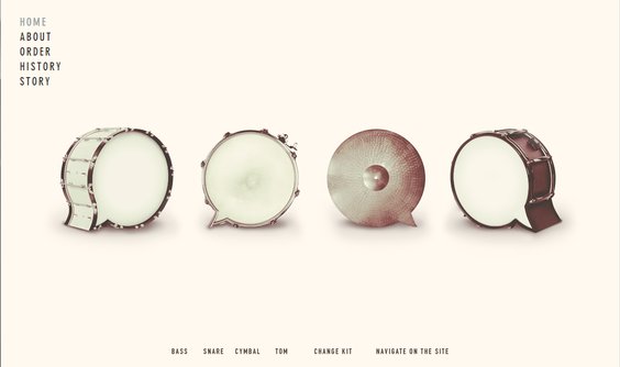


