As Apple announced last Tuesday, iOS 7 will be here September 18, and everyone with an iPhone or iPad will be seeing drastic aesthetic changes to their device. The redesign also inspired quite a bit of controversy and argument, but at this point there is little use fighting the new “almost flat” design requirements for apps and the Apple interface. The new iOS will be here in a few days, and designers have to either get on board or get left behind.
With a new iOS comes a complete redesign of most apps as well. Apple has already released guidelines for users to update their apps, and many have already shown drastic changes. But, many designers are still trying to figure out how to adapt their old app to the new style and interface requirements. But, there are many tools to help you along with the redesign. Alvaris Falcon compiled 10 of the best high quality tools and UI kits that will speed up the whole process. Best of all, all of the tools listed are free.
Many of these tools are designed to help you with the entire process all at once. The iPhone GUI from Teehan+Lax, for example, included everything you could need to update an app for the latest version of iOS. Others are more specialized. There is Home Screen, which offers an editable iPhone mockup, complete with home screen designs and icons. The App Icons Template similarly offers a simple template which aims to ensure your new icon looks great and fits all the requirements.
There are plenty of other options at your fingertips and it is up to you to choose the best tools for the way you design. Some will want to rely heavily on complete toolkits, while other designers are only looking for templates and inspiration for their creative jumping off point. Either way, if you choose any of the resources listed by Falcon, you’ll know you’re using a quality tool.
00TMOhttps://www.tulsamarketingonline.com/wp-content/uploads/2018/07/TMO-Logo.pngTMO2013-09-13 14:46:562013-09-13 14:46:5610 Resources That Will Help You Update to iOS7
If you haven’t heard from me and every other web design writer, typography is a really big deal in web design right now. How you decide to use typography on your website can affect how your audience perceives you and judges your quality. But there are so many options. Your font should always be legible, but it also needs to be charming and visually interesting.
If you use the correct font in a design, you can greatly enhance the finished product. But, if you are careless and choose a font that doesn’t fit, it will stick out like a sore thumb. To put it simply, websites are absolutely reliant on typography.
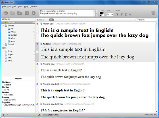
As any designer can tell you however, a font collection can quickly become a huge pain. There are constantly new free and premium fonts coming out that you have to keep up with, or at least regularly browse. Then, you have to actually manage to organize and sort these, then figure out which to use in your next project. This can mean making lists, and doing constant comparisons between fonts.
Wouldn’t you like a tool or program to help you with all this? Of course you would, and of course the web design community has you already taken care of you with many options for both Mac and Windows. Andra Postolache collected a few of the best font management tools. Some are costly, while others are free. The only way to know whats right for you is to try them out.
00TMOhttps://www.tulsamarketingonline.com/wp-content/uploads/2018/07/TMO-Logo.pngTMO2013-09-12 14:22:412013-09-12 14:22:41Keep Your Fonts Organized With a Font Management Tool
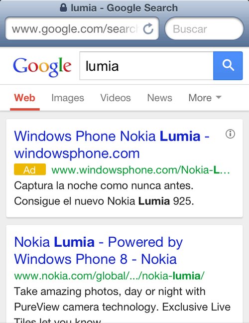
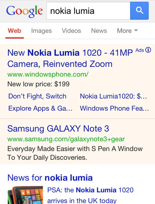
Over the next few days you might notice some changes to the way Google displays their mobile AdWords ads. Search Engine Land reports Google is currently testing out a new look which simultaneously makes the entire result page look more cohesive while keeping ads clearly labeled.
The first change you will likely notice is the way Google is using color. Google have been using lightly colored backgrounds to signify ads, but with this test they may be moving towards placing both ads and organic listings in white boxes in front of a gray background. Similarly, the gray background that has been behind the Google logo and search box is gone.
Instead of identifying ads with colored background, there is a new eye-catching yellow ad icon directly next to the display URL. The icon is significantly more attention grabbing than the old small “ad” that was previously to the right of the headline.
You can see the new style being tested above, while the current version is below.
00TMOhttps://www.tulsamarketingonline.com/wp-content/uploads/2018/07/TMO-Logo.pngTMO2013-09-12 11:39:112013-09-12 11:39:11Google Tests Out New Style For Mobile AdWords Ads
Typography has become more important in web design than ever before. Technological advancements have made it possible and practical to use nearly any font that you want on the web.
With the rise of interesting and well-thought out typography in web design, we have also seen new trends popping up in how people are using this typography. The first and most notable instance of this is the wave of retro typography on vintage style websites that is still prevalent across the web.
A newer trend we are starting to see has been around for a while in other types of design, but it becoming very popular for websites who want to establish their brand in bold and visually interesting ways. This “Mix and Match” typography relies on the designer’s ability to choose the right fonts to complement not just the message, but the other typographic styles in use.
Some designers opt to use subtly different fonts that are only minutely unique from each other to establish a visual hierarchy of interest while maintaining cohesiveness. Others opt to go all out and harshly contrast fonts against each other to create a visual friction and energy.
Marcin Treder collected 15 examples of this “Mix and Match” typography so you can get some inspiration to try out the style yourself. The rule of thumb for using fonts in web design has long been to never use more than three fonts in a design. It is clear that modern designers are finding ways to break that rule while creating classy and attractive designs.
00TMOhttps://www.tulsamarketingonline.com/wp-content/uploads/2018/07/TMO-Logo.pngTMO2013-09-10 14:08:022013-09-10 14:08:02Is “Mix and Match” Typography The New Thing?
Flat design is undoubtedly one of the most popular design trends of the moment. You’ll find it online, on your phone, and it is even starting to make its way off the screen and onto posters and physical designs. It has already spit off into sub-categories of flat design like the so called “almost flat design” Apple is employing in their new iOS and the newly popular long shadow design.
But, the design style isn’t perfect. None are. The trendy style has numerous things it achieves very well, but there are far too many people glancing over the more problematic side of using flat design. Carrie Cousins wrote about the pros and cons of flat design, but plenty of people are willing to sell you on the upside of flat design. Today, I wanted to focus on the drawbacks.
It’s Trendy – While being trendy can be a positive – no one wants to be falling behind – you also have to be aware that flat design won’t last forever. As we’ve seen with the splintering into new iterations like long shadow design, the trends are already moving away from completely flat design, and there is no way of knowing when it will suddenly seem out of date entirely.
Usability – The simplification that lies underneath flat design can cause usability problems. Flat design can streamline a site, but it can also cause users to feel confused by the minimalistic interface. Many say they don’t know where they are supposed to click or tap, because the style does not do a good job defining what is and isn’t clickable.
Typography – Great typography looks absolutely marvelous in flat design, but boy does the style make it noticeable when typography is weak. Just look at iOS 7. The initial unveiling used an insanely thin typeface which many complained about. With layouts as simple as these, the eyes immediately go towards problem areas, and there is less to hide any flaws. If you aren’t great with fonts, you might ask for help or consider another style.
Too Simple – Not every site needs minimalism. The reason you haven’t seen flat design on many news sites is that the style isn’t good at conveying large amounts of information visually or textually. The style demands short phrases, impactful concise words, and full paragraphs just don’t tend to fit. The style of your site should entirely depend on the needs of your site. If you fill like you’re having to cut too much to fit into the trend, you should choose another design solution.
There is something inherently nostalgic and sweet about handwritten fonts in design projects. Not only do they make designs feel more personal and loan some much needed personality to your projects, they immediately draw the eye in ways that your more standardized and formal typefaces don’t. They elicit emotion and a personal connection. You can’t say the same for Times New Roman, for sure.
Of course, handwritten fonts are all unique and can be used for a huge array of design projects. There are script fonts with extensive flourishes which look right at home on wedding invitations and greeting cards, but there are also the more shaky fonts designed to recreate the look and feel of journal entries or rushed messages. There might literally be a handwritten styled font for every occasion.
Naturally, these fonts work as well in digital or web design as they do in print media. Websites can strongly benefit from the more intimate appearance their copy adopts when using a handwritten font. You can charm visitors or make them feel more comfortable with the right font selection, but the key is knowing how to pick and use these styles.
For instance, many of the fonts that look handwritten push the bounds of legibility. There are those which look scrawled out in thick marker, as well as the extravagant scripts which can be obscured by their own ornamentation. These styles can absolutely work well, but they are best reserved for headers or isolated small blocks of text intended to make an impact, because readers absolutely won’t spend their time trying to make sense of blog articles or extensive copy that is hard to read. These styles attract visual interest, but don’t work in excess.
There are plenty of handwritten fonts that do work for blurbs or more extensive copy, though you have to walk a fine line when using them. It is still best to use traditional fonts for comprehensive blogs or anything that will take more than a handful of seconds to read, but front page sections such as navigation or small “about us” blurbs can be made more interesting with a immediately legible but unique handwritten style.
Maryam Taheri collected 12 handwritten fonts that work in a variety of situations. You won’t find the swirly decorative script fonts most tend to imagine when they think of handwritten typefaces, but you will find a wide variety of fonts which will make your site seem charming, intimate, and unique.
00TMOhttps://www.tulsamarketingonline.com/wp-content/uploads/2018/07/TMO-Logo.pngTMO2013-08-29 14:49:172013-08-29 14:49:17Using Handwritten Fonts To Make Your Site Feel More Intimate
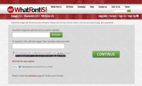
Choosing the right font has always been one of those tasks that sounds deceptively easy, but can slowly drive you crazy. It has become easier thanks to new websites with better searchability, but if anything we are now dealing with the problem of too many options. While we used to have to scavenge for the best fit from the low quality fonts available for graphic design ten or fifteen years ago, now we have to choose the exact best fit from countless options.
Thankfully, as with all design quandaries, there is a new tool to help us out. WhatFontIs allows you to find the exact font you are looking for by uploading an image containing the font or directing the tool towards a URL with the font present on the page.
All in all, the whole thing only takes around 10 seconds. You upload the image or enter a URL, then you confirm the letters the website recognized. From there, you’ll be given a list of font options that you can easily download. It is as easy as it sounds, and if for some reason, you can’t find the exact font you’re looking for, you will almost definitely be given an option that will get the job done well. They currently have a database cataloguing around 280,000 fonts, so you’ll always have options.
00TMOhttps://www.tulsamarketingonline.com/wp-content/uploads/2018/07/TMO-Logo.pngTMO2013-08-27 12:58:462013-08-27 12:58:46A New Tool Finds The Right Font For You
Chances are no matter what medium you work in, you consider yourself a designer. Not a web designer, or a print designer, but simply a designer. It is increasingly rare to find a designer that restricts themselves to a specific medium. Why should they when they have almost limitless possibilities for matching their design to the best medium?
The biggest distinction that still lies between digital and print design is the language. Every medium has its own technical jargon, and as a designer it is important for you to understand and be able to speak the language. Even if you think you don’t, Carrie Cousins points out there is a good probability that at some point a client will ask for print components to go with the website. Eventually a client will want to be able to put part of the design onto posters, or business cards, or pamphlets.
You don’t want to be caught off guard and look amateurish in that scenario, and getting informed isn’t difficult. All you need to do is add some new words to your vocabulary. Design Shack put together a list of the ten most important terms. I’ve explained some of them below, but there are always more terms you could learn to be a more rounded designer.
1) DPI
Dots per inch is a literal measure of printing quality. Many traditional printing methods still being used today work by creating tiny dots to create an image. The more dots used per square inch, the higher quality and accuracy of the detail. Most print jobs use 300 or 600 DPI, but lighter papers require lower DPI to prevent color bleed and over saturation.
Many programs include settings to increase or decrease DPI, but the settings only refer to print design. Increasing the DPI will increase a file size, but it means absolutely nothing to digital projects because screen resolution is measured using pixels, not DPI. DPI can improve the quality of printing, but it doesn’t intrinsically affect the quality or size of an image.
2) CMYK
Digital designers are familiar with the RGB color profile, but printing uses a CMYK color model. The CMYK model refers ro a four-color (or plate) process of printing where each letter refers to a color used in the process: Cyan, Magenta, Yellow, and Black (K equals black).
This means any design you create on a computer for a print design needs to be created with CMYK profiles so that the color is accurately reproduced. Many printers will even require that a job be converted before being submitted. Above all it creates consistency across all print jobs.
3) Large Format
Large format refers to any project that needs to be printed on a specialty printer, usually larger than 16 by 20 inches. Usually these types of print jobs are for banners, posters, and sometimes billboards. These types of projects are also made to be viewed from afar, and are usually rather low quality or pixelated up close. From a distance however, they look great. It does require a high quality image to print these projects, but they also tend to be printed at lower DPI.
4) Pantone Color
Pantone is the worldwide standard for color. The company has been around since 1963, and they have established a universal system for understanding and matching colors created by mixing a set of standard colors in precise combinations. This way, they can be precisely printed across different presses and substrates.
The colors are identified by number, but what sets the system apart is the detail they take into consideration. They include information on how to account for different types of paper based on a lettering system.
5) Overprint
Overprint is exactly what it sounds like; it is the process of printing on top of other things. Specifically overprint is when inks are printed directly on top of each other. The effect ca be used to create special effects, but it can also create issues during the printing process if not taken account for. The most common issue is the use of pure black, which can become richer when overprinted, and tends to overwhelm images. Instead, it is suggested to use rich black created with all four color plates to prevent overprinting.
00TMOhttps://www.tulsamarketingonline.com/wp-content/uploads/2018/07/TMO-Logo.pngTMO2013-08-22 14:10:242013-08-22 14:10:24The Most Important Printing Terms for Web Designers
Web design has a love of all things retro. You can’t scan the web for long before you come across a site with faux wood textures or faded and breezy images influenced by the aesthetics of another time. These old styles are even large parts of current design trends such as flat design and the new found focus on typography. Designers are constantly taking the old and turning it new again.
Some choose to lean more heavily into the retro styles than others. While many flat designs owe debts of gratitude to minimalist styles of the 50’s and 60’s, you usually wouldn’t confuse the two. Others however do their best to emulate the styles of earlier times as closely as they can, but translated into a digital medium.
Going retro is a popular style for many brands and artists, and it isn’t any more difficult to achieve than most other current design aesthetics. Designrfix recently shared tips to really get the look and feel of older times, if you want to try it out for yourself.
Think Retro – The first step is getting inspiration. It can be difficult to detach yourself from your contemporary ideas of good style, and the best way to do that is go directly to the source. Search out old magazines and newspapers, any sort of graphic media from the time you can find. There is a huge amount of it online, and you’ll be able to get inspired within just a couple searches.
Focus on Simple Shapes – Vintage and retro styles are characterized by simplicity. Designs of the past relied on impact to grab attention, and this was usually achieved by using very simple shapes like circles which demand attention. Consider a circle surrounded by decoration, or blocky and heavy arrangements.
Limit Your Use of Color – Modern designers have it easy. We can use any assortment of colors we want on the web, even down to slight shading choices. Designers of the past were limited by the expense of full color printing, so they often relied on two-toned coloring to come up with colorful designs without breaking the bank. Using black-white, orange-yellow, or cream-brown color combinations will immediately make viewers think of older printing styles.
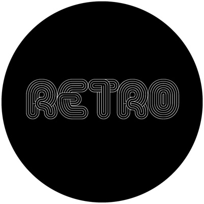
Retro Typefaces and Fonts – As previously mentioned, big typography in retro styles is an absolute necessity of a vintage site. The style has grown some legs on its own, but it still is a defining trait of older styles. You need to choose a font reflective of the era you want to reflect. Using the wrong typeface can seem anachronistic or lazy, so take your time and get it right. Check what designers were using in the era you’re emulating and find something similar online. It shouldn’t be hard to do so.
Borders – Borders have always been a big part of design, and ornamental borders were definitely a big part of making older designs attention grabbing. Frame your images and content in borders and simple shapes and you’re site will already look pretty retro.
Badges – Interestingly, if you look at websites with retro designs, you tend to see lots of badges as buttons, even though badges weren’t actually a big part of designs in the past. Still, these badges remind users of county-fair days and older times, while also standing out on the page and drawing attention. It is a simple addition that works better than it should.
Using the Right Texture – Well used textures can make a boring page feel stoic and formal. They can entirely define how a page feels, and can certainly make a page feel more retro. The trick is subtlety and integrating the texture into the layout, not simply laying it over things.
00TMOhttps://www.tulsamarketingonline.com/wp-content/uploads/2018/07/TMO-Logo.pngTMO2013-08-20 13:02:372013-08-20 13:02:37How to Make Your Website Look Retro
How fast does your website load on mobile devices? Under five seconds? If you said yes to the second question, you are probably pretty happy with your answer. What about under one second? Probably not. But that is how fast Google says sites should load, according to their newest guidelines for mobile phones.
Before you start freaking out at the suggestion their site is supposed to load in under a second, it should be clear that Google isn’t mandating an insane guideline. They don’t actually expect most websites to completely load that quickly. Instead, they are focusing on the “above the fold” content. They think users should be able to get started playing with your page quickly, while the rest can progressively load.
It is probably a wise insight, considering most mobile users say they are more likely to leave a site the longer it takes to load. On smartphones, every second really counts, and if you can get the above the fold content loaded within a second, most users will be happy to wait for the rest of the content while they start exploring.
“…the whole page doesn’t have to render within this budget, instead, we must deliver and render the above the fold (ATF) content in under one second, which allows the user to begin interacting with the page as soon as possible. Then, while the user is interpreting the first page of contents, the rest of the page can be delivered progressively in the background.”
To match with the new guidelines, Google also updated its PageSpeed Insights Tool to focus more on mobile scoring and suggestions over the desktop scoring. They also updated scoring and ranking criteria to reflect the guideline changes.
00TMOhttps://www.tulsamarketingonline.com/wp-content/uploads/2018/07/TMO-Logo.pngTMO2013-08-15 11:18:102013-08-15 11:18:10Google Updates Mobile Guidelines With Focus On Loading Times
 As Apple announced last Tuesday, iOS 7 will be here September 18, and everyone with an iPhone or iPad will be seeing drastic aesthetic changes to their device. The redesign also inspired quite a bit of controversy and argument, but at this point there is little use fighting the new “almost flat” design requirements for apps and the Apple interface. The new iOS will be here in a few days, and designers have to either get on board or get left behind.
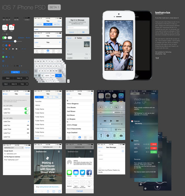

