A website redesign can be unbelievably exciting, but it can also be dangerous to your traffic. If you don’t communicate well with them, designers and creative teams can accidentally throw out all your hard work on optimization in favor of purely visual aspects of the site. You can lose content, functionality, and all the other optimization that has won you the favor of search engines.

With a few considerations and regular contact with the design team, all of these problems can be prevented. Brad Miller pointed out seven factors you should consider when tackling a redesign. Just don’t get to eager to delve into changing how your site looks, and you can end up with a great looking site that works as well or better as your old design.

  1. Always start with research – Any design that is going to give you results is built on research. You need to know who you’re targeting, what the best functionality practices are, the current standards, and doing extensive market research. This shouldn’t come part of the way through the design or after the site is built. It should always be the very first move you make.
  2. A Redesign Changes Your Site Structure – A quality redesign can be much more than a new coat of paint on an old frame. It gives you the opportunity to change how your site is structured entirely, which should be used as an opportunity to optimize your site for visibility and conversions. Consider what pages are succeeding and what isn’t on your page and reassess how you can efficiently design your site.
  3. Redirects – Before redesigning begins, you should make an inventory of every page and incoming links on your site, including subdomains. As the structure of your site is changed, including the URLs, a strategy will need to be put into place for redirects to protect any SEO rankings. Audit where links are coming from and going to, then map out all your pages as well as their new redirects.
  4. Navigation – You need to consider how people will be finding your site from the start, and putting that information into your URL structure. Can you shorten URLs or make them more streamlined? As sites grow, URLs can become unweildly, and should be trimmed as much as possible. Once you have people on your site, however, you need to understand how they will navigate around the site. Where are they entering your site from? What do you want visitors to do? If you know how visitors navigate your site, you can design it to direct them where you want.
  5. How is the Content Going to Be Presented? – Content is the keystone to a successful online marketing campaign, but it is still an afterthought for many site designs. Content should be visible and worth the attention of your viewers. Decide before hand whether you will have a blog and how that blog is going to be used.
  6. Technical SEO – Way too many redesigns play with factors that need to be controlled for proper optimization. They build sites that look great, but take ages to load losing visitors and credibility with search engines. However, you can use the redesign to toy with some behind the scenes factors like ensuring your site is compliant with all the standard best practices of design and SEO and cleaning up your code to make sure search engine crawlers will be able to easily understand your site.
  7. Testing – Test everything you can afford to. Not only do you gain invaluable data about your consumers and how your site is actually being used, but you get the chance to actively connect with customers and mold your new site to their needs.


Any SEO professional who has been around for a couple design trends knows what its like to bump heads with designers about the design methods and usability. There are certain innovative design trends that can be wonders for usability, but are completely at odds with standard SEO practices. According to Janet Driscoll Miller, that doesn’t mean we have to throw out both, we just have to be creative with our solutions to integrate creative design.

Parallax design is the most popular trend that runs into this issue with usabilty and SEO. It has actually been around for a few years, but it has recently gained quite a bit of notoriety as designers have used it to animate pages in a way that scrolling makes the entire page change what is being shown. It’s really easier to show people than to describe.

The most commonly seen site with this design style is the Spotify front page which essentially moves layers as the viewer scrolls downwards.

Spotify Screenshot


What makes parallax design so popular is it basically allows the site to walk a visitor through a story by scrolling down the page. Google has even used the style for their big “How Search Works” site, where Google tried to explain how it works to the average internet user. It directs how visitors view the site, rather than letting visitors click around at will.

The big problem is that parallax designs are essentially extremely large one page websites, which is extremely difficult to optimize for many search terms. All of your keywords have to be concentrated onto one page, rather than spread out across many as Google is used to. On top of that, inbound links to your site all point to a single page, not specific content.

Another interesting problem is that parallax design doesn’t work on mobile phones of any kind. As mobile traffic rises, that means more and more people aren’t able to use pages in this style. It also means site owners have to basically create an entire separate mobile version of their site. Many companies already do this, as Google did for the “How Search Works” site. Until responsive design popped up, it was common practice to build a second mobile site.

None of this means we should immediately cut out parallax design. As stated before, parallax design is unparalleled at telling stories, and some site don’t have to rely heavily on SEO to drive traffic. There is also an approach which allows you to use parallax design and a multipage site, by creating accomying sub-pages, like Spotify did. The home page is a parallax design, but the links take you to content on separate, static pages. That creates a static URL for different content and allows keywords to be more spread out.

Deciding whether or not to hop on these trends all depends on what you intend to achieve with your site. If you intend to tell a story or direct visitors through your site in a linear fashion, parallax design is possibly the best answer.

Color Wheel


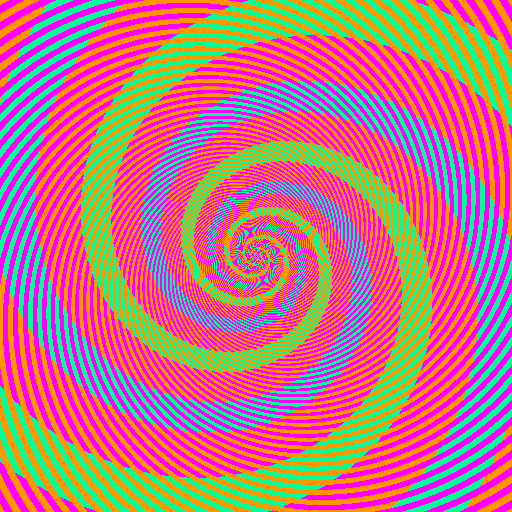
Have you ever seen the old “optical illusion” that makes one color appear to be two entirely different colors? If you’ll excuse the MS Paint quality image (is there a rule that all optical illusions have to have been designed before 1997?) the one below makes two spirals appear to be blue and green, when the stripes making the spirals are actually the same color. Its the same principle at play as when you look at a color in a design and it just doesn’t seem to work right. When placed next to specific hues, certain colors can take on the visual characteristics of their neighboring color. Making this even more tricky, the human eye perceives color in different ways depending on if it is in the background or foreground.

Optical Illusion


The specific colors that can take on other characteristics are referred to as recessive colors, while those who always look the same are called dominant colors. Many pure colors such as cyan maintain their hue even when mixed or paired with other colors. No matter what color is mixed with a dominant color, the original color will still remain at least partially visible.

Dominant colors also tend to “push through” the design, or powerfully assert themselves within the composition. While recessive colors easily fade into the background, it is hard to make a dominant color sit far in the background. Pure hues are naturally dominant, though primary colors are more dominant than the others, because red, blue, and yellow literally can’t be created by mixing other colors.

Recessive colors, on the other hand, naturally fade into the background. They also easily take on the properties of any surrounding color. Recessive colors act as a neutral in a palette which help the more dominant colors maintain their emphasis and focal attention. As Carrie Cousins puts it, “recessive colors are the blurry or muted tones behind the focal point of an image or the pattern that appears behind something you’re supposed to be looking at.”

Cousins explored the relationships between dominant and recessive colors exhaustively at Design Shack. Not only does she delve into the scientific basis for why we perceive these colors the way we do, she also explains how these ideas can be adapted to design of all kinds, including web design.

iOS 7 Icon

There is a lot of talk going on about Apple’s new mobile operating system iOS 7, even though it is at least a couple months away from actually being unleashed on the public. Most of the discussion is centered around the new flatter aesthetics Apple has adopted, especially the new icons. But, there are quite a few other changes designers are concerned with, namely the actual app redesigns necessary to keep up to date with the update and how much influence iOS 7’s new UI should have on the redesigns.

Many believe that the Apple’s new style should be a heavy influence on the new app designs so that they will appear more native. But, other brands have put a ton of energy and resources into designing their own style and appearance and they don’t want to throw all of their independence and unique brand identity away. To make it even more confusing, there is a fair amount of confusion over how strict Apple’s iOS Human Interface Guidelines are.

This puts designers in a place where they aren’t sure what they are required to do to continue to be accepted by Apple’s app store, and what is simply suggested to keep in step with Apple’s style. Sam Jones from Web Designer Depot decided to tackle all the questions designers have during the transition period, and his article will give designers a good idea of where to go from here.

Jones also pulled quotes from Apple’s iOS 7 Transition Guide which help clear up exactly what Apple expects from their apps. If you want to know the exactly what apps must do, and what Apple suggests for moving forward, the information from the Transition Guide is about as clear as can be.

Things Apps Must Do

  • Update the app icon. In iOS 7 app icons are 120 x 120 pixels in high resolution, rather than the 114 px they’ve been using for the Retina capable iPhones.
  • Every app must update the launch image to unclude the status bar area, if the app doesn’t already do so.
  • All apps are also expected to support Retina displays and iPhone 5 dimensions in all artwork and designs

Things Apps Should Do

  • Apple would like all app content to be discernible through translucent UI elements such as bars and keyboards, as well as the transparent status bar. In iOS 7, view controllers use full-screen layout.
  • iOS 7’s bar button icons are lighter in weight and displayed in a new style, and as such they would like designers to redesign their own custom bar button icons.
  • Prepare for borderless buttons by moving away from supplying button background images and reassessing how to handle them within your layout.
  • Examine your app for hard-coded UI values—such as sizes and positions—and replace them with those you derive dynamically from system-provided values. Use Auto Layout to help your app respond when layout changes are required.
  • Examine your app for places where the metrics and style changes of UIKit controls and views affect the layout and appearance. For example, switches are wider, grouped tables are no longer inset, and progress views are thinner.
  • In iOS 7, users can adjust the text size within apps, and as such designers should move to adopt dynamic type, so that text responds appropriately.
  • Ensure your app doesn’t respond inappropriately to the new Control Center gesture or to a navigation controller’s swipe to go back gesture.
  • Keeping in line with Apple’s new flatter style, they would like designers to reassess their use of drop shadows, gradients, and bezels. Apple’s new aesthetic puts way less emphasis on visual effects that attempt to make UI elements look physical.

Minimalism has been all the rage in web design lately. Flat design is currently one of the most popular design trends around, and it relies strongly on minimalist design principles. If done correctly, minimalism can achieve an experience that will stick in the minds of visitors for some time while doing away with all the sound and fury normally associated with the web.

Obviously, minimalist design techniques require sites that can be parsed down to just a few pages of information, but that has the added benefits of making your site automatically more friendly for mobile loading speeds and making your site easier to read. It can also cut your maintenance time down to a fraction of what is necessary for other larger sites. But, if you have a site that aims to comprehensively cover a topic or multiple topics, minimalism might not be right for your site.

One of the best aspects of great minimalist websites, and one of the biggest reasons flat design is taking off, is that every good minimalist site is built on a unique wireframe and a quality gridding system. When done right, that means your site will be easily made responsive, making the move to a mobile friendly site even easier than ever before.

Flat design is already beginning to branch out and apply more depth to sites that retain their minimalist principles, so it makes sense to get to know the ideas behind the broader style of design being co-opted for the new mobile-friendly internet. Mohammed Shakeri took the task of exploring how minimalism functions, some of its history (including Ludwig Mies van der Rohe’s famous “less is more”), and he even helps explain how to begin the transition to a minimalist website.

If you’ve been considering hopping on the latest trend to streamline sites, but haven’t been able to figure out what all the fuss is about, it’s never to late to find out. Or, as Frank Rossitano sings, “It’s never too late for now.”

Easy Infographics Graphic


It is undeniable that social media has completely changed the ways we share information. Gone are the days when loaning a book was the best way to help your friends learn about a topic. Even long form blog posts are often smothered by easy-to-understand content delivered in direct and immediate formats that are fun to read and tempting to share.

This is clearest when you look at the infographic, poster styled graphics aimed at informing people in depth on topics, similar to the way some of the more detailed posters you find in schools function. The difference is that infographics tend to give much more information than any of those posters ever could, thanks to the removal of site constraints.

Infographics engage users and attract them with stylish graphics and colors, which make readers more interested in the information that would normally be boring. Because of how easy it is to digest the information and get excited about what they present, infographics are incredibly popular on Facebook.

For a while, creating one of these infographics basically required a dedicated designer on staff, as no one gets interested in equally boring or sterile graphics without any of the style that bring infographics to life. That has changed much over the past year however, with a lot of credit belonging to the number of free tools and web applications that quickly help put together infographics with minimal design knowledge.

Crazy Pixels shared 10 of these free resources for businesses or bloggers hoping to share a lot of information in an exciting way. Of course, if you just slap something together on one of these applications, it is still going to come out bad. But if you take the time to compose the graphic and market it towards the proper audience, the rest will take care of itself.

Graphic design may be one of the most in demand jobs out there right now, especially within the art field. But, as any designer can tell you, competition for work is tough, and designers looking for full-time employment rather than freelance work have bad odd working against them. Employers are looking for designers for diverse projects that can vary wildly depending on who hires you, but they expect you to have just as versatile skills to cover anything they will ask of you.

With such a tough marketplace, it is obviously very important for designers to have a great CV or resume that will make employers want to hire you. That doesn’t mean they want it to be over-styled and decorated. Employers obviously want professional looking resumes that gives them the impression you are equally professional and business-minded. What makes the real difference to prospective designer employers is the skills you have. The jobs may vary wildly, but almost all design jobs require the same 10 skills or proficiencies.

Amy Edwards took the time to go through over 100 design jobs advertised on Bubble to see exactly what employers are looking for, and the results were even more homogeneous than you would expect. Needless to say, those Photoshop and Illustrator skills should be maintained, and you should be get getting experience in all the other programs and design techniques coming out are also hugely important in climbing the career ladder.

Color is one of the most important aspects of graphic design as well as branding and advertising. It can be used to give emphasis, depth, and even motion to a design but it also helps establish the overall feel or atmosphere of the design.

As designers, we do more than just create nice looking compositions. We also connect and communicate to others through images, text, sites, sound, and yes, color. Color is one of the strongest tools we have as a designer, because color decides a large amount of how a viewer perceives a design. It can set off emotional or visual cues, or it can be used simply to pull viewers in.

One of the most important parts of learning how to use color in your designs is learning the understandings and meanings of different colors. They don’t just set the mood, but colors can actually mean quite a lot about companies, sites, and even people. You The Designer recently created the infographic seen below which details “The Psychology of Color” for designers and they lead into it with an insight about color from American stage director Vincent Minnelli who once said, “I use colors to bring fine points of story and character.”

We don’t tend to work much with characters as graphic designers, but in some ways we do tell stories through our sites. Our clients want their websites to represent their company or brand as a whole, including its history and reputability. We weave these stories through our websites through imagery that supports the brand story they want to tell. Color plays a big role in this through making connections to preconceptions we already have. If you’ve ever seen a green logo for a health food store, or a red fast food sign, you’ve already seen the principle in action.

AColorGuideForDesigners_51087f68f22e5_w587


Source: WikiCommons

Source: WikiCommons

Responsive web design isn’t quite the standard yet, but it certainly shows no sign of going away. It is currently the best solution for the majority of website owners attempting to make their site work well for people accessing it, no matter where they are coming from.

A growing minority of internet users are using smartphones and tablets to browse, and especially with Google’s push to punish sites with poorly configured or non-existing mobile sites, there isn’t much time left before site owners will have to choose between going responsive or creating a separate mobile site. To help you choose, Designrfix shared the latest facts about responsive web design.

  • Display Doesn’t Affect Load Times – Responsive design largely changes the appearance of sites depending on the device being used to access them. They don’t really affect what is actually loaded when a page is brought up, and so it doesn’t really do much to load times. In other words, you can’t rely on responsive design to “dumb down” and speed up your site on slower machines or lesser resolutions.
  • Search Engines Like It – Google has actively supported responsive design as the best solution to going mobile, mostly because it makes the job easier for its crawlers. The webmaster guidelines for Google even address the issue saying, “Google recommends webmasters follow the industry best practice of using responsive web design, namely serving the same HTML for all devices and using only CSS media queries to decide the rendering on each device.”
  • It Directly Affects Your SEO Campaign – Running a separate mobile site rather than simply adapting responsive design basically requires running two SEO campaigns for the same site. With the ability to design for all devices with one site, comes the ability to only have one SEO strategy for the site as a whole.
  • Most Sites Can Be Turned Responsive – This isn’t a hard and fast rule, but for the most part site owners don’t have to create an entirely new site design when they decide to create a responsive design. Instead, most sites can be converted, saving over half the total cost of a full redesign.
  • There Is a Lot of Testing – The main thing people forget to mention when they support responsive design is that designing for all devices means testing for all devices. Going responsive does save you time in the actual design process, but the best rule of thumb for responsive design is if you haven’t tested on a device, your site probably doesn’t work perfectly on it.

I fully predict responsive design to become the standard for all website design in the future because it simply makes more sense for the large number of site owners out there, especially those with limited resources who want to only manage one version of their site.

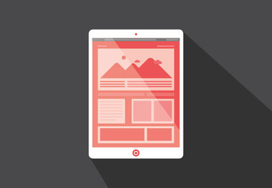
long shadow design

Source: Web Designer Depot

Flat design is established to the point where many are starting to iterate and experiment with the basic principles in ways that break some of the basic rules of flat design while still clearly relying on the style for the overall effect. Apple’s new iOS7, for example, is heavily influenced by flat design, but as many have noted, is not even close to being completely flat.

One flat design inspired trend that is quickly gaining some popularity is “long shadow” design. It’s hard to call it a full design trend, but it is certainly a unique effect that is starting to pop up across the web.

Long shadow design “produces an effect like looking at an object late on a Winter’s day,” as Ben Moss from Web Designer Depot so poetically described it. It replicates when shadows draw out to dramatic proportions adding significant depth while not completely detracting from an overall flat aesthetic.

The trend is typified by a 45 degree shadow that extends far out, gradually evaporating. The look is very similar to the early Soviet style used on posters and collages by designers such as Kazimir Malevich, which makes it great for icons and branding.

Long shadow design isn’t going to grow legs outside of flat design, but it is a sign that flat design isn’t going to stay completely flat for long.