Since the release of Apple’s retina capable displays, the internet has been running behind the devices accessing it. Instead of improving the way browsing the web looks, the end result of using retina devices to look at the internet is usually blurry images.

Some have begun upscaling their images so that higher resolution images will be loaded only on these high resolution displays, but these images will only look good until screen resolution makes another leap forward. Basically, upscaling images is just optimizing your site for two different kinds of displays, and not preparing for the future.

Adam Fairhead has a different option that may help designers be prepared for future advances, as well as promising a great experience for users right now. By using Scalable Vector Graphics (SVGs) you can create images that are responsive to displays. Rather than hardcoding every pixel to an individual color, these graphics act as instructions for the display to show the image in the best way possible for that resolution.

If you want to not just upgrade your site to the current display standards (which most of the web has yet to actually do), you can upgrade your site’s images to hopefully be able to stand up to any advances future displays throw at us.

Creating a responsive website design from the ground up can be exhausting and costly. Thankfully, for those of us without the time or money to completely build a brand new site, there are lots of frameworks or boilerplates you can use.

Chris Spooner from Line25 compiled a bunch of these free frameworks, from the most popular, Bootstrap which was made by the guys at Twitter, to some more obscure but helpful frameworks. They also all have the complicated grids and layouts prepared so you can almost completely customize them.

Responsive design has never been so easy.

Retina capable displays don’t seem to be going anywhere, and every new analysis of mobile browsing shows that Apple dominates the mobile browsing market. Add to that the number of people using new MacBook Pros, and you have a fairly large audience using very powerful screens.

For the designer, this poses an issue. How are you supposed to go about creating graphics at high enough resolutions for these screens? Even worse, how are you supposed to make your old website look good on these new screens?

Well Chris Spooner has made a tutorial available at Line25 to help you through this, and he makes it much easier than you probably thought. From creating new graphics to optimizing those old images, the tutorial covers just about everything you need to know, including the code.

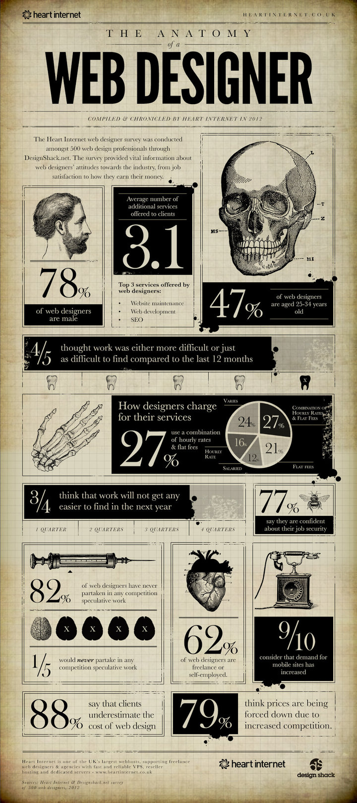
The UK web hosting company Heart Internet wanted to find out who web designers are and what their opinions are on their profession. They asked 500 designers and while that is far from being representative of the entire industry, the results are pretty much in line with what you would expect.

Firstly, Heart Internet found that 78% of all web designers are male. There are definitely female designers out there, but I think most figured web design was still a male majority.

Eighty-percent believe work is hard to find, and three-fourths don’t expect it to get better in the near future. That makes it shocking that 77% feel secure in their job security, probably because most designers are freelancers anyways.

The rest of the results are compiled into this infographic. There are some very interesting findings.

In the design community, every step of the creation process becomes a tale we tell each other to establish our own know-how, as well as trading insight and tips. What we don’t seem to discuss is the “why” side of things. We share what happened and how, but rarely do you hear designers explaining why they decided to do what they did.

It is possible we just don’t realize how important that question can be. Sometimes, it doesn’t seem relevant while trading stories “from the field”. Unfortunately, not answering these questions holds everyone back.

This is the issue Rob Bowen brings up in his article for Webdesigner Depot, and he makes some important arguments for why to be sure you can answer “Why?” Most importantly, answering why you did something helps a client understand your professional opinions and decisions.

If you have thought through why you selected a certain layout or tool, you will be able to argue for it better if your decision is questioned by your client. Sometimes, that forethought is all that can get some ideas past the boardroom. Thinking through every step, also helps ensure you create the best design you can.

The good designer can make a solid website, but the great designers can tell you why every aspect of the design was chosen. If your vision or understanding of the design are blurry, you won’t be able to back it up when the pressure is on.


Any time you are trying to launch a site on a new platform, there are tons of things and details to keep track of. Thankfully, the folks at SaleAMP have a great website migration checklist (PDF) to help you keep track of everything. I found it thanks to Smileycat Blog.

There are plenty of these out on the net, and the best checklist is one you’ve made by yourself by going through the process multiple times. But, this is a great place to start until you’ve got your own list made up.


One of the biggest priorities for designers is creating and maintaining a client base. Without one, the designer is out of work. Unfortunately, even after months of work with a client, you can lose them with just a single, simple mistake.

Alexa D’Agostino has a list of 15 mistakes you can make that will lose you clients. Most of the mistakes seem like common knowledge, but they are also mistakes we all still make.

From not responding fast enough to having a messy office, these small issues are enough to drive you out of business.


Do you understand how color affects your website content? Do you know color can affect how your site is interpreted by commercial search engines?

Most people don’t. Normally, for designers, color selection comes down to aesthetic preference or corporate color palatte. What they don’t realize is color selection can have a negative effect on your conversions if it isn’t well planned.

Shari Thurow examines the link between SEO and color selection in her article at Search Engine Land. Beyond impacting the usability of your site, color selection can cause different cultural understandings of your site. More frightening for the developers out there, improper color usage can even be considered search engine spam. Make sure you think before you paint your site the wrong colors.


All designers have concepts or designs that have ended up on the cutting room floor. The reasons vary; maybe a client didn’t like the color you chose to work with. But, sometimes, the reasons the design didn’t get chosen is perfectly reasonable.

Maybe you didn’t understand what the client wants. Some clients aren’t looking for a complete overhaul. If a client wants a small area or one aspect of a page changed, don’t let yourself run away with your concept. It is also possible to just go too far technologically. I think every designer has come up with some “masterpiece” only to realize it is not entirely feasible.

There are lots of different reasons a design can not be selected. Issac Pinnock from Made By Many has an article where he pulls out specific examples from his portfolio that never made it to publish. The main reason is usually the same, however. The designs don’t give the client what they wanted.

Understand your client, and ask plenty of questions to make sure you know what they want. That is the secret to making a design that gets chosen.


Here we are, gathered around again for another article on responsive design. You’ve heard me say why responsive design is great, how easy it is to implement, and the different ways you can approach it. Now I’m going to tell you why you shouldn’t use it.

Okay, not quite, but I am going to focus on the pros and cons of using responsive design. Every design system has its drawbacks, and this is no different. The question, of course, is do the positives outweigh the negatives? And the answer to that is, it depends what resources you have and what your needs are.

The Positives

  1. Low Maintenance – One of the biggest upsides to responsive design is the need to only maintain one website. Every device gets a different layout, but the same content simultaneously. This is important if your website goes through frequent content updates. If you are updating numerous times a day, this makes your work much more streamlined than having to update your desktop page, your mobile page, and maybe even a tablet or middle range page.
  2. Brand Consistency – Having only one webpage to maintain allows you to also keep an incredibly uniform brand representation across your pages. The look and feel of your page, and all of the brand image imbued within it, will remain consistent for all screen sizes, and you won’t have to spend time ensuring similar representations across different versions of your site.
  3. Usability – Responsive design is known for being user friendly, mainly because visitors only have to learn your site once. Their navigational abilities aren’t stunted when they decide to visit your page on another platform, and they get a uniform experience from anywhere.
  4. No redirects – This aspect seems insignificant at first glance, but helps ensure your users always have a positive experience with your site, especially if you are sharing content on social media platforms. Having a uniform URL for all versions of your site means that you can link to content elsewhere with one link, and no longer worry if users will have compatibility issues. Mobile users won’t be directed to the desktop version, and vice-versa.

The Negatives

  1. Development Time – Obviously a responsive website can take more time than a regular page, and require more testing than others. It also takes longer to convert an old website than to create a new one from the ground up. You will still likely spend less time than building multiple versions of one page, but if you outsource your mobile page to a seperate designer, you may actually end up increasing your load by taking on a responsive page.
  2. Different Devices are Still Different – While responsive design allows users to have a more uniform experience than different versions of the same page, there is no way any website will ever work equally well on every platform or device. Different platforms have different needs associated with them, and having only one version of your page actually limits the ways you can tailor your content to their needs. Sabina Idler from Webdesigner Depot uses the scenario of a public transportation website. Desktop users will either be planning trips or looking for deals, with plenty of time to look at options and explore. A mobile user on the other hand, may be relying on the mobile site to get on the correct train at the last second. If you only have one version of the page, you can’t cater to both.
  3. Scalable Images Lose Details – Scaled images lose detail, which strips them of meaning. With responsive design, images and text are scaled by screen size rather than context, so things you want to be big may not be. There are ways to get around this issue, but it still takes time and planning to avoid.
  4. Designing Menus – Desktop pages anymore tend to have fairly complex menus with multiple layers. Trying to design a seperate version of this for a mobile user is hard enough, but designing one menu for both is downright intimidating. The rule to follow is to try to find a balance between easy access to info and unobtrusive design.

Conclusion

If you have the time to invest in responsive design, it is very possible it will benefit you. To know if it will however, you have to take a long look at your business and decide what is needs are. Do you have customers who may have drastically different wants based on what platform they are on? Do you have numerous updates going out every day? Answer these questions, and you will be much closer to knowing what path to take.