It is hard to ignore how quickly mobile traffic has grown to become an essential part of how people access the internet, but there are still a fair amount of brands burying their heads in the sand and pretending nothing has really changed. It is almost astounding to see how many are stuck in the past and refuse to invest in going mobile. With some brands estimating that half of their traffic comes from mobile devices, it is clear that brands who refuse to step-up are going to begin suffering very soon.

We know how popular smartphones and tablets are now, but we don’t actually know how much of all online traffic comes from these devices. Some analysts estimate as low as 15 percent of all traffic is coming from mobile devices, while others have said that as much as a third is coming from non-desktop devices. With such a large range, it has difficult to discern what the exact amount of mobile traffic is, but these studies do give us insight into the direction things are going.

Mobile Traffic Report

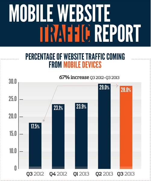
For example, Greg Sterling reports that public relations firm Walker Sands released their latest quarterly index of mobile traffic to their clients’ websites, and they estimate 28 percent of their clients’ traffic is coming from smartphones and tablets. The problem is their sample is too small for their estimate to be very relevant when dealing with the big picture. However, because of how regularly they compile and release this data, we can use their report to see the direction the market is going, and the market is largely going mobile.

Walker Sands actually found a small drop from 29 percent of traffic coming from mobile devices to 28 percent, but those numbers are a big leap from 17.5 percent at this time last year, and a one percent drop in mobile traffic isn’t large enough to draw any conclusions that mobile traffic is faltering.

It becomes even more apparent that mobile is becoming a hugely important consideration for online marketing when you consider that Facebook currently estimates that a third of their users access the site strictly from mobile devices and Yelp says that 59 percent of their searches are now coming from mobile.

The big takeaway, as Sterling points out, is that marketers are doing themselves a massive disservice by ignoring mobile traffic or even by just treating mobile traffic as secondary. Every marketer should be taking mobile traffic seriously, and not treating it as secondary. For some markets, it may even be best to put mobile ahead of desktop in their priorities.

Android

Source: Google

Smartphones have revolutionized how we browse the web, but most browsing still happens within the same web browsers we have all grown accustomed to. For the most part, we do our searches and actual browsing from Chrome, Safari, or Firefox, while we limit our apps to games, reading the news, or taking care of business. But, that all could change in the near future.

Google announced late last week that they would begin allowing Android app developers to have their app content indexed. That content will then be able to be opened directly through apps on Android devices. It is a large step towards a more seamless user experience on smartphones and tablets, rather than the disjointed experience we currently enjoy.

Googlebot has been improved to be able to index the content of apps, either through a sitemap file or through Google’s Webmaster Tools, though the feature is currently only in the testing phase. This means the indexing is only currently available to a small selection of developers, and signed-in users won’t begin to see the app content in their result for a few weeks.

The update means that searches will be able to return information from app content, which will then open directly in the intended app. For websites which tend to offer the same content on both their website and their app, such as news sites, it means users will be able to pick their desired experience, whether it be from within the browser or within the app.

Jennifer Slegg reports that app developers can sign up to let Google know they are interested in having their apps indexed by filling out an application of interest. Before you do though, you should know that your app must have deep linking enabled, and you will have to provide Google with information about alternate URLs either within their sitemap or in a link element within the pages of their site.

Indexing is only available for Android apps currently, and Google has yet to comment on when or if they will extend the capability to iPhone or Windows apps.

Last week, Apple announced their new iPads, the iPad Air, a thinner, lighter, and more powerful version of their full-size tablet, as well as an updated iPad mini with Retina Display. The broad public response to Apple’s latest products seems to be underwhelming, but it hasn’t seemed to sway how popular Apple products are with consumers.

The day of Apple’s big announcement, ad network Chitika released their analysis of tablet traffic from North America, and it appears the negative market analysis has done little to diminish Apple’s grip on mobile traffic. The iPhone owned mobile traffic through the entire rise of smartphones, and now it seems the iPad has just as strong of a stranglehold on tablet traffic, raking in 81 percent of the market.

According to Marketing Land, this is actually a decrease from their 84 percent traffic share in June, but Chitika says no other single competitor has directly benefited. Their traffic may be down, but not a remarkable level by any means.

Recent data from the Pew Research Center says that 35 percent of Americans over the age of 16 own a tablet, and clearly the iPad is the most popular option for browsing the internet. However, the Kindle has proven to be the most successful Android tablet in North America, so it may be that consumers are simply choosing the tablet most suited for their needs: e-books or the internet.

Now that the dust has settled after some extended debate, it seems clear that responsive design is here to stay. It won’t last forever, but it certainly isn’t a flashy trend that is going to fade away soon. It makes sense responsive design would catch on like it has, as it makes designing for the multitude of devices used to access the internet much easier than ever before.

Almost as many people accessing the internet right this moment are doing so using a smartphone or tablet, but they aren’t all using the same devices. A normal website designed to look great on a desktop won’t look good on a smartphone, but similarly a site designed to work well on the new iPhone won’t have the same results on a Galaxy Note 3.

This problem has two feasible solutions for designers. Either you can design multiple versions of a website, so that there is a workable option for smartphones, tablets, and desktops, or you can create a responsive website which will look good on every device. Both options require you to test your site on numerous devices to ensure it actually works great across the board, but a responsive site means you only have to actually design one site. The rest of the work is in the tweaking to optimize the site for individual devices.

That all explains why designers love responsive design as a solution for the greatly expanding internet browsing options, but we have to please other people with our designs as well. Thankfully, responsive design has benefits for everyone involved. The design solution is even great for search engine optimization, which is normally not the case with design and optimization working together. Saurabh Tyagi explains how responsive design benefits SEO as much as it does consumers.

Google Favors Responsive Sites

SEO professionals spend a lot of their time and efforts simply trying to appease the Google Gods, or trying to follow the current best practices while also managing to outplay their competition. Google has officially included responsive design into its best practice guidelines, as well as issuing public statements calling for websites to adopt the design strategy, so naturally SEOs have come to love it.

One of the biggest reasons Google loves responsive sites is that it allows websites to use the same URL for a mobile site as they do for a desktop site, instead of redirecting users. A site with separate URLs will have a harder time gaining in the rankings than one with a single functional URL.

Improves the Bounce Rate

Getting users to stay on your page is actually easier than you might think. If you represent yourself honestly to search engines, and offer a functional, readable, and generally enjoyable website, users that click on your page are likely to stay there. By ensuring your website is functional and enjoyable on nearly every device, you ensure users are less likely to hit the back button.

Save on SEO

Having a separate mobile site from your desktop site means double the SEO work. Optimization is neither cheap, fast, or easy, so it doesn’t make sense to waste all that extra time and work on basically duplicate efforts. Instead of having to optimize two sites, responsive websites allow SEOs to put all their efforts into one site, saving you money and providing a more focused optimization effort.

Avoids Duplicate Content

When you’re having to manage running two sites for the same business, it is highly likely you will eventually end up accidentally placing duplicate content on one of the sites. If this becomes a regular problem, you can expect punishments from search engines which could be easily avoidable by simply having one site. Responsive design also makes it easier to direct users to the right content. One of Google’s biggest mobile pet peeves of the moment is the practice of consistently redirecting mobile users to the front page of the mobile site, rather than to the mobile version of the content they asked for. Responsive design avoids these types of issues altogether.

Synergy

Often, online marketers talk about search engine optimization (SEO) and social media marketing as if they are entirely separate. However, online marketing is often better perceived as a complex interconnected system which is best met with a more holistic approach. SEO and social media are especially compatible bed fellows and if you get the two working together properly you’ll see incredible improvements to both sides that couldn’t be accomplished alone.

A well joined strategy can see huge benefits in numerous areas such as outreach and promotion, content creation, brand management, and goal tracking. In the end, this all means more dollars in the bank for everyone involved. Purna Virji has some tips to help get the two running together instead of apart.

1) Use Promoted Posts to Scale Outreach and Link Building

SEO professionals spend a lot of time attempting to earn high-quality links, while the social media team normally aims to reach out and interact with their audience to build their brand. These may seem like unique tasks, but in reality they are very similar.

Well earned links often require outreach to begin with. You can’t just buy links (well, you can but Google won’t like it) so one of the best ways to earn links in the current field requires creating and sharing content. Just about every online brand has their own blogs these days, but they often expect them to pull their weight on their own. Writers post to the blog, and expect people to simply find their content. At best they share them directly to Facebook and Twitter for free and leave it at that.

Marty Weintraub from aimClear suggests taking it further and making sure your best content gets out to the public with Paid Organic Distribution. Instead of leaving the blog content to languish on its own, you can use Facebook to search out the perfect demographic that will enjoy and respond to your content. You want to look for those who are likely to share, but also seem right for your content. Then, you target them with promoted posts.

This strategy allows you to reach out to possible customers who may have not interacted with your brand before while also offering them something of value. Then, with a well-placed call to action you encourage them to share, driving more organic traffic and scaling up your link building efforts all at once. Best of all, this traffic is more likely to convert once on your site, which can help improve profits.

2) Create More Effective Content

As I previously indicated, one of the most important efforts for SEO professionals these days is creating quality content. It improves how Google perceives your site while also opening up many doors for link building and audience outreach. But what exactly is quality content?

While there are some writers who can magically intuit what their audience wants to know, most of us are secretly writing for ourselves, even if we don’t know it. Instead, using a joint brainstorming session to go over analytics and create a specific content strategy can improve the quality of your content and increase its sharability all at once.

A community manager can offer a great deal of insight into their audience to SEOs, while community managers will appreciate the opportunity to grow and expand their audience with a regular flow of great content. Virji suggests preparing for such a brainstorming session by:

  • Have the SEOs compile a list of which audiences and types of content have resulted in the best campaigns.
  • Have the community manager pull together data on what type of content receives the most shares and audience engagement.
  • Have the SEOs bring in their outreach plan for the coming three months.

This preparation allows you to understand which audiences you should be expanding to and how to better engage the highest performing demographics and cater content to them. You will better understand what gets the best responses and be able to plan ways to create more content that performs highly and less content flops. The community manager will also be able to plan audience engagement activities relevant to your content ahead of time.

3) Engage Influencers

While you can always go straight to your audience, you’ll often see great results from reaching out to those who already have a lot of influence in your field. SEOs will do well to connect with influential bloggers or website owners. Not only can they have a huge impact on your link building efforts, but one link from them can result in a high rate of qualified leads that can lead to conversions.

There are even tools for helping to identify the biggest influencers if you aren’t sure. Klout, FollowerWonk, and Traackr all create lists which will tell you who to engage.

Be careful not to just reach out with a sales pitch. You aren’t trying to gain a link, but build a real relationship between influencer and content creator. Start by sharing their content and retweeting posts, or helping out on community and audience endeavors. Create a reciprocal relationship where the influencer will be inclined to scratch your back in return.
Once you’ve built the relationship, getting them to share links to real quality content will feel natural. Those that see the links will also perceive your brand in higher terms of credibility, as you are co-signed by a trusted influencer.

Google IconHow fast does your website load on mobile devices? Under five seconds? If you said yes to the second question, you are probably pretty happy with your answer. What about under one second? Probably not. But that is how fast Google says sites should load, according to their newest guidelines for mobile phones.

Before you start freaking out at the suggestion their site is supposed to load in under a second, it should be clear that Google isn’t mandating an insane guideline. They don’t actually expect most websites to completely load that quickly. Instead, they are focusing on the “above the fold” content. They think users should be able to get started playing with your page quickly, while the rest can progressively load.

It is probably a wise insight, considering most mobile users say they are more likely to leave a site the longer it takes to load. On smartphones, every second really counts, and if you can get the above the fold content loaded within a second, most users will be happy to wait for the rest of the content while they start exploring.

The update reads:

“…the whole page doesn’t have to render within this budget, instead, we must deliver and render the above the fold (ATF) content in under one second, which allows the user to begin interacting with the page as soon as possible. Then, while the user is interpreting the first page of contents, the rest of the page can be delivered progressively in the background.”

To match with the new guidelines, Google also updated its PageSpeed Insights Tool to focus more on mobile scoring and suggestions over the desktop scoring. They also updated scoring and ranking criteria to reflect the guideline changes.

iPad 2

Source: Matthew Downey

There is a big push recently to ensure that websites are optimized for mobile devices, especially after Google has openly stated they plan to begin punishing sites that don’t properly accommodate mobile traffic.

There are really two solutions for making a site work great on smartphones. Designers can either create an entirely separate and unique version of their site specifically for mobile phone users to access, or they can choose the more popular responsive design solution which promises to “work on every device.” Both have their perks and drawbacks, but can lead to great smartphone internet experiences when done properly.

The devices everyone forgets to discuss are tablets. While we’re ensuring sites work wonderfully on smartphones and desktop devices, the normal solution is to simply direct tablets to the desktop version of the site and be done with it. While that may sound fine initially, it actually leads to sub-par experiences for a quickly growing market.

According to Mobify’s ebook Tablet Design Best Practices, over half a billion tablets are estimated to be shipped in 2013 and 2014 combined, and that number could end up being higher as prices drop and new options become available. Not only that, tablet users continuously show remarkably high quality of traffic and are more earnest to make bigger purchases than smartphone or desktop users.

If you aren’t optimizing sites for tablet users, you are leaving quality traffic and willing consumers to mediocre experiences that can lead them to take their business elsewhere.

Designing sites that work well on tablets doesn’t require much more time than ensuring you are also delivering a quality smartphone internet experience, and often builds on the same responsive or adaptive framework. Most desktop sites do in fact work on tablets, so long as they aren’t overloaded with Flash, but they become frustrating to use. Buttons are too small or scrunched together, text becomes tiny, and images can become pixelated messes when viewed on the high pixel density screens that are becoming standard.

If you want to create a site that will actually excite and draw in tablet users, you can choose to minorly alter your desktop site with small adaptive enhancements and basic media queries, or you can strip your site down to its basics and rebuild a tablet option that creates a uniquely usable site.

For companies without a lot of resources to spend on creating multiple versions of their sites, improving your desktop site to make it enjoyable for tablet users is often the best option. It can be as simple as making buttons a bit bigger and incorporating the zooming and pinching that tablet users are constantly doing. Text also has to be bigger, but that can be easily solved by increasing font sized to 16 pt minimum. But, there are even smaller changes you can make that can make the site easier to use.

Typing on tablets can be incredibly difficult without any tactile response and overzealous autocorrect, but it isn’t difficult to make your site light on text input or create shortcuts that will save the fingers some effort. It is also a snap to enable contextual keyboards with some simple code adjustments.

But, webmasters who want to really engage tablet users and have the resources to do so can find huge benefits from going above and beyond, taking the basic structure and layout of their site and remixing it with adaptive frameworks to really make the site tablet friendly. It is entirely possible to create an adaptive tablet site without even changing the desktop site, and you rarely have to create entirely new elements for the site. It is more about using the elements you have on your site in new ways.

For example, sites with tons of images can make it so that these high quality images can be pinched and zoomed endlessly, while the rest of the page maintains its original size and clarity. You can also re-imagine your navigation for your site to fit how visitors will be using your site. Similarly, you can attempt to replicate the app style on your website with smooth transitions and panel menus hidden away, but always available at the tap of a button or swipe of a finger.

It is hard to suggest specific techniques for creating great adaptive tablet websites that go beyond simply editing your original desktop page, but that only goes to show how slowly the internet is adapting to one of its most fruitful markets. There are massive opportunities for us to completely redesign the tablet experience for the people actually using them, but designers can be stunted by the need to work for multiple clients, limited resources, and general willingness to rest on “acceptable” sites rather than truly exciting experiences.

Hopefully, as businesses recognize the potential of the market, designers can begin to truly explore the potential for design on these great devices.

Source: WikiCommons

Source: WikiCommons

Responsive web design isn’t quite the standard yet, but it certainly shows no sign of going away. It is currently the best solution for the majority of website owners attempting to make their site work well for people accessing it, no matter where they are coming from.

A growing minority of internet users are using smartphones and tablets to browse, and especially with Google’s push to punish sites with poorly configured or non-existing mobile sites, there isn’t much time left before site owners will have to choose between going responsive or creating a separate mobile site. To help you choose, Designrfix shared the latest facts about responsive web design.

  • Display Doesn’t Affect Load Times – Responsive design largely changes the appearance of sites depending on the device being used to access them. They don’t really affect what is actually loaded when a page is brought up, and so it doesn’t really do much to load times. In other words, you can’t rely on responsive design to “dumb down” and speed up your site on slower machines or lesser resolutions.
  • Search Engines Like It – Google has actively supported responsive design as the best solution to going mobile, mostly because it makes the job easier for its crawlers. The webmaster guidelines for Google even address the issue saying, “Google recommends webmasters follow the industry best practice of using responsive web design, namely serving the same HTML for all devices and using only CSS media queries to decide the rendering on each device.”
  • It Directly Affects Your SEO Campaign – Running a separate mobile site rather than simply adapting responsive design basically requires running two SEO campaigns for the same site. With the ability to design for all devices with one site, comes the ability to only have one SEO strategy for the site as a whole.
  • Most Sites Can Be Turned Responsive – This isn’t a hard and fast rule, but for the most part site owners don’t have to create an entirely new site design when they decide to create a responsive design. Instead, most sites can be converted, saving over half the total cost of a full redesign.
  • There Is a Lot of Testing – The main thing people forget to mention when they support responsive design is that designing for all devices means testing for all devices. Going responsive does save you time in the actual design process, but the best rule of thumb for responsive design is if you haven’t tested on a device, your site probably doesn’t work perfectly on it.

I fully predict responsive design to become the standard for all website design in the future because it simply makes more sense for the large number of site owners out there, especially those with limited resources who want to only manage one version of their site.

rsz_1377498_16940838Google has made it very clear that mobile SEO is going to play a big part in their plan moving forward. Last month, Google’s webspam team leader Matt Cutts stated as such during the SMX Advanced Conference in Seattle and Google’s own Webmaster Central Blog confirmed the changes will be here very soon. A recent update told webmasters, “We plan to roll out several ranking changes in the near future that address sites that are misconfigured for smartphone users.”

It isn’t like these changes are coming out of nowhere. Analysts have been encouraging site owners and SEO professionals to pay attention to their mobile sites for years and mobile traffic increases show no signs of slowing down. So, you would think most companies with a fair amount of resources would already be ahead of the curve, but a recent assessment run by mobile marketing agency Pure Oxygen Labs shows that the top 100 companies on the Fortune 500 list are actually in danger of Google penalties in the near future.

Pure Oxygen Labs used their proprietary diagnostic tools to evaluate sites against Google’s best-practice criteria, according to Search Engine Land. They hoped to see how many sites redirected smartphone users to mobile pages, how these redirects are configured, and how widely responsive design was actually being used to reach mobile users.

Only six of the 100 Fortune 500 companies had sites that properly follow Google’s best-practices. The report stated that 11 percent of the sites use responsive design techniques, while only 56 percent of the sites served any sort of content formatted for their mobile users. That means 44 percent had absolutely nothing in the way of mobile optimized sites or content.

The six that actually completely complied with Google’s policies included Google, so it should be noted that means only five outside companies were safe from future penalties at the moment.

There were multiple reasons sites were ill-equipped, but the most common problems were faulty redirects and lack of responsive design, both issues Google has singled out recently as their primary targets for future attacks on poorly configured mobile sites.

iOS7 concept by Andre Almeida

iOS7 concept by Andre Almeida

It appears that flat design is taking the lead over skeuomorphism, as Apple’s new iOS is rumored to be receiving a huge overhaul in the near future. The most recent speculation claims that the new iOS look is going to be largely monotone and understated, as well as abandoning the textures and “realistic” drop shadows of the past.

Web Designer Depot reported the claims which have also been going around most design blogs, which also state that the new mobile OS is rumored to be announced at the Apple WDDC on June 10th, where there is also speculation about a new iPhone announcement.

One of the leading reasons many designers have been slowly migrating is that it is incredibly easy to make a flat design also responsive, especially compared too skeuomorphic designs. Flat design follows the ideology that effects simulating the 3D world such as drop shadows or textures that mimic real objects are not only deceitful, but becoming increasingly irrelevant in an online world.

This isn’t to say that skeuomorphism is completely dead; there are still many designers promoting the strategy. But, Apple has long been cited as one of the biggest proponents of the trend, with their iconic mobile OS styles.

The rumors all started when Apple tapped Jonathan Ive to head the design of iOS7. Ive, Apple’s Vice President of Industrial Design and the man responsible for the iPhone, iPad, and iPod touch hardware, is known to have a strong dislike of skeuomorphic design, which was heavily promoted in the company by Steve Jobs and former iOS head Scott Forstall.

No one will know for sure what is coming with the Apple conference until the 10th, and many skeptics claim that Apple is likely to be implemented incrementally rather than suddenly with an iOS update.