Tag Archive for: Design Instruct

Photoshop IconRaw, high-quality PSD files are one of the most treasured finds online for web designers. They aren’t particularly easy to find, especially compared to all of the readily available resources out there like tutorials, scripts, and templates. A combination of contractual restrictions for much of our professional work, and fear of outright plagiarism of our hard work keep many from sharing their finished PSD files for others to use.

We should be sharing more of them however. PSDs speed the design process up dramatically, as designers can cut and borrow elements of existing files rather than building nearly identical looking versions from scratch, as often happens.

PSDs are also great for learning. Rather than reading tutorials, designers can dig into PSD files and see how every layer acts, individual settings for simple elements, and truly get hands on while studying other designers’ techniques.

While these files aren’t as popularly shared online, there are some sites devoted strictly to sharing PSDs for our own use. Jacob Gube listed the ten best sites posting new files on a regular basis that are high enough quality to be used professionally.

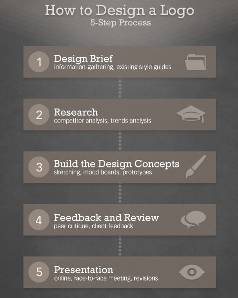
What if I told you there was a simple five step process you can use to create great quality logos? Seems to good to be true? It kind of is. There are no shortcuts to great logos, because you always have to put the work in during every step, but if your problems stem from not knowing where to get started rather than simply skimping on the effort, Martin Christie’s five step process may be just what you need.

Every designer might have their own work flow, but if you don’t have one in place you are sacrificing efficiency and most likely quality. Christie’s process starts where every good design should, with a design brief, and walks you through every step all the way up to the presentation. He simplifies it into the image below, but to get the full idea of the process, you should see it in his own words over at Design Instruct.

Five Step Design Process

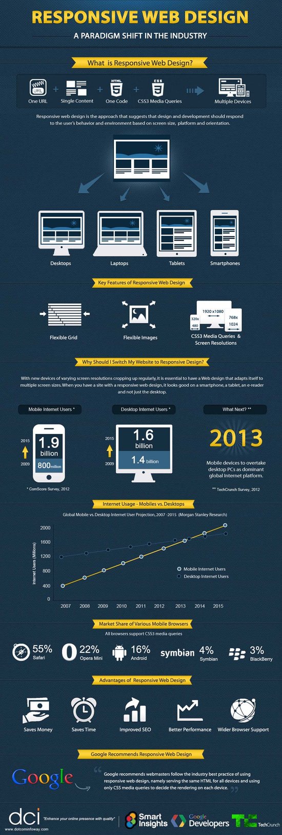
I believe pretty much every web designer that hasn’t been living under a rock knows what responsive web design (RWD) is, but for the few that might be unaware, responsive design is a technique that allows websites to have flexible layouts that change depending on the screen size of the device accessing the site.

I’ve already discussed the pros and cons of responsive design at length, but there is much more to know about the technique than simply what it is good and bad for. There is so much to know, in fact, that it can fill ten whole infographics, like the ones compiled by Jacob Gube at Design Instruct.

Of course, there is an infographic devoted entirely to simply stating the beneficial aspects of RWD, and the obvious infographic focused on explaining exactly what responsive design is in clear visuals. But, other infographics contain basic tips for RWD I haven’t heard elsewhere, or the numbers on how many people are moving to mobile devices and how our use of the web is impacting how people interact with web pages.

Enjoy the infographic showing you what exactly responsive design is below, and you can see the rest at Design Instruct.

Responsive Web Design Infographic

MINOLTA DIGITAL CAMERAFew new designers appreciate how important design briefs are. It usually takes a few years and a couple frustrating and seemingly directionless projects to realize how effective briefs are in giving a designer good direction, and saving designers from numerous redrafts.

Even once you realize how importance a design brief is, many designers have trouble integrating them into their practice. How do you get that type of information out of a client? What do I ask?

That last question is probably the most notable. Asking the right questions can give you all the information you need to make a great finished product, but you have to know what to ask. In Claire Roper’s opinion, it only takes ten questions to make a great design brief.

Of course, even if you followed Claire’s rule, you’ll find yourself asking way more than that. For example, if you ask your client, “what do you want to achieve with the design,” there is no way for a client to respond that won’t solicit at least five follow up questions from a good designer.

The goal of a good design brief is to collect as much information as possible from your client to know what they want out of a project, and that involves asking questions you might not otherwise consider. You want to learn everything about the company you are representing, their history, and how they do work, but you also want to learn exactly what they like.

Asking a client to show you designs they like may seem like the first step to plagiarism  but its far from it. As a designer, your tastes are likely different from your client, and you need to know what each client likes. Asking them to show you what they like and dislike will give you a better idea of what you are trying to create and what to stay away from.

While you can start out with ten questions to ask clients, don’t stop there. Ask questions until you feel confident you understand the desires of your client and their business as a whole. These ten questions will get you going, but if your client isn’t bothered by answering twenty-one question, you should ask as many as you need.

They say a picture is wort a thousand words. Every designer knows how tired that cliche statement is, and just how true it is when you use the right pictures. But, sometimes designers don’t have access to a quality staff photographer or a subscription to Getty Images or a similar stock photo collection website. How is a designer supposed to find quality images to use?

Some designers will settle for using lower quality images they find elsewhere, or using a confusing stock photo with little connection to the content. Neither actually improves content or web designs. Thankfully, there are collections of great free stock photos designers and bloggers can use without using the little money they have.

Stephen Jeske collected ten websites which offer high-quality free stock images. I’ve used one of the sites, Stock.XCHNG, for months and you can always find photographers willing to share their images through it. It is well organized, and easy to use, but no one stock photo site will have pictures for your every need.

When using any sort of images you didn’t create yourself however, it is always essential to make sure you are following the licensing terms and attributing the creator of the image, if you can find out that information. Read the licensing terms for every image you plan to use, and if you are unsure of any details, ask the author of the image.

Typography is one of the most deceptively complex components of design imaginable. I mean, to the outsider, it is just arranging letters and picking fonts. The uninitiated have no idea about the complexities and the history of typography; they don’t know typography has a rule book all its own.

Now, I’ve said infographics will tell you “all you need to know” about a couple different design aspects, but the truth is, you can never learn too much about design, and just about every part of design has books upon books worth of material to learn. But, reading books about design seems kind of boring right? Everyone in the field at this point got into it because we love looking at awesome images.

Instead of reading a book about typography – which you should totally do – you can always look at infographics which will put all of that information in visually stimulating ways. Typography lovers and experts certainly love making them.

Jacob Gube collected ten different infographics from across the web on Design Instruct. I am posting one of the ten below, but you’ll have to go to their site to see the rest. The one I’m showing you is “A Brief Introduction to Typography”, which you will notice is not particularly brief. That should give you an idea just how much there is to say about the “simple science” of “arranging letters”. Click on the image to see the full size.

Brief Introduction

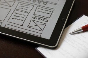
Prototyping your web designs can come in many different forms, from sketches on a napkin or in a notebook, wireframes, or high-fidelity mock-ups. No matter what way your prototyping takes shape, it is critical that the prototyping process is treated as an important part of your workflow.

Wireframe

Source: Flickr

There are quite a few reasons prototyping is integral to the web design process, but the main point is that they can save you extra effort you might otherwise use on creating a design that may not work. This is because prototypes take relatively little time to create, and they can help you identify issues in your design early on. Instead of spending hours laying out a page and tweaking it to find what works best, you can start crafting your design with a solid idea what you want, if you’ve spent the time beforehand to plan it out.

Prototypes also allow you to create variations on designs and compare them much more easily. Instead of coding different designs and layouts to compare. Using sketches or high-fidelity mock-ups, you can easily put the different iterations side-by-side. This means no switching between tabs and saved layouts and designs.

Jacob Gube points out more reasons prototyping is a must for any designer’s work process. Most importantly, putting your ideas on paper before investing time and energy allows you to cut any bad ideas at the beginning of the process. It also makes it easier to communicate your ideas to clients or employers who may need to approve a design.