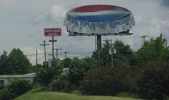
We see banners everywhere, especially in advertising. Whether they’re online, printed on cloth and draped across an entrance, or splashed across a billboard, banner ads all have the same core principles.
You wouldn’t think there is an entire art to making visually exciting and engaging banner ads, but if we can devote more than one article to the skill of making simple and attractive logos, Onextrapixel can devote each letter of the alphabet to effective banner advertisements.
Some of the entries are a little obvious like “grab attention” but they go the extra mile (or pixel if you enjoy the same type of lame humor I do) by explaining shock or surprise isn’t the real way to grab attention. Making viewers want to interact is the real trick to getting someone’s full attention.
Some of the other seemingly obvious suggestions shouldn’t need to be said, but so clearly are needed in the current marketing environment. There are only so words you can fit on a banner before it becomes illegible, and complex fonts make that word limit somewhere between one and five words. If someone can’t tell you what your ad said with just a one to two second glance, you’re trying to squeeze too much in.
Seriously, clarity is so important their list includes it three times with the entries “Message Clarity” and “Succinctness” and I don’t fault them for it. Keep your banner short. I’ve seen far too many ads at the top of my screen and running along the tops of subway cars absolute packed with words in a variety of fonts and all they ever do is hurt my eyes. Viewers remember the short and sweet.
There is obviously more to banner design than keeping it simple, but it opens up the big question addressed by many more of Onextrapixel’s list; “how do I convey a memorable message with so little?” If you can find an answer to that question, you are already well on your way to a great banner.


