Tag Archive for: tablets

It is hard to ignore how quickly mobile traffic has grown to become an essential part of how people access the internet, but there are still a fair amount of brands burying their heads in the sand and pretending nothing has really changed. It is almost astounding to see how many are stuck in the past and refuse to invest in going mobile. With some brands estimating that half of their traffic comes from mobile devices, it is clear that brands who refuse to step-up are going to begin suffering very soon.

We know how popular smartphones and tablets are now, but we don’t actually know how much of all online traffic comes from these devices. Some analysts estimate as low as 15 percent of all traffic is coming from mobile devices, while others have said that as much as a third is coming from non-desktop devices. With such a large range, it has difficult to discern what the exact amount of mobile traffic is, but these studies do give us insight into the direction things are going.

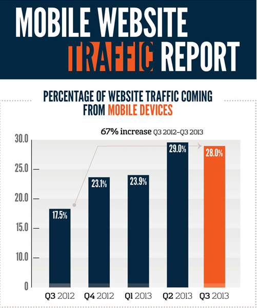
Mobile Traffic Report

For example, Greg Sterling reports that public relations firm Walker Sands released their latest quarterly index of mobile traffic to their clients’ websites, and they estimate 28 percent of their clients’ traffic is coming from smartphones and tablets. The problem is their sample is too small for their estimate to be very relevant when dealing with the big picture. However, because of how regularly they compile and release this data, we can use their report to see the direction the market is going, and the market is largely going mobile.

Walker Sands actually found a small drop from 29 percent of traffic coming from mobile devices to 28 percent, but those numbers are a big leap from 17.5 percent at this time last year, and a one percent drop in mobile traffic isn’t large enough to draw any conclusions that mobile traffic is faltering.

It becomes even more apparent that mobile is becoming a hugely important consideration for online marketing when you consider that Facebook currently estimates that a third of their users access the site strictly from mobile devices and Yelp says that 59 percent of their searches are now coming from mobile.

The big takeaway, as Sterling points out, is that marketers are doing themselves a massive disservice by ignoring mobile traffic or even by just treating mobile traffic as secondary. Every marketer should be taking mobile traffic seriously, and not treating it as secondary. For some markets, it may even be best to put mobile ahead of desktop in their priorities.

iPad 2

Source: Matthew Downey

There is a big push recently to ensure that websites are optimized for mobile devices, especially after Google has openly stated they plan to begin punishing sites that don’t properly accommodate mobile traffic.

There are really two solutions for making a site work great on smartphones. Designers can either create an entirely separate and unique version of their site specifically for mobile phone users to access, or they can choose the more popular responsive design solution which promises to “work on every device.” Both have their perks and drawbacks, but can lead to great smartphone internet experiences when done properly.

The devices everyone forgets to discuss are tablets. While we’re ensuring sites work wonderfully on smartphones and desktop devices, the normal solution is to simply direct tablets to the desktop version of the site and be done with it. While that may sound fine initially, it actually leads to sub-par experiences for a quickly growing market.

According to Mobify’s ebook Tablet Design Best Practices, over half a billion tablets are estimated to be shipped in 2013 and 2014 combined, and that number could end up being higher as prices drop and new options become available. Not only that, tablet users continuously show remarkably high quality of traffic and are more earnest to make bigger purchases than smartphone or desktop users.

If you aren’t optimizing sites for tablet users, you are leaving quality traffic and willing consumers to mediocre experiences that can lead them to take their business elsewhere.

Designing sites that work well on tablets doesn’t require much more time than ensuring you are also delivering a quality smartphone internet experience, and often builds on the same responsive or adaptive framework. Most desktop sites do in fact work on tablets, so long as they aren’t overloaded with Flash, but they become frustrating to use. Buttons are too small or scrunched together, text becomes tiny, and images can become pixelated messes when viewed on the high pixel density screens that are becoming standard.

If you want to create a site that will actually excite and draw in tablet users, you can choose to minorly alter your desktop site with small adaptive enhancements and basic media queries, or you can strip your site down to its basics and rebuild a tablet option that creates a uniquely usable site.

For companies without a lot of resources to spend on creating multiple versions of their sites, improving your desktop site to make it enjoyable for tablet users is often the best option. It can be as simple as making buttons a bit bigger and incorporating the zooming and pinching that tablet users are constantly doing. Text also has to be bigger, but that can be easily solved by increasing font sized to 16 pt minimum. But, there are even smaller changes you can make that can make the site easier to use.

Typing on tablets can be incredibly difficult without any tactile response and overzealous autocorrect, but it isn’t difficult to make your site light on text input or create shortcuts that will save the fingers some effort. It is also a snap to enable contextual keyboards with some simple code adjustments.

But, webmasters who want to really engage tablet users and have the resources to do so can find huge benefits from going above and beyond, taking the basic structure and layout of their site and remixing it with adaptive frameworks to really make the site tablet friendly. It is entirely possible to create an adaptive tablet site without even changing the desktop site, and you rarely have to create entirely new elements for the site. It is more about using the elements you have on your site in new ways.

For example, sites with tons of images can make it so that these high quality images can be pinched and zoomed endlessly, while the rest of the page maintains its original size and clarity. You can also re-imagine your navigation for your site to fit how visitors will be using your site. Similarly, you can attempt to replicate the app style on your website with smooth transitions and panel menus hidden away, but always available at the tap of a button or swipe of a finger.

It is hard to suggest specific techniques for creating great adaptive tablet websites that go beyond simply editing your original desktop page, but that only goes to show how slowly the internet is adapting to one of its most fruitful markets. There are massive opportunities for us to completely redesign the tablet experience for the people actually using them, but designers can be stunted by the need to work for multiple clients, limited resources, and general willingness to rest on “acceptable” sites rather than truly exciting experiences.

Hopefully, as businesses recognize the potential of the market, designers can begin to truly explore the potential for design on these great devices.

The reality of online marketing is that advertisers must find a way to reach users on a variety of different devices. AdWords recently made that difficult task a little easier with a new tool that allows you to convert ads using Flash to HTML5.

Since many tablets do not support Flash, this tool could help your business reach thousands of additional users. And converting takes just a couple of mouse clicks, no expert knowledge is needed.

To find out more, check out Chris Crum’s article at Web Pro News.