Web design changes all the time. New trends come and old trends go as quickly as the crowd catches up to them. Some of these trends can be long lasting and have a huge impact on how we interact with the internet like responsive design, others can be more fluid and fleeting like flat design. The design community has made its name by always pushing to create the most visually exciting and effective user experience the technology allows, but that means we also have to let go of bad habits as we grow.
As the new year draws closer, designers are reflecting on the changes web design has undergone in the past year. While many are using this reflection to predict what is going to be popular next year, Maryam Taheri looks at what we need to get rid of to improve looking forward.
Homepage Sliding Banners

The sliding banners have become a hallmark of news and culture websites across the web, as well as many retailers. But, the banners are becoming dangerously close to cliche and users seem to be mixed in their response. Many find them to be distracting and annoying. While there may be ways to make these sliding banners more enjoyable for users, it could very well be in our best interests to instead turn to more interactive design methods such as single-page scrolling.
Extensive Fill-Out Forms
While we will always have to fill out lengthy forms for legitimate purposes like online shopping (at least the first time!), there is no need to make users fill out a full length form for optional areas of your site. Chances are, they will just avoid that area of your site to avoid giving personal information, and it could severely hurt your trust with many of your online customers. Asking for an e-mail address is fine. Asking for their life story isn’t. Thankfully, the majority have already realized this.
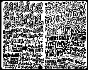
Overuse of Fonts

It works in a sketchbook, not on your site.
Source: Carolyn Sewell
Typography is enjoying a new wave of interest in all areas of design, but it has its limits. A good designer can match a select number of fonts (no more than three) to create a pleasing website. But, it is far to common for less experienced designers to choose the “more is better” approach to diminishing returns. A mish-mash of fonts only makes a site look cluttered and schizophrenic. If you want to make your header or your copy pop but don’t know much about fonts and typfaces and kerning, it is wise to limit yourself to two fonts. If you can make two fonts compliment each other, you’re design won’t need any more.
Complicated Design
If there is one thing the favored trends of the past year have shown us, it is that users want their web experience simple. This seems like common sense for the large number of mobile users accessing the web while out and about, but it also stands true for desktop users. You don’t have to choose flat design or convert to the church of minimalism, but successful websites are increasingly focused on creating the best experience for users. If your website confuses or overwhelms, you’re doing it wrong.


