Tag Archive for: color theory

Pantone Red

Colors do more than most people give them credit for. In web design, they aren’t just physically helping define a page. They can set a mood, establish trust, excite viewers, and define your brand. Colors can help a company secure their professional image or severely damage it. Colors can be out of date, and they can be hip or trendy.

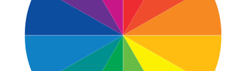
The key to understanding how colors function is to understand how we think about and respond to those colors. Onextra Pixel has been exploring colors and offering guides to help us understand the use of color in web design.

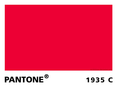
Red is a color with perhaps the strongest associations, possibly because it is such a bright, attention grabbing color. It is such a dominant color, it seems to always be extroverts favorite color.

These associations tend to be dramatic connections. Red is normally associated with passion, danger, sacrifice, blood, passion, fire, beauty, and anger. In contrast, in many cultures the color is associated with happiness and love.

Because of these dramatic associations, red is one of the most powerful colors for expressing moods or grabbing attention in all types of media. It encourages appetite, inspires activity, and evokes emotion all depending on the shade used. Pale shades like pink can be soft and feminine, while pure bright reds can be harsh, aggressive, and overbearing. Meanwhile, deep dark shades of red like crimson can evoke warmth and comfort or creepy sinister vibes.

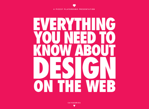
As you can see, red is one of the most versatile colors on the spectrum. If you can choose the right shade for your design, you can create heightened emotion and attention with ease. Or, you can pair it with white and black to create a formal, professional perception.

Due to its incredible versatility red is obviously a popular color on the web and in all other kinds of design. Onextra Pixel has a showcase of websites using red in many different ways to portray a huge variety of moods and emotions.

Everything Design

Source: Everything Design

Color Wheel


Have you ever seen the old “optical illusion” that makes one color appear to be two entirely different colors? If you’ll excuse the MS Paint quality image (is there a rule that all optical illusions have to have been designed before 1997?) the one below makes two spirals appear to be blue and green, when the stripes making the spirals are actually the same color. Its the same principle at play as when you look at a color in a design and it just doesn’t seem to work right. When placed next to specific hues, certain colors can take on the visual characteristics of their neighboring color. Making this even more tricky, the human eye perceives color in different ways depending on if it is in the background or foreground.

Optical Illusion


The specific colors that can take on other characteristics are referred to as recessive colors, while those who always look the same are called dominant colors. Many pure colors such as cyan maintain their hue even when mixed or paired with other colors. No matter what color is mixed with a dominant color, the original color will still remain at least partially visible.

Dominant colors also tend to “push through” the design, or powerfully assert themselves within the composition. While recessive colors easily fade into the background, it is hard to make a dominant color sit far in the background. Pure hues are naturally dominant, though primary colors are more dominant than the others, because red, blue, and yellow literally can’t be created by mixing other colors.

Recessive colors, on the other hand, naturally fade into the background. They also easily take on the properties of any surrounding color. Recessive colors act as a neutral in a palette which help the more dominant colors maintain their emphasis and focal attention. As Carrie Cousins puts it, “recessive colors are the blurry or muted tones behind the focal point of an image or the pattern that appears behind something you’re supposed to be looking at.”

Cousins explored the relationships between dominant and recessive colors exhaustively at Design Shack. Not only does she delve into the scientific basis for why we perceive these colors the way we do, she also explains how these ideas can be adapted to design of all kinds, including web design.

Color is one of the most important aspects of graphic design as well as branding and advertising. It can be used to give emphasis, depth, and even motion to a design but it also helps establish the overall feel or atmosphere of the design.

As designers, we do more than just create nice looking compositions. We also connect and communicate to others through images, text, sites, sound, and yes, color. Color is one of the strongest tools we have as a designer, because color decides a large amount of how a viewer perceives a design. It can set off emotional or visual cues, or it can be used simply to pull viewers in.

One of the most important parts of learning how to use color in your designs is learning the understandings and meanings of different colors. They don’t just set the mood, but colors can actually mean quite a lot about companies, sites, and even people. You The Designer recently created the infographic seen below which details “The Psychology of Color” for designers and they lead into it with an insight about color from American stage director Vincent Minnelli who once said, “I use colors to bring fine points of story and character.”

We don’t tend to work much with characters as graphic designers, but in some ways we do tell stories through our sites. Our clients want their websites to represent their company or brand as a whole, including its history and reputability. We weave these stories through our websites through imagery that supports the brand story they want to tell. Color plays a big role in this through making connections to preconceptions we already have. If you’ve ever seen a green logo for a health food store, or a red fast food sign, you’ve already seen the principle in action.

AColorGuideForDesigners_51087f68f22e5_w587