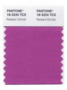
 While most people outside of designers don’t tend to follow color trends, it can be surprising how much they affect what you see every day. Most consumers would be surprised to hear that colors come in and out of favor in design on a regular basis, and those trends affect marketing, purchasing decisions, and your perception of a brand or object.
One of the leading influencers in color studies and usage is the Pantone Color Institute, known for their widely used color system. Not only do they provide an organized way to communicate about color in exact terms, they also regularly analyze media, socio-political events, and technological advances to help decide the Color of the Year.
In 2014, you can expect to see a lot more “Radiant Orchid”, as the purplish-pink color has been chosen as the color of the year, as reported by Web Designer Depot.
 Last year’s chosen color was the more recognizable Emerald, though the specific hue wasn’t what most actually associate with emerald. It was a bold but relaxing color of green “symbolizing growth, renewal, and prosperity”, which then became extraordinarily popular among the fashion and design world.
“Radiant Orchid reaches across the color wheel to intrigue the eye and spark the imagination,” says Leatrice Eiseman, executive director of the Institute. “An invitation to innovation, Radiant Orchid encourages expanded creativity and originality, which is increasingly valued in today’s society.”
It is hard to tell whether the analysis is so accurate that the team can predict a color that will become popular on its own, or whether Pantone’s influence is the primary factor making these colors so ubiquitous for a year. But, it is almost guaranteed 2014 is going to have its fair share of Radiant Orchid.


