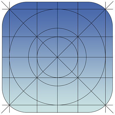
There is a lot of talk going on about Apple’s new mobile operating system iOS 7, even though it is at least a couple months away from actually being unleashed on the public. Most of the discussion is centered around the new flatter aesthetics Apple has adopted, especially the new icons. But, there are quite a few other changes designers are concerned with, namely the actual app redesigns necessary to keep up to date with the update and how much influence iOS 7’s new UI should have on the redesigns.
Many believe that the Apple’s new style should be a heavy influence on the new app designs so that they will appear more native. But, other brands have put a ton of energy and resources into designing their own style and appearance and they don’t want to throw all of their independence and unique brand identity away. To make it even more confusing, there is a fair amount of confusion over how strict Apple’s iOS Human Interface Guidelines are.
This puts designers in a place where they aren’t sure what they are required to do to continue to be accepted by Apple’s app store, and what is simply suggested to keep in step with Apple’s style. Sam Jones from Web Designer Depot decided to tackle all the questions designers have during the transition period, and his article will give designers a good idea of where to go from here.
Jones also pulled quotes from Apple’s iOS 7 Transition Guide which help clear up exactly what Apple expects from their apps. If you want to know the exactly what apps must do, and what Apple suggests for moving forward, the information from the Transition Guide is about as clear as can be.
Things Apps Must Do
- Update the app icon. In iOS 7 app icons are 120 x 120 pixels in high resolution, rather than the 114 px they’ve been using for the Retina capable iPhones.
- Every app must update the launch image to unclude the status bar area, if the app doesn’t already do so.
- All apps are also expected to support Retina displays and iPhone 5 dimensions in all artwork and designs
Things Apps Should Do
- Apple would like all app content to be discernible through translucent UI elements such as bars and keyboards, as well as the transparent status bar. In iOS 7, view controllers use full-screen layout.
- iOS 7’s bar button icons are lighter in weight and displayed in a new style, and as such they would like designers to redesign their own custom bar button icons.
- Prepare for borderless buttons by moving away from supplying button background images and reassessing how to handle them within your layout.
- Examine your app for hard-coded UI values—such as sizes and positions—and replace them with those you derive dynamically from system-provided values. Use Auto Layout to help your app respond when layout changes are required.
- Examine your app for places where the metrics and style changes of UIKit controls and views affect the layout and appearance. For example, switches are wider, grouped tables are no longer inset, and progress views are thinner.
- In iOS 7, users can adjust the text size within apps, and as such designers should move to adopt dynamic type, so that text responds appropriately.
- Ensure your app doesn’t respond inappropriately to the new Control Center gesture or to a navigation controller’s swipe to go back gesture.
- Keeping in line with Apple’s new flatter style, they would like designers to reassess their use of drop shadows, gradients, and bezels. Apple’s new aesthetic puts way less emphasis on visual effects that attempt to make UI elements look physical.


