Tag Archive for: Web Design Ledger

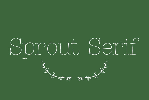
Sprout Serif


There is something inherently nostalgic and sweet about handwritten fonts in design projects. Not only do they make designs feel more personal and loan some much needed personality to your projects, they immediately draw the eye in ways that your more standardized and formal typefaces don’t. They elicit emotion and a personal connection. You can’t say the same for Times New Roman, for sure.

Of course, handwritten fonts are all unique and can be used for a huge array of design projects. There are script fonts with extensive flourishes which look right at home on wedding invitations and greeting cards, but there are also the more shaky fonts designed to recreate the look and feel of journal entries or rushed messages. There might literally be a handwritten styled font for every occasion.

Naturally, these fonts work as well in digital or web design as they do in print media. Websites can strongly benefit from the more intimate appearance their copy adopts when using a handwritten font. You can charm visitors or make them feel more comfortable with the right font selection, but the key is knowing how to pick and use these styles.

For instance, many of the fonts that look handwritten push the bounds of legibility. There are those which look scrawled out in thick marker, as well as the extravagant scripts which can be obscured by their own ornamentation. These styles can absolutely work well, but they are best reserved for headers or isolated small blocks of text intended to make an impact, because readers absolutely won’t spend their time trying to make sense of blog articles or extensive copy that is hard to read. These styles attract visual interest, but don’t work in excess.

There are plenty of handwritten fonts that do work for blurbs or more extensive copy, though you have to walk a fine line when using them. It is still best to use traditional fonts for comprehensive blogs or anything that will take more than a handful of seconds to read, but front page sections such as navigation or small “about us” blurbs can be made more interesting with a immediately legible but unique handwritten style.

Maryam Taheri collected 12 handwritten fonts that work in a variety of situations. You won’t find the swirly decorative script fonts most tend to imagine when they think of handwritten typefaces, but you will find a wide variety of fonts which will make your site seem charming, intimate, and unique.

Endless CodeIt is a little ironic that most web designers hate coding. We’re all familiar with it, and we’ve all spent sleepless night chugging coffee and endlessly editing code until we feel like we’ve lost touch with reality. But, the best coders realized the entire process can be simplified and sped up with all the free tools available online.

Web Design Ledger created a “cheat sheet” of tools and resources designers can use to cut through the fog of coding. You’ll never be able to completely escape coding, but you can at least make it as painless as possible.

Code Editors

One of the main tools any designer should already have is a code editor such as Sublime Text 2. Back in the dark days of coding, many designers were forced to create Notepad files that seemed to endlessly drag on as they were filled with line upon line of code, but no one should know that pain in these days. Code editors can help you quickly jump between the tags you want to work on, and best of all, they highlight problems in your code as you write. To anyone who has ever searched for hours trying to find the proverbial needle in the haystack, that alone is reason to find a new editor to use.

CSS Pre-Processors

CSS is notorious for spiraling into obscenely long and confusing script that becomes eventually unworkable. Sass (Syntactically Awesome Style Sheets) is a meta-language that can be put on top of the original CSS to clean up all that messy code and make it workable and lightweight again. If you combine Sass with Compass, an open-source CSS authoring framework, you can easily create responsive designs with cross-browser friendly scripts to keep everything simple.

Code for Humans

We all have to deal with our own code, but writing for yourself or entirely for machines can leave the code hard to understand when you come back to it later. If you get caught up using entirely your own coding style, colleagues may not be able to make sense of it all, but if you write exactly as computers read it, your code can become difficult to update and read. Instead, write in a way that will keep everything easy to find and understand, with small file names and consistent organization. You can use Codekit (Mac) or Mixture (Mac/Windows) to convert it all into computer-friendly language later.

Use GoMockingbird

Wireframing is one of the first steps designers go through when constructing a site and creates the entire foundation you will build the site upon. These foundations are also used to present site designs to clients, so using sketches and doodles is a bit too unprofessional of an option. Instead, GoMockingbird creates professional looking wireframes that can portray even the more tricky elements of a page to everyone who needs to approve the design. You can include widgets, sliders, check boxes, and even social buttons, so that clients get a clear and complete understanding of how their site will end up.

Conclusion

There are tons of other tools included in Nicola Allen’s cheat sheet over at WDL. The ones I highlighted here can make the biggest effect on the time spent slaving over code, but every shortcut helps. There are tools and resources for every design task, including creating Lorem Ipsum dummy text so that you don’t have to. If you want to design, but hate the long nights associated with coding, you’ll appreciate everything the cheat sheet offers.

Just like every aspect of design, color is subject to trends and fads, though they aren’t always obvious. Look around a city and you’re hit by a wave of color so various it is hard to make heads or tails of what color palettes are popular at the moment. Start to hone in on the individual elements however, and soon you’ll see patterns in the different billboards and store fronts that litter the landscape.

The same goes for web design. If you are looking at the entire web as a case study, it is hard to tell what is popular right now. If you pay attention to the trendsetters and heavy hitters though, the trends are pretty clear. Luke Clum from Web Design Ledger selected four color trends he has seen coming up this year, and they are indicative of many other fads going on right now.

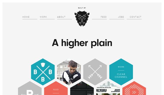
1) Grayscale with Colorful Accents – Designers have long understood the use of bright colors on muted backgrounds to provide points of interest and direct the eye along the page. Lately, this has been refined to an art. Grayscale palettes give sites an air of sophistication while the brighter spots of color help differentiate between different aspects of the page and important content.

Color Palette Screenshot

2) Muted Pastels – For sites going with the grayscale with accents palette, muted pastels are often the hues of choice for those accents. A desaturated robins-egg blue or grayed out purple still jump off largely black, gray, and white pages, without throwing off the balance with overly saturated brights. These muted colors also work well with creating formal web presences, or more vintage artisanal brand images when accompanied with retro typography.

3) Neons and Brights – On the other hand, while a large group is going muted and reserved, other designers in fashion and visual mediums have been moving towards loud neon colors that scream 80’s throwback. Bright pinks and electric blues are showing up more and more places, giving businesses a perceived image as modern, energetic, and engaging.

4) Color Blocking – This is the trend that unites all of these palette fads, as well as giving a view as to what is going on in web design as a whole. Breaking sites into distinct, but aesthetically pleasing grids is one of the most irrefutable trends going on right this moment, and it all leads back to flat design. These crisp blocks of color help create an organization across the page, without separating every element with white space. It is reminiscent of illustration, minimalism design, and even the trend towards vector graphics. Plus, it can be combined with an other color trend for great results.

Conclusion

While the trends will always be changing, and some of these may not even still be en vogue by the end of the year, keeping up with what is happening across design is essential to the job, and following the latest color trends allows you to keep your site looking modern while experimenting with palettes and layouts outside of your normal wheelhouse. Sometimes, following trends will help get you away from your boring design routine.

Just because we are a month into the year, it doesn’t mean some aren’t still giving their predictions for what will be popular this year. Jake Rocheleau is a little late to the fray, but he makes a couple predictions which pique my interests, especially because he stays away from the standard for this years’ lists, responsive design.

Instead of just repeating that responsive design will be big this year, Rocheleau suggests responsive design is going to shift our workflows to starting on mobile and building sites up from there. Mobile first design allows you to identify what is important from the beginning, then flesh out the site for other platforms. The traditional method of starting on desktop usually turns into a game of squishing and cutting elements when scaled down for mobile.

Rocheleau also uses a popular implement for many social media websites as a sign that soon infinite scrolling will be common on the web. Facebook, Tumblr, Pinterest, and Twitter have all popularized the layout style, and even Reddit’s most popular add-on, Reddit Enhancement Suite, adds in infinite scrolling, as well as numerous other features. This style doesn’t work for every type of site, but it certainly is spreading.

His other predictions aren’t as interesting as the last two advancements. White space and minimalist designs have had a niche following for years in web design, and while many sites use this style, it is hard to see it becoming widespread. The idea behind using minimalist designs or a lot of negative space is that it removes clutter and helps users focus more on pages. Clutter on a webpage is never good, but most companies will continue to opt for other solutions, if the trend continues as it has been.

The same goes for big photography. In the circles extra large photography online benefits, big photography has been common in some form for years. Design portfolios and personal websites have long organized their main pages around large, high quality images. The newer high definition displays out there definitely make these types of pages pop a little more than they used to, but it is hard to see it becoming any more common than it already is.

It is always interesting to look at predictions or annual lists that arrive a little behind the rest of the pack. Most lists for 2012 that came out in early January or late December tended to focus on responsive design and parallax scrolling. Those two design implements are keeping their foothold, but as this list shows, we’re already moving further with design.